• Our software update is now concluded. You will need to reset your password to log in. In order to do this, you will have to click "Log in" in the top right corner and then "Forgot your password?".
  • Welcome to PokéCommunity! Register now and join one of the best fan communities on the 'net to talk Pokémon and more! We are not affiliated with The Pokémon Company or Nintendo.

Rate the signature of the person above you

Status
Not open for further replies.

Aizuke

[b]long sword style[/b]
  • 3,025
    Posts
    16
    Years
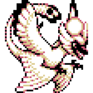
    Ew smiley. :x The small text on top of the banner is barely noticable compared to your banner. It would look better if it was center aligned and the text was at the bottom. If not, stick it at the bottom of the banner.

    5/10
     
    Last edited:

    THIRTY-SIX

    Banned
  • 8,174
    Posts
    19
    Years
    • Seen Nov 18, 2015
    Bg low quality compared to the over sharpened focal.

    Text needs better colouring and probably would look better with some character spacing.

    6.10
     

    Barney.

  • 2,485
    Posts
    15
    Years
    • Age 29
    • Seen Jul 30, 2015
    You don't know it? wth?

    anyway...It's just a google searched pic of spyro x.x

    2/10
     

    Amaruuk

    [span="letter-spacing: -2px;"][b]└──[/b]►[/span]TY
  • 1,302
    Posts
    16
    Years
    • Age 35
    • She/Her
    • Seen May 16, 2024
    It's pretty decent. It could use better color-coordination between the text and the banner, but then I just like stuff that matches.

    6.5/10
     

    Barney.

  • 2,485
    Posts
    15
    Years
    • Age 29
    • Seen Jul 30, 2015
    It's nicely CSS'd

    But I'm not a fan of that banner..

    Definately not your best.

    6.5/10
     
  • 8,279
    Posts
    15
    Years
    • he/him
    • Seen today
    I do not like Batman that much, though the Dark Knight was a good movie... It is very organized and neat... So. 6/10
     
    Status
    Not open for further replies.
    Back
    Top