
You are using an out of date browser. It may not display this or other websites correctly.
You should upgrade or use an alternative browser.
You should upgrade or use an alternative browser.
Rate the signature of the person above you
- Thread starter Fire Master
- Start date
- Status
- Not open for further replies.
More options
Who Replied?
Snivi
..•.¸¸•´¯`•.¸. ஐ
- 20,089
- Posts
- 20
- Years
- TULSA, OK, USA
- Seen Nov 26, 2021
Yours is kinda busy. but ok 6/10
Eos Aduro
The Kid with the Bullet Soul
- 2,142
- Posts
- 16
- Years
- Publi City
- Seen May 13, 2014
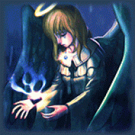
I can't really see what the text says, but overall its an 8/10
The Red Chain
Guest
- 0
- Posts
Much better than the last time I rated it.
But I still think the text could be better.
7.9 out of 10
But I still think the text could be better.
7.9 out of 10
ReyRey-Pyon
THREAD KILLER
- 1,006
- Posts
- 15
- Years
- Age 30
- Seen Feb 6, 2015
d'aww i love that XD;
cute picture <u>
9/10
cute picture <u>
9/10
The Red Chain
Guest
- 0
- Posts
I think it could do without the chibi in the corner.. and the random right-aligned floating text.. but that's just me. XD
Other than that, the banner is extremely beautiful and well made. <3
Edit ; Lol, forgot the actual rating.
9.0 out of 10
Other than that, the banner is extremely beautiful and well made. <3
Edit ; Lol, forgot the actual rating.
9.0 out of 10
Last edited:
Bianca Paragon
Banned
- 940
- Posts
- 16
- Years
- Seen Apr 10, 2010
I got cheated out of a rating ;_;
I love your new one! The colors are larger than life and seem to jump off the screen; I adore it <3
You're getting a 10/10
I love your new one! The colors are larger than life and seem to jump off the screen; I adore it <3
You're getting a 10/10

- 1,118
- Posts
- 15
- Years
- Age 27
- Somewhere in Neo Arcadia.
- Seen Sep 4, 2016
8/10. Um. Like I said in the theme rating thread: the text is nicely aligned, and although the banner's huge, it looks real pretty anyway. :D
The Red Chain
Guest
- 0
- Posts
I really love the organization.
Gold and Silver look radically epic, and are so well drawn. <3
Very wonderful job.
9.7 out of 10
Gold and Silver look radically epic, and are so well drawn. <3
Very wonderful job.
9.7 out of 10
- 307
- Posts
- 15
- Years
- Viridian City
- Seen Aug 11, 2016
Brilliant, great image.
but the font under is abit hard to read. 8/10
but the font under is abit hard to read. 8/10
ReyRey-Pyon
THREAD KILLER
- 1,006
- Posts
- 15
- Years
- Age 30
- Seen Feb 6, 2015
lolwut?
I love the background
pretty colors ouo
it like, doesn't match the focal but at the same time kinda does rofl
7/10
I love the background
pretty colors ouo
it like, doesn't match the focal but at the same time kinda does rofl
7/10
Bianca Paragon
Banned
- 940
- Posts
- 16
- Years
- Seen Apr 10, 2010
Yay TWEWY <3 Cute render!
It's a little spartan; but I'm a fan :3
8/10
and you're welcome; you know who you are ♥
It's a little spartan; but I'm a fan :3
8/10
and you're welcome; you know who you are ♥
Empty Pot
a new beginning...
- 1,234
- Posts
- 14
- Years
- Age 28
- North America
- Seen Aug 5, 2023
Everyone is such critics o:
Yours shall be 8/10 due to how awesome it is d:
Yours shall be 8/10 due to how awesome it is d:
The Red Chain
Guest
- 0
- Posts
I like the way the banner is going, but the font could be better..
The random Pidgey faces are kinda.. out there..
It would also be nicer if the orange font if it was changed to brown or something, to color coordinate with Pidgey..
But this is all my own opinion. :3
7.2 out of 10
The random Pidgey faces are kinda.. out there..
It would also be nicer if the orange font if it was changed to brown or something, to color coordinate with Pidgey..
But this is all my own opinion. :3
7.2 out of 10
Last edited:
Adorable image. Usually, I would say to use a dark purple for the background and border, but considering the text, it looks good. Much better than if you had it without.
9/10~ And now I'm wondering how on earth you have the bottom curved like that on Chrome. I can't get it to curve on Chrome. Only on Firefox.
9/10~ And now I'm wondering how on earth you have the bottom curved like that on Chrome. I can't get it to curve on Chrome. Only on Firefox.
Ayano Katagiri
♥ 陳意涵 - 痞子英雄
- 8,399
- Posts
- 17
- Years
- Age 32
- New Zealand
- Seen Jul 9, 2010
Ooh, cute. The layout's great and the sound tag nicely integrated.
9//10
9//10
The Red Chain
Guest
- 0
- Posts
I think it looks really nice..
But I dunno.. something about it is irking me..
Maybe how big the text is? I really don't know. XD
7.8 out of 10
But I dunno.. something about it is irking me..
Maybe how big the text is? I really don't know. XD
7.8 out of 10
Anxiety.
Walking on sunshine.
- 1,670
- Posts
- 16
- Years
- Birmingham, England.
- Seen Feb 5, 2011
It's cute. It's also very well made.
8/10
8/10
Griffinrich
Welcome to the Jungle...
- 14
- Posts
- 14
- Years
- Springfield, MO
- Seen Sep 5, 2010
I'd give a good 8.5/10 on that one.
Mine is the prime example that pure simplicity can be funny.
Mine is the prime example that pure simplicity can be funny.
- Status
- Not open for further replies.