
560cool.
An old timer?
- 2,002
- Posts
- 14
- Years
- Age 25
- Eastern Europe
- Seen Mar 29, 2021
The Espeon Ball and the Nine-Tailed Espeon are the best.
You truly have some amazing skills ! ^^
You truly have some amazing skills ! ^^


^__^ Animated fusion!
It's telling you off! What do you think?


Those recolours are oversaturated where there's colour, and under-contrasted all the way through. The outlines are far too light and the orange and pink are eye-sores. The black on the Bulbasaur's shades are so close together that it's hard to identify shading. Perhaps try taking shades from Game Freak's official sprites?
Just 3 recolours of the Bulbasaur line...Nothing special, really. It's been long since my last sprite. Venusaur is ugly XD


These are both pretty nice. Well done. The first could have some work done on the outline, but it's quite a nice fusion.
I'll tell you which ones I like first: Altaria, Shuckle Red and Green and Greyscale Bronzong. The rest, unfortunately, I do not like. Similar to with Inferny, the shades you have used do not have enough contrast between each other, and, more importantly, are too saturated in quite a few places, especially where there's black. I'm not going to go over how to do black properly again, but to reiterate, try checking out the Absol, Darkrai, Kricketune, etc. sprites for guidance on how to execute it properly and make it look nice. Putting the seriously dark top aside, Mantyke's yellow really is horrible. It looks like... well, it doesn't look nice. Perhaps try using a more orangey yellow, or maybe a yellow like used in these sprites?


Nice colour scheme. Nothing I can really see wrong with this.
I think Glaceon should keep it's own colour scheme. Seriously. It just doesn't work on Porygon-Z. The arms have had the outline colour used on them. That's a real no-no. If you don't have enough colours, make one yourself or don't do it. >:
...it's not nice. WHY use red for a blue-coloured part. It just doesn't work. Seriously.
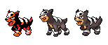
Okay, all three of these fusions have been copied-and-pasted, thus presenting anatomical errors all over, wings being behind the body and not merged in, escher-style angles with the claws and illogical shading (which is the result of just copying-and-pasting and not reshading). I'm not gonna point much out, but these could be done much better. Arcanine's colouring is weird, with the dark red outline on a black body, which just looks weird. The horns have got some stray pixels, and Kingdra looks like it was done in five seconds.


Heh, thanks for the feedback...I'm just a beginner, though. Splicing is rather difficult for me; recolors are pretty much my specialty, though I have a hard time putting the right colors in the right places.Nice colour scheme. Nothing I can really see wrong with this.I think Glaceon should keep it's own colour scheme. Seriously. It just doesn't work on Porygon-Z. The arms have had the outline colour used on them. That's a real no-no. If you don't have enough colours, make one yourself or don't do it. >:...it's not nice. WHY use red for a blue-coloured part. It just doesn't work. Seriously.Okay, all three of these fusions have been copied-and-pasted, thus presenting anatomical errors all over, wings being behind the body and not merged in, escher-style angles with the claws and illogical shading (which is the result of just copying-and-pasting and not reshading). I'm not gonna point much out, but these could be done much better. Arcanine's colouring is weird, with the dark red outline on a black body, which just looks weird. The horns have got some stray pixels, and Kingdra looks like it was done in five seconds.


