This is an official challenge to one Renyui! for a freestyle battle, no restrictions.
Time period: One week from whenever you respond to this.
Theme: Freestyle.
Restrictions: Just the 600x350px max dimensions.
May the best man win. <3
EDIT: VOTING TIME NOW!
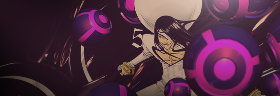
Tag 1.
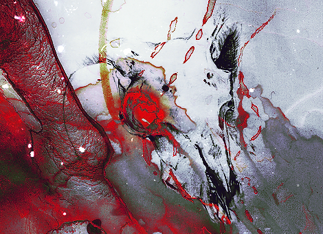
Tag 2.
There will be no poll. You must leave a comment with which tag you think is better, and give an explanation.
Time period: One week from whenever you respond to this.
Theme: Freestyle.
Restrictions: Just the 600x350px max dimensions.
May the best man win. <3
EDIT: VOTING TIME NOW!
Tag 1.
Tag 2.
There will be no poll. You must leave a comment with which tag you think is better, and give an explanation.
Last edited: