• Our software update is now concluded. You will need to reset your password to log in. In order to do this, you will have to click "Log in" in the top right corner and then "Forgot your password?".
  • Welcome to PokéCommunity! Register now and join one of the best fan communities on the 'net to talk Pokémon and more! We are not affiliated with The Pokémon Company or Nintendo.

Saber's Edge

Aizuke

[b]long sword style[/b]
3,025
Posts
16
Years


  • Welcome

    » information about aizuke :: Asian. Music Is Life. Chatterbox. Adores Her friends. Loves Her Boyfriend. Jokes. Obsessor. Will Do Anything To See A Smile. Sings When No One Is Around. Loyalty. Secretly Likes to Cuddle. Devoted. Graphics Maker Extraordinaire. Snap Happy. Kryptonite To Suits. Never Gives Up. Optimistic Outlook To Life. Loves To Smile & Laugh. Confident. GirlGamer. Competitive. Internet Junkie. Fascinated By Pretty Things. Expert Bow Accessoriser. Somewhat Fashionista. Shining Stars. Sometimes Rational. Can Be A Little Emotional. Don't Give A Damn Attitude. Personality Over Looks.

    Recent Graphics


    Saber's Edge


    Saber's Edge


    Saber's Edge


    Saber's Edge


    Saber's Edge


    Large Pieces


    Spoiler:


    Past Graphics


    Spoiler:
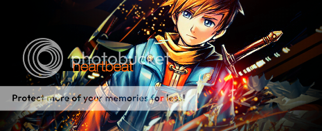

    Winning Icon :: Ultimate Graphic Maker


    Saber's Edge


    Icons


    Saber's Edge
    Saber's Edge
    Saber's Edge
    Saber's Edge
    Saber's Edge
    Saber's Edge
    Saber's Edge


    Photography


    Spoiler:


    Doodles/Drawings


    Spoiler:

    Fin


    If you would like to use any of the graphics in my showcase, please feel free to ask me either in this thread or VM or PM. Don't forget to give credit. ♥

    As for now I will try and regularly update my showcase as I slowly make my way back into graphics scene.


    Last edited:
    7
    Posts
    15
    Years
    • Seen Sep 8, 2010
    Ultimate indeed. Im still in-training. I hope with your works I can learn and further my skills. ;)
     

    BHwolfgang

    kamikorosu
    3,906
    Posts
    15
    Years
  • Hey, Malyka! I know it'll be troublesome for you to go out of your way to make me a new graphics, so I was wondering if I can claim one instead. :)

    Saber's Edge

    I don't think anyone had claimed this tag or used it. 110x110, please? If you feel like I shouldn't, then just so.
     

    Assault

    Exotic Water Pokemon Hunter
    209
    Posts
    13
    Years
  • Your signatures are really good but I think with some of them the stock doesn't flow well with the background.
     
    13,373
    Posts
    14
    Years
    • Age 29
    • Seen Jan 28, 2019
    Wow. Aizuke you really out did yourself. I love all the tags and the flows of them :D

    Keep up the good work! I'll edit this post with more crits when I get the time :D
     

    Jack O'Neill

    Banned
    8,343
    Posts
    18
    Years
    • Age 34
    • Seen Jul 15, 2015
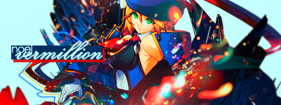
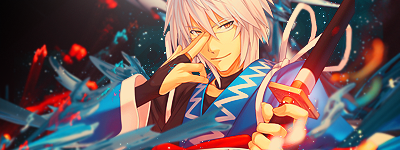
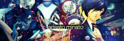
    Regarding your recent work, I'm quite fond of the Aigis and Noel banners, but the stock of your Jin banner clashes quite a bit with the background and textures.

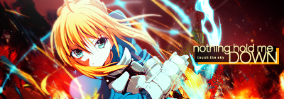
    As for your past works, Shana, Rinnosuke, and Minato are my favourites among those. I don't think the colour scheme of the Saber banner works very well with the stock, though.

    I'm also wondering what kind of camera you used for those pics. I'm probably guessing some kind of DSLR, though a specific make and model would be nice.

    Overall, keep up the good work.
     
    2,571
    Posts
    15
    Years
  • Good to see you back on the scene dear. I'm so in love with that Vanille tag. You know how to use bright colors without making them look like a total eye-sore :3
     
    10,674
    Posts
    15
    Years
    • Seen yesterday
    I'm just going to drop a quick C&C here, I'm not the best with tags as you may have noticed, I'm more of an LP guy myself, but I'll do my best to give you some good critique! Anyway, here we go.

    Contrasting your styles:

    Saber's Edge


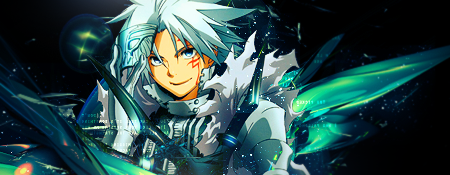
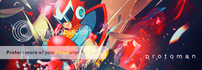
    Here we have the popular Aizuke style, the one that so many seem to love, myself included! But in terms of making your work more professional and edging at what might actually be used in design, you're going to need to lay off the reliance on C4D's big time. They're really dying out in the graphics world to be honest with you. Especially since so many people know how to make them themselves now. So the use of C4D stocks is becoming more and more redundant as the months go on. Visit any major graphics community or forum and you'll see, look at PR's SOTW or something, tags have moved on in style again. At any rate, the big thing I notice about this style is, that it's repetitive across the board, same sort of idea for every tag, and you know yourself how much you used to stick to it. At any rate, it is a fantastic style, well composed and really striking. Just a little outdated now I suppose. For this one in particular, I would say that clutter is nudging its way into this tag. Slight overuse and dependence on C4D's and little to bring the render out, the focal point is obscured a little by heavy effects. Think of a woman who wears too much make up, you know that she could be beautiful if her features weren't so over done. I hope the metaphor makes sense, but I do like how you use the effects and the colour choices are always pristine. Next thing I like about your tags, if your choice of fonts, you always seem to have good taste, which is something I wish I had when it comes to font usage. At any rate, they work really well here, I would say that the placement is also nice. With all of the above said, I'll just give a few example and explain why I like and dislike their style. Forgive me for dragging out some old ones.

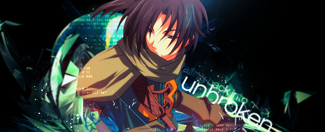
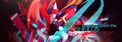
    This wouldn't be one of my favoured tags of yours. The use of black in the BG really throws me off and is an example of bad use of negative space. When using so much negative space, I think that the positioning of your effects and stock could be better here, more centered and no effects on the bottom left and right with a sort of circular emphasization on the focal with the use of the burn tool to darken the edges (when the black is changed to something else) or the tag in a circular motion. Hard to explain to be quite honest. What bugs me a lot also, is the use of the stripes to the right of the render, they're going at a different angle to the flow of the render, not hard to change but a little something you should keep your eye out for. The text is also much lower in class than your usual, plain choice of font and I'm not digging the repeat of the text either, I feel you have the skill to dish out much better.

    As far as flow goes, this is one of the best tags I have ever seen, it's as close to perfect as you've managed in creating a perfectly flowing tag. Just watch out when sharpening edges as here and there it looks somewhat pixelated due to over sharpening on the render.

    Saber's Edge


    I'm liking your new style quite a bit. It is very LJ, maybe more noticeable on this tag, but lets start with the bad news then with the good. The thing that bugged me most about the Vanille tag, was simply the circular clipping mask. It works for the tag you make for Shivi, but not in this one. Moving on from that, I love the use of the Japanese texture, it's really inventive and even the colour choices for it (clipping mask I suppose?) is really clever. The vector is a really nice effect too, just be careful though, mixing vectors and 3D renders can be risky and can kiiiill depth. It's alright here as the vector is quite dynamic and works well with the stock. Also liking the small bit of bokeh by her arm, that is really rather in with graphic design nowadays. Used very commonly. But yes, I think you should press with this style. It'll come along nicely.

    Now, onto some Icons

    I'm really disliking the text in your FF ones, I think they attack flow and manage to kill it. It defeats the purpose of adding to simplicity of icons.The only one I really like is this one as the text works well with the space. With that said, I don't think it's a style you should pursue with, the text is very heavy and there's a reason this won a contest. In saying that, I know you might not want to be doing the same thing over and over and you're trying for a new style, but rather than trying the same style but with adding to it on icons, try something completely different, try darker and less contrasted ones (what I mean is something like my avatar I suppose), or go wild on colour on RL stocks by not going the obvious route and being in general; creative and adventurous. Don't be afraid to do something new, which in turn brings me onto your Large Piece

    That large piece of course, being this one. I'll admit that it does look nice. But it is waaaay too simplistic. There's not a whole lot you could have done with the stock though I know, but I think you could have went against taking the safe route and tried something more off the wall. The pentooling is nice, again, very simplistic, the use of C4D's works in most places here, though I think you might have been struggling to think of ideas for this one. But looking back to old conversations, I know you've been skeptical about doing LP's, though I think you should definitely press forward with some more. Try working with IRL images or even from scratch and maybe photomanipulation. But that might not be your thing, just don't be afraid to go off the wall.

    Some things I would say about your style in general is that I think exploring more wouldn't do any harm, work more on depth using dodging, burning and smudging that bit more. Watch out on text placement here and there, it should never be stuck in a corner usually. Work more with lighting, by this I mean that you should brush more often, almost like clouds on soft light or overlay or something with reduced opacity to add depth. I suck with explaining though as you can see. After that, I shall take my leave from the thread and stop burning your eyes with Tahoma! Any questions about the post, you can just MSN or VM me I suppose, might be easiest!

    Overall, you're one of the best artists on PC by a long mile, so no worries, just don't be afraid to go outside your comfort zone. It gets every artist places.
     
    Back
    Top