• Our software update is now concluded. You will need to reset your password to log in. In order to do this, you will have to click "Log in" in the top right corner and then "Forgot your password?".
  • Welcome to PokéCommunity! Register now and join one of the best fan communities on the 'net to talk Pokémon and more! We are not affiliated with The Pokémon Company or Nintendo.

[Showcase] Showing off my new art!

  • 23
    Posts
    9
    Years
    • Seen Dec 13, 2014
    So, I've been part of the Pony fandom for almost 4 years, but alternately I've been a pokemon fan since... 1998, when it first aired in England.

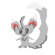
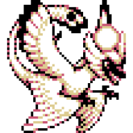
    So, having drawn ponies for so long, I wanted to try something different. And BOY did I get a taste for something I loved!
    I'd like to share my newest, best, and most inspiring art I've ever done.
    This spurs me on to do more! Make more.
    Draw something different!

    Please enjoy, and don't hesitate to critique, unless you tell me how horrible it is.
    :P

    Showing off my new art!


    Showing off my new art!


    Showing off my new art!
     

    Kyoe

    working on it
  • 265
    Posts
    9
    Years
    Hmm, it's not bad.
    The lines are a little rough, and the colours are a bit muddy, though. You should work on creating a more clear image!

    Keep drawing, don't lose confidence!
     
  • 23
    Posts
    9
    Years
    • Seen Dec 13, 2014
    Hmm, it's not bad.
    The lines are a little rough, and the colours are a bit muddy, though. You should work on creating a more clear image!

    Keep drawing, don't lose confidence!

    How do you think I could improve?
     

    Yoshikko

    the princess has awoken while the prince sleeps on
  • 3,065
    Posts
    12
    Years
    • Seen Apr 27, 2020
    Heyy nice compositions there! Love the water in the Kyogre pic. As Kyoe said some of the colours are a bit muddy or dull. What helps is to try avoid using actual black and white (unless absolutely necessary for pupils or highlights something) in your colours and your shading/lighting. Try to look at the environment you're putting the Pokémon in and then decide the appropriate colour for shading and lighting. If you're having a hard time deciding the right colours don't worry about looking up references or tutorials, they're all over the internet and they can be a big help. There's a lot of potential in your drawings, keep it up!
     

    Ice1

    [img]http://www.serebii.net/pokedex-xy/icon/712.pn
  • 3,447
    Posts
    9
    Years
    • Seen Nov 23, 2023
    These look great! There are some problems with it, as Yoshikkko and Kyoe said, but that doesn't take away that these are quite good. You're on track to becoming one hell of an artist.
     
  • 23
    Posts
    9
    Years
    • Seen Dec 13, 2014
    Thank you all very much.
    I only started drawing pokemon like this yesterday. So, I will take any advice, tutorials, or anything you can offer me, to improve!
     

    Kyoe

    working on it
  • 265
    Posts
    9
    Years
    Heh, looks like Yoshiko beat me to it...

    Try visualizing where the point of light is coming in from. It really works to help you see where and how your shadows/shading should be. Since this type of art is heavily effected by lighting, it could really do wonders.
    Your Kyogre looks really good in this respect, but Rayquaza for example is being hurt a bit by it.

    Remember, practice, practice, practice! I'm sure you'll have drawing Pokémon down in no time! :D
     

    Amaruuk

    [span="letter-spacing: -2px;"][b]└──[/b]►[/span]TY
  • 1,302
    Posts
    16
    Years
    • Age 35
    • She/Her
    • Seen May 16, 2024
    These are certainly a solid start! I must concur with the others in that the lighting, while pretty good particularly in the Kyogre piece, doesn't seem so consistently sourced in the other two, and light/shadow almost always has a color cast to it depending on where it is. Daylight for example has near-white but just slightly warm light, and blue in the shadows from the ambient light of the sky. All your shading and surfaces are also too smoothly graded. Look at how light affects different surfaces and how different lighting affects how sharply the transition to shadow is. Cast shadows in direct sunlight will be sharper than those under an overcast sky, for example. The part of the cast shadow closest to the object casting it is also sharpest, so the shadow under say, Seviper's head, wouldn't be blurry like that. The light from Rayquaza's beam should also be affecting it, especially places like its face which are closest to the beam. I recommend the book Light for Visual Artists if you want an excellent crash-course in everything an artist needs to understand about lighting conditions in a digestible format.

    Overall, you've got a good basic understanding of constructing with form and composition, and the beginnings of lighting, you just need to keep pushing further :3
     
    Back
    Top