• Our software update is now concluded. You will need to reset your password to log in. In order to do this, you will have to click "Log in" in the top right corner and then "Forgot your password?".
  • Welcome to PokéCommunity! Register now and join one of the best fan communities on the 'net to talk Pokémon and more! We are not affiliated with The Pokémon Company or Nintendo.

Sky is the Limit.

PokemonSkySD

Credit to Dots for the Avatar
74
Posts
13
Years
    • Seen Dec 7, 2010
    Ok, I'm Sky SD.
    This is my gallery.
    Ok, onto the details on me.

    Username - PokemonSkySD
    Actual Name - Darryl Graham
    Age - 16
    Experience - 2 Years with Photoshop, 3 years with GIMP
    Preference - Large pieces, anything from backgrounds too headers
    Alt Accounts on other sites - NFS_Street_King, NFS_SK, Darkriai Nameless 1.
    Photobucket - darkriai_nameless_1
    Requests - Accepting

    All the material shown can be used, but credit MUST be given.

    Large Pieces
    Spoiler:


    Banners
    Spoiler:


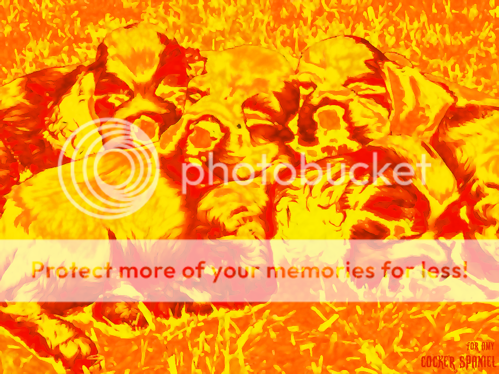
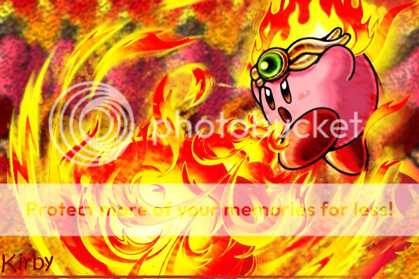
    Comments are welcome, please say as much as you'd like
     

    Orinjmate

    The Orinj of the Mate
    120
    Posts
    13
    Years
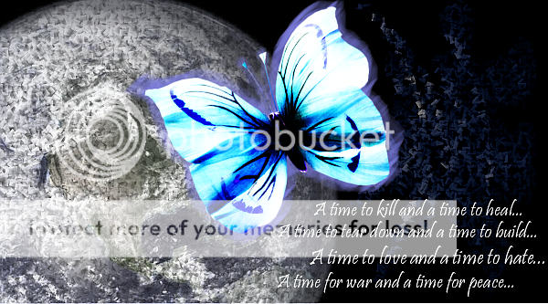
  • Looks good, especially the first one. With the butterfly.
    Try too alter the text too improve it, change clarity.
     

    Shirō.

      
    4
    Posts
    13
    Years
    • Seen Apr 23, 2011
    Your tags are a bit too empty, and I'm seeing the same techniques used over and over. Try using more C4Ds to give them the flow they need. You also seem to be overusing brushes, which isn't that bad once in awhile, but using them regularly causes your tags to lose depth most of the time. I'm not going to comment on the text, since I'm not too good with it myself, but try having your text blend in more with the render you're using. On the LPs, some effects are way overdone. Take the second one for example. It's too monotone, and the colors are a bit too vibrant. Lowering the effects you use on them can help quite a bit. I'm not too good at criticism, but hopefully I helped you out somewhat. Good luck.
     

    PokemonSkySD

    Credit to Dots for the Avatar
    74
    Posts
    13
    Years
    • Seen Dec 7, 2010
    Thx, Shiro.
    I'm trying not too rely on C4Ds as I prefer to produce my own images. Though I haven't tried Image blends, which could probably improve many of the pieces. (as done with many C4Ds)
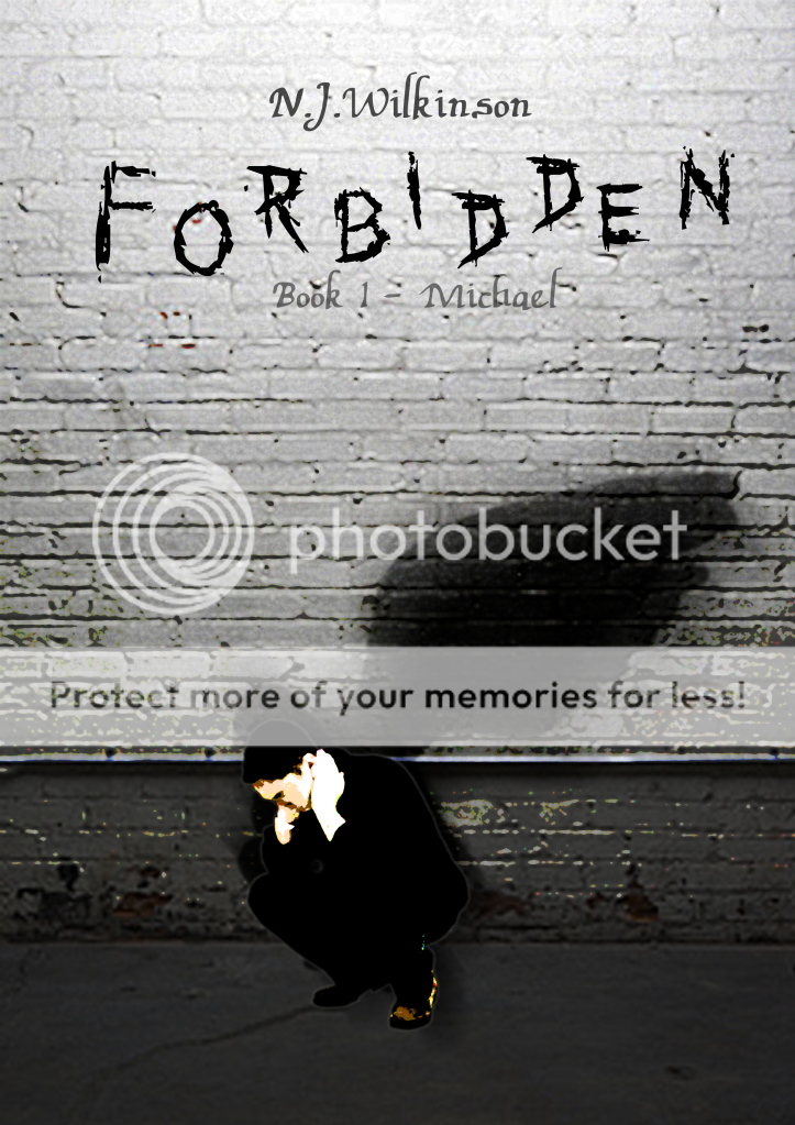
    Also i'm trying less too use stocks, and to produce all my own pieces e.g. the book cover is completly scratched.

    Also, each technique I learn I like too get right so I can remeber it. Any ideas for a future piece?
     
    130
    Posts
    13
    Years
    • Seen Jan 8, 2023
    Very Empty some are too monotone....5 years total..i'd expect better...anyways no lighting horrible text no blending...
     

    PokemonSkySD

    Credit to Dots for the Avatar
    74
    Posts
    13
    Years
    • Seen Dec 7, 2010
    Very Empty some are too monotone....5 years total..i'd expect better...anyways no lighting horrible text no blending...

    Any comments too help improve, rather than just negative, negative, negative.
    Critic is good, but it needs too be constructive.
    I've always hated doing the text stuff, and these are quite a lot of my older pieces. needs updating.
     
    130
    Posts
    13
    Years
    • Seen Jan 8, 2023
    Any comments too help improve, rather than just negative, negative, negative.
    Critic is good, but it needs too be constructive.
    I've always hated doing the text stuff, and these are quite a lot of my older pieces. needs updating.

    For the text use a basic sans serif font and keep it horizontal but near the focal.
     

    WonderGirl

    Bye bye :(
    538
    Posts
    14
    Years
  • I think you should add more smudging to the background to not make it look like you just pasted everything on top. As for the text, try not to use colors that are already on the palette of your program. It would be better to take a color from the render with an outline/shadow with another color.

    There's a good thing that I see in most of your work, though. You blend the render quite well with the background. Remember, continue experimenting!
     

    Uecil

    [img]https://i.ibb.co/4jfYrCT/tHdpHUB.png[/img]
    2,568
    Posts
    14
    Years
  • I like them; quite a good, nice start. Try playing around with the renders that's all I can say ^^ Great job, keep it up!.
     

    PokemonSkySD

    Credit to Dots for the Avatar
    74
    Posts
    13
    Years
    • Seen Dec 7, 2010
    Thanks, i'll put up some new stuff soon.

    Also trying too vary the fonts now, to add to the text.
    All good keep the comments coming. :)
     
    Back
    Top