

Yume Tsuki
(/ ゚ヮ゚)/彡 ┻━┻
- 1,193
- Posts
- 15
- Years
- She/Her
- In a cardboardbox aside the main highway
- Seen today
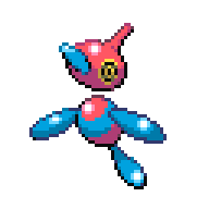
I was paying more attention to shading than to concept and colour. any comments?

I was paying more attention to shading than to concept and colour. any comments?
a little bee pokemon i designed, its based on those beehives/nests you see that bears try and get honey from, the kind that falls on a cartoon characters head and invokes mass hysteria


You're using way too many shades for one color that the sprite now looks too detailed to fit with the other, official sprites. Game sprites often use four shades for a color (I'm not counting the black here), those shades are usually in this order: highlight, base, shade, outline, and black outline. Also, I know you said you didn't pay attention to the concept while making this, but how are you going to shade in a similar fashion to the creators' sprites if the concept, however bland it is, doesn't even look like a pokemon? I like the pose you have though, and I'm sure that with some tweaking here and there, this would fit in more.
Keep trying! ^^
Ya usually I use 4 shades per colour. But this time I felt like: Let's go more detailed. I want to show Tentayely now, but due contest issues I have to keep it hidden until the end of the contest I think.

It's a contest on a Dutch Forum. Anyone can start a contest there. And you can make your own rules for the contest ^-^;
Here are some fakemon sprites I'm really satisfied with:
Submasect
Bug/Water type. Evolves into Aquascor at level 23.
Aquascor
Bug/Water type. Evolves from Submasect at level 23.


Storish, the Fisher Pokemon.
Evo of:
Ponchick, the Water Chick Pokemon.
Still need one more to finish off my water starter line.


Wow that's actually a pretty unique design you have there :D
It might be a bit too bright for my tastes though, I would recommend using some dimmer colors. It also seems like the body has a metallic-ish feel to it. It doesn't really fit the actual description you written up. Maybe you should take out the lighting on the bottom portion of the body. Otherwise its an amazing sprite, I'd hope to see more that would come from this.

They're not too bad, but there is one problem I noticed: Outline Shading. You're not distributing it correctly.how's my spriting?
fire type- Parasaurolophus
first one
dex data: When it is first hatched, it has a candle wick 16 ft long. when it begins to run out, it is close to evolving.
third one:
dex data: The sac below its throat hold flamable chemicals, allowing it to breathe fire. Occassionally pressure builds up and flames engulfing its entire crest.
You got the skills, alright. What could use some work here is the colouring. The theme is currently dull, and afaib, the round fists look more like wool than steel. You can change the hues a bit, too, if you want.How is my scratch?
No, it is not grayscale <.< The sphere things and the spikes are supposed to be steel, the stripe is black, and the body is white-ish gray.

I know it could use quite a bit of work.
Okay, I fixed a couple things.
Better now?
EDIT: Thought I'd up these up too, since no sleep = crazy amounts of spriting.
Female and Male protagonists. I may redo the female at some point (again, since this is version #3), now that I seem to be getting better.
