• Our software update is now concluded. You will need to reset your password to log in. In order to do this, you will have to click "Log in" in the top right corner and then "Forgot your password?".
  • Welcome to PokéCommunity! Register now and join one of the best fan communities on the 'net to talk Pokémon and more! We are not affiliated with The Pokémon Company or Nintendo.

The Emporium

Opticgoo

Ignorance is my best friend.
  • 3
    Posts
    13
    Years
    So, this is my first gallery on PC, and I've browsed around some other galleries and can truly say my work is no where near the work I've seen, but still, I'd like everything anyone can throw at me, because I'd like to get better =]

    I don't really have a style so-to-say, I just follow tutorials, improvise and make whatever I'm in the mood for, some turn out horrible, and some decent. I also use GIMP(sometimes PS).

    So lets get going then.

    The Emporium

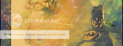
    My first pop-out banner. Not very good imo.

    The Emporium

    First banner on PS. :/

    The Emporium

    Basically just a B/W version of the one above as it was too bright for some people.

    The Emporium


    The Emporium


    The Emporium


    The Emporium


    The Emporium


    The Emporium


    The Emporium

    Second one made on PS by following a tutorial and improvising.

    The Emporium

    Very old.

    The Emporium

    Very, very old.

    The Emporium


    The Emporium

    Very old too.

    I've been very hesitant posting these because I don't have any recent examples so I don't want my skill to be judged on this too.
     

    Opticgoo

    Ignorance is my best friend.
  • 3
    Posts
    13
    Years
    New tag, made for a contest.
    The Emporium


    The Emporium


    One with border, one without.
    C+C would be nice. o3o
     
    Last edited:
    Well, Opticgoo, It's pretty fun and easy to see what stage of development in learning to make tags you are (although everyone here is still learning to make tags). Right off the bat I can tell you are going to websites and downloading brush packs and making "sick bgs" with them. For a new graphic artist that is awesome, well done. What I'd like to encourage you to do is start to read tutorials that shy away from using brushes at all (unless they are smudging). When you stop crutching (for lack of a better word) on the pre rendered brushes of someone else's work, you actually start thinking a lot more about composition and how you want the tag to look. A side from that you should generally just work on colors, depth, lighting and text placement. Right now your tags can literally be categorized by color. That isn't incessantly a BAD thing, but I like to think that variety in color makes your pieces waaaaay more exciting than if they are like 10% of the color spectrum. For instance, take your newest Paramore tag. It pretty much uses different shades of red and yellow. While this isn't horrible, it is also boring. While depth is something that takes time to learn, lighting in tags is not. Right now the gradatians of light in your bgs conflict with what your render (or focal) suggests. This is not apealing to the eye, and makes the tag look worse. My suggestion to you is figure out what direction the light would be headed at your render and on a new layer just brush a white 100pixel soft brush over there and lower the opacity like to 10%. Just try it. As for text placement, start by shying away from writing a lot in tags. No one likes art to be covered by sorta cheezy looking text.

    So that's my to cents. Have fun and keep up the good work!
     

    Opticgoo

    Ignorance is my best friend.
  • 3
    Posts
    13
    Years
    Thanks for you comments, it helped me a lot, but I have to point out, I didn't use any burhses in the Paramore tag, for brushing, I did over-do them a bit on my other ones, but in that one, I only used brushes for smudging and dodge-burn.
     
    Back
    Top