• Our software update is now concluded. You will need to reset your password to log in. In order to do this, you will have to click "Log in" in the top right corner and then "Forgot your password?".
  • Welcome to PokéCommunity! Register now and join one of the best fan communities on the 'net to talk Pokémon and more! We are not affiliated with The Pokémon Company or Nintendo.

6th Gen Ugliest looking Mega-Evolution?

Vinny Vidi Vici

Leave Luck To Heaven
  • 270
    Posts
    9
    Years
    • Seen Jan 2, 2016
    I already hate Glalie as it is so I'll gladly jump on the band wagon of Mega Glalie hate. Although I think the pokemon whose Mega design detracts from it the most is Garchomp. With those should pad things and his colouration, it looks like he's wearing a blue blazer with a red shirt. Along with the weirdly humanoid jawline I can't look at it and not think 70s TV host. I really like regular Garchomp's design, but Mega Garchomp? Let's just say I'm not a Rotom Fan.
     
  • 1,544
    Posts
    14
    Years
    Mega Mewtwo Y (because for me it deviated in design far too much from the original, at least with X it's still recognisable), Mega Alakazam (I can't with that beard lol) and Mega Heracross.


    If we're talking strictly ORAS Megas, then either Mega Slowbro, Mega Sharpedo (the design isn't too bad but I think they could've done something more with it, I dunno) or Mega Altaria (I love me some fluff but that's just overkill lmao).


    I see Glalie and Swampert's getting a lot of dislikes but I actually like both lol - they've made Glalie look even more bad-ass and also made it quite relevant, and with Swampert while I think the other two starter Megas look WAY better, as a stand-alone Mega it ain't half-bad and it actually made me warm up to the Mudkip line a little more lol :)
     

    YellowTemperance

    DeDeDoodles™ by Kirby
  • 106
    Posts
    9
    Years
    To me, Mega Glalie looks like Glalie turned into one of the Langoliers, but I'd have to say Sharpedo's and Garchomp's Mega Evolutions are the most ridiculous, edge-lord reminiscent thing I have ever seen in my life. The two of them look like something I would have doodled in a notepad back in middle-school and traded for a mint condition Team Rocket's Meowth and a bag of Sun Chips.
     
    I am really disappointed that they ruined some of my all time favorites.

    Mega Swampert,ain't that just a "little Big"?This is ridiculous.It was my favorite starter.

    And Mega Lati@s too.Same color and those weird-ish looking wings,just too awful.They could have make em much much cooler.

    Mega Glalie's look is kinda akward,isn't that that mouth too big?

    And Last Mega Altaria,it looks bad,very bad.

    As for Pidgeot,they didnt make many changes.But I still dont hate it.
     
  • 3,315
    Posts
    10
    Years
    • Seen Jan 1, 2023
    I don't think they made any big changes to mega pigeot because it is a beloved Pokemon by older fans. If they ruined it by going too extreme I feel like many people would be upset.
     

    Vinny Vidi Vici

    Leave Luck To Heaven
  • 270
    Posts
    9
    Years
    • Seen Jan 2, 2016
    They essentially just gave Pidgeot and extra splash of colour for it's Mega. I think it suits it as it makes it look more regal and those bright colours give it that little hint of magic which works for it in that it is a Special Attacker.
     
  • 146
    Posts
    10
    Years
    Sharpedo is probably the ugliest mega out there.
    Way too overdone.

    If Gamefreak make it look like a actual shark with a few yellow markings I bet in a snap a lot of people would like it more.

    As far the ugliest, Mega Steelix. I hate its typing (wanna be Metagross) and it looks the same to me, just with floating metal parts.

    Mega Glalie is love! Those chompers are glorious, he's ready to bite everything off now! LOL!

    Your face is literally dinner to him. Better recognized.
     
  • 11
    Posts
    10
    Years
    • Seen Jun 22, 2015
    I get the feeling they designed his mega evolution around Archie's redesign, also possibly to make him look like a pirate. It's not my favorite either.

    They should have given sharpedo a long body with a tail. I always wanted a design like this
     
  • 14
    Posts
    9
    Years
    • Seen May 1, 2015
    The ugliest new Mega is sharpedo it is just a lazy design that just doesn't work. Plus they messed up its ability making even worse.
     

    TwilightBlade

    All dreams are but another reality.
  • 7,244
    Posts
    17
    Years
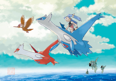
    I find Mega Latias/Latios to be the ugliest. It is my least favorite mega form.

    Latias is my favorite Pokemon. I really like Latios, too. I like these features of the eon twins:
    - the design of their arms and how they would tuck them in when flying around at a jet-plane speed.
    - the design of their wings
    - the design of their interesting tail/end, especially how Latias's is tame compared to Latios's spiky end
    - the design of their ears in how Latias's ears pointed downwards and Latios's ears pointed forward, again, signifying their personality. Latios is more aggressive than his sister in Pokemon Heroes.
    - triangle being on their chest, plus it was the color of the other sibling

    Ugliest looking Mega-Evolution?


    What I don't like about their mega forms:
    - the design of their godawful arms. Their arms are not that long and it doesn't make sense. How can they tuck their arms in backwards, anyway? Think about it. In their original forms, they tuck their arms in with their claws facing the front. This is easy enough for you and I to do. In their mega forms, they are tucking their arms in with claws facing behind them in order for their "wing" to face the correct direction. Can you tuck your arms in like that without your elbow being in the way? wtf. I don't understand it nor do I know what the designer was aiming for when giving them these kind of arms. Even in the Soar feature they only tuck in their arms in whatever way (collapse, break a bone, I don't know) when doing a Boost. So, frankly, their fattened mega form is actually increasing the air drag or air resistance. I am mega displeased, that's what.
    - the wings are completely different and are attached to the arm in a most unflattering way.
    - the design of their lackluster tail fin that also took away the differences in their personality
    - the ears were really not changed, but the added spike on their cheek is pointless and unnecessary.
    - triangles are plain white and the placement on their body isn't as inspiring as it being placed on their heart.

    Ugliest looking Mega-Evolution?


    Ugliest looking Mega-Evolution?


    TL;DR everything I loved about the eon twins was butchered in the mega form design
     
  • 6,266
    Posts
    10
    Years
    ^ Yeah, I know i'm not the only person that found it rather jarring that Mega Latios and Mega Latias both look almost exactly the same. But I don't hate them, per se, just feel they weren't necessary.

    But anyway, I think I wasn't very fond of Mega Slowbro's design, either, that Shellder looks pretty goofy, as if it's wearing it as a coat or something.
     

    Kameken

    URYYYYYYYYY
  • 796
    Posts
    10
    Years
    As far the ugliest, Mega Steelix. I hate its typing (wanna be Metagross) and it looks the same to me, just with floating metal parts.

    ...
    What? Because it's a steel type?

    Anyway, while mega sharpedo looks fine in-game to me, I think the art where it has spikes looks like a little too much.

    I actually love the Lati@s megas, but agree that they'd be much better if they were varied.
     
  • 146
    Posts
    10
    Years
    ...
    What? Because it's a steel type?

    I keep thinking it's Steel/Psychic. I dislike how I think about Steelix that way.

    The floating steel parts are just a bit to much for me. The rainbow crystals it has make it look like the power source to control them.

    And in all honesty I feel like Gamefrek try to make this thing look cute. I am in utter disgust by its design.
     
  • 317
    Posts
    9
    Years
    Mega Salamence.

    Its head is ugly af and that thing on its back is just a crescent. There's nothing to like there.
     

    sCr45h

    The Littleroot Champ
  • 134
    Posts
    11
    Years
    I don't like Mega Sableye at all. Its THE SAME LOOK but holding a huge gem. Plus, Sableye isn't the prettiest pokemon anyways
     
    Last edited:
    Back
    Top