Round 1 of the graphics tournament happening. This battle is between brane and moments.!
This battle had the following restrictions.
Stock: Must be rendered with background not being made up of a single photograph stock.
Size: No restrictions.
Colour: No restrictions.
Text: Bold, sans-serif, either all caps, or no caps.
TAG 1.
![[VOTING] Round 1: brane vs. moments.](https://fc05.deviantart.net/fs70/f/2012/094/5/9/gangster_by_br4ne-d4uyhg7.png "[VOTING] Round 1: brane vs. moments.")
vs.
TAG 2.
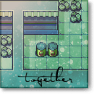
![[VOTING] Round 1: brane vs. moments.](https://i233.photobucket.com/albums/ee207/mattimogalli/link-1.png "[VOTING] Round 1: brane vs. moments.")
If you wish to vote, please leave a comment stating who you are voting for, and at least one reason why you are voting for them over the other. As there is no poll, votes will only count if you leave a comment. The comments don't need to be really long, having to post should not deter you from voting, it can be a simple sentence if you want. Good luck!
Voting will last for one week after the opening of this thread.
(N.B: The usernames are detached from the images to remove bias or anything.)
This battle had the following restrictions.
Stock: Must be rendered with background not being made up of a single photograph stock.
Size: No restrictions.
Colour: No restrictions.
Text: Bold, sans-serif, either all caps, or no caps.
TAG 1.
vs.
TAG 2.
If you wish to vote, please leave a comment stating who you are voting for, and at least one reason why you are voting for them over the other. As there is no poll, votes will only count if you leave a comment. The comments don't need to be really long, having to post should not deter you from voting, it can be a simple sentence if you want. Good luck!
Voting will last for one week after the opening of this thread.
(N.B: The usernames are detached from the images to remove bias or anything.)
Last edited: