• Our software update is now concluded. You will need to reset your password to log in. In order to do this, you will have to click "Log in" in the top right corner and then "Forgot your password?".
  • Welcome to PokéCommunity! Register now and join one of the best fan communities on the 'net to talk Pokémon and more! We are not affiliated with The Pokémon Company or Nintendo.

what is this i don't even

Status
Not open for further replies.
  • 84
    Posts
    14
    Years
    • Age 26
    • Seen Jan 22, 2013
    what is this i don't even;; updated 19/07

    Hey, call me Artic. I'm a beginner graphic artist, many of you here are epic ones, so I'm mainly here for C+C. [: I started off with GIMP but later moved to Photoshop (all the ones here are done in Photoshop). Lately I've been following tutorials, just to learn little bits and pieces.

    Most Recent:
    20/07/10
    what is this i don't even

    Older:
    what is this i don't even


    what is this i don't even

    what is this i don't even


    what is this i don't even

    what is this i don't even


    what is this i don't even


    what is this i don't even


    what is this i don't even


    I've been pretty busy lately so I haven't really been able to make anything ;;

     
    Last edited:
  • 10,674
    Posts
    15
    Years
    • Seen May 19, 2024
    Wowowowow, you have so much potential it's crazy, just a few pieces but I can already see that you're good. But let's push onto the critique :]
    1. First off, for a vertical, this is really nice, it strikes me right away as nice and colourfull, throwing monotone out the window and introducing an array of sweet and textured colours. I'm liking the stock positioning also, but it seems just a tad cramped, barely noticable but it looks to me as if you may have had spent a few minutes positioning this one. But it's nicely placed all in all. The piece is lacking two things, depth and your apply image adjusments. Depth, you're just lacking blurring and possibly smudging, see how the background is like a complete different image to the render? It just looks like the render was pasted onto the background without much effort to make them flow physically, as I say, blurring and smudging does the trick. Apply image adjustments, Image>apply image then whip out your dodge and burn, you're gonna need to darken some places, the edges primarily. Nothing too seious but it actually links to depth too. But I like this, I'm not a big fan of vertical tags but this would be one I did like. Good job. Oh, text, seems a little badly done, hard to read, what would have suited the style would be a clipping mask, as it would flow with the slight graffiti themed thing you have going on.

    2. Dukey's tutorial I notice. Well first off, the issue with doing tutorials in my eyes is, you end up having a result that looks a lot like the original. Though this is well composed, I would say that the background just doesn't suit the renders all too well. The flow is a little bit messy and there's lines flying is every direction rather than following the render. See, I like the stock but one thing about it is that flow goes in two opposite directions, left and right, you can easily tell which goes where, so it's quite hard to make it flow with anything though unfortunatly, you've gone in the wrong direction only with the background. I'll tell you why, see the "sexy lines" that Dukey talks about in his tut? Those are just looking pretty random here, they don't really add anything to the signature imo. The background in general is my only feat with this, I like the brushing and the lines around Beat (is that his name? Been a while since I've played TWEWY) as well as the effects and the nice spot light. I just kind of wish that this one blended a little better, and that you worked on flow a little bit more. Don't get me wrong, you did most things well, just the background needed a little more thought. Good work around the render though, that's my favourite part about the piece.

    3. This one doesn't give me as much to chew on critique wise. I love the colours though, they seem so pastel, definately the blues. It's hard to get nice soft colours in tags, but you've got it nicely. The black on the right, really bothers me, it's just plain #000000 without any sort of texture in it. I would have thrown some sort of texture down that end, just to add a tiny bit of depth, but it almost kills the tag being so plain and empty. But good work on this one, I like the simplicity, just be careful what you do with your space.

    4. I love this, I just wish it was wider. That's what annoyed me most, small width tags are slightly off putting, so if you widen this I'll be all like <33333 The left side of Morty needs a little smudging. I also would drag the text a little more right, it's too much hidden where it is. Maybe make a selective color clipping mask on Morty and bring down the magenta. Other than that it'd be perfect, not overly complicated, nice and clean.

    Anyway, I look forward to seeing more of your work, you're definately scored some points in my book, I like what you've done so far. I'll be keeping an eye on the thread ;]

    Also I love Breakeven
     
  • 84
    Posts
    14
    Years
    • Age 26
    • Seen Jan 22, 2013
    Thank you very much! [: I haven't gotten critique in quite a while, so yours is really helpful. You also made me notice some things that I didn't see before xD

    Well I made another tag today, and it's kind of messy D; Unfortunately I only realized that after all the apply image adjustments and I was too lazy to go back and redo all of them. /shot

    what is this i don't even
     
  • 130
    Posts
    13
    Years
    • Seen Jan 8, 2023
    Random Brushing...on some of them random c4d usage...some missing lighting....some it looks like you used the "hard mix" or something...never use it....
     
  • 84
    Posts
    14
    Years
    • Age 26
    • Seen Jan 22, 2013
    Yeah when I look at the last one it looks way too messy. But to answer what you said before, no, I didn't use Hard Mix or Vivid Light or anything like that.

    Forgot to say I updated with the SotW entry, and I just made the FFXIII one today.
    what is this i don't even

    what is this i don't even


    19/07:
    Made this today.
    what is this i don't even

    I think I overdid the fire effect...

    20/07: Another one, I have nothing to do at home other than sleep because I'm sick. ]:
    what is this i don't even
     
    Last edited:

    scotlineV3

    I ♥ Krabby Patties (XDDDD)
  • 27
    Posts
    13
    Years
    • Seen Aug 15, 2014
    My favorite of all of them its the Silver and Miku!!!!!!

    And how you can be a Beegginer???
    Ur works looks so professional, AWESOME WORKS!!
    If U make one of Konata from Lucky Star, I will be so much happy X33333

    :)
     
  • 177
    Posts
    13
    Years
    • Seen May 9, 2012
    Some of the contrast and stuff needs work but overall it's okay. All of them are messy too, and one or two of them have flow issues. Good work mate!
     

    Chaos190

    Likes to Hack Pokemon
  • 752
    Posts
    15
    Years
    • Seen May 25, 2016
    OMG
    The silver one you made is awesome. For a beginner you are very good :D
     
  • 84
    Posts
    14
    Years
    • Age 26
    • Seen Jan 22, 2013
    Thank you guys! Yeah, I've got a lot to work on.

    @Cycle: I've got this problem with messyness for some reason, I've really got to try and clean up my tags xD I'll try lowering the contrast and tweaking some things in the future, so thank you!

    @SehCure: Most of them are from PlanetRenders, but I like to go to Bulbapedia for Pokemon renders/art. As for that background, I used this tutorial.
     
  • 84
    Posts
    14
    Years
    • Age 26
    • Seen Jan 22, 2013
    Wanted to try out enhancing colors with adjustment layers and all. Not exactly a LP, I just wanted to work big.
    [link]

    Stock

    Made this for a friend, I kinda rushed it, don't really like it as much as I didn't really experiment with techniques and all. Apparently it looks monotone. And yeah I know I should try removing the white behind the render (that's what some people have said), but I lost the PSD when my computer crashed the other day. D:
    what is this i don't even

    It looks quite dull in color because I tried to do it like the Devil Survivor DS cover style, but I could have done more burning and dodging.
     

    Uecil

    [img]https://i.ibb.co/4jfYrCT/tHdpHUB.png[/img]
  • 2,568
    Posts
    14
    Years
    Wow!! your graphics are so amazing! I love the use of colours.
     

    W4r p4nda

    Go Pokemon!
  • 32
    Posts
    13
    Years
    lotsa potential though none impress me. You need to learn the basics.

    1. Lighting
    2. Depth
    3. Flow

    You do seem better with the vector style ones. Stick to those unless you dont like them urself.
     
  • 84
    Posts
    14
    Years
    • Age 26
    • Seen Jan 22, 2013
    @Galukxy: Thank you [: I actually usually have trouble picking colors xD

    @Ryder: Well actually I do try and do all of those 3, but I haven't really gotten a grip on depth and flow. I guess what I'm doing for lighting isn't obvious enough xD

    I don't like sticking to one style, it normally restricts what renders you can use. But when you're talking about vector style, which, uh, tag's style would you be referring to? /fail
     

    Inv4sion

    A weakling I see, what a pity.
  • 110
    Posts
    13
    Years
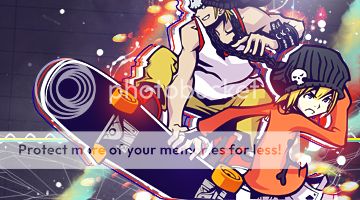
    I am talking about the one wit the two skateboarders. BtW I meant by U dont have lighting I mean U do it wrong.
    what is this i don't even

    Look at the lighting area. (The top right corner) Do you see how it is perfect? Well, it is not. See, The render's lighting path comes from the other side. Or more likely, the top, above.
    Flow:
    Okay, you have gotten down very minor flow. Your best tag that shows flow is this one.
    what is this i don't even

    You see the flow? If not I made it obvious for you.
    Legend/Key
    Red=Bad FLow
    Green=Good
    what is this i don't even

    See the smudging is great for flow. Unfortunately That C4d is messing it up. remove the c4d and add maybe 2 c4ds that have good flow. (Diagonally to the top right corner)

    Depth:
    Okay, Depth is the realism of the signature. So first off. Look at the background. Say they are buildings. If so then all you should do is put a small blur on it.
    This is an example. It was made by Galaxy of YCM
    what is this i don't even

    You see how the render/focal area is sharp but the Building(s) in the distance are blurred? Thats how you should make sigs.


    Big big big big Lesson by:
    Inv4sion
     
    Last edited:
  • 84
    Posts
    14
    Years
    • Age 26
    • Seen Jan 22, 2013
    As I mentioned in the PM, I just saw your old gallery so I assumed you would prefer to be called that. xD

    And yeah I know what all three of those terms mean, it's just my work is really too messy so it's hard to do depth. I guess I have to clear up my work so it's easier to do all of those three.
     
    Status
    Not open for further replies.
    Back
    Top