• Our software update is now concluded. You will need to reset your password to log in. In order to do this, you will have to click "Log in" in the top right corner and then "Forgot your password?".
  • Welcome to PokéCommunity! Register now and join one of the best fan communities on the 'net to talk Pokémon and more! We are not affiliated with The Pokémon Company or Nintendo.

Wind's Tasty Pixels!

~Wind~

Detective
  • 383
    Posts
    16
    Years
    Wind's Tasty Pixels!

    Ok, so maybe they aren't tasty.
    This is basically just a place that I'll put anything I may make so no-one steals them.
    Ok, so, here are my items.
    (I have my four scratches now.)

    Trainers
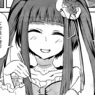
    Set Kaita, partly amalgamation, partly scratch.
    He is based on a picture I drew of a character I thought up.
    Wind's Tasty Pixels!

    Pokemon
    Chanpuff. (and animation)
    Wind's Tasty Pixels!
    Wind's Tasty Pixels!
    Wind's Tasty Pixels!

    Normal/Water
    This was made for project communitydex.
    (Normal represents the noodles, Water represents... water.)

    Some sort of cosmic thing.
    Wind's Tasty Pixels!

    ???
    So this is kinda space-ish. It draws a cloud that shows the stars of the distant universe around it.

    Mercurum...?
    Wind's Tasty Pixels!

    Steel.
    This is one I had planned for a special ability, mercury, that edits it's weaknesses and resistances.

    Ghost Helmet thing
    Wind's Tasty Pixels!

    Ghost/Steel
    This one was pulled together from an idea that is now lost in my mind D: but I'll think of something.
    (I know the shading is awful)

    Maps


    Kimuto
    Wind's Tasty Pixels!


    Tahjo
    Wind's Tasty Pixels!


    Other
    Wind's Tasty Pixels!

    Yeah, this is an unfinished sprite of a kind of evil plant thing from an RP i'm in.
    Don't take too much notice.

    So as you can see, I'm currently not too good at generic spriting.
    Feel free to critisice, give pointers, or generally discuss if you want.
     
    Last edited:
  • 10,769
    Posts
    14
    Years
    Your scratched sprites are all very large and round. That's not necessarily a bad thing, but it leaves a lot of empty space on the sprites. If you look at similar types of official 'mon they're all on the smaller side.
    Wind's Tasty Pixels!
    Wind's Tasty Pixels!
    Wind's Tasty Pixels!

    Jigglypuff makes up for a simple, round design by having large eyes and a curlicue thing on its head. They help fill up the space. Marill fills in the empty space by using a different color, but otherwise it would look pretty plain. Even Ditto, which has very little detail at least has a varying outline so it doesn't seem too plain. Your sprites I would say are too large for the level of detail you have on them. So I'd recommend scaling them down or adding something to make them more interesting to look at. Hands and feet and ears and tails are great things to add on since the can be relatively small and detail-less, but give the sprite an overall more detailed look. Colors work well, too, if they aren't too overpowering and they compliment each other.
     
  • 2,982
    Posts
    15
    Years
    Wind's Tasty Pixels!
    Wind's Tasty Pixels!


    You've must have heard this twice already, it's too large. I think its design is better fit for a smaller sprite. The asian character on it's stomach could use some anti-aliasing as well. What would make it less spacious maybe is if you make the bowl a little larger and have noodles falling out? Just an idea.

    There's not much contrast as well, I suggest brightening the highlight and darken the shading.
     

    ~Wind~

    Detective
  • 383
    Posts
    16
    Years
    Ok, for this one, I made it less circular, but still pretty round, as I dislike sharp edges, but have not gotten soft ones right yet.
    Wind's Tasty Pixels!

    It's still got a way to go, but is IMO much better than the first few. (and much, MUCH better than the helmet ghost.)
    I call it Kantasm, Like Phantasm, and it is pure ghost type.
    (BTW, the cosmic thing is unfinished.)
     
  • 12
    Posts
    13
    Years
    • Seen Nov 19, 2011
    The new one is somewhat better, but like you said there's still some work to be done. First off, the outline is pretty rough, I'd start by smoothing that out. The shading also needs some work, there's not a lot of it present. The arms are also a little bit boring, try making them different and put them in an interesting pose or something. I know that it's a ghost but that doesn't mean the pose has to be boring. Overall, I'd say you're definitely making improvements, just fix a few minor problems and your sprites could turn out pretty nice.
     

    ~Wind~

    Detective
  • 383
    Posts
    16
    Years
    thanks! anyways, I haven't done much spriting, since my laptop broke, and all my sprites were on it.
    Oh well.
     
    Back
    Top