• Our software update is now concluded. You will need to reset your password to log in. In order to do this, you will have to click "Log in" in the top right corner and then "Forgot your password?".
  • Welcome to PokéCommunity! Register now and join one of the best fan communities on the 'net to talk Pokémon and more! We are not affiliated with The Pokémon Company or Nintendo.

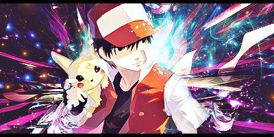
[Showcase] xxzyyzxx's GFX

xxzyyzxx

Board.up.the.housE
37
Posts
14
Years
  • Program: Photoshop CS5 and CS6 Extended
    Preferred Style: Smudge and C4D.
    Experience: About 8 years off and on. (It totally doesn't show. .____. )
    Weaknesses: Text, sharpness, lighting.
    Other Usernames: seraphim, milk lizard, atrophy, dusk, vacuity, cracktheskyye, etc.

    Signatures
    Spoiler:


    I also make Zetaboards themes. Here's some examples.

    https://s4.zetaboards.com/smugleafthemin/index/

    https://w11.zetaboards.com/richardstuff/index/

    + I also code for Invisionfree, vBulletin (learning), and soon enough, IPB.

    My deviantArt


    cnc? =D
     

    Bartolomeo

    Youtube = Crap
    23
    Posts
    10
    Years
  • Palindrome username. Nice.
    This post is being written while I'm on phone. So I will refrain from commenting on technical aspects like depth since the images, although visible, aren't as sharp as they would look on a PC.

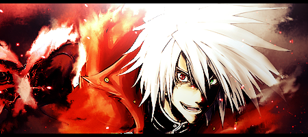
    First off, don't put yourself down. You've got some good-looking stuff here. Improvement is possible but then again when is it not? Your style has changed quite a bit over the years. And for the better. It used to be very simplistic. Used to comprise of not much use of effects and techniques. Not anymore. Wish you continue to practice and showcase smudge tags, though. They can look amazing if done right. Your smudge tags are very basic in nature but I can see you doing a swell job with some practice. Good flow in them, btw. As for your more recent ones, its obvious that you've been using brushes a lot. I hope you try using textures and c4ds more instead. Brushes are okay, imo, if used sparingly. Tags which utilize textures instead of brushes tend to have a better visual impact. Of course, they're harder to work with but that shouldn't stop you from trying, right?

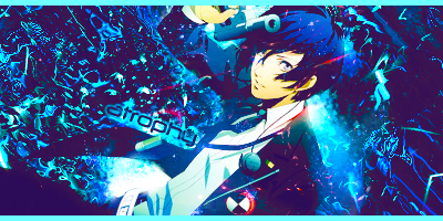
    I wish you'd experiment more with typography as well. Try varied fonts and different placements. Refrain from placing it near the corners like in your signature image. Just my 2 cents.

    All in all - good job. Hope to see more of your stuff.
     
    Last edited:

    xxzyyzxx

    Board.up.the.housE
    37
    Posts
    14
    Years
  • Thanks for the cnc. I Agree with a lot of it. As for time span, these were all made from January to now. My older stuff is really bad imo xD

    I've been trying to get into typography, but between sig making, coding, and learning to design web templates and user interfaces, my creativity has been stretched thin. Once I have gotten more done, or just lose interest in something I'm working on, I'll give more typography a chance.

    My new ones I use a lot of c4ds, except for the vector-ish styled ones, and ones with textures. C4d is something I'm new to, and I don't really have a style I'm that good at. I guess I would say I have more practice with smudging, since it was a style I used for almost 4 years.

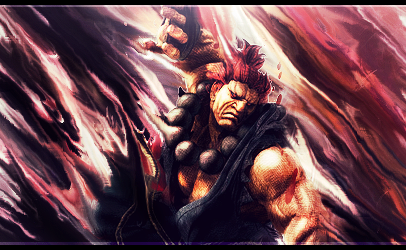
    Most of my tags featuring smudging are horrid examples of tags I can make. I made everything from the Akuma sig above on a laptop that had shoddy lighting, so it greatly affected the lighting as I've noticed moving back to a desktop.

    All in all, thanks, I really appreciate it.
     

    Bartolomeo

    Youtube = Crap
    23
    Posts
    10
    Years
  • Well, if you're not really gonna put your all into typography right now then it is probably a good idea if you do not incorporate any text into your works at all. Might sound weird but it works; trust me. I have gone through this phase. ;> I just stopped adding text into my works for a while and concentrated on the betterment of other aspects of my works. It worked. And then, after giving my attempts at making text work in tags a break, I finally, somehow, got better. Just got the much needed spark somehow, I guess. So yeah, try it out, maybe? :p

    Talking about your smudge tags - if that's the case then I'd like to see some of your 'good' examples. If these are horrid by your standards then I can't wait to see what's actually 'good', haha. I mean, I personally wouldn't call them horrid. They're simplistic, yes, but in no way 'bad'.

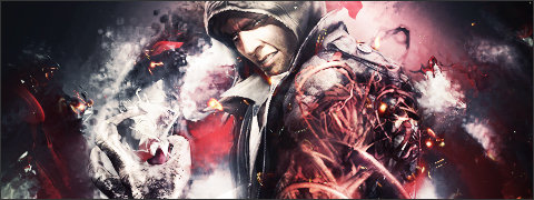
    And, now that I'm on my PC and can see your works in their full glory, I do realize that what you're saying is quite true. The lighting is, in fact, off in quite a lot of your works. The first thing that came to my mind when I was going through your works was that you seem to have multiple light sources in some of your works. Works like the prototype tag, for example. And then there are those where lighting is just off - like, it just doesn't look as if you've incorporated a light source at all. But its understandable considering the fact that you're working on a laptop with shoddy lighting. Hope it gets fixed soon. Update this gallery more often, btw. Wanna see more of your stuff.
     
    Back
    Top