Sasquatch: (sorry, I don't know how to quote messages :S) Really love the idea of having the 'sunken' area in your map, however where the grass meets the cliff edge tile it doesn't blend, its just a hard line, if you get what I mean?
You are using an out of date browser. It may not display this or other websites correctly.
You should upgrade or use an alternative browser.
You should upgrade or use an alternative browser.
Map Rating/Review Thread
- Thread starter Christos
- Start date
- Status
- Not open for further replies.
More options
Who Replied?- 30
- Posts
- 15
- Years
- Seen Oct 6, 2009
Map Name: Unnamed
ROM: Fire Red
Hack: Unnamed
Credits: Nintendo - tiles
Image attatched, as I'm currently unable to use links. D;
ROM: Fire Red
Hack: Unnamed
Credits: Nintendo - tiles
Image attatched, as I'm currently unable to use links. D;
- 1,906
- Posts
- 16
- Years
- Age 30
- Seen Oct 21, 2019
Oceania Point
Ocean takes place at the very north end of the region of Kypra. It is the second town visited in Gray Version. It connects to Grande Aquacia Falls, the massive waterfall leading to the lowlands in the region. The southern connection leads to Grande Aquacia Mountains.
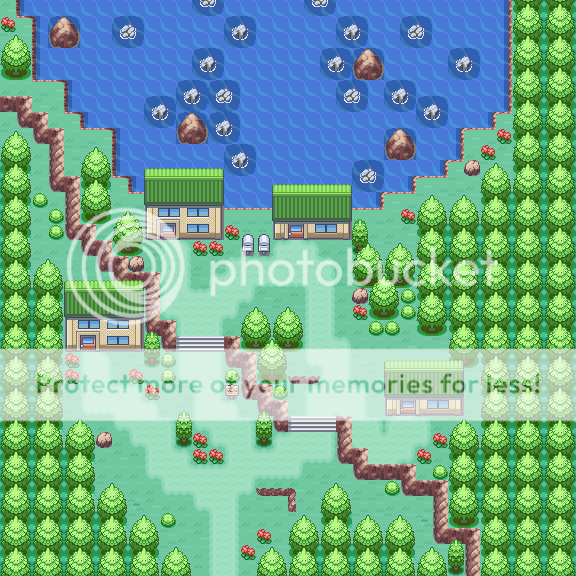
Ocean takes place at the very north end of the region of Kypra. It is the second town visited in Gray Version. It connects to Grande Aquacia Falls, the massive waterfall leading to the lowlands in the region. The southern connection leads to Grande Aquacia Mountains.
Spoiler:

Chimchar 9
(:
- 1,619
- Posts
- 16
- Years
- Age 30
- England, London
- Seen Dec 5, 2023
Neti
Inactive
- 1,516
- Posts
- 16
- Years
- Age 32
- Cologne, Germany
- Seen Feb 7, 2021
i like your new styleMap name: Nesia Village
Hack name: Sentra Journeys
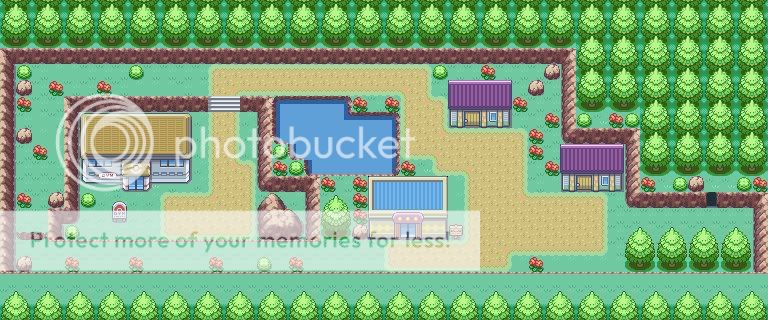
Comments: As you may have seen in this map, i have changed my mapping style, well i hope you'll like it.;)
Map:
it somehow reminds me of the johto mapping style...
but there could be some more highlights in the map like rocks
also the trees dont look natural
i dont have the time to go more into detail
so just a quick rating... 6/10
you have tile errors at the house parts where the mailbox is in front of the house
just to show you how to make trees look more natural ill post a new map of mine for rating:
Spoiler:

its very likely to be changed, but you can rate it nevertheless
the top part is a bit empty, im aware of that
Tropical Sunlight
The Faltine
- 3,476
- Posts
- 16
- Years
- Age 28
- Slovenia
- Seen Mar 30, 2015
Nintendo mappers would be all green if they saw this...i like your new style
it somehow reminds me of the johto mapping style...
but there could be some more highlights in the map like rocks
also the trees dont look natural
i dont have the time to go more into detail
so just a quick rating... 6/10
you have tile errors at the house parts where the mailbox is in front of the house
just to show you how to make trees look more natural ill post a new map of mine for rating:
Spoiler:
its very likely to be changed, but you can rate it nevertheless
the top part is a bit empty, im aware of that
Another great map!
But it lacks some mountains...
And it's quite -idk...- boring?
7/10
colcolstyles
Yours truly
- 1,588
- Posts
- 15
- Years
- The Bay Area
- Seen May 19, 2019
Map name: Nesia Village
Hack name: Sentra Journeys
Comments: As you may have seen in this map, i have changed my mapping style, well i hope you'll like it.;)
Map:
Oh, I beg to differ. First of all, you've got no tree shadows which I consider to be even more important in "Nintendo" mapping. Nintendo maps are empty and boring compared to more natural maps but the way you've done it, it just doesn't look right. The vegetation palette doesn't look very good in my opinion, the pond looks weird, the path is terrible, the flowers (and bushes) are placed poorly. I also see a tile error on the top of the mailbox outside the northernmost and easternmost houses. Overall, this map would not be very fun or visually stimulating to play through which is the ultimate goal in Nintendo mapping.Nintendo mappers would be all green if they saw this...
———————————
Map Name: N/A
Map Game: Pokémon Ruby
Comments: Just to help you see that Nintendo maps don't have to be incredibly empty and dull.
Mapshot:
Spoiler:

- 1,906
- Posts
- 16
- Years
- Age 30
- Seen Oct 21, 2019
Phenomenal. This is definitely your best map. I have a copy of your map with all the errors circled, or things that just look funny, or things that shouldn't be there.Oh, I beg to differ. First of all, you've got no tree shadows which I consider to be even more important in "Nintendo" mapping. Nintendo maps are empty and boring compared to more natural maps but the way you've done it, it just doesn't look right. The vegetation palette doesn't look very good in my opinion, the pond looks weird, the path is terrible, the flowers (and bushes) are placed poorly. I also see a tile error on the top of the mailbox outside the northernmost and easternmost houses. Overall, this map would not be very fun or visually stimulating to play through which is the ultimate goal in Nintendo mapping.
———————————
Map Name: N/A
Map Game: Pokémon Ruby
Comments: Just to help you see that Nintendo maps don't have to be incredibly empty and dull.
Mapshot:Spoiler:
Spoiler:
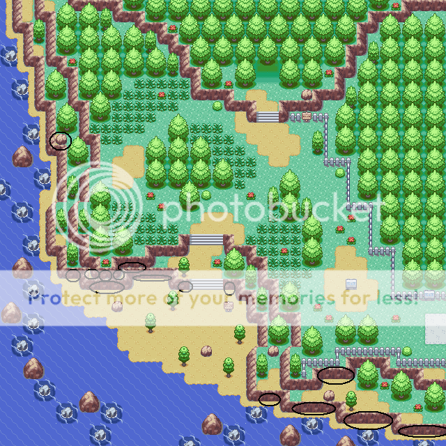
I think the flowers and bushes can also use better placement, and the fence looks a bit weird on the bottom :\
9.3/10
Now, incase you folks skipped my map...

Last edited:
Neti
Inactive
- 1,516
- Posts
- 16
- Years
- Age 32
- Cologne, Germany
- Seen Feb 7, 2021
putting both maps into one post wasnt a really good idea, cause youre right: that map of colcolstyles is really very good! and it makes your map look worse than it actually is xDPhenomenal. This is definitely your best map. I have a copy of your map with all the errors circled, or things that just look funny, or things that shouldn't be there.

I think the flowers and bushes can also use better placement, and the fence looks a bit weird on the bottom :\
9.3/10
Now, incase you folks skipped my map...

it is 11:24pm here so ill just give a quick rating:
somehow the map appears a bit empty to me. actually i dunno why, its just a feeling
and that ledge at the bottom, is there a tile error at it? im not sure...
also youre the one who gave me really helpful advices on how to place natural looking trees and now you place them so nintendo-like?^^
8/10
~Teh Panda~
Back in hacktion
- 918
- Posts
- 16
- Years
- Seen Jul 20, 2022
Map name: Route 2 (original eh?)
Purpose: Second route of game
Pic: (Page burner)

Purpose: Second route of game
Pic: (Page burner)

kebbles
Rom Hacker.
- 616
- Posts
- 16
- Years
- Victoria, Australia!
- Seen Feb 27, 2015
Map name: Route 2 (original eh?)
Purpose: Second route of game
Pic: (Page burner)
Spoiler:
Wow!
Rating: 9.5/10
Comments: This map is incredible, one of the best maps i've ever seen.
I can't really see anything wrong with it.
A challenging map aswell, it would take ages to get threw it lol.
Great Work!
Neti
Inactive
- 1,516
- Posts
- 16
- Years
- Age 32
- Cologne, Germany
- Seen Feb 7, 2021
Map name: Route 2 (original eh?)
Purpose: Second route of game
Pic: (Page burner)

A-W-E-S-O-M-E
10/10
Tthis is like the most natural ive ever seen and definitely in the top 3 of the best maps ive ever seen!
Would you tell me how long it took you to make it and espacially how much fun you had doing the walking permissions?^^
You could have taken more advantadge of the size of the map, but it deserves a 10/10 nevertheless cause space usage is not so important in my eyes
colcolstyles
Yours truly
- 1,588
- Posts
- 15
- Years
- The Bay Area
- Seen May 19, 2019
I'm tempted to inquire as to the identity of the other two maps but I'm afraid doing so would only create trouble.A-W-E-S-O-M-E
10/10
Tthis is like the most natural ive ever seen and definitely in the top 3 of the best maps ive ever seen!
Would you tell me how long it took you to make it and espacially how much fun you had doing the walking permissions?^^
You could have taken more advantadge of the size of the map, but it deserves a 10/10 nevertheless cause space usage is not so important in my eyes
To keep this on topic, I'll add my thoughts on the map:
Well, don't expect it to be similar to Neti's rating. I'm not so fond of this map. As Neti pointed out, there is a large amount of space that not only is inaccessible, it isn't even viewable. If you can't fill up a big map, then you should settle for a smaller one. The mountains are done nicely but, again, your poor space usage renders all that work useless as it will never be seen in-game. Another thing I don't like about this map (and a lot of other maps I've seen lately) are the gaps in-between trees in the inaccessible areas. On top of that, when you add grass to those gaps, it makes me think that I should be able to access those areas when, if you take a look at the entire map, I can't. If you're going to create a large block of trees to make an area off-limits (which is fine; it is good for making the whole map have a good shape if done correctly), then you should map it like it is, in fact, off-limits. The signpost at the bottom of the map narrows the map down to one moveable block which I wouldn't recommend. Also on the topic of signposts, I would recommend moving the signs outside the cave entrances a little further away, even if it's only one block, just to give the player more room. The grass placement is poor in my opinion and it leaves several empty patches here and there which, if you're going for a more natural look, is a big no-no. While I'm on the subject of what looks natural, the trees get awfully non-natural looking at the bottom of the map near the down connection. The trees are spread out a lot in the middle but near the exits, they get clumped up. I know regularity isn't often seen in "natural" maps but that is one area that requires it. The ledge appears quite uneventful for an object which will prohibit the player from returning for, most likely, a long time. Perhaps a signpost warning any travellers that they can't return is in order?
Well, I'm all out of things to say. The main thing you need to take note of is the huge amount of unused space. You could have made that map in probably half of that size. It is, on the whole, a decent map but I wouldn't say it's one of the best I've ever seen.
Last edited:
- 21
- Posts
- 15
- Years
- Stravros Town
- Seen Dec 30, 2010
Okay, I have a few and i'm wondering how they're rated.
1
Map name: Stravros Town
Purpose: Starting town for Pokemon Rise of the Legendaries. (replaced Littleroot)
image

2:
Map name: Baletown
purpose: second town for Pokemon Rise of the Legendaries (replaces Oldale)
image

3:
map name: Miresburg
Purpose: Third town of Pokemon Rise of the Legendaries (replaces Petalburg)
image:

1
Map name: Stravros Town
Purpose: Starting town for Pokemon Rise of the Legendaries. (replaced Littleroot)
image
Spoiler:

2:
Map name: Baletown
purpose: second town for Pokemon Rise of the Legendaries (replaces Oldale)
image
Spoiler:

3:
map name: Miresburg
Purpose: Third town of Pokemon Rise of the Legendaries (replaces Petalburg)
image:
Spoiler:

- 1,906
- Posts
- 16
- Years
- Age 30
- Seen Oct 21, 2019
I really need to grill this map, because it isn't NEARLY as good as people are saying. Okay, everything but the mountains would take me, a mere 15 minutes, tops. The mountains, I couldn't estimate. I bet you just went crazy with the grosser block, and this is similar to how it turned out. Then you just added a couple more trees to make one or two designated pathways. Also, the trees themselves are placed unprofessionally. They start out in rows on the bottom, and go crazy... then resume the rows at the top. The playability is so bad, words cannot describe it. Sure the map looks natural, but playability is ALWAYS the most important thing in mapping when the map itself is going to be in a hack. This is so off balance, and there really isn't anything special about it. Let's take a closer look at the flowers... HORRIBLE. They are abundant at the top of this map, and scarce on the bottom. On top of that, their overall placement is sickening. Grass placement isn't nice at all. If you were aiming for natural, you didn't make the cut, I'm afraid. The top of the mountain looks bad, you should have added maybe just another level, instead of the countless boulders and rocks...Map name: Route 2 (original eh?)
Purpose: Second route of game
Pic: (Page burner)

3.5/10
Sorry :(
EDIT: Ontop of all that, there is a tile error on the mountain, the southern part. You'll find it ;)
- 207
- Posts
- 16
- Years
- Seen Nov 28, 2023
Map Name:Bill's Secret Garden
Map Game:Fire Red
Comments: The left cave leads to a tunnel to Bill's yard.The right one leads to Poke'God cave. Bill's Grandpa lives in the house. In the grass you can catch all the starters and in the water is Pikablu, Riablu, and Piblu.
Map Game:Fire Red
Comments: The left cave leads to a tunnel to Bill's yard.The right one leads to Poke'God cave. Bill's Grandpa lives in the house. In the grass you can catch all the starters and in the water is Pikablu, Riablu, and Piblu.
Heart's Soul
Hey, look, I was gone.
- 2,535
- Posts
- 16
- Years
- Age 28
- Seen Aug 20, 2020
Okay, I have a few and i'm wondering how they're rated.
1
Map name: Stravros Town
Purpose: Starting town for Pokemon Rise of the Legendaries. (replaced Littleroot)
imageSpoiler:
2:
Map name: Baletown
purpose: second town for Pokemon Rise of the Legendaries (replaces Oldale)
imageSpoiler:
3:
map name: Miresburg
Purpose: Third town of Pokemon Rise of the Legendaries (replaces Petalburg)
image:Spoiler:
Well, each one has a special rating.
The playability isn't that bad, but the maps itself is horrible. I see at least 15 tile errors in each map, random use of incorrect tiles, and there is no balance at all.
The first map has these odd rocks, which I can't even get to, all this useless grass, too many repeated tiles. No, I won't show you each of the tile errors, there are too many to list. But just look at:
The rocks around the town
The houses
The island itself
Just poor.
The second map:
Looks slightly worse than the first one and looks like you were lazy in a few parts. Sorry, no big difference than the first one.
Tile errors and odd things:
The two rocks on the island
The grass
The island itself
The rocks on the path
The path itself is not completed
The third map:
You were lazy here, but it looks better. in a creepy way. I looked closely and found numerous cave entrances, some incorrect tiles around the GYM, the rocks and the grass, as always, and too many rock tiles. Use some trees, ROM Bases, and so on.
It's 'ideous.
Anyway, I rate it a 1.7/10 for some playability and some minimal creativity. Everything else is a fail. Sorry, but try working longer on them, read some tutorials, and you made Nintendo laugh.
Chimchar 9
(:
- 1,619
- Posts
- 16
- Years
- Age 30
- England, London
- Seen Dec 5, 2023
Map name: Nesia Village
Hack name: Sentra Journeys
Comments: As you may have seen in this map, i have changed my mapping style again, well i hope you'll like this one.;)
Map:

Hack name: Sentra Journeys
Comments: As you may have seen in this map, i have changed my mapping style again, well i hope you'll like this one.;)
Map:
Spoiler:

- Status
- Not open for further replies.

