Okay Wesley I will be hoenst with you here, your tiles are really putting me off due to their colours. They are very bright. However you are a good spriter but your colours are a bit stange if you ask me. For example, your mountain tiles ar enice but they are too bright, if you take a look at mountains around you, around the world even you will see that the colours will never go as bright as the ones in which you made. The thing is, I would like your tiles very much if you were to simply darken your pallets.
I will just go through your latest upload
I will begin with your "treehouse" themed tile very much like the one's you would see in Pokemon Emerald in Fortree city. Once again you've sprited it well but the colours are really rather poor. You've used 5 or 6 different colours and it looks so metallic. The shading is well done but I don't like how the whole house looks due to all the browns that didn't look good to begin with are just sort of ruining it for me. Again, great sprite with bad colouring.
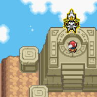
As for the other tiles they follow much the same pattern as most of your other tiles, seems you've improved in spriting buildings however the colour choices seem very bright and don't appeal to me.
Try using palletes from Pokemon Platinum for some things and experiment with darker colours and I will put your work in much higher regard but at the moment you stand out as a good spriter but not so great with colours.
Although some of your trees are perfect ;)
Overall some good work so keep it up just watch out for those colours!