• Our software update is now concluded. You will need to reset your password to log in. In order to do this, you will have to click "Log in" in the top right corner and then "Forgot your password?".
  • Welcome to PokéCommunity! Register now and join one of the best fan communities on the 'net to talk Pokémon and more! We are not affiliated with The Pokémon Company or Nintendo.

Map Rating/Review Thread

Status
Not open for further replies.

.LMG.

Yeah! Custom User Title!
  • 65
    Posts
    14
    Years
    • Seen Aug 8, 2015
    Game: Fire red
    Hack name: Emblems of darkness
    Map Name: N/A
    Map shot:
    Spoiler:

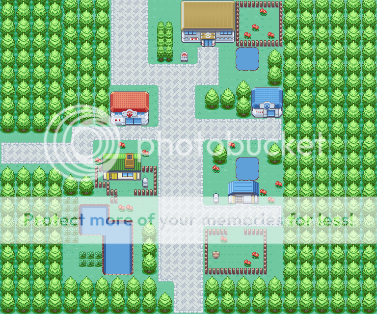
    I like how your trees are in less of a block. Most people just align their trees in littler squares and call it natural. +3
    I also like the way you didn't use the gray cement for the whole map. +3
    The flowers and pond are a good space filler. +3
    There is a weird looking thing coming out of the tree next to the professor's building and also at the bottom right. I don't know if its a tree or a tile error, but either ways it doesn't look good IMO. -1

    Overall it looks good for the little town it is. 8/10
     

    Pokestick good times.

    [i]cheeky[/i]
  • 7,521
    Posts
    15
    Years
    Game: Fire red
    Hack name: Emblems of darkness
    Map Name: N/A
    Map shot:
    Spoiler:
    Hm... I guess I could do a rating...
    Awright, a little town, possibly a starter one... A thing that quickly hits my mind and that bothers me is that you use three different kinds of roads in such a small town. One or two could do perfectly fine IMO. Also, we have the shape of these... I personally think the cement one in the middle looks abit stumpy and clumsy, you know what I mean? There's not much to do about it, but it just seems really off. Ah well (there's also a tile error on this road). The brick roads that looks the very same way at the same places confuses me a bit, especially when placed right next to the cement road. A little difference inbetween could do fine, or just replacing them all.
    The whole area to the top left is also a little weird. There's an odd bunch of empty space, probably created when you put the trees like that... (I'll return to that matter in a moment.) This thingy returns on many places of the map, and it may look natural perhaps, but in a Pokémon game it looks wrong and badly planned.
    There's a little hedge and two smaller trees right next to the house, and their very presence disturbs me, as the place looks perfectly fine without them, and they aren't anywhere else on the map where they could have been needed. This all put together makes the area just... weird. To me, atleast.
    The lake and the area around it looks fine, I'm not gonna comment it.
    Again, the tree structures... As mentioned, putting the trees like that may look decently natural, but also weird, as it creates those little problems, like empty spaces, that we've encountered here on this map (and you managed to fill in ALOT of shadow errors.... check other FrLg maps to figure how these works out). Some of them, at the bottom, you filled these spaces with "weird looking things coming out of the trees", AKA a recoloured GSC bush tile. It works decently well, but again it looks odd because it's not used anywhere else on the map where it could have been needed.

    The shape and the idea of your map works, but all these little details kinda ruins the map for me. You get a six out of ten from Yours sincerely.
     

    ~Hot n' Cold~

    is too good for a title.
  • 329
    Posts
    15
    Years
    Here is my map. I tried out mapping in the water. I know that it totally sucks... please rate it though. I will repost it after some ratings for improvement.

    Map Rating/Review Thread


    Thanks for rating!
     

    Ninja Caterpie

    AAAAAAAAAAAAA
  • 5,979
    Posts
    16
    Years
    That red rock looks really, really, really bad. Try a different not-so-clashing red.

    Anyway, the ledge at the bottom still seems really useless, just add a tree or something. Other than that, though, the map is relatively good. Use the dark water as a border instead of nothing.
     

    Skara

    THIS. IS. SEMPITERNAL.
  • 350
    Posts
    15
    Years
    Bumping up my first map that never got rated, and posting a new one.

    Game: Pokemon Aqua Sapphire (FireRed)
    Maps: Teal Town (first town), Route 49 (first route)
    They're actually really good, but I assume Teal Town was Pallet Town and Route 49 was Route 1?

    97%, fantastic but it's obvious what they used to be

    If they weren't what I said then it's 100% from me
     

    PeregrineFig

    Starting Pokémon Obsidian
  • 202
    Posts
    14
    Years
    rate my map,give some suggestion ^_^
    Spoiler:

    Map Rating/Review Thread

    This map is by no means bad, but to me it feels far too simple. Something more than trees, grass, and paths would breathe a lot of life into it. I can't spot any obvious tile errors, which is a plus. I'd give your map a 7/10. It's good, it just needs that extra something to make it look fantastic.
     

    DuoRyan

    Hack'in as usual, it seem.
  • 335
    Posts
    14
    Years
    This map is by no means bad, but to me it feels far too simple. Something more than trees, grass, and paths would breathe a lot of life into it. I can't spot any obvious tile errors, which is a plus. I'd give your map a 7/10. It's good, it just needs that extra something to make it look fantastic.

    thank it was suppose to be simple i try to add something
     
  • 10,078
    Posts
    15
    Years
    • UK
    • Seen Oct 17, 2023
    rate my map,give some suggestion ^_^
    Spoiler:

    Spoiler:
    Spoiler:


    I'll give you a rating too n___n

    I feel that the flowers are wrongly placed in this map, you have lots of flowers surrounded by tall grass, however they would look better on normal ground (In pairs of 2 max, diagonal to each other looks best).

    All the trees are in perfect rows, look across from any tree and there is one perfectly parallel. Mix it up a bit and throw some of the lines out of sync (Where it doesn't mess up borders, such as the top and on the 'islands' of trees).

    Shadows on the trees need looking at, you'll notice in A-Map there are two tree tiles that are similar, one is shaded and one isn't. You need to use the non-shaded tile on sides that are not hidden.

    Paths look good.

    The berry trees could be placed differently, at the moment they are all placed to the side and it looks quite repetitive.

    A good map but could do with some fine tuning, 6/10.
     
    Last edited:
  • 10,078
    Posts
    15
    Years
    • UK
    • Seen Oct 17, 2023
    i improve the map
    Spoiler:
    Spoiler:


    See attachments for comments.

    Shadowing is still wrong, look at the trees highlighted in yellow and notice how their tile is different to the trees in the red area? That is the shadowing tile (for when trees are next to each other).

    I recommend you move some of the trees like shown in blue.

    And removing the flowers in the grass, as well as half of the ledge (as it will cause problems in the map when the player tries to jump over it and glitches in the bush).

    And maybe take a few of the tall grass tiles out, it looks quite blocky and could do with some gaps.

    Same score as before as not much has changed, 6/10.
     
    Last edited:

    sasquatchd00d

    welcoming a clean head.
  • 264
    Posts
    15
    Years
    Map Name: N/A
    ROM Hack: N/A
    Credits: Alucus, Kymotonian, Pokemon-Diamond, TheDeadHeroAlistair, and WesleyFG for tiles. A few are modified by →goon.
    Comments: I'm thinking my mapping skills are a little rusty so I mapped this to see what you guys think I need to improve on. It won't be in game, this was just for practice. Also, in case anyone points out that I did the bottom of the waterfall where the water edge meets the misty part of the waterfall wrong, I used the water edge tiles that I did because the "correct" tiles looked worse in my opinion. Rates? :)

    Spoiler:
     

    ~Hot n' Cold~

    is too good for a title.
  • 329
    Posts
    15
    Years
    Made some improvements - say if u like!

    Map Rating/Review Thread


    Thanks for rating!

    This is what might be my final edit. Please rate with numbers.
     

    Ty2

    New Hacker and Working Hard
  • 87
    Posts
    18
    Years
    Well Hot n Cold I think that this would be a great map if you take out the red rock near the top and the ledge at the bottom. I don't really see a use for the ledge and the rock stands out a bit too much. Other than that I would give this map a

    8/10

    Please someone rate my map below. :D

    Map Name:N/A
    Rom Hack: Pokemon Ecru (Still waiting for a moderator to approve my hack thread)
    Comments: Second map in my hack in progress Pokemon Ecru. I haven't figured out a name yet so please tell me what you think I should fix. :D
    Spoiler:
     

    Anselection

    Malicious Mapper
  • 174
    Posts
    14
    Years
    • Seen Dec 20, 2011
    @ty2 - I like the map. Although, I'm not a huge fan of wild grass in towns, so -1 point.

    Also, every building with a road in front of it has tile errors. Plus, the wooden fence has a tile error in it. AND almost every road corner has a tile error. -1 point.

    So that leaves you at 8/10. Good job.
     

    Ty2

    New Hacker and Working Hard
  • 87
    Posts
    18
    Years
    Oh oops. I was planning on changing those, but I probably wasn't paying anymore attention. What about something more like this? I couldn't find anything to change the rode corners because the corner tiles are kind of frustrating sometimes.

    Spoiler:
     

    Anselection

    Malicious Mapper
  • 174
    Posts
    14
    Years
    • Seen Dec 20, 2011
    Well, the corner tiles should be right next to the path tiles, just use them, they'll look better once you find out how to fit them. :P
     

    Omega Zero

    Is back...
  • 444
    Posts
    14
    Years
    Mapname: N/A
    Game: Fire red
    Hack: Emblems of darkness
    Mapshot:
    Spoiler:


    Mapname: N/A
    Game: Fire red
    Hack: Emblems of darkness
    Mapshot:
    Spoiler:


    Mapname: N/A
    Game: Fire red
    Hack: Emblems of darkness
    Mapshot:
    Spoiler:


    Credits: Wesley Fg berry and Headbutt tile.
     

    ~Hot n' Cold~

    is too good for a title.
  • 329
    Posts
    15
    Years
    Made some improvements - say if u like!

    Map Rating/Review Thread


    Thanks for rating!

    This is what might be my final edit. Please rate with numbers.
     
    Last edited:

    Alice

    (>^.(>0.0)>
  • 3,077
    Posts
    15
    Years
    For the first time in half a year, I found the inspiration to make another map. As usual, it isn't meant to be played in a real hack, so the areas that the player can't actually see are still meant to look good/ be rated. (Although it is still meant to be playable.)

    Map Name: Crescent Lake

    Map Game: Emerald

    Comments: I'm gonna skip the story behind the map this time, so I can see what you think before hearing me point out the billions of obvious problems. (Although, most of them are just because it's near impossible to make a natural map with Emerald tiles.)
     
    Status
    Not open for further replies.
    Back
    Top