
You are using an out of date browser. It may not display this or other websites correctly.
You should upgrade or use an alternative browser.
You should upgrade or use an alternative browser.
[Free Shop] Lapis Philosophorum
- Thread starter TwilightBlade
- Start date
More options
Who Replied?Zorogami
WUB WUB
- 2,164
- Posts
- 11
- Years
- Madrid/Spain
- Seen Apr 23, 2014
Noibat
♡
- 339
- Posts
- 14
- Years
- Galatic HQ
- Seen Jul 15, 2017
[supporter]Noibat[/supporter]
Yus, the colors~ How's this?


They're both wonderful! Thank you very much!

TwilightBlade
All dreams are but another reality.
- 7,243
- Posts
- 16
- Years
- Age 32
- Florida
- Seen yesterday
No Chance Without Zekrom, [supporter]Murkmire[/supporter], and [supporter]Noibat[/supporter]
Anytime, I'm glad you like your icons~
Shadow Sneak Sableye
Thank you! Here's what I've done with these two:


WAS
Thanks for the comment, fellow artist! Feel free to request any icon. I don't use High Pass. I either use smart sharpen or reduce noise. I will keep an eye on the oversharpening though, thanks!
[supporter]Morning Sun Espeon [/supporter]
Your first image doesn't seem to work, so I did the other two in the meantime.


qOptic
You're too sweet, thank you for the comment. :D
[supporter]Zorogami[/supporter]
No problem, I'll help you out~ However, I felt that simplicity was best here.

Anytime, I'm glad you like your icons~
Shadow Sneak Sableye
Thank you! Here's what I've done with these two:
WAS
Thanks for the comment, fellow artist! Feel free to request any icon. I don't use High Pass. I either use smart sharpen or reduce noise. I will keep an eye on the oversharpening though, thanks!
[supporter]Morning Sun Espeon [/supporter]
Your first image doesn't seem to work, so I did the other two in the meantime.
qOptic
You're too sweet, thank you for the comment. :D
[supporter]Zorogami[/supporter]
No problem, I'll help you out~ However, I felt that simplicity was best here.
Miracle Seed
Serpentine trainer
- 215
- Posts
- 10
- Years
- I don't even
- Seen May 18, 2019
These icons are great! The colors are vivid and warm. It seems like you can really touch up anything. By chance, what would be your favorite piece that you've worked on so far? And what other pieces would you have liked to revamp, or do anything different to since time has passed?
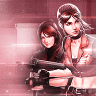
Stock: http://img1.wikia.nocookie.net/__cb...mb/8/83/Auricaxedge.JPG/479px-Auricaxedge.JPG
Size: 180 x 180
Stock: http://img1.wikia.nocookie.net/__cb...mb/8/83/Auricaxedge.JPG/479px-Auricaxedge.JPG
Size: 180 x 180
TwilightBlade
All dreams are but another reality.
- 7,243
- Posts
- 16
- Years
- Age 32
- Florida
- Seen yesterday
[supporter]Miracle Seed[/supporter]
Thanks, I can do that request for you.


My favorite piece so far would be the Shadow tag. He's one of my favorite Sonic charactersbias, and I wanted to do justice to the banner. I spent quite a long time just trying to figure out what I wanted to do with the background. I have one early draft version saved. Yeah, it was becoming odd-looking no matter what I did to the coloring effect. Scrap it. At this point in my graphics-making, I had grown too dependent on c4ds. So, I experimented with smudging black and red as a start for the background. I applied several tricks, like clipping masks (splotches), slight vignette effects (darkened corners), textures (the red light), and everything I knew about curves and selective coloring. Yet, I don't feel like the effects distracted from Shadow. They merely emphasized the focal; the color scheme is still his predominant three colors and the effects are broken up, chaotic. I think everything fell right into place. Sometimes, I just over-effect and have geometric shapes ?? and flowers ?? and explosions ?? and abstract art ?? with images that have nothing to do with those patterns. I feel like sometimes, the background becomes more attention-grabbing than the actual picture I started with. Which... makes me feel like I'm not talented at all, but resourceful. If you throw enough ingredients into the pot, sooner or later you'll produce something.
So... I'd love to redo a number of pieces, or re-try working with green backgrounds in banners. They're all vivid, but are many evoking any kind of emotion from the viewer?
Icons are great because their small size restricts me from throwing down too many bombastic effects. That helps me get back to the basics. I can also do them within 5-15 minutes usually.
--
Gintama icons, 100x100


Thanks, I can do that request for you.
My favorite piece so far would be the Shadow tag. He's one of my favorite Sonic characters
So... I'd love to redo a number of pieces, or re-try working with green backgrounds in banners. They're all vivid, but are many evoking any kind of emotion from the viewer?
Icons are great because their small size restricts me from throwing down too many bombastic effects. That helps me get back to the basics. I can also do them within 5-15 minutes usually.
--
Gintama icons, 100x100
Morning Sun Espeon
Time to shine ★
- 217
- Posts
- 14
- Years
- Seen Sep 26, 2016
[supporter]Morning Sun Espeon [/supporter]
Your first image doesn't seem to work, so I did the other two in the meantime.
Gahhhhh~ too wonderful! Here's the other image, I'm very sorry to make you double back ;;_;;
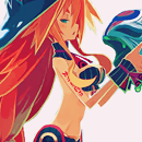
http://img1.wikia.nocookie.net/__cb..._.png/480px-Chou-Chou_final_moe_kill_Ego_.png
Or if it still won't go there's http://img3.wikia.nocookie.net/__cb20140311035810/mugen-souls/images/0/08/CC_Ego.png
TwilightBlade
All dreams are but another reality.
- 7,243
- Posts
- 16
- Years
- Age 32
- Florida
- Seen yesterday
Awesome, here are your icons then.


Miracle Seed
Serpentine trainer
- 215
- Posts
- 10
- Years
- I don't even
- Seen May 18, 2019
[supporter]Miracle Seed[/supporter]
Thanks, I can do that request for you.
My favorite piece so far would be the Shadow tag. He's one of my favorite Sonic charactersbias, and I wanted to do justice to the banner. I spent quite a long time just trying to figure out what I wanted to do with the background. I have one early draft version saved. Yeah, it was becoming odd-looking no matter what I did to the coloring effect. Scrap it. At this point in my graphics-making, I had grown too dependent on c4ds. So, I experimented with smudging black and red as a start for the background. I applied several tricks, like clipping masks (splotches), slight vignette effects (darkened corners), textures (the red light), and everything I knew about curves and selective coloring. Yet, I don't feel like the effects distracted from Shadow. They merely emphasized the focal; the color scheme is still his predominant three colors and the effects are broken up, chaotic. I think everything fell right into place. Sometimes, I just over-effect and have geometric shapes ?? and flowers ?? and explosions ?? and abstract art ?? with images that have nothing to do with those patterns. I feel like sometimes, the background becomes more attention-grabbing than the actual picture I started with. Which... makes me feel like I'm not talented at all, but resourceful. If you throw enough ingredients into the pot, sooner or later you'll produce something.
So... I'd love to redo a number of pieces, or re-try working with green backgrounds in banners. They're all vivid, but are many evoking any kind of emotion from the viewer?
Icons are great because their small size restricts me from throwing down too many bombastic effects. That helps me get back to the basics. I can also do them within 5-15 minutes usually.
Explosions make everything better! Haha. I can see what you mean with the older tags through the icons you make now. They're different, but not in a "holy crap that's awful" way. The backgrounds aren't necessarily in your face and don't take away from what's there with the stock. I appreciate your insight into what you do! ^^ Thank you for sharing and thanks for the icon!

Crystal Glaceon
Devious
- 166
- Posts
- 14
- Years
- Age 33
- Snowpoint City
- Seen Jan 23, 2016
TwilightBlade
All dreams are but another reality.
- 7,243
- Posts
- 16
- Years
- Age 32
- Florida
- Seen yesterday
[supporter]Miracle Seed[/supporter]
You're welcome, my dear.
Henshin!
Enjoy~


[supporter]Couriway[/supporter]
It's better for me to do them before exams pile up in a week. From the TCG or Sugimori art, we have...


You're welcome, my dear.
Henshin!
Enjoy~
[supporter]Couriway[/supporter]
It's better for me to do them before exams pile up in a week. From the TCG or Sugimori art, we have...
I just had to stop by and say that I am extremely impressed with your Photoshop skills, great job. Your art is a clear indication of your photoshop abilities, and I hope that when I've used it for that long I will be at least half as good as you. :) I'm about a year into avidly using it and I really enjoy the program. Although it's typical and a lot of people use it I do believe hardly anyone seems to master it or take many risks/explore the possibilities.
Great job, if anything you've inspired me to keep working on my photoshop skills. I look forward to seeing more, of course!
Great job, if anything you've inspired me to keep working on my photoshop skills. I look forward to seeing more, of course!
Crystal Glaceon
Devious
- 166
- Posts
- 14
- Years
- Age 33
- Snowpoint City
- Seen Jan 23, 2016
They turned out so great! Thank you very much!
Silver Soul of Johto
Journey's end
- 123
- Posts
- 13
- Years
- Seen Apr 10, 2016

- 1,085
- Posts
- 14
- Years
- Seen Aug 26, 2023
[supporter]Miracle Seed[/supporter]
You're welcome, my dear.
Henshin!
Enjoy~
[supporter]Couriway[/supporter]
It's better for me to do them before exams pile up in a week. From the TCG or Sugimori art, we have...
Thank you soo much! <33 These look amazing :D
TwilightBlade
All dreams are but another reality.
- 7,243
- Posts
- 16
- Years
- Age 32
- Florida
- Seen yesterday
Saki
Thanks for the lovely words. For as long as I've had Photoshop, I wish I were better. D: Make use of every tutorial and resource you can come across and draw inspiration from others... I'm happy to have been able to share some of my art with you all. Looking forward to delivering more goodies... :3
Henshin!
You're welcome. They look great on ya. :)
Silver Soul of Johto
How are these?


Terabyte
Sorry for the wait. ;;
[supporter]Couriway[/supporter]
Noooo, you're amazing.
Thanks for the lovely words. For as long as I've had Photoshop, I wish I were better. D: Make use of every tutorial and resource you can come across and draw inspiration from others... I'm happy to have been able to share some of my art with you all. Looking forward to delivering more goodies... :3
Henshin!
You're welcome. They look great on ya. :)
Silver Soul of Johto
How are these?
Terabyte
Sorry for the wait. ;;
[supporter]Couriway[/supporter]
Noooo, you're amazing.
- 171
- Posts
- 10
- Years
- United States
- Seen Sep 14, 2014
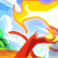
Hey, could you do a shiny Mew thats in this position?

And if you can, a background something like this?

Reg. icon size please, I want to make it my icon! (I've had two previous icons. Both mews. :D)
And if you can, a background something like this?
Spoiler:
Reg. icon size please, I want to make it my icon! (I've had two previous icons. Both mews. :D)