
- 24
- Posts
- 11
- Years
- Seen Dec 23, 2022
Thanks Reuncario, Ive been working on the map a lot with your help. I realized to become truly serious making these maps im going to export all the tilesets and take this to photoshop

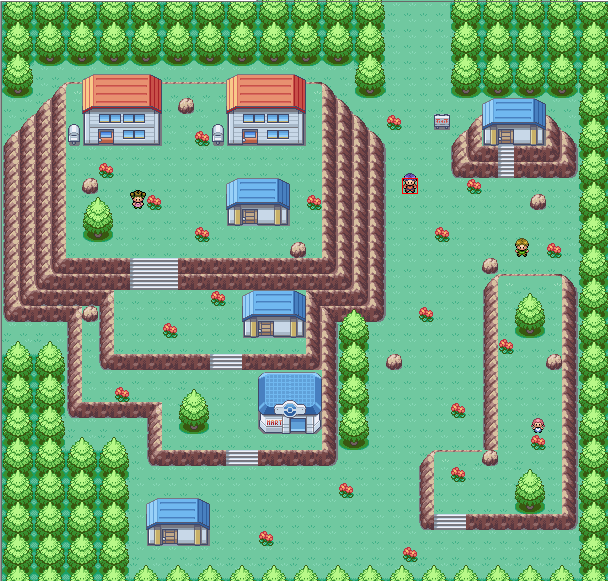
This is my starting town for my game, Pokemon Destiny/Hope. I wanted to test my mapping skills. While this is a town, it is a focal point with four exits. Please do not criticize it for being "too elaborate" for a starting town please.
Map Name: Surtic Town. Where The Grass Is Greener.
Map Game: Pokemon Destiny/Hope(FireRed Hack)
Comments: The middle section and the lower-left section serve as important events in the game.
Credits to E.C for the ROM base. Alistair, War8, Zein, Wesley FG, Trevor for the tiles.
Thank you in advance :)
Spoiler:
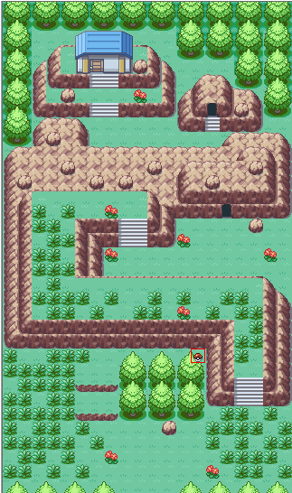
Map name: Mountainridge Town
Game: Pokemon ReHeat (FireRed Hack)
Notes: The reason the trees don't go all the way up against the wall in some areas is because there's no tile of a tree top with a mountain corner, and to make one, I'd need a 3 layer block and I don't feel like using MEH just yet
Also, it's the starter town
Edit: I just noticed that's an old pic. There's no longer that tile error on the lower right part of the map, and the signpost is now 3 blocks to the right of the selected sprite (one left from the flower)

The map is alright at best, it could be a lot better. Some parts feel too empty and it looks like you only used one of the grass tiles, even though Fire Red provides more to use. I like what you did with the house on top of the little mountain. I recommend using the other tree, the small one a few times around the map, and adding a few more things in the area in front of the cool trainer. Fix all those things and the map will be much better. As of now I give it a 6/10, fixing those things will make me give it a 9 or 10 :)
Now my map :)
Map name: Amity Forest
Game: Pokemon Fluorite (Emerald hack)
Note: The guy in the beginning of the map (green shirt, brown hair) is there for a story script and will dissapear after.
Here it is
Spoiler:
Not bad. I don't really have anything to criticize really. It can be better, I don't know what. Is that house important? If it is, make it so it can be entered via 1 way. But that's just me. 8.3/10 overall.
Map name: Wavern City
Game: Pokemon Cosmic (for now)
Main city for my hack and the place where the Pokemon HQ is at. It's almost done but I thought it would be best to get a review.
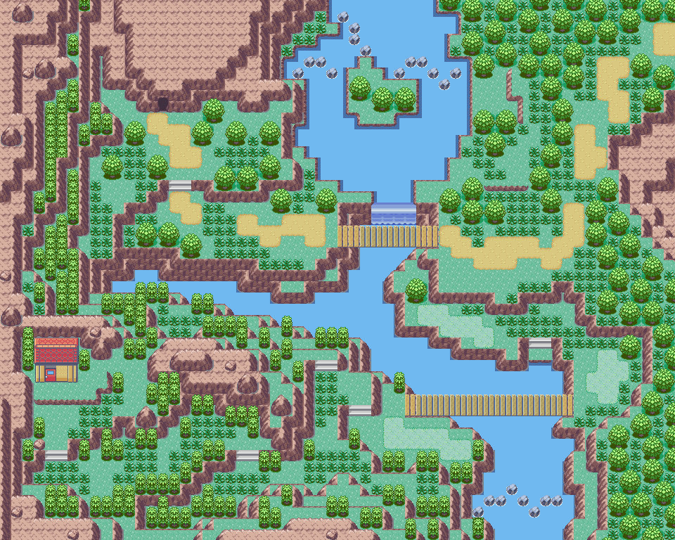
Name: Route 1
Game: Pokemon ReHeat (Pokemon FR Hack)
Notes: The route above my city, which you can find about 2 posts ago. You need to go through the cave to get to the house, and inside the cave you also get to move on with your journey
Spoiler:

Rombase: Fire Red
Comment: My first map in about 4 years. I was opting for a natural feel. Ignore the bottom sea part (you wouldn't be able to see the emptiness at this stage of the game, no HM03). Oh, I do believe my tree shadowing is a bit off, so could someone point me in the right direction here, please? :( I plan on changing the grass tile to a singular one, possibly the one from Emerald.
Mapshot:
Spoiler:
space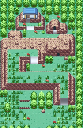
Very nice map, 10/10, just be aware that the her0/player can see 5 blocks above and beyond him, and 7to the right and left, so on the left side of the map the player can see 1 or even 2 blocks beyond the border, and those parts can't be fixed with border
My map
just an upgrade
Before and after:
Spoiler:
I mostly only added small trees, and I'm aware of the fact that there are some "unfinished" trees, on the mountain/cave's corners
Now here is my map :)
Name: Route 2 (technically it's the third one but w.e)
Game: Pokemon Fluorite (Emerald)
Note: I tried to go for the natural mapping style, not sure if I did it good or not. Also, the signpost notifies the player that they can choose the easy way, which would be like a normal route, or the harder way, which will be going through the mountain then back, but will get a lot of rewards.
Here's the link to see it better :)
This is my starting town for my game, Pokemon Destiny/Hope. I wanted to test my mapping skills. While this is a town, it is a focal point with four exits. Please do not criticize it for being "too elaborate" for a starting town please.
Map Name: Surtic Town. Where The Grass Is Greener.
Map Game: Pokemon Destiny/Hope(FireRed Hack)
Comments: The middle section and the lower-left section serve as important events in the game.
Credits to E.C for the ROM base. Alistair, War8, Zein, Wesley FG, Trevor for the tiles.
Thank you in advance :)
Hi, I don't usually map hack, so you can totally disregard my advice, as you are most probably more experienced at mapping than I am, however as a perfectionist I can see some things in which you can make to further enhance and improve your map.
It's simply far too spacious for a beginning town. I think maybe instead of having that bundle of trees in the middle, you should arrange the houses so that they're in order, as opposed to being randomly situated within the town. Also, I don't really like how you've kind of used some things to simply fill up large spaces, such as the corners/inaccessible rivers etc. Sure it gives the town an aesthetic pleasure, but I don't really think it's necessary.
Instead, I'd recommend making a much smaller town with maybe not as many houses. If I were to ever pick up mapping as a hobby then I would definitely use smaller objects and more interesting things to fill space as opposed to just leaving them blank, like what you have done. If there's a space which is blank and is larger than 2x2 then I'd thoroughly recommend adding some flowers, trees, stumps, fences, puddles, rocks, sign posts or even people! Your map is just too blank. How about trying to create a dirt road around the houses so the players aren't just left to casually stroll around the town with no sense of direction, I'm sure that'd help! :,)

No maps to review so here is mine:
Name: Swaq(Seriously nothing else comes to mind)
Game:PokemonFeuerrote Edition(Hack Violet) I was given permission to use it
Notes: I think I did the base right but the middle just seems too squeezed in
I also haven't mapped in a while so I'm rusty sh*t right now :L
Spoiler:
Credits:Spoiler:Alen (Rombase)
WesleyFG
SL249
Red-ex
Alistair
Red-eX
princelegendario
Mepotes
Evolina X
Calis Projects
minorthreat
Alucus
Kyledove
Dewitty
zetavares
Riolu-Fan
Zein
Mew1993

Hitsushiro said:Rombase: Fire Red
Comment: My first map in about 4 years. I was opting for a natural feel. Ignore the bottom sea part (you wouldn't be able to see the emptiness at this stage of the game, no HM03). Oh, I do believe my tree shadowing is a bit off, so could someone point me in the right direction here, please? I plan on changing the grass tile to a singular one, possibly the one from Emerald.
Mapshot:
Spoiler:
I think I really like this map. It's very simple, but vey well done and has a lot of attention to details. The best part here is the natural feel you DID accomplish: The trees, flowers and bushes are well placed and spaced out, the mountain formation not too symmetrical and the random patches of grass thrown around on said mountain add to the look. And although some people don't like putting tall grass where you can't reach it, I find it adds a nice touch to maps and do it excessively in my maps (as you'll see below). As for the tree shading, sorry, can't really help you with that :/
Part of me is saying that I can't just give a 10/10 because I like a map, but there really isn't any flaws with this map. Well done! (10/10)
Well, since it was my 1st PC anniversary yesterday, I wanted to do something huge and awesome to celebrate. Couldn't think of a single thing. So I did a map!
Map Name: Who Cares?
ROM Base: Emerald
Notes: "A nice path, almost untouched by human hands, nestled between a small mountain range and flowering forest." xD I like fancy words... Anyway, this map is consisted of the main path from the cave to who knows what (City or Forest) and a bonus path that hides a move tutor or something of the like. Three things I want to say, though: I am a COMPLETE newb when it comes to shading. I kinda winged it here, really had no idea about what I was doing. Also, I know the bridges are really messed up, I was just too lazy to fix them (I REALLY didn't want to upload new tiles for ONE map that I'm not even putting in a hack). Finally, borders don't really matter here, because, again, this is for fun, not actually putting this in a hack.
Spoiler:

REVIEW: First of all, I really like the shape of the route.
Its nature is perfect, and I how untouched, the map is. I also like the player has choices to either go to the cave or the house. The best part is the river, that goes through the map. It's very nice and clean.
But as you've said, the shapes of the mountain at river doesn't fit the river.
Otherwise, I think it's a natural map, which I personally like xD.
I'll give it a 9,5/10.
SUGGESTIONS: SHAPES. SHAPES EVERYWHERE...
-------------------------------
My map
Map name: I dunno- town?
Rombase: E.C' fire red rombase.
Comments Practice, for a game I am making!
ANY CRITICISM WANTED
Spoiler:
