• Our software update is now concluded. You will need to reset your password to log in. In order to do this, you will have to click "Log in" in the top right corner and then "Forgot your password?".
  • Welcome to PokéCommunity! Register now and join one of the best fan communities on the 'net to talk Pokémon and more! We are not affiliated with The Pokémon Company or Nintendo.

Map Rating/Review Thread

Status
Not open for further replies.

Vrai

can you feel my heart?
  • 2,896
    Posts
    15
    Years
    • Age 29
    • Seen Oct 24, 2022
    Ok, so now that everyone else has had their map rated, maybe someone could do mine?


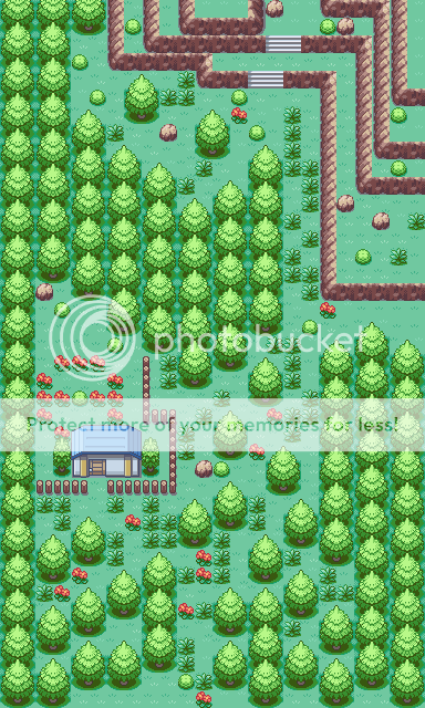
    The trees.. well, I can see what you're going for here.. at least, with the trees. But when you try to vary the outside edge with the trees and stuff, you have to actually vary the outside edge of the map. Have you ever seen a forest in real life? It looks big and thick from the outside, yeah? After going a few trees in, does it get all flat and all you can see is grass? No.

    What you have to do here, sir, is to 1. Overlap tree tiles (using the block editor), and 2. Make more trees, mainly around the edge.

    Now, FireRed trees hardly help much, if at all with this method. The tiles included don't vary too much, so learn how to insert tiles or pick up a rom base if you want to make it easier on you.
     
  • 53
    Posts
    15
    Years
    • Seen Apr 19, 2012
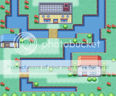
    Here, since a long time, a new map of me. Its the 3th route of my hack, Pokémon - TMoC -> don't copy.

    Map Rating/Review Thread
     

    MASTEROFPUPPETS93

    Liebe Ist Für Alle Da
  • 110
    Posts
    15
    Years
    I saw it on rhw and i have to say: haefele, this map is awesome! But there's one thing i don't like: The river is next to the rockwall (sry my english sucks XD)... Make a waterfall then it look not so regular^^ 8,5/10
     
  • 277
    Posts
    15
    Years
    • Seen Sep 24, 2014
    Map Name: ?? Town
    Map Game: FireRed
    Comments: I know that it looks square. I'm kinda going to make Nintendo styled maps. :)
    Map Rating/Review Thread
     

    Ninja Caterpie

    AAAAAAAAAAAAA
  • 5,979
    Posts
    16
    Years
    Map Name: ?? Town
    Map Game: FireRed
    Comments: I know that it looks square. I'm kinda going to make Nintendo styled maps. :)
    Map Rating/Review Thread

    This is a square map.

    It's still awesome though. Why? Because its other features make it looks much better. =D Everything else is not Nintendo. =P

    9/10

    But why did you copy my idea of Emerald grass/paths?
     

    4th Gen Matt

    Pokemon Onyx Creator
  • 545
    Posts
    15
    Years
    Same with Neti

    Here's anoter Map of me... I made it because it was soo boring today T~T
    Map Name: ??
    Rom: Fire Red (German)
    Comments: I hope you like it^^ ô.O

    View attachment 46084

    Map Rating: 9/10

    Comments: The map looks great in my opinion. No tile errors as far as I can see. Not square at all. I love the island and the mountains look great. Just the right amount of grass for my taste.

    Recommendations: Add a rock border on both sides of the water even if they cannot go in the water. It makes it look that much better.

    EDIT: Congratulations! Your map has been rated as my 500th post!
     

    Ninja Caterpie

    AAAAAAAAAAAAA
  • 5,979
    Posts
    16
    Years
    Same with Neti

    Here's anoter Map of me... I made it because it was soo boring today T~T
    Map Name: ??
    Rom: Fire Red (German)
    Comments: I hope you like it^^ ô.O

    View attachment 46084

    This is a beautiful map.

    And it's playable. See? You CAN have the best of both worlds.

    The shape of the mountains is beautiful. Just beautiful. Yet, it allows you a fair bit of room to walk about. 8/10

    Now I have a map
    Map Rating/Review Thread

    It's for a test to join the Pokemon Hall Of Fame fangame.
     
    Last edited:

    destinedjagold

    I do not exist.
  • 8,593
    Posts
    17
    Years
    • Seen May 26, 2024
    Guys, if your map's too big, put it inside a SPOILER tag or provide a link.
    Have mercy towards those who have a slow internet connection.
    Also, since I don't hack FE, I might as well not rate them since I don't have any backgrounds on those games.

    Messed around in Gold Map a bit and came up with this redesign of New Bark Town. Nothing too special.

    Map Name: White Town
    Map Game: Pokemon Gold Hack Of Awesomeness
    Spoiler:


    I might try tile editing later and see what I can come up with. (I just learned that the word editing only has one t. Fun.)

    COMMENT: It's a nice map, though the only thing I don't like is the path towards the house on the upper-right corner of the map, 'cause we only have one tile space for walking. :\
    RATING: 7/10
    SUGGESTION: Um, give more space on that path?

    I have nothing to do so i created this map...there maybe have errors but overall...haha Look at it...
    View attachment 46030

    COMMENT: What the...? o.O
    RATING: 1/10
    SUGGESTION: You seriously need to read mapping tutorials...

    I saw all the maps and they all are good...
    Here is mine...Its not for my hack,its just a jus 4 fun map i make...
    View attachment 46079

    COMMENT: Ugh...
    RATING: 1/10
    SUGGESTION: You really need to read mapping tutorials...

    Here, since a long time, a new map of me. Its the 3th route of my hack, Pokémon - TMoC -> don't copy.

    Spoiler:

    COMMENT: This is a wonderful map!
    RATING: 9/10
    SUGGESTION: Put the map inside the SPOILER tag next time if it's too big, k?

    Map Name: ?? Town
    Map Game: FireRed
    Comments: I know that it looks square. I'm kinda going to make Nintendo styled maps. :)
    Spoiler:

    COMMENT: It's a nice map for a Nintendo styled map.
    RATING: 8/10
    SUGGESTION: Nothing, I suppose?

    Same with Neti

    Here's anoter Map of me... I made it because it was soo boring today T~T
    Map Name: ??
    Rom: Fire Red (German)
    Comments: I hope you like it^^ ô.O

    View attachment 46084

    COMMENT: That is one big and wonderful map but I don't like the sideview bridges...
    RATING: 7/10
    SUGGESTION: Maybe make the bridges more neat to look at, especially the side-way bridges.

    This is a beautiful map.

    And it's playable. See? You CAN have the best of both worlds.

    The shape of the mountains is beautiful. Just beautiful. Yet, it allows you a fair bit of room to walk about. 8/10

    Now I have a map
    Spoiler:

    It's for a test to join the Pokemon Hall Of Fame fangame.

    COMMENT: I really like those big trees though. The map is good.
    RATING: 8/10
    SUGGESTION: Nothing, I suppose...
     

    colcolstyles

    Yours truly
  • 1,588
    Posts
    16
    Years
    Same with Neti

    Here's anoter Map of me... I made it because it was soo boring today T~T
    Map Name: ??
    Rom: Fire Red (German)
    Comments: I hope you like it^^ ô.O

    View attachment 46084
    Well at first glance, it looks very good. But, as always, on closer inspection, you can easily see a few key faults. One, what's up with the water? No rocks? No deep water? No sand at the base of the mountains? If you're going to use that much water so that it dominates the map, try to fill it with something. Yes, the player won't see most of it in-game but at least try to add some a few touches here and there to make the experience a little more visually stimulating. Merely adding a layer of sand that encompasses the mountains on the bottom tier would make it look MUCH better.
    Besides the water, there are also several other locations throughout the map that look empty. You used a lot of flowers but they just don't seem to fill the space that well. Maybe if you varied the vegetation so that it wasn't just the same flower over and over again, it might look a little better. Perhaps using some of those rocks not exclusively on the mountain? Or maybe a bush tile? Your choice. Other than that, the tile selections are pretty good. I noticed a tile error by the northeastern house where you thought you could bypass the two-layer rule ;) Another thing I noticed, which might not be a tile error but is more of a personal preference, is the lack of shadows underneath the bridge tiles. It will make it look a lot better in my opinion (and not to mention more realistic).
    Other assorted things: path usage is decent. You could probably get away with a little more to cover those bare spots. Still I like the way you made it seem as though the path was dribbling over onto the next mountain layer. However, if you're going to do that, why not put down some path on the layer below? I know that's not a very good description but hopefully you get what I mean ;) Uh, what else... The mountains are fairly well shaped, save for a handful of spots where you made the mountains like ONE TILE too long, therefore causing it to appear a little too straight for my tastes. But on the whole, it's very good. Tree placement is good although I'm not too keen on the diagonal method. Still, if it works for you, I suppose it's okay. You could probably get away with a few more of the small trees here and there. I don't like the way that the player only has one tile of moving space when trying to enter the house on the island. Grass placement is just fabulous! I've got nothing to complain about there :)
    So yeah, that's pretty much it. Overall, it's a great map but, as with most maps, there's always room for improvement. Keep up the good work!
     

    Eletj

    Once Eletj, Always Eletj
  • 363
    Posts
    16
    Years
    Its been awhile but here are a couple of maps~

    Map Name: ??? Town
    Game: Fire Red
    Spoiler:


    Map Name: ???
    Game: Fire Red
    Spoiler:
     

    ~Teh Panda~

    Back in hacktion
  • 918
    Posts
    16
    Years
    • Seen Jul 20, 2022
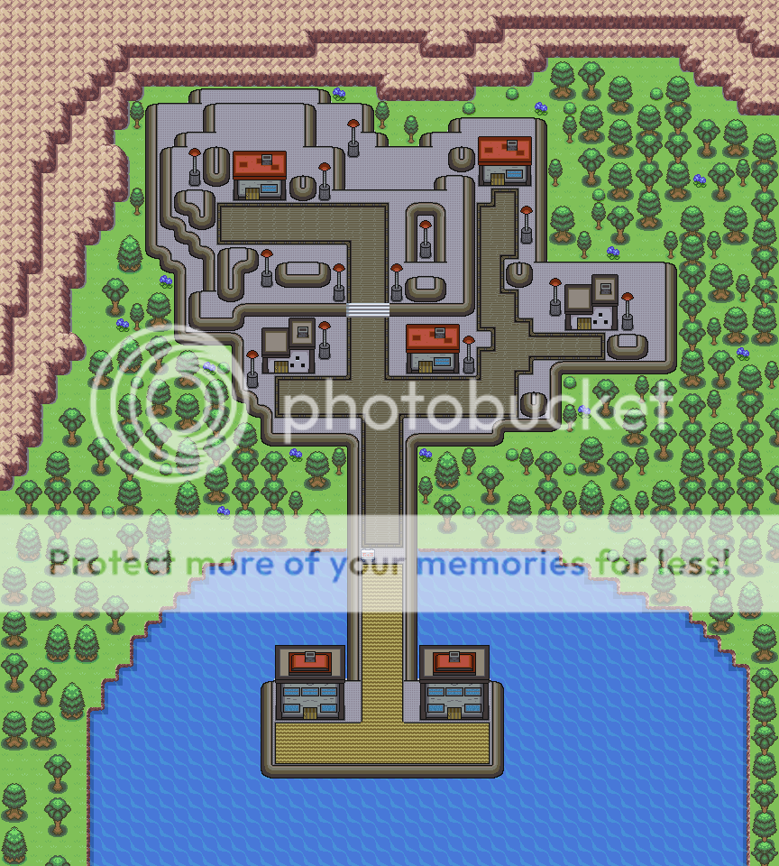
    Endigo Port City:

    Reason for scarce trees on bottom left and right is because it is unreachable to get there. No surfing :P

    Map Rating/Review Thread
     

    MASTEROFPUPPETS93

    Liebe Ist Für Alle Da
  • 110
    Posts
    15
    Years
    Well at first glance, it looks very good. But, as always, on closer inspection, you can easily see a few key faults. One, what's up with the water? No rocks? No deep water? No sand at the base of the mountains? If you're going to use that much water so that it dominates the map, try to fill it with something. Yes, the player won't see most of it in-game but at least try to add some a few touches here and there to make the experience a little more visually stimulating. Merely adding a layer of sand that encompasses the mountains on the bottom tier would make it look MUCH better.
    Besides the water, there are also several other locations throughout the map that look empty. You used a lot of flowers but they just don't seem to fill the space that well. Maybe if you varied the vegetation so that it wasn't just the same flower over and over again, it might look a little better. Perhaps using some of those rocks not exclusively on the mountain? Or maybe a bush tile? Your choice. Other than that, the tile selections are pretty good. I noticed a tile error by the northeastern house where you thought you could bypass the two-layer rule Another thing I noticed, which might not be a tile error but is more of a personal preference, is the lack of shadows underneath the bridge tiles. It will make it look a lot better in my opinion (and not to mention more realistic).
    Other assorted things: path usage is decent. You could probably get away with a little more to cover those bare spots. Still I like the way you made it seem as though the path was dribbling over onto the next mountain layer. However, if you're going to do that, why not put down some path on the layer below? I know that's not a very good description but hopefully you get what I mean Uh, what else... The mountains are fairly well shaped, save for a handful of spots where you made the mountains like ONE TILE too long, therefore causing it to appear a little too straight for my tastes. But on the whole, it's very good. Tree placement is good although I'm not too keen on the diagonal method. Still, if it works for you, I suppose it's okay. You could probably get away with a few more of the small trees here and there. I don't like the way that the player only has one tile of moving space when trying to enter the house on the island. Grass placement is just fabulous! I've got nothing to complain about there
    So yeah, that's pretty much it. Overall, it's a great map but, as with most maps, there's always room for improvement. Keep up the good work!

    oh f*** i forgot to do the water! but thx for your long post^^

    View attachment 46115

    i hope its better now!

    @teh panda: the map is really good i like it but i don't like the tiles very much : /
     

    CollinP

    My Avi Evolved
  • 104
    Posts
    15
    Years
    • Seen May 19, 2009
    New Pallet Town

    1.Map Name: New Pallet Town
    Map Game: Pokemon GOLD VERSION
    Comments: This Is Pallet Town 8 Years After Ash Left On His Adventure... So It's Two Years Ago..... ya....
     

    Ninja Caterpie

    AAAAAAAAAAAAA
  • 5,979
    Posts
    16
    Years
    Some maps...
    https://img245.imageshack.us/img245/1783/cave.png
    First Floor
    https://img245.imageshack.us/img245/6270/undergrowthcatacombs.png
    Second Floor
    https://img245.imageshack.us/img245/624/undergrowthcatacombs2.png
    Basement level

    The colours link the levels, btw.

    More of that test Jonny Chleevas is giving me. He already knows I'm good, now he's just seeing what I'm better at.

    https://img245.imageshack.us/img245/7048/route.png

    I'm just linking them so you can see them easier (if you're using Chrome like I am).
     

    colcolstyles

    Yours truly
  • 1,588
    Posts
    16
    Years
    Some maps...
    https://img245.imageshack.us/img245/1783/cave.png
    First Floor
    https://img245.imageshack.us/img245/6270/undergrowthcatacombs.png
    Second Floor
    https://img245.imageshack.us/img245/624/undergrowthcatacombs2.png
    Basement level

    The colours link the levels, btw.

    More of that test Jonny Chleevas is giving me. He already knows I'm good, now he's just seeing what I'm better at.

    https://img245.imageshack.us/img245/7048/route.png

    I'm just linking them so you can see them easier (if you're using Chrome like I am).
    Um, I think your cave layout could create some problems if you don't have a pokémon with surf (but it may just be me). Here, let me try:
    1. Enter at the red dot
    2. Walk down those stairs and hop over the ledges in order to descend the light blue ladder
    3. From there, drop down the brown (or pink) dot
    4. Since there's nowhere else to go, ascend the dark blue laddder
    5. Get stuck unless have surf
    6. ???????
    7. Profit

    Anyways, onto the next map:
    Ewwwwwwwww. Those path block edits make the path look all, what's the word, disgusting? I dunno why but they kinda gross me out. They look like amoebas :D Anyways, besides that, you need to work on your tree shadows. It's nice to see another person using the standard FR/LG back-side-of-mountain stairs (the one at the end of the condom shaped path). Was that map made in RMXP or AM? I see some block edits which are technically possible in a ROM but I'm guessing you made this map very quickly and if you did, you probably didn't have time to make too many block edits. That and this is for your application for HOF. Anyway, grass placement is mediocre. Same with flower/vegetation placement. Other than that, meh, it looks decent. We'll see what Johnny thinks ;)
     

    Ninja Caterpie

    AAAAAAAAAAAAA
  • 5,979
    Posts
    16
    Years
    Um, I think your cave layout could create some problems if you don't have a pokémon with surf (but it may just be me). Here, let me try:
    1. Enter at the red dot
    2. Walk down those stairs and hop over the ledges in order to descend the light blue ladder
    3. From there, drop down the brown (or pink) dot
    4. Since there's nowhere else to go, ascend the dark blue laddder
    5. Get stuck unless have surf
    6. ???????
    7. Profit
    Uh... Go down the yellow dot? Then go up the ladders?

    Anyway, if you didn't see the previous map, the entrance is blocked by water, so you need surf to get in.

    It's made in A-Map, as my RMXP strangely ran out. So...I need to prove myself in order to get a real copy from HOF. Anyway, I would be using HOF's standard NewKanto tiles - the Kyledove styled ones.

    :O!

    You said my grass placement was mediocre! >:O Waaaaahaaaaaa. :(

    xD
     
    Status
    Not open for further replies.
    Back
    Top