• Our software update is now concluded. You will need to reset your password to log in. In order to do this, you will have to click "Log in" in the top right corner and then "Forgot your password?".
  • Welcome to PokéCommunity! Register now and join one of the best fan communities on the 'net to talk Pokémon and more! We are not affiliated with The Pokémon Company or Nintendo.

Map Rating/Review Thread

Status
Not open for further replies.

Crimson Stardust

Anime Addiction
  • 1,319
    Posts
    15
    Years
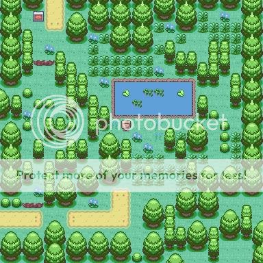
    Name:Route 1
    from fire red
    credits to:wesley,kyledove...i think there is somemore..xD
    comment:a simple route 1 i make
    rate it guys
    Spoiler:
     
    Last edited:

    .Seth

    .explorer.
  • 1,644
    Posts
    15
    Years
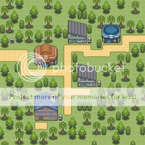
    Map Name: No name as of yet

    Map Game: emerald

    Comments: not finish
    Spoiler:
    Rating: 3/10
    Comments: About the mountains, you need at least one more level, and you need to make more corners on it. And don't make it so square. ;-;. Oh, and add small and big rocks as well. The path, it needs to be less long. You don't need the "extension" near the top-right unless that goes to a route, which it doesn't. You also should put space betwen the middle part of the path and the PokeMart and the House. You don't need the one tile extension by the gym, shorten it there. The sign for the gym should be next to the path, not away from it. The trees look very unnatural, and there are tile errors on where the lines of trees end. You used the "small tree to city" tile. You need the small tree to grass tile, which reminds me. You used the same grass tile throughout. Unless that's the only one, add different ones. Another thing, there should be a path going under the gate and out of the town.
    Plus, you should make the entrance of the cave more obvious to the player, as in, move it closer to the center, to the right of the gym, or the top-right of the map, then at least the extension of the path would lead to something.

    Wow, that was a long rating.
    Name:Route 1
    from fire red
    credits to:wesley,kyledove...i think there is somemore..xD
    comment:a simple route 1 i make
    rate it guys
    Spoiler:
    I'll be quick on this one as my laptop's battery is near-dying. Uhm..
    Rating: 6/10 (And that's a good one, coming from me.)
    Comments: Uhm, well.. where to begin? You should keep the path the same through unless there's a change in terrain, which there isn't. Tile errors on the jump thing near the sand path. Used the same grass tile through. Some flower/blue things don't show that well, I suggest you palette edit that. Tile errors on the water. Border is boring and unnatural.
    But, it does have a nice feel to it.
     

    Crimson Stardust

    Anime Addiction
  • 1,319
    Posts
    15
    Years
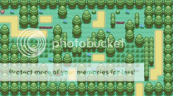
    I improve the map abit....
    nME:ROUTE
    credits:to the owner of the tiles
    info:about the water tiles,i have not make the corner yet and have not inserted it{forget about it..lol}going to to do it later on...It is already been done too much so i cannot change the borders.but the next map i will make i will make it different
    so rate it
    i will improve on it till it get a high rating or i want to start on a new map..xD
    Spoiler:
     
    Last edited:

    Full Metal

    C(++) Developer.
  • 810
    Posts
    16
    Years
    Well heres a second shot at the map above.
    Different tiles are used. I'm using the trees that require four blocks wide so i was limited on the tree placement (i have about 3 empty blocks left in my tileset1 and about 7 8x8 pixel areas left in the image part)
    Map Game: FR
    ROM BASE: PHO D/P tiles base + Kyledove + MOP base for the mini tree and the pokemart/shop pallettes (pals 2&3)
    Spoiler:
     

    Sierraffinity

    Desperately trying to retire from ROM hacking
  • 1,069
    Posts
    16
    Years
    Map Name: Petalburg City

    Map Game: FireRed

    Comments: It's 13 years later than in R/S/E, and it's been partially flooded. A whole lot of tiles have been taken from random places and inserted, so I can't name them all here. Also, the "can't SURF here" water's been used.

    Mapshot: In Attachments

    --------------------------------------------------

    Map Name: Unnamed City (old Route 104)

    Map Game: FireRed

    Comments: It's 13 years later than in R/S/E, and it's been partially flooded. The Petalburg Woods have been chopped down to create a new city, which I still haven't named. A whole lot of tiles have been taken from random places and inserted, so I can't name them all here. I took a screenshot from the game and fixed a tile, since it would only show up right in-game. Also, the "can't SURF here" water's been used. EDIT: Updated.

    Mapshot: In Attachments
     
    Last edited:
  • 3,411
    Posts
    15
    Years
    • Seen May 5, 2024
    Map Name: Petalburg City

    Map Game: FireRed

    Comments: It's 13 years later than in R/S/E, and it's been partially flooded. A whole lot of tiles have been taken from random places and inserted, so I can't name them all here. Also, the "can't SURF here" water's been used.

    Mapshot: In Attachments

    --------------------------------------------------

    Map Name: Route 104 (unnamed city)

    Map Game: FireRed

    Comments: It's 13 years later than in R/S/E, and it's been partially flooded. The Petalburg Woods have been chopped down to create a new city, which I still haven't named. A whole lot of tiles have been taken from random places and inserted, so I can't name them all here. I took a screenshot from the game and fixed a tile, since it would only show up right in-game. Also, the "can't SURF here" water's been used.

    Mapshot: In Attachments

    Petalburg city
    is pretty good,although the north part of the map has square maps,and the water could be placed a little more natural. Overall,nice map.
    rating:
    Spoiler:


    Route 104
    looks like a route in R/S/E :D. But if it is a route, why it has a town in it? The town is good,but i wouldn't recommend combining a town and a route. Anyway,i like the mine/cave in the middle of the town. But whats with the flowers on the roof of that house/store?
    It seems good,but a little weird to me.
    rating:
    Spoiler:
     

    Sierraffinity

    Desperately trying to retire from ROM hacking
  • 1,069
    Posts
    16
    Years
    Petalburg city
    is pretty good,although the north part of the map has square maps,and the water could be placed a little more natural. Overall,nice map.
    rating:
    Spoiler:


    Route 104
    looks like a route in R/S/E :D. But if it is a route, why it has a town in it? The town is good,but i wouldn't recommend combining a town and a route. Anyway,i like the mine/cave in the middle of the town. But whats with the flowers on the roof of that house/store?
    It seems good,but a little weird to me.
    rating:
    Spoiler:
    It was MEANT to be Hoenn, 13 years later. And that's the new flower shop.
     
  • 493
    Posts
    15
    Years
    this map of mine is not rated so please rate and give c&c...xD
    Name:route 1
    Spoiler:

    My another map i jus completed
    Name:Tropical Village
    Rombase:Ray secret Rombase
    Info:trying out to make the map look natural..
    please rate and give comment and advice
    Spoiler:

    Route 1
    Rateing 7/10
    comments: well its a nice map and good tiles(by wesly FG) but it looks odd to me. Like when you use a bush to block the edge of the map off.. dosent look so good. also i realy dont like how you placed the trees at the bottom right =/ they look lazyish and the big emptie space is useless. Overall its a nice map

    Tropical Village
    rateing 3/10
    comments: i realy dont llike this map at all exept for the tiles wich ray edited the pallets and still again wesly FG tiles, ok for one the trees again i dont like them placed like that looks lazy and just makees useless spaces and gaps. 2. the path is squarish dont you think? make it lessish square XD. 3. add some flowers or vushes or something if your gunna add those emptie spaces
     

    Full Metal

    C(++) Developer.
  • 810
    Posts
    16
    Years
    Well heres a second shot at the map above.
    Different tiles are used. I'm using the trees that require four blocks wide so i was limited on the tree placement (i have about 3 empty blocks left in my tileset1 and about 7 8x8 pixel areas left in the image part)
    Map Game: FR
    ROM BASE: PHO D/P tiles base + Kyledove + MOP base for the mini tree and the pokemart/shop pallettes (pals 2&3)
    Spoiler:
    lolz before it gets too far back and forgotten (i think this needs to be a rate the above thread...xD)
     

    TheWicked

    Pogi ako!
  • 59
    Posts
    16
    Years
    this map of mine is not rated so please rate and give c&c...xD
    Name:route 1
    Spoiler:

    My another map i jus completed
    Name:Tropical Village
    Rombase:Ray secret Rombase
    Info:trying out to make the map look natural..
    please rate and give comment and advice
    Spoiler:

    Route 1
    Rating: 8.5 / 10
    That was really great!
    You should add more trees at the lower side of the map to make it better.

    Tropical village
    Rating 8.2 / 10
    there are many spaces around the map,you should put something there,maybe a flower?
    And add more trees at the top of the map^_^
    And there are some tile errors at the back of the house,but that isnt a problem.
     
  • 3,411
    Posts
    15
    Years
    • Seen May 5, 2024
    It was MEANT to be Hoenn, 13 years later. And that's the new flower shop.

    Yeah,sorry,i missed that one.

    this map of mine is not rated so please rate and give c&c...xD
    Name:route 1
    Spoiler:

    My another map i jus completed
    Name:Tropical Village
    Rombase:Ray secret Rombase
    Info:trying out to make the map look natural..
    please rate and give comment and advice
    Spoiler:

    first map: really good,but the tiles are weird,and tha pallets are too.Pretty good.
    Rating: 8/10

    second map: Y' know,ya shouldn't place the trees so far from each other, its againist the mapping rules. And thanks for using my rombase.
    Rating: 7/10
     
  • 159
    Posts
    16
    Years
    Map Name: Anime Kanto

    Map Game: Fire Red

    Comments: I tried to remake kanto as it is in the anime. Used lots of references and made custom buildings. There are some things I would change, such as building placement, but as you know moving buildings in advance map is a pain, so I'm just going to leave it. Ashes house is on the bottom.
    I really made this just to show people how much better a map from a game based on the anime could be, because most I find are just lazy edits.
    I might make a hack, or even just a demo (up to viridian).
    Tell me what you think.

    Mapshot:
    Map Rating/Review Thread
     

    negative

    Life returns. Life prevails.
  • 501
    Posts
    15
    Years
    Map Name: Anime Kanto

    Map Game: Fire Red

    Comments: I tried to remake kanto as it is in the anime. Used lots of references and made custom buildings. There are some things I would change, such as building placement, but as you know moving buildings in advance map is a pain, so I'm just going to leave it. Ashes house is on the bottom.
    I really made this just to show people how much better a map from a game based on the anime could be, because most I find are just lazy edits.
    I might make a hack, or even just a demo (up to viridian).
    Tell me what you think.

    Mapshot:
    Map Rating/Review Thread
    Ok...where to start...
    -Not Every house needs a fence.
    -there is a lot of un-used space.
    The lab-Used the real mountain, not the "jump-off" one.
    -The map is very square.
    RATING:3/10
     

    <~F.M.P~>

    I got you whistling Blue Box!
  • 577
    Posts
    17
    Years
    Map Name: Anime Kanto

    Map Game: Fire Red

    Comments: I tried to remake kanto as it is in the anime. Used lots of references and made custom buildings. There are some things I would change, such as building placement, but as you know moving buildings in advance map is a pain, so I'm just going to leave it. Ashes house is on the bottom.
    I really made this just to show people how much better a map from a game based on the anime could be, because most I find are just lazy edits.
    I might make a hack, or even just a demo (up to viridian).
    Tell me what you think.

    Mapshot:
    Map Rating/Review Thread

    Whoa, whoa, whoa...First, these tiles aren't even for public use Dude...They're for A game called Pokemon Lost World, and those tiles belong more specifically to Captain Arcane. You'll have to remove those Houses and such and get permission from him or Use some other ones.

    The map overall looks pretty decent.
    ~There is quite a bit of open space. Use a FEW more flowers and tress in those open areas.
    ~Try not to make a line of trees. Make it less boxy using the trees in different/random
    patterns, because trees don't grow aligned like that.
    ~Also there are a few tile errors.

    5/10
     
    Last edited:
  • 159
    Posts
    16
    Years
    Whoa, whoa, whoa...First, these tiles aren't even for public use Dude...They're for A game called Pokemon Lost World, and those tiles belong more specifically to Captain Arcane. You'll have to remove those Houses and such and get permission from him or Use some other ones.

    The map overall looks pretty decent.
    ~There is quite a bit of open space. Use a FEW more flowers and tress in those open areas.
    ~Try not to make a line of trees. Make it less boxy using the trees in different/random
    patterns, because trees don't grow aligned like that.
    ~Also there are a few tile errors.

    5/10

    Haha, I wish I had stole them, unfortunately I spent hours spriting them and putting them into the game. But if you look it up theirs is much different.
    Mine's a lot smaller, and still in the same style/palette as firered. Though I do really like that whole map.
    I see that mine could be a lot better. I might redo it, but as I said it's such a pain to move things around in advance map that I might not.
    EDIT: unless that was before they changed their style, but I assure you it's all custom.

    Everyone seems to not like the hills up to the Lab, but I didn't use the taller cliffs is because... that's not what it looks like... In the anime it's just a hill, a huge cliff is too much IMO
     
    Last edited:

    tImE

    It's still me, 44tim44 ;)
  • 673
    Posts
    17
    Years
    Whoa, whoa, whoa...First, these tiles aren't even for public use Dude...They're for A game called Pokemon Lost World, and those tiles belong more specifically to Captain Arcane. You'll have to remove those Houses and such and get permission from him or Use some other ones.

    The map overall looks pretty decent.
    ~There is quite a bit of open space. Use a FEW more flowers and tress in those open areas.
    ~Try not to make a line of trees. Make it less boxy using the trees in different/random
    patterns, because trees don't grow aligned like that.
    ~Also there are a few tile errors.

    5/10

    No, FMP. Skeddles is actually right.
    These are not made by CA, he is using much bigger tiles, like 2.5 times bigger.

    Anyway, for the rating now.

    5,5/10

    +Good Idea about shape
    +Nice use of tiles

    -To square and unnatural trees
    -Too much empty space
    -Incorrectly used tiles.
    -Unnatural path.

    Comments:
    Try moving the far left path more to the right.
    Smooth out the trees, in more circle forms, rather than boxes.
    Fill out the empty space
    Learn to use the ledges correctly.

    If you improve on these things, you'll probably get a pretty good map. ;)


    //44tim44
     

    Momoko

    OMGOODNESS THATS NOT TRUE WDF!
  • 742
    Posts
    16
    Years
    Map Name:CherryGrove City Pokemon Ranch

    Map Game:Firered

    Comment(s):This was taken from my pokemon hack that I work on called Pokemon Heart Fire,In CherryGrove City I decided to put in a ranch,I cannot do new tiles...

    Image:
    Either In this section or in attached files...

    EDIT:I DID put in overworlds but I put the map instead of map and overworlds


    Wow..
    ok...
    i can tell ur a beginner.
    There are many things wrong with this map, other than the fact that you changed almost nothing.
    There are many tile errors/mapping mistakes, and the map looks bad overall to be honest.
    The pokecenter and pokemart have no need to be stretched so much, and the mart roof tiles look horrible with the small bump of the top of the pokemark sign.
    The weird pond and square shaped rocks looks totally misplaced and like they dont belong.
    There is also a random path of lightly colored grass that looks very random.
    Better luck next time. 2/10
    It is also too spaced out and way too plain, so you should edit the map height and width.
    Add more trees, paths, fix the buildings, take out the random stuff to make it look more natural and not messed up.

    for a normal map-1/10
    for a beginner-2.5/10
     
    Status
    Not open for further replies.
    Back
    Top