• Our software update is now concluded. You will need to reset your password to log in. In order to do this, you will have to click "Log in" in the top right corner and then "Forgot your password?".
  • Welcome to PokéCommunity! Register now and join one of the best fan communities on the 'net to talk Pokémon and more! We are not affiliated with The Pokémon Company or Nintendo.

Map Rating/Review Thread

Status
Not open for further replies.

Resultz

All- round Poke-Whizz
  • 583
    Posts
    14
    Years
    I like the grass/tree tiles and palettes, and i think that generally the map has been done well in the sense that there is not too little or too much space to move around in. However i think that there are a few too many flowers above the gym and below the mart and i also am wondering why the abandoned ship is right next to a town/city (unless it is going to be a normal ship).

    Overall i'd say 7/10

    ----------------------------------------------------------
    Now for my map:-

    Hack: Sky SD
    Base ROM: Fire Red
    Map Name: Path 6
    Comments: It is incredibly cluttered and dense with trees because you are about to enter a forrest - gradually getting more thick with trees. All my other maps aren't as cluttered as this one. Also as you enter the route from the top left it stops raining hence the two small puddles.
    Spoiler:


    Posting again because it didn't get rated, please rate :)

    thanks and yeah the ship is more of a landmark.... Not supposed to be boarded.


    Yours is really nice! the thing id like to point out though is the tree shape, it looks boxy around the edges and i personally dont like that. Other than that its nice and natural looking!

    8/10
     

    x Necromorph x

    Super Saiyan 4
  • 295
    Posts
    14
    Years
    Just so you all know this is a RATING/REVIEW thread, not a bash that map thread. Just sayin..

    @Orinjmate
    Your map is really good!
    my overall rating would be 7.5/10
     
  • 10,078
    Posts
    15
    Years
    • UK
    • Seen Oct 17, 2023
    Hack: Sky SD
    Base ROM: Fire Red
    Map Name: Path 6
    Comments: It is incredibly cluttered and dense with trees because you are about to enter a forrest - gradually getting more thick with trees. All my other maps aren't as cluttered as this one. Also as you enter the route from the top left it stops raining hence the two small puddles.
    Spoiler:


    Posting again because it didn't get rated, please rate :)

    I kind of disagree with everyone else :\.

    I understand it's meant to be cluttered, but things are just too close together. Generally the path the player goes should be two or more tiles wide but yours is mostly one tile. This makes it very restricted to the player.

    Your use of trees is also very weird. You have two types except the only overlap in one place. Incorporate both trees into the 'border' trees and make them meet a bit more for realism. Also, the entrance (left side), is very square and should be broken up a bit by more trees.

    The ledges are pointless and one of them means you end up on a tree.

    The water is pointless, if you include water it should probably block the whole path, rather than being a tiny little pond that you can just walk by. The puddles are just fillers too :\ more trees less water.

    Flower placement could also be improved, the general idea for those type of flowers is group them in 2 (diagonally placed).

    Overall rating: 6/10
     

    Orinjmate

    The Orinj of the Mate
  • 120
    Posts
    13
    Years
    You can see my critique in Team Masterz thread^^

    Here is a Mountain Route I made.
    Spoiler:

    I think that there is way too much wild grass and that the map is a bit plain in the sense that there is no trees flowers or water. The mountains are done quite well excluding the tile errors.

    Rating - 4 out of 10

    -----------------------------------------------
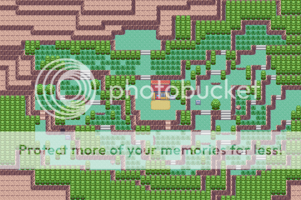
    Here is another map I have made for my hack.

    Hack: Sky SD
    Base ROM: FR
    Map Name: Edge Town
    Comments: Bottom Left of the Town is bland because that is where an event happens, palettes need some work I know, and I know that there is a sign facing a tree :L that is there to stop you being able to see the border block behind the transport-building thingy (i dunno the word for it)
    Spoiler:
     

    Deokishisu

    Mr. Magius
  • 990
    Posts
    18
    Years
    Just so you all know this is a RATING/REVIEW thread, not a bash that map thread. Just sayin..

    OMG, look here, this isn't a thread to tell people with bad maps that everything's "peachy perfect!" Your map had errors, your style is flawed, and they bashed you for not accepting their valid criticism in an entirely rude and inappropriate manner, not your map. Grow up, open your eyes, or just shut up and leave. It'll be better for you that way.
    (And if you want to call me an "ass" for this, like you did the people who took the time and effort to actually rate your map so that you could improve, so be it.)
    Hack: Sky SD
    Base ROM: FR
    Map Name: Edge Town
    Comments: Bottom Left of the Town is bland because that is where an event happens, palettes need some work I know, and I know that there is a sign facing a tree :L that is there to stop you being able to see the border block behind the transport-building thingy (i dunno the word for it)
    Spoiler:

    I see a few problems with this map. First of all, the bottom-most house has only a one tile clearance from the trees. That should generally be avoided, as it's unnecessarily restrictive for the player. Moving the house up a tile would solve that. However, you may also want to move it a little to the left as well, to prevent it from getting in the way of your gatehouse. Speaking of the gatehouse, it lacks windows. I believe that they're under the gym tiles on the default tileset. It'd look much better with some windows. Your mountain is a little bland. Might I suggest varying the shape of it a bit more? That sign and bush blocking off the border look a bit awkward as well. Perhaps putting a regularly-sized tree there instead and putting the Trainer Tips sign in front of that would look better. Grass in towns is generally something to avoid, but it's your call here. Your town also lacks paths, which makes it quite bland, and almost empty looking. You may want to add a few more flowers as well, but not too much! It's easy to overdo it with the foliage. Your trees don't have shadows, but I'm not sure if that's due to the tileset you're using. If you do have tree shadows, please use them. It makes the map look much better. I really love the concept for this map, and I love the palettes you have for everything on the map, except the house. I'm not sure exactly what needs to be done to it, but it looks a bit awkward as is. It might just be me though, so leaving it is perfectly fine. Good work overall, I'd say.

    5.5/10.
     

    altariaking

    Needs NO VMs...
  • 1,087
    Posts
    14
    Years
    @Orinjmate
    the bottom left looks really empty, the mountain is too rectangular, and instead of the sign facing the tree I think you should add another tree there and move the PC to the empty space.
    6/10

    Spoiler:

    Credits too-
    PHO
    Green Charizard
    Peyi
    rata
    for tiles.

    Edit: This is offtopic, but does anyone know where I can find some HG/SS Grass and Sideways Stairs?
     

    Resultz

    All- round Poke-Whizz
  • 583
    Posts
    14
    Years
    Spoiler:


    Hillsion City

    Ignore the stray pokeball and the red event box.
    @Altariaking

    I like your style, but the mart and houses stick out A LOT.
    its a nice map, but because of that, 8/10
     

    Rabbit

    where is my mind?
  • 484
    Posts
    15
    Years
    Spoiler:

    Credits too-
    PHO
    Green Charizard
    Peyi
    rata
    for tiles.

    Ah, God, the tiles...they burrrrn. x_x

    Well, the town is a pretty decent town. The shape is alright, and there's a bit of variety, but there are some odd gaps between things, like above the top left house, and between four trees on the right. I would put a bit more space between the border and bottom house, since right now it's just a two-tile path.

    The mountain area is completely unreachable, which is strange because you've put so much detail there. Did you forget to make a path to it?
     
  • 780
    Posts
    14
    Years
    Spoiler:


    Hillsion City

    Ignore the stray pokeball and the red event box.
    Ooooooooookay. This place is... squarish. The lake's square, the trees are square, even the mountain's square! there will be border errors down the bottom. I also spot a tile errors on the mountain.
    Rating: 2.5
    Work on your natural mapping, and avoid tile and border errors.
     

    dragoniteuser

    The dragon master
  • 1,696
    Posts
    14
    Years
    Spoiler:

    Credits too-
    PHO
    Green Charizard
    Peyi
    rata
    for tiles.

    Edit: This is offtopic, but does anyone know where I can find some HG/SS Grass and Sideways Stairs?

    God look at those colors, my eyes are bleeding! That green is so bright it could be used for making x-ray at the local hospital! PLEASE use some more contrast and just kill us all with it! Plus the houses are soooo different from the mart they look like they're from another world!
    Rating 1.1/10
    sorry but this is one of the worst maps I've seen in my life!
     

    Tropical Sunlight

    The Faltine
  • 3,476
    Posts
    16
    Years
    Spoiler:


    Hillsion City

    Ignore the stray pokeball and the red event box.
    @Altariaking

    I like your style, but the mart and houses stick out A LOT.
    its a nice map, but because of that, 8/10
    I adore your mapping style a lot.
    This map has no flaws except maybe the small lake that doesn't do anything except being in the way, so maybe you could put a tree instead. I also don't understand what that Pokeball is doing there XD

    I also just spotted an abnormality at the mountains. At the top of the map, the mountains are done incorrectly.

    So, if I had to rate it, it would be 8/10. Good job.
     

    Chaos190

    Likes to Hack Pokemon
  • 752
    Posts
    14
    Years
    • Seen May 25, 2016
    @Orinjmate
    Ok with some errors you should correct.

    You should give your mountain some more shape. Because, it looks more natural looking. Mountains aren't the same but really different. I like the cabins, gives it more of the forest outlook. Try adding trees to parts of the town because trees sometimes don't grow in lines. There was no need for the grass patch in the back. All towns don't have grass patches. Add more flowers and bushes for this town but don't over do it.

    Rating 4/10
     

    Master Terrador

    Mostly Dead
  • 1,032
    Posts
    15
    Years

    Spoiler:

    Credits too-
    PHO
    Green Charizard
    Peyi
    rata
    for tiles.
    Time to put on the eye bleed palette goggles.

    Its decent, aside from the horribly bright green palette and the error in the bottom right corner. Why make the mountain unaccessable though if you put details into it? Also, it strikes me odd that there is no pokemon center, if there is a mart why no PC?

    Bottom line: Decent map, but the palette is bad. BAD.

    4/10
     
  • 193
    Posts
    15
    Years
    • Seen Aug 3, 2013
    @Orinjmate
    the bottom left looks really empty, the mountain is too rectangular, and instead of the sign facing the tree I think you should add another tree there and move the PC to the empty space.
    6/10

    Spoiler:

    Credits too-
    PHO
    Green Charizard
    Peyi
    rata
    for tiles.

    Edit: This is offtopic, but does anyone know where I can find some HG/SS Grass and Sideways Stairs?

    well the colour of this map are confusing me they dont look good =(
    0/10 ...


    I just have a couple more maps that I'd like honest opinions on. Please be brutally honest. I don't want any "OMG I think your map is good" comments.

    Caution: Some of these maps are somewhat large.

    Spoiler:

    Spoiler:

    Spoiler:

    Spoiler:

    PRETTY NICE MAPS DUDE !!!!
    They rock if i had to rate them 10/10!!!!


    here is a map from me =)
    ROUTE 702 OF POKEMON DAWN STAR
    Map Rating/Review Thread
     
    Last edited:

    tetrix1993

    Quality-Map Hacker
  • 35
    Posts
    14
    Years
    • Seen Aug 31, 2011
    HI!

    Here are my maps I created from my hacked ROM. I got several other maps as well, but I picked the best few.

    PLEASE RATE FOR EACH ONE OF THEM! :)

    Sector B-02
    Spoiler:


    Sector C-05
    Spoiler:


    Sector C-06
    Spoiler:


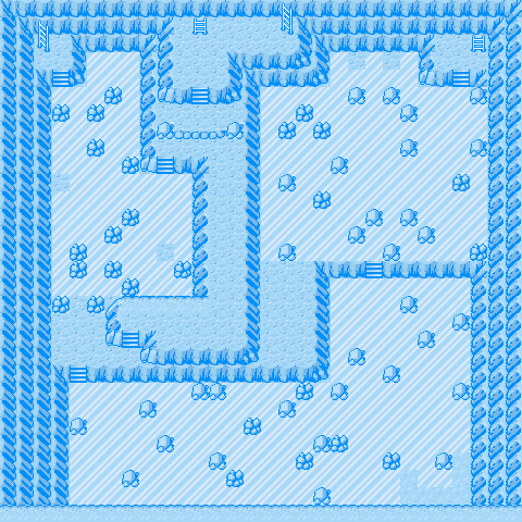
    Ice Cave
    Spoiler:


    PLEASE RATE FOR EACH ONE OF THEM! :)
     
    Last edited:

    altariaking

    Needs NO VMs...
  • 1,087
    Posts
    14
    Years
    is this the tile/palette rating thread or the map rating thread? because almost everybody who has rated my map has only rated the tiles and nothing more.
    1/ there will be stairs when I find some sideways stairs
    2/ there is a mart and no pokecentre because shut up.
    3/ rate the map, not the tiles!

    @tetrix1993
    I like all of them, and honestly can't find anytjing bad 10/10

    Edit: Here is a map I just finished, mabye this time people will rate the map and not just say 0/10 because of the tiles, or say "This is the worst map I've ever seen!" and flame me because of the tiles

    Spoiler:
     
    Last edited:

    tetrix1993

    Quality-Map Hacker
  • 35
    Posts
    14
    Years
    • Seen Aug 31, 2011
    is this the tile/palette rating thread or the map rating thread? because almost everybody who has rated my map has only rated the tiles and nothing more.
    1/ there will be stairs when I find some sideways stairs
    2/ there is a mart and no pokecentre because shut up.
    3/ rate the map, not the tiles!

    @tetrix1993
    I like all of them, and honestly can't find anytjing bad 10/10

    Edit: Here is a map I just finished, mabye this time people will rate the map and not just say 0/10 because of the tiles, or say "This is the worst map I've ever seen!" and flame me because of the tiles

    Spoiler:

    It is quite okay, but I don't like the tiles. If I were to rate about the map, not the tiles, it is quite okay. Rating: 6/10. Oh yes, if this map were to put into a game, I wonder how the player jumped through the double ledges near the centre of the map.

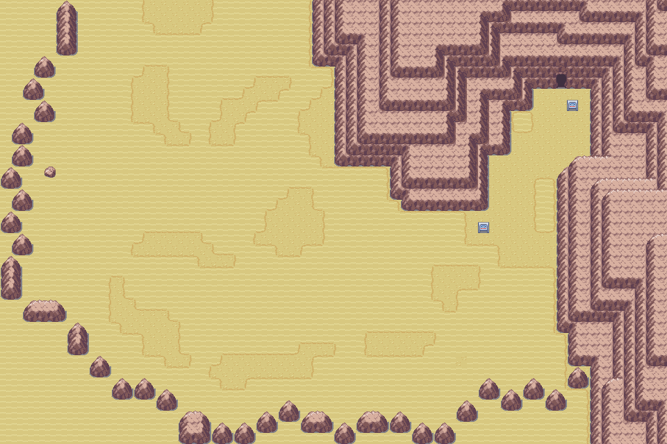
    My desert map:
    Sector D-02
    Spoiler:


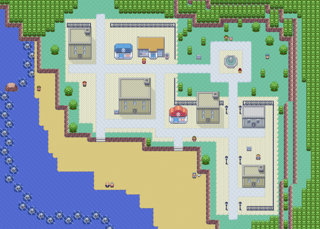
    Beachside City
    Spoiler:
     
    Last edited:

    Orinjmate

    The Orinj of the Mate
  • 120
    Posts
    13
    Years
    My desert map:
    Sector D-02
    Spoiler:

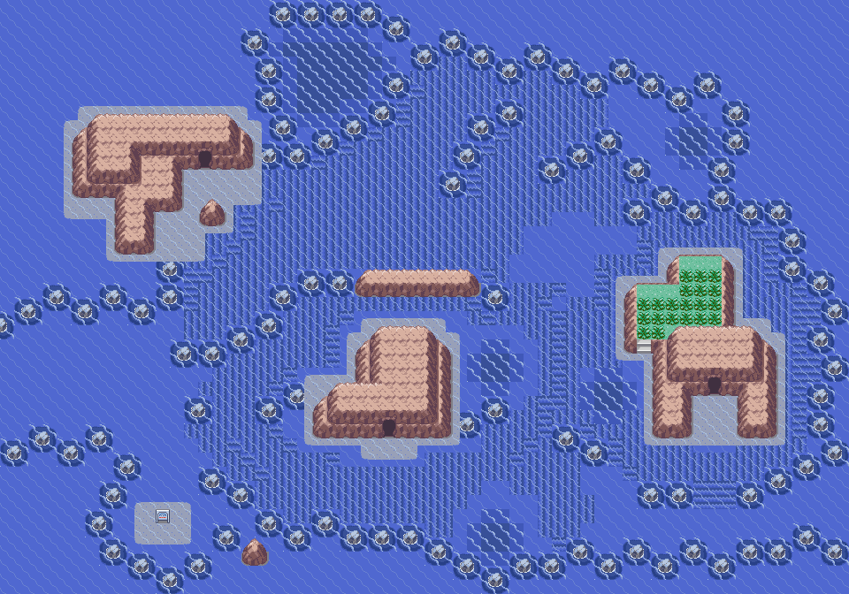
    Ok, to start off with, the mountains are done very well. however, the map is FAR too big and bland, and also the small rocks blocking you off from going to the edge of the map don't look right, you should just change them to mountains.

    Overall - 3.5/10


    -------------------------------------------------
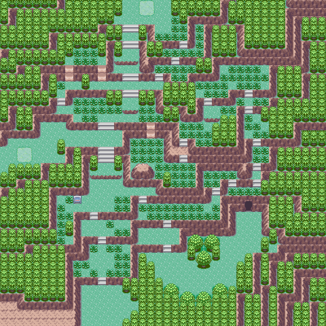
    I re-did a map i put up a while back called Path 6

    Hack Name: Sky SD
    Base Rom: FR
    Map Name: Path 6
    Comments: I redid the map with some of the suggestions, I changed the tree's, flower's and grass's palette and I also made them less rectangular and included the round ones into the border block trees, I also got rid of the pond and the ledges.
    Spoiler:
     

    Resultz

    All- round Poke-Whizz
  • 583
    Posts
    14
    Years
    It is quite okay, but I don't like the tiles. If I were to rate about the map, not the tiles, it is quite okay. Rating: 6/10. Oh yes, if this map were to put into a game, I wonder how the player jumped through the double ledges near the centre of the map.

    My desert map:
    Sector D-02
    Spoiler:


    Beachside City
    Spoiler:

    Both of your maps are far too boring, and open.
    Had to say it. you do not need a 60x60 map or bigger for a plain desert, add some more features like some more mountains or a cave or an oasis.. that just shows lack of imagination.

    the second one suffers the same problem although reclaiming some of its dignity by having a nice layout. theres just too much open space.

    3/10-First- Im finding it hard to see a good point
    6/10 second-you dont need that big a map for what should be a small town.


    now for mine.
    Spoiler:

    Just to prove i can map naturally and not square.

    Sheerface town.
    as you can tell i like towns and cities.
     

    Rabbit

    where is my mind?
  • 484
    Posts
    15
    Years
    Beachside City
    Spoiler:

    I like what you've done with Rustboro's tiles. I never liked that city because it was so plain and rectangular, and the fence was completely redundant. Your fence surrounds a park, which gives the city a whole new shape and feel. I especially like the way you've used the city tiles to integrate the park into the rest of the city. The park does seem a little empty, though. The trees in it are sparse and randomly scattered. Why not put them in clumps, to give the park a definite shape?

    The 2x2 trees you've added to the map look rather out of place. They're always isolated, never in rows or clumps. You should either use more of them, adding them to the border of the map, or settle for just using 1x2 trees.

    I like that you've added a beach, but it seems too large and empty. It's even larger than the beach on Route 104, and there's nothing interesting on it - no Beach Shacks, no umbrellas. If it serves no function, I think it could be cut in half without the map losing anything.
     
    Status
    Not open for further replies.
    Back
    Top