• Our software update is now concluded. You will need to reset your password to log in. In order to do this, you will have to click "Log in" in the top right corner and then "Forgot your password?".
  • Welcome to PokéCommunity! Register now and join one of the best fan communities on the 'net to talk Pokémon and more! We are not affiliated with The Pokémon Company or Nintendo.

Map Showcase and Review Thread

Status
Not open for further replies.

TBM_Christopher

Semi-pro Game Dev
448
Posts
14
Years
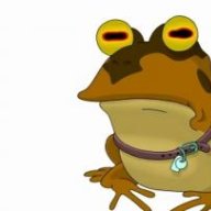
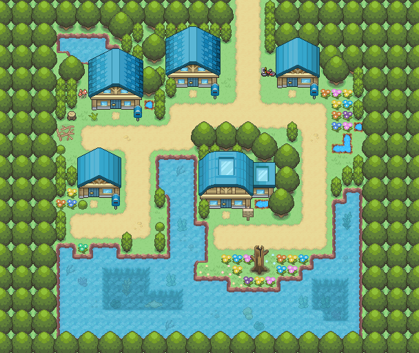
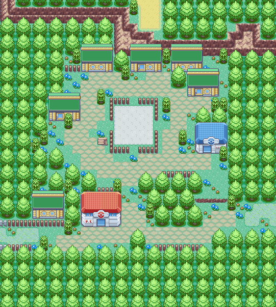
Hey everyone, so so far a most of the screenshots I've been showing have been leaning mostly on the 'showcase' side of this thread, but this time I've got one that I'm actually not very sure about.

Spoiler:


It's called Tansou City, home of the second gym (Rock type). The geometric design of the city was supposed to reflect this, but I'm thinking that perhaps it looks a bit plain. Thoughts? They can be non-specific too, just about the feel of it. I know sometimes it's hard to pick what you don't like in a map other than it just might feel 'off'.
I think the mountains are just too regular. Duplicate the map, and try making them a little jagged when going up a layer, and see if you like that. It'll probably remove the geometric design you had in mind, but I think it'll add new life to the map.
 
1
Posts
8
Years
  • Age 28
  • Seen Sep 26, 2015
I just started learning in Pokemon Essentials and I created starting town for my game. I don't like it too but I don't know how to improve it.
 

Mellan

Pokémon Chion Developer
85
Posts
9
Years
I just started learning in Pokemon Essentials and I created starting town for my game. I don't like it too but I don't know how to improve it.

It is not bad for a first try. Maybe adding more variety would give a better look to the map. For example, don't make the dirt path too straight and outdistance more the houses with the red roof. Also, that fence doesn't make any sense placed there. Fill that empty space with some decorative tilesets instead.
 

Aljen

The Lost Boy...
125
Posts
10
Years
~^^~ This is one of the maps in my Project ~^^~ the Alpha Avenue. What do you guys think?
Spoiler:
 
Last edited:

TBM_Christopher

Semi-pro Game Dev
448
Posts
14
Years
~^^~ This is one of the maps in my Project ~^^~ the Alpha Avenue. What do you guys think?
Spoiler:

You've nailed the ground in terms of detail, but the tiles you're using are meant to convey that same amount of detail underwater. I'd recommend either switching to opaque water or adding rocks and such under the water's surface
 

Inky

:pleading_face:
789
Posts
11
Years
  • Age 25
  • Seen Apr 26, 2024
EDIT: Ok, so I've updated my Start Town with a different Tileset and a few new / changed details. The old map is below for comparison! Again, water looks odd, but it looks different when moving.


Arceae%20TownNew_zps6dfeocci.png


Older Version:
Spoiler:
 
Last edited:

TBM_Christopher

Semi-pro Game Dev
448
Posts
14
Years
CcC69rX.png
Here's a WIP view of the starting town from my current game project, Pavor Nocturnus(Not a Pokemon game, but still a JRPG-inspired game). It uses voxel graphics set on a grid, coupled with the 4th/5th generation Pokemon style of 2D sprites in a 3D environment(it's currently an isometric view in the editor so that I can see the entire map as I work). The large red squares are there for me as marks as to where NPCs or interactable objects(such as the town sign or the phone booth) will be standing, the red-and-white striped market stall is a fireworks stand where the player can buy weapons, and the block in the northeast corner is going to be a restaurant. After visiting the restaurant, the player can order takeout(healing items) from any phone booth they find while playing the game.
 

Inky

:pleading_face:
789
Posts
11
Years
  • Age 25
  • Seen Apr 26, 2024
Another map I've been working on lately (still WIP), which is a Forest area. I'm working on some sort of overlay so it looks like light is breaking through the trees, but that can come later. Feedback is appreciated!


OrchidWoods_zpsudxcxlgl.png
 
Last edited:

KillerMapper

Helix Follower
200
Posts
9
Years
I like it. But why did you stop putting trees with different shades of color on the right and down area? It's a good way to get some variety in the trees.
 

Inky

:pleading_face:
789
Posts
11
Years
  • Age 25
  • Seen Apr 26, 2024
I like it. But why did you stop putting trees with different shades of color on the right and down area? It's a good way to get some variety in the trees.

Thanks! Yeah I'm not done with the trees yet, just wanted to nail the layout and such first, will certainly be filling that side of the map in later on
 
63
Posts
15
Years
  • Seen Jan 11, 2022
Arceae%20TownNew_zps6dfeocci.png

Older Version:
Spoiler:

To be honest I prefer the original to the newer one. It seems more lively, and the trees are less droll.
 

Yū Narukami1

Merovin Incarnate
9
Posts
8
Years
It has been a long time, but I've been playing around recently and I think I will soon be ready to return to the realm of making fan games. Here's an example of a map I've been making at the moment, looking for some feedback and criticism if possible please!

bxeYY5t.png
 

TBM_Christopher

Semi-pro Game Dev
448
Posts
14
Years
It has been a long time, but I've been playing around recently and I think I will soon be ready to return to the realm of making fan games. Here's an example of a map I've been making at the moment, looking for some feedback and criticism if possible please!
[Snipped for page width - TBM_Christopher]
I'm a huge fan of your style there, and couldn't find anything large to nitpick. That said, I think that your water autotile doesn't look so good in the areas where it's only 1 wide, so you may want to avoid that narrow tail on the south end of the pond there, and you may want to explore using some additional shades of stone for your mountain(if you have them) just to make it 'pop' a bit more.
 

Yū Narukami1

Merovin Incarnate
9
Posts
8
Years
I'm a huge fan of your style there, and couldn't find anything large to nitpick. That said, I think that your water autotile doesn't look so good in the areas where it's only 1 wide, so you may want to avoid that narrow tail on the south end of the pond there, and you may want to explore using some additional shades of stone for your mountain(if you have them) just to make it 'pop' a bit more.

Thank you very much! Yeah I see what you mean with the water, I am considering changing a lot of that bottom left corner. Also great shout with the stones, unfortunately with this tileset I don't have any but hopefully when I can get a newer set of tiles this is something I'd be able to implement. Thanks again for the feedback. :)
 
Status
Not open for further replies.
Back
Top