You are using an out of date browser. It may not display this or other websites correctly.
You should upgrade or use an alternative browser.
You should upgrade or use an alternative browser.
Signature of the Week
- Thread starter /Circa
- Start date
- Status
- Not open for further replies.
More options
Who Replied?EarthsVisitor
Jolly Good
- 385
- Posts
- 18
- Years
- New Jersey
- Seen Sep 18, 2017
For your entertainment, I will present a short journal on my signature of the week process, hopefully I will do this each week.
Sig of The Week #44 - Brand
Well, first of all, the first two things that popped into my mind with this topic, was "branding a cow" and "brands" more specifically with advertising.
My first idea came with a fusion of these two ideas. I wanted a guy who was ripping off his shirt, revealing some of his chest, with some type of logo brand, branded onto his chest, with the text. "Advertising, *insert witty comment about advertising here.*
So, I started on this idea. I found a picture. More specifically.
https://www.supermanhomepage.com/images/superman-returns11/shirt-rip-skin.jpg
I began, by imprinting the coca-cola logo on him, and tried several different things. Unfortunately, I did not like where the piece was going, and so, cancelled it, and went with a new idea.
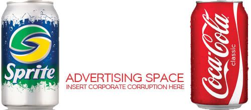
My second idea, was essentially a battle between two very popular brands, "Coke" and "Sprite" having them clash, and their colors collide in the center. It got about this far, when I decided, I actually hated this idea.

Not much going on there. It's actually not bad just like that, I didn't want to destroy it anymore, but I wanted something of higher graphic capabilities.
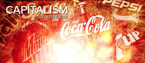
So, I came upon my 3rd and final idea. I decided to get a bunch of brands, and capitalize on and idea that I actually had before this competition, which was about capitalism.
So, I started getting together a bunch of logos, and meshing them together, with lots of grunge, and smudging, and color balance, etc, etc. At first, there were things like McDonalds, and Geico, but I didn't like that look of them. So I decided to stick with Soda, cause I really like the pepsi and coca-cola. Found the rest, and came up with a semi-decent peice.
Unfortunately, the lighting at the bottom, was much too strong, and the peice was too big anyway. So, I cropped it out, to make it attractive, I do this alot. I make a big peice, and crop out a small portion of it. I suggest it to you all.
It looked like this before cropping.

and, then I came with my final piece, which can be seen on the SoTW thread.
Thank you.
- EarthsVisitor.
Enjoy!
Sig of The Week #44 - Brand
Well, first of all, the first two things that popped into my mind with this topic, was "branding a cow" and "brands" more specifically with advertising.
My first idea came with a fusion of these two ideas. I wanted a guy who was ripping off his shirt, revealing some of his chest, with some type of logo brand, branded onto his chest, with the text. "Advertising, *insert witty comment about advertising here.*
So, I started on this idea. I found a picture. More specifically.
https://www.supermanhomepage.com/images/superman-returns11/shirt-rip-skin.jpg
I began, by imprinting the coca-cola logo on him, and tried several different things. Unfortunately, I did not like where the piece was going, and so, cancelled it, and went with a new idea.
My second idea, was essentially a battle between two very popular brands, "Coke" and "Sprite" having them clash, and their colors collide in the center. It got about this far, when I decided, I actually hated this idea.

Not much going on there. It's actually not bad just like that, I didn't want to destroy it anymore, but I wanted something of higher graphic capabilities.
So, I came upon my 3rd and final idea. I decided to get a bunch of brands, and capitalize on and idea that I actually had before this competition, which was about capitalism.
So, I started getting together a bunch of logos, and meshing them together, with lots of grunge, and smudging, and color balance, etc, etc. At first, there were things like McDonalds, and Geico, but I didn't like that look of them. So I decided to stick with Soda, cause I really like the pepsi and coca-cola. Found the rest, and came up with a semi-decent peice.
Unfortunately, the lighting at the bottom, was much too strong, and the peice was too big anyway. So, I cropped it out, to make it attractive, I do this alot. I make a big peice, and crop out a small portion of it. I suggest it to you all.
It looked like this before cropping.

and, then I came with my final piece, which can be seen on the SoTW thread.
Thank you.
- EarthsVisitor.
Enjoy!
THIRTY-SIX
Banned
- 8,174
- Posts
- 19
- Years
- Seen Nov 18, 2015
The first image actually looks better, more like an advert.
EarthsVisitor
Jolly Good
- 385
- Posts
- 18
- Years
- New Jersey
- Seen Sep 18, 2017
Yeah, probably, but I don't think it's fair, because what work would I have actually done?
The brands themselves did all the work by being popular and providing those images.
I just added text. :]
The brands themselves did all the work by being popular and providing those images.
I just added text. :]
THIRTY-SIX
Banned
- 8,174
- Posts
- 19
- Years
- Seen Nov 18, 2015
"Text" is also an art form. Dx
And I suppose you could vector the cans if you think you haven't put any effort into it, though graphics isn't always about the effort you use.
And I suppose you could vector the cans if you think you haven't put any effort into it, though graphics isn't always about the effort you use.
THIRTY-SIX
Banned
- 8,174
- Posts
- 19
- Years
- Seen Nov 18, 2015
Nah, I think it needs a white negative space rather than a random PC theme bg colour. Might ruin it for people using dark skins.
Zebra Thunderhead
the avenger
- 3,159
- Posts
- 16
- Years
- Age 32
- Massachusetts
- Seen Jul 3, 2013
Lawl, finally entered. Wanted to do it for the luls.
Aizuke
[b]long sword style[/b]
- 3,025
- Posts
- 16
- Years
- Canberra, Australia
- Seen Nov 6, 2015
..What the hell to the flashing out of focus entry. @_@;
Aizuke
[b]long sword style[/b]
- 3,025
- Posts
- 16
- Years
- Canberra, Australia
- Seen Nov 6, 2015
It took me a while to realise too. XD; Though I'm half asleep here.
But omg, Hello Kitty converses exists? 8D
But omg, Hello Kitty converses exists? 8D
THIRTY-SIX
Banned
- 8,174
- Posts
- 19
- Years
- Seen Nov 18, 2015
CME's entry has the same concept as mine, but with the it's drawn crappy on purpose feel to it. Dx
I thought she hated that style. xD
I thought she hated that style. xD
Zebra Thunderhead
the avenger
- 3,159
- Posts
- 16
- Years
- Age 32
- Massachusetts
- Seen Jul 3, 2013
No, I normally don't go for the kind of style I did in my entry just because it's always for the luls and this is one theme where I can to jump on the bandwagon for a little bit.
ruby
[span="howdy;partner"][/span]
- 1,390
- Posts
- 20
- Years
- Seen Mar 27, 2024
-AdvancedK9- and Earthsvisitor have been disqualified;
Being named "Signature of The Week" the rules that would normally apply to a signature still do, yours exceeded the maximum width/height restrictions.
Kayashi's entry... Yeah.
I'm waiting on a theme from T2.
Being named "Signature of The Week" the rules that would normally apply to a signature still do, yours exceeded the maximum width/height restrictions.
Kayashi's entry... Yeah.
I'm waiting on a theme from T2.
- Status
- Not open for further replies.
