
ProGuava
ʇnoɥs puɐ ʇsıʍʇ
- 31
- Posts
- 13
- Years
- New Orleans
- Seen Mar 12, 2012
Pxl Piano!
This is my piano pixel art i created today! tell me what you think!

This is my piano pixel art i created today! tell me what you think!

Hello, um well this is really something for the 'spriters showcase' if you want to show individual pixel art.
If you really want to keep this thread open, you need at least 4 pieces of pixel art for a pixel thread.
~Kian


It looks very horrible :3
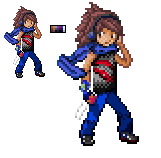
Black is pretty much exclusive to outlines in a pokemon style. There's a lot on the shirt and shoes and it makes it hard to distinguish where the pants (which are also quite dark) meet the shoes.
Alright, so I updated my pokemon trainer and tried to give him a more pokemon style of shading. I used less hues and I dithered the shirt quite a bit. I'm pretty sure It still needs a lot of work, but I'd like to get further criticism at this point. Thoughts?
I'm not sure what would be proper shading, but when I look at official art (pixel or otherwise) I sometimes see a pretty simple shading style.I require constructive criticism and SPPf is bad at giving it!
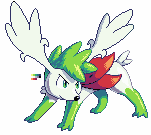
(Uh, I'm working on the left one, by the way. The right one was an old unfinished work that I put alongside it for comparison purposes when posting elsewhere.)
As you can see, it's mostly done except for the wings. I have zero idea on how to shade flat things that are angled away from the viewer. Can anyone knowledgeable in the areas of shading and how light works in general help me figure out where the shadows would go? I am at a loss. D:
~Chibi~


Alright, maybe it's too much to care about, but at least I want to keep activity up on the Showcase thread.
So I'll post these two animated OWs that I made a long time ago and wait for some comments:
You guys post your work as well! I'll be happy to feed your back any time!
- Arceus -
- Cutting tree -
Oh, my bad, I forgot to mention that the cutting tree is for my hack, and there need to be exactly 4 frames into the OW animation, so that's the pace in which it goes. Same is with the Arceus (only that I won't be using it-I made the animation smaller, meaning it's smoother).I think that cutting tree animation could use an extra frame or two to smooth out the animation.
And I'm just wondering why Arceus' face turns red. XD.


1. Simple enough I think it would be better if the sprite was facing the other way -.- however trollish that sound i think it would be easier for you because in pokemon the light source is coming from the upper left hand side, so if it was facing that way it may be easier to shade
2. I think the arms could be made a bit more definitive because they are a bit difficult to see
3. I think it's a wing and if it is than maybe it would suit the pokemon if it was smaller and on both sides?


