• Our software update is now concluded. You will need to reset your password to log in. In order to do this, you will have to click "Log in" in the top right corner and then "Forgot your password?".
  • Welcome to PokéCommunity! Register now and join one of the best fan communities on the 'net to talk Pokémon and more! We are not affiliated with The Pokémon Company or Nintendo.

The Graphics Rating Thread [READ THE FIRST POST. D:<]

Status
Not open for further replies.

Loki

x
6,829
Posts
18
Years
  • Seen Apr 4, 2024
Poke-Roy, read the rules before posting again. You will also recieve a PM detailing exactly what you missed in case you overlook this post. ^^

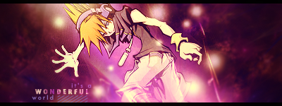
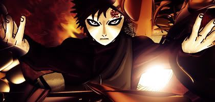
BreD; It looks really cool, though it's hard to pinpoint what it is. xD; The lighting is a bit too strong for my tastes, but the text is awesome, the pentooling and motion blurs are great, and the border is extremely well executed. Overall, this is a really good banner, even though I can't see much more of the render than the fact that it seems to be a sprite from a fighting game.

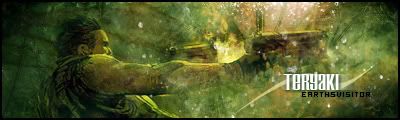
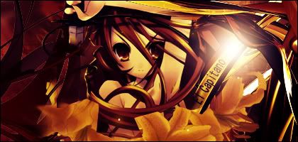
Shiranui; I love your banner. o_o The floating orbs are great, and everything flows in the right direction. The render's position is great, and the shiny explosion thing at the bottom fits perfectly. The border actually makes me think of like, a movie film strip. xD It's really cool. And the text! I envy your text skills like no other. :< The positioning is perfect and everything looks balanced. I give you an honest 10/10, because there's no doubt in my mind.

As for your Law of Ueki wallpaper, I love the cut-out effect, especially how it's not just a white cut out, but there's also a sort of drop-shadow black one. If you know what I mean. xD I think the flowery brushes don't really go with Law of Ueki art, but they look alright in this sense. However, the guy on the right, between his head and arm is like, a triangle thing of black. It probably wasn't intentional, but it looks really weird. xD; Just thought I'd point that out.

Shika-kun; Hmmmmm.... It's great, and I think it looks fine without text, but the problem here is, if you're not going to use text, don't make a spot where text would sit really nicely. That makes it feel as though something is missing. I'm referring to those white lines on the right. You probably should've lowered the opacity on the stars and arcs in the upper right hand corner, because like Utami said, they take the focus away from the render. (What's worse is that they don't even consist of the primary colors of the render, so it feels a little out of place.) I don't really like the border myself, but it doesn't detract from the quality of the banner overall. I like the checkered brush/(MOSAIC?!) in the back, it's a really nice touch. ^^

- - - -

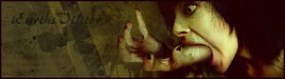
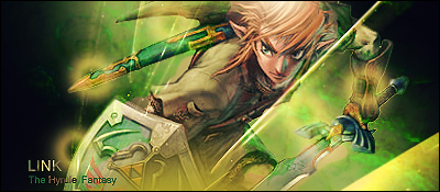
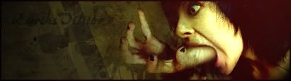
In the meantime, I have another banner that I don't really like very much. It was just me trying out the effects of my tutorial on a stock that didn't have entirely warm colors, to see if it would work. xD;; In the end, I had to add a texture on top because it looked too dark. *fish'd*

There's no border, because I don't add borders to things I'm not planning on using. xD; And for all you people who don't read, it's a stock, so if it isn't obvious, I didn't make the background. xD;;

Fans.png
 
1,594
Posts
17
Years
That's really cool Xenocrates! I love all the little hearts you put near the text. Your texts are always so great! The image is really cool too! And did you make that background or is it a stock? It matches so well! 10/10!

I'd like my banner rated please. I haven't added a border yet.

And Shiranui, I love that Law of Ueki wallpaper. Got one in 1280 x 1024? :P

EdwithC4Dcopy.png
 

Michii

as in Mishy
1,323
Posts
16
Years
To be honest, Relyt, I don't like that banner D:
The image is spectacular though. Did you do anything with the levels and balances?

The Text though is eww. I don't like it. You really should try going on Dafont or something. I'm not a fan of the text inside the lined box. The brushing is ok I guess, but it doesn't match the image well and there's not much difference with colors. What I would do is have some red involved to give it more balance. Right now it just looks like it's... IMAGE. BANNER. TEXT. There isn't much transition between the three.
 
1,594
Posts
17
Years
To be honest, Relyt, I don't like that banner D:
The image is spectacular though. Did you do anything with the levels and balances?

The Text though is eww. I don't like it. You really should try going on Dafont or something. I'm not a fan of the text inside the lined box. The brushing is ok I guess, but it doesn't match the image well and there's not much difference with colors. What I would do is have some red involved to give it more balance. Right now it just looks like it's... IMAGE. BANNER. TEXT. There isn't much transition between the three.

1) I did do stuff with the levels and balances.

2) I DO use Dafont...

3) You have no idea what you're talking about since there is absolutely no brushing involved.

Can I please have someone who knows what they're talking about rate it?
 

Loki

x
6,829
Posts
18
Years
  • Seen Apr 4, 2024
Can we please take criticism in stride? That was not okay.

If you can't handle the potential comments you might get, then don't post it. D: Simple as that. Adding a rule on that.

I agree with everything she said. The dashed box for the text is kind of too stand-outish, and you should've lowered the opacity of the back of the box. (The tan color). Also, there is one thing I disagree with Michii about; I really don't like that image at all. Dx It looks like Ed got a really bad sunburn. You should dodge around his face or something. The aloe of photoshop. The c4d doesn't blend with the render, nor does it really match since the render is kind of sandy and the c4d is metallic, and there's really no blending at all. No blending, to me, is applied best and only when the background is vector-ish. The scanlines would also be better if it incorporated Ed, instead of just the background. I think the font is fine, but the dotted box really takes away from the focus. The empty spot in the text box bugs me a little too. And by brushing, I believe Michii's referring to the background, the darker bits over the tan, which I also believed was brushing before you mentioned it wasn't.

I don't know if I "know what I'm talking about" but don't be so rude. If you don't like the comments, just ignore them. Adding fuel to the fire really only gets you in hot water, so unfortunately the next time you act so rudely towards another member in the G&P, I'll have to give you an infraction.

And no, I didn't make the background to the banner I posted, I said it was a stock, not a render. xD But thank you for the compliments.
 
Last edited:

EarthsVisitor

Jolly Good
385
Posts
17
Years
Okay, no one posted in front of me, but I will go back to a sig I wanted to comment on.

Shiranui said:
Hmm... Rate my latest banner, I guess:

nekubanner-3.png


I kind of fell in love with the outcome, but I dunno.

Now don't get me wrong. It looks, pretty good. Not amazing, but pretty good. Generally better than the stuff I make atleast.
My only peeve is that this looks so clique. Now for this forum, it might not be, but I've been to many Graphic Websites, and staff of many. I'm not that good, but.
This is unoriginal. I've seen sigs like this thousands of times. It almosts look like you got this idea straight from a tutorial.
Maybe you didn't, but still, you should develop your own style.
I might be completely wrong, you might have never seen a sig like that before, but that is my opinion.
And please, I'm really not trying to start a fight or insult you at all. You got skills, I can see that, it's just what I see in that signature, particulary.
:)
<3

and for the next rating I give:
HandMouth2.jpg

HandMouth.jpg


And just to show, that I can be unoriginal and clique too. Here's a typical signature:
TeryakiVer.jpg
 
1,594
Posts
17
Years
Okay, no one posted in front of me, but I will go back to a sig I wanted to comment on.


Now don't get me wrong. It looks, pretty good. Not amazing, but pretty good. Generally better than the stuff I make atleast.
My only peeve is that this looks so clique. Now for this forum, it might not be, but I've been to many Graphic Websites, and staff of many. I'm not that good, but.
This is unoriginal. I've seen sigs like this thousands of times. It almosts look like you got this idea straight from a tutorial.
Maybe you didn't, but still, you should develop your own style.
I might be completely wrong, you might have never seen a sig like that before, but that is my opinion.
And please, I'm really not trying to start a fight or insult you at all. You got skills, I can see that, it's just what I see in that signature, particulary.
:)
<3

and for the next rating I give:
HandMouth2.jpg

HandMouth.jpg


And just to show, that I can be unoriginal and clique too. Here's a typical signature:
TeryakiVer.jpg

One kid spazzes and everyone worries. xD

But anyways. I owe a personal apology to Michii and everyone who had to see that. I'm truly sorry I'm just having a bad day, I should not have taken it out here. I'm happy for being warned because I know that because I'm not feeling good, others shouldn't need to see it. From now on I make a vow, I will not do that ever again and, again, I'm sorry.

Sorry for all the sorries, but I felt it was necessary.

Don't worry, this post is not spam.

EarthsVisitor, is that a hand coming out of a mouth?! That's really freaky, and looks odd, but I love the way the signature blends altogether. I can't really read the font though, but just because I made few parts of it out, I found out it was your username. Although it looks creepy to me, it's good. 8.5/10.

The second one is awesome. I love the sort of dissolved effect you gave it. And the colors are really well done. 9/10. Again though, the font is hard to read, the EarthsVisitor text.

And now, don't worry, I'm ready for it.

Hitsugayacopy.png


Be as harsh as you please. No talk-back from me, I promise.
 

Loki

x
6,829
Posts
18
Years
  • Seen Apr 4, 2024
Don't worry, I don't need to be harsh this time... -as- harsh. xD

- I don't like how Hitsugaya's skin is the same color as the background. Dx I think just lowering the Saturation would've helped the color scheme a lot better.
- I don't like the text positioning. I don't know if you do this or not, but I put every word of my text on a different layer, so that I can move them around wherever I please. The text should flow a little more diagonal to conform to his arm or something.
- I don't like how the

+ The brushing is cool, especially the way you positioned it.
+ The brushing helps blend the render very nicely.
+ Though it could be lowered a little more in terms of opacity, I like the reflection of the render.
+ The border is alright, since the colors fit.

And, just clearing things up you weren't warned. You got a verbal warning, which means I was just telling you not to do it again. The new infraction system forces me to send a PM, so I'm sorry if that was confusing. xD; If you do it again, THEN you'll get an official infraction, which is the equivelant of what used to be a warning.

I know, it's confusing, and I don't really get it myself either. xD;; Just, bear with me while I sort out which words to use for warning and verbal warning.

(The reason I gave you a yellow-card infraction though is so that if Sorano see's you doing it, she won't be like, "Oh, first time. I'll just tell him not to do it again." Or something like that, y'know?)
 

Uryū Ishida

Hishoku no Sora
443
Posts
16
Years
  • Age 30
  • Seen May 30, 2009
@relyt (since xenocrates didnt post one and i wanted to rate relyt's)
9.5/10 for me =P i like how you used your strokes..did you use luminance on your render?
i don't know much about the text but i reckon its fine there..but im not much of a critic am i?

heres one i did..this is my first ever proper banner (one that i didnt copy a background for)
7ws876d.png
Please go as harsh as you want..im still learning and i want to be better so i really need constructive critisism...BTW i thought i'd let you know that i made this in GIMP
 

Shika

F o r e s t Wizard
1,192
Posts
17
Years
  • Age 30
  • Seen Sep 18, 2009
@Demedian: I don't know if the render was bad or you used Dissolve (I don't know if there's one in GIMP), the render didn't blend in the background IMO
For the background, some places are bright and some are really dark. I don't like the 'silence' text too.
@Shika-kun

The right side doesn't blend well into the left side. I think you overdid it on the effects. All those extra effect really take your eyes away from the focal point.
Shika-kun; Hmmmmm.... It's great, and I think it looks fine without text, but the problem here is, if you're not going to use text, don't make a spot where text would sit really nicely. That makes it feel as though something is missing. I'm referring to those white lines on the right. You probably should've lowered the opacity on the stars and arcs in the upper right hand corner, because like Utami said, they take the focus away from the render. (What's worse is that they don't even consist of the primary colors of the render, so it feels a little out of place.) I don't really like the border myself, but it doesn't detract from the quality of the banner overall. I like the checkered brush/(MOSAIC?!) in the back, it's a really nice touch. ^^
Hee Hee. Agreed. I accidentally clicked on the canvas while I chose those stars =O And I thought it was on the new empty layer. >D Because I had to go, so I just saved it. When I continued, as you can see. It's there like that. D: I tried to smudge or blur that, but both failed so it's there xD For the brush, it's not checkers, it's like silk ribbon texture or whatever. I lowered the opacity to make it look like what you guys can see now.
 

Uryū Ishida

Hishoku no Sora
443
Posts
16
Years
  • Age 30
  • Seen May 30, 2009
@Demedian: I don't know if the render was bad or you used Dissolve (I don't know if there's one in GIMP), the render didn't blend in the background IMO
For the background, some places are bright and some are really dark. I don't like the 'silence' text too.


Hee Hee. Agreed. I accidentally clicked on the canvas while I chose those stars =O And I thought it was on the new empty layer. >D Because I had to go, so I just saved it. When I continued, as you can see. It's there like that. D: I tried to smudge or blur that, but both failed so it's there xD For the brush, it's not checkers, it's like silk ribbon texture or whatever. I lowered the opacity to make it look like what you guys can see now.
@shika-kun then render was noised..like i did with the background i thought it would make it blend..as for the light and dark places its like that because i used a gradient but i didnt think it would be like that..as for the text..what dont you like about it?
 

RYOUKI

survive the world.
3,252
Posts
17
Years
Relyt: Wow, For some reason... I wanna use it! Can I? -got KO'd-
The Banner is great, the gradient maps are awesome! I <3 it! <3333
BUT, Edward doesn't blend well, that's the problem with your banners.

EarthsVisitor: The Banners is good and certainly blend well, but then... it's too blurry, I can't even stare at it without having my head tilt.
Maybe go to Filter > Sharpen > Sharpen?

Relyt (again): The Text, doesn't match. Toushiro's charcter doesn't blend well with the banner, AND~ the text is... yuck. I'm sorry, but then. I don't like that banner very much.

Demidian: The Banner is good, but then I think you should make the image more uh, bigger, and yeah... I didn't notice there was a text in there. :/

Okay, enough criticism from a crappy person, please give criticism too. (Nothing Personal)

zeldaone.png


My Latest banner by request, I sort-a like it, and sort-a not.
 

Pikabloo

...
4,628
Posts
19
Years
  • Seen Sep 8, 2010
Now don't get me wrong. It looks, pretty good. Not amazing, but pretty good. Generally better than the stuff I make atleast.
My only peeve is that this looks so clique. Now for this forum, it might not be, but I've been to many Graphic Websites, and staff of many. I'm not that good, but.
This is unoriginal. I've seen sigs like this thousands of times. It almosts look like you got this idea straight from a tutorial.
Maybe you didn't, but still, you should develop your own style.
I might be completely wrong, you might have never seen a sig like that before, but that is my opinion.
And please, I'm really not trying to start a fight or insult you at all. You got skills, I can see that, it's just what I see in that signature, particulary.
:)
<3

and for the next rating I give:
HandMouth2.jpg

HandMouth.jpg


And just to show, that I can be unoriginal and clique too. Here's a typical signature:
TeryakiVer.jpg

Aah, it's alright. Any comments about my graphics are welcome ^^

I am aware that it looks un-original and totally not unique, seeing as I did just use a tutorial for this (I should have stated that in the post), and I have seen a bunch of banners similar to it in different graphics forums. But compared to most of my other banners, it is a bit better. And I guess I haven't even developed my own style of banners yet. Anyway, thanks for the comment.

And I think I'll rate your banners, just because xD

The first two are definitely awesome. Grungy and gruesome, I like it ^^ I prefer the second version, since it better highlights the focal point, and it looks like it's coming from the darkness xD The background is really nice with the spatters and everything, oh, and I especially like the colour choice. Definitely matches the whole theme of the banner. The text blends into the background a bit, which is okay, but then creates a gap in the banner. But over all, it's cool. It looks like it's missing something, though...

The last banner... Yeah, I can see why you say it's unoriginal. Regardless, it looks pretty awesome. The text looks quite good on this banner, and that veil of mist-type stuff is cool. But it looks like there's a fire coming from in between his arms/guns. I don't know what it is, but it looks sort of strange in some way. Lighting is good, colours are nice, and I like the floaty-spotty things o.o

Ryouki;; Oh, I wonder where you got that style from >.> Eheh. The main thing I don't like about it is the fact that the rendering is really rough, mainly towards the right side. I can see white-ish stuff around the edges. The flow of the background goes against the flow of the image D: But it doesn't look too bad, I guess. The orbs look really strange and, er, strange. You should have varied the sizes of the orbs more. Oh, and the C4D thing at the bottom right corner should be erased... And the text needs work. Are you using anti-aliasing on it, so it doesn't look too block-ish?
 

Uryū Ishida

Hishoku no Sora
443
Posts
16
Years
  • Age 30
  • Seen May 30, 2009
@ evrybody
i edited it taking ppls advice its in me siggy i still like the text recommend me one and ill use it though =]
 
1,594
Posts
17
Years
Guess I get a wildcard.

@Ryouki: I love the link banner, it's awesome. A few things though, it looks like there isn't another side of his sword near the hilt. For like the purple bat wing part that's supposed to stick out. The yellow spots seem a bit overdone on it. It still looks good though. 7.5/10.

@Demidian: The background is awesome, but the render looks like it was dissolved into it. If it had of just stayed normal without any effects it still would've looked good. The text is very nice and the silence part blends extremely well with the background. You used Visitor font. xD But yeah, try to not make the render blend too well into the background. 7/10.

Anywho, completely out of my style, here's one I made for Chikara. I made her a Winry banner and it looked kind of funny to me because I tried a whole new style. So I decided to make a better one, and in my opinion this one looks waaay better.

Chikaracopycopy.png


Please rate.

EDIT: Now that I look at it some more, I'm thinking if I should put more of an effect in the background.

EDIT2: Demidian, now that I see your signature, it's not dissolved anymore, and it looks amazing. Good job! Just do it to your avatar now. :P
 
Last edited:

Shika

F o r e s t Wizard
1,192
Posts
17
Years
  • Age 30
  • Seen Sep 18, 2009
@Demidian: I don't like it because it's font. Not because of your placement or whatever xD

@Relyt: I like it. The text positioning and decorating. Even though I think you often use outer glow effect. The brushing is nicely done, but it will look better if you lowered the opacity for the ones near the render's face. And I guess you used a 2 color border which is a no IMO. Anyway, well done ^__^

- - -

This is my newest one.
I used 2 space wallpapers which my friend gave me and i blended them. Brushed over them. But I like the Text most even though positioning sucks.

f_Pachicopym_b9ec63d.png
 
1,396
Posts
16
Years
@ Relyt: Thats a pretty nice banner you got there! Cho Kawai! Um the lighting and text placement is great. But the floral brushing is very good aswell. NICE JOB!!!

@ Shika-kun: I love the space background, and would love it even more if you made all of it yourself. But one thing that isnt clicking with me in this sig is the blending of your render. other then that everthing is pretty good. The text, I like alot, although it is not placed perfectly. NICE JOB!!

Okeydoke I made this yesterday, it is my first ever vector.
BapeVector.png

I randomly decided to vector bape.... here is the original image.http://i91.photobucket.com/albums/k284/andytoe/bape-ape-skyblue-blue-shoes.jpg

EDIT: And I just made this!
Shakugan.jpg
 
Last edited:

Loki

x
6,829
Posts
18
Years
  • Seen Apr 4, 2024
El Capitano; I love it! :O Though the lighting doesn't seem all too perfect in terms of the whole banner and the way it looks overall, it's definitely a nice touch. I've never been too big a fan on the whole 'yellow-ish' skin thing, but all the effects look really nice. I don't really like how the brush or whatever is outlined on the left side though, it's kind of... pixelly? Yeah. ^^; Is that a c4d on the right side? (It's really cool. xD)

Demidian; I actually really really like that text. xD I think it's a little odd how the reflection sort of cuts off randomly, but I think the font and positioning is awesome. The noise was indeed, pretty bad. xD; I agree that the noise did help the render blend, but you should've erased any noise over his face and body, and kept it strictly to the edges. Now it's not blended at all, and though it's nice to be able to see the render, it's kind of tacked on. xD; It's not terrible overall though. ^^
 
1,594
Posts
17
Years
El Capitano; I love it! :O Though the lighting doesn't seem all too perfect in terms of the whole banner and the way it looks overall, it's definitely a nice touch. I've never been too big a fan on the whole 'yellow-ish' skin thing, but all the effects look really nice. I don't really like how the brush or whatever is outlined on the left side though, it's kind of... pixelly? Yeah. ^^; Is that a c4d on the right side? (It's really cool. xD)

Demidian; I actually really really like that text. xD I think it's a little odd how the reflection sort of cuts off randomly, but I think the font and positioning is awesome. The noise was indeed, pretty bad. xD; I agree that the noise did help the render blend, but you should've erased any noise over his face and body, and kept it strictly to the edges. Now it's not blended at all, and though it's nice to be able to see the render, it's kind of tacked on. xD; It's not terrible overall though. ^^

Not trying to bother you or anything Xenocrates, but would you please rate mine? xD

@Shika-kun: I love that sparkle effect, those are brushes that were used to do that right? It looks amazing. The background looks cool too, kind of multicolored and different shades of blue. Pachirisu is so cute too!

@El Capitano: The banner is really good! I love the anime character, looks really cute. The text could be in a better position though. I love the color though!

EDIT: I made another one from within the time I posted this, and now. I'd like it rated please. :D

BestFriendscopy.png


And an avvy to go with it.

BestFriends.png
 
Last edited:
1,396
Posts
16
Years
@Relyt: Hokay this is a pretty sweet banner. I love the white brush that you used, that is now glowing. And I also think the vector brush you used under the render is sweet. Why did you take it out for your signature?

And here is a sig I just made. I bet it is kind of obvious I am trying to make c4d banners right now.
Gaarapwnage.jpg
 
Status
Not open for further replies.
Back
Top