• Our software update is now concluded. You will need to reset your password to log in. In order to do this, you will have to click "Log in" in the top right corner and then "Forgot your password?".
  • Welcome to PokéCommunity! Register now and join one of the best fan communities on the 'net to talk Pokémon and more! We are not affiliated with The Pokémon Company or Nintendo.

must update this soon

10,674
Posts
15
Years
    • Seen yesterday
    Well I have been in a high graphics slump as of late, so my recent stuff has been very low quality for my liking. My icons remain up to scratch as I find them really easy to make well. However, they bore me to death. So I'll just update with whatever ones I have uploaded for now. I also have an LP which I made today, an attempt at a new style perhaps? I think I failed. It was a present for someone however.

    For PrinceLegendaio

    must update this soon


    These were made for Patchisou Yutohru and I'm not sure if they're public, but anyway, here you are.

    100x100

    must update this soon
    must update this soon
    must update this soon
    must update this soon


    180x180

    must update this soon
    must update this soon
    must update this soon
    must update this soon


    500x500 profile picture

    must update this soon


    And finally, my current theme

    must update this soon
    must update this soon
     

    Stratos99

    Banned
    276
    Posts
    13
    Years
  • I absolutely love, love, love the vertical tags of charmander, squirtle, and bulbasaur. I don't have the time to do a thorough critique of anything right now, but I wanted to say that. You're very talented.
     

    moments.

    quixotic
    3,407
    Posts
    15
    Years
  • With the typo from your current theme, did you edit the 'k' yourself, or is it a special font?
    I'm guessing liquify filter or pentool. :P

    Anyways, all those icons / profile pic made for Patchisou look a bit blurry and think every one of them could go with a tiny bit of sharpening, but otherwise the colours are great!
     
    10,674
    Posts
    15
    Years
    • Seen yesterday
    It's a special font, but it's the concept I was pointing to more so, the I being on it's side like it had been killed etc. Also being red has significance.

    As for the icons, I tend to forget to sharpen sometimes, but I didn't notice it anyway, it's the colour. Just an error maybe, very minor and well, I'm not a big fan of sharpening high quality stocks anyway.

    First tag in almost 6 months =OOOOO
    So go easy on me

    must update this soon
     
    10,674
    Posts
    15
    Years
    • Seen yesterday
    Been working on some icons lately. I'll upload them soon. But for now, I did a little CSS typography.


    Z̹̱̬̜̞̦̝ͪͬ̿́ͬ͝͡͠͠ͅa̷̢̦͉̯̹͖͓͓̱̞̲̥ͣ͌͌ͣ͊͛ͪͩͫ̚͟͜͞ͅͅl͒̓͑̊ͩͯ̾ͤͯ̽͊͊̚̚҉͎̣͕͚̣g̛͓̳̲̮͓̲̠̗̦̜͉̠̺̬̘ͯ͋̃͐ͬ̋̎̈́͞ŏ̶͈̺̹̠͒̚͘͟͝ ̬̪̯̣̪͈̎ͯ͋ͮ̉̅̾̆̊ͬ̇̎͆́͡ị̷̸̖̙̙̜̣̳ͨ́̍̾̌̋ͯ̑̄̓̚͜͜͢s͙̥͖̺̙̣̪͔̹̗̖̈̉ͫ͊̾͞ ̽ͫ̿͒͌ͥ͐̑͆͌ͭ̀͏̴̢̧̣̭̯͚̺̘͖̠̺̘͓̜ḩ̵̼̖̳͕̌̈̀̈́ͫ̔ͦͪͣ͋̏̕͟͝ě̴̱̫̫ͯ̂̅ͣ̏̌ͫ̓̀̍͘r̴̢ͨ͐ͥ̐͂ͫͫ̃ͨͣ̔͑̉̂ͯ́̚͏͕̠̳̪̝̹͔͍ę̗̭̦̱̘̹ͩ̓ͪ͛́ͮ̾͛ͧ̇͢͝ͅ.̷̢͉̪̘̬̯̊̊͊̄ͮ̍̽ͥͪ̚͞ ̧̧̘͙̣̜̼̩̖͔̯̲̜͍̞̳̪̘̪̖̦ͬ̐ͣ̏ͦ̿ͤ..


    moments.

    quixotic
    3,407
    Posts
    15
    Years
  • Unless there is something wrong with my computer, your CSS typo just looks like random symbols and maths signs and stuff? Unless it's meant to be like that, and if so, it is extremely messy and really has no appeal..
     
    10,674
    Posts
    15
    Years
    • Seen yesterday
    Unless there is something wrong with my computer, your CSS typo just looks like random symbols and maths signs and stuff? Unless it's meant to be like that, and if so, it is extremely messy and really has no appeal..

    Disappointed in you moo. Check out one of the greatest typographers of all time, David Carson.
    Also, all done with coding, not graphics. But it's art so I'm throwing it here for now :]
     
    Last edited:

    Zelda

    ⍃⍍⍄ ⍃⍍⍄
    4,842
    Posts
    15
    Years
    • Age 8
    • +
    • Seen Sep 15, 2020
    I like it, the random letters and symbols make it very unique, especially the placement of each. My only problem with it is how it keeps...moving? I don't know if it's just my computer but every time I scroll up, the letters and symbols switch to a different place on the CSS background. o_O
     
    10,674
    Posts
    15
    Years
    • Seen yesterday
    Thanks Kaori, well it was just a little playing around really.

    Anyway, I've been easing my way back into large pieces, so I was at my girfriend's place playing around with her iMac, which is huge, so I was eager to open photoshop. Anyway, I finished it about 10 minutes ago.

    Stock

    Outcome

    Spoiler:


    Not really looking for C&C on this, sure it took me a few hours, but I know my style is lacking in places, in which I'm aware of. Anyway, most effects done by me, same goes for the images as I rendered most of those too. So general comments will do fine for now guys, thanks.

    Next up, I have a concept in mind. It will be an illustration involving typography and effects. If I manage to finish it, I shall post.

    It's been too long, about time I got back into the swing of things
     
    10,674
    Posts
    15
    Years
    • Seen yesterday
    Well, a bump I guess. My thread is unpopular! But while I have the chance, here's a new LP/Wallpaper)

    Version 1 (Busy)

    Spoiler:


    Version 2 (not so busy)

    Spoiler:


    Feel free to user either of these as your wallpaper. It'd be cool if you showed me a screenshot of your desktop if you did I guess!
     
    10,674
    Posts
    15
    Years
    • Seen yesterday
    I see you guys love my LP's huh?
    Well, I decided to make some icons, and a tag, just to update this. Icons aren't my best, at all, but they're all I'm willing to upload right now. The tag, I made the night before last. Bit of experimenting.

    must update this soon
    must update this soon
    must update this soon


    must update this soon


    Anyone wanting to make a request? Now is the time.
     
    2,413
    Posts
    16
    Years
  • Okay wow, Gav. I don't stumble around here very often nor do I know much about the technicality in graphics, but it's plain to see that you've improved from whenever I last saw your stuff.

    The lettursnnumburs thing (what's an LP?) is just phenomenal. You've created the mass very beautifully, but the important parts like the eyes stand out enough. I feel like I can see more of the characters in the busy version and I personally like it better.

    Am I seeing things or is all of it only the Greek Alphabet?
     
    10,674
    Posts
    15
    Years
    • Seen yesterday
    Thanks Nina. Well an LP just stands for Large Piece, graphics slang. There's a mixture of Greek & English ;]

    Anyways, some icons & a WIP of an LP


    The first 7 are in my new style, which is a blurred background and a more focused focal.

    must update this soon
    must update this soon
    must update this soon
    must update this soon
    must update this soon
    must update this soon
    must update this soon
    must update this soon
    must update this soon
    must update this soon
    must update this soon
    must update this soon
    must update this soon
    must update this soon
    must update this soon
    must update this soon
    must update this soon
    must update this soon
    must update this soon
    must update this soon
    must update this soon
    must update this soon


    A taste of what's to come

    must update this soon
    must update this soon
    must update this soon
    must update this soon


    LP WIP
    Spoiler:


    moments.

    quixotic
    3,407
    Posts
    15
    Years
  • https://i1235.photobucket.com/albums/ff429/Iconsya/17.png
    https://i1235.photobucket.com/albums/ff429/Iconsya/2.png
    https://i1235.photobucket.com/albums/ff429/Iconsya/Skins1.png

    Quite like those icons.

    As for the LP, hurry up and finish it, it has been ages... I think all you need is a definitive focal now, something that just ties it all together. Also some more details and specifics and stuff, also perhaps contrast up and try to work in some more dark purples. Otherwise, I've said it before, I love the style, and I think you pulled it off very well, especially considering it is a WIP, but there is still a bit to go before it becomes super good.
     
    10,674
    Posts
    15
    Years
    • Seen yesterday
    Glad you like my style Moom. And yeah, I'm just having a graphics block when it comes to LP's as of late. Or else I'm just too tired lately, which is more likely. At any rate, I have about 10 icons to show you. I tried to make some yummy colours on some of them, I'm not too proud of some of the ones I did in my low contrast style, I think my other style comes across better here. Anyway here they are.

    must update this soon
    must update this soon
    must update this soon
    must update this soon
    must update this soon

    must update this soon
    must update this soon
    must update this soon
    must update this soon
    must update this soon


    Free to use, like all of my icons, so long as you give credit and no one else is using them. If anyone has a suggestion for some icons I could make, I'll make a set of them. So throw any suggestions at me. As you can see, I made a set of Evageline Lily icons this time and a Hayley Williams batch the last time.
     

    Alternative

    f i r e f l y .
    4,262
    Posts
    15
    Years
  • Time for me to give you some CnC. :D But since it's easier to critique work that isn't as appealing to people as others, I'll stick with a couple.

    https://i1235.photobucket.com/albums/ff429/Iconsya/1.png
    I'm not sure how I feel about this icon. Your placement is outstanding and you've seemed to crop the image into an icon pretty well, but I think what baffles me about this is the colours. I think you've tried to bring out the colours, which is good for icons, but deliberately or not, I think they've been brought out too much and ruins the icon for me. I like the icon itself, but I think if you went with more of a monotone with this sort of thing, that it would be better for the eyes. What I'm trying to say is that you've brought out the neutrals and shades out much more than they should need to be brought out, and I don't like that.

    https://i1235.photobucket.com/albums/ff429/Iconsya/10-1.png
    This one is nice, and I'm liking the colour you've used for the text, but again like the other one, I think you've brought out the whites too much in the icon. I'm speaking moreso for the background, that I think you've just slopped a white background at the end for the sake of giving it a background. I'm also not really liking the placement of the focal point either. I like what you've done with it, but I don't think this sort of icon works with using the negative space around it. I see you've tried to fill that void with text, but still, I don't think the negative sopace is helping the focal point of the icon one bit. Not one of your best works Gav.

    Well, there's my CnC for the day.
    Also now that you mention it, you should try and make a Muse batch, for me. :D
     
    10,674
    Posts
    15
    Years
    • Seen yesterday
    Aye, those two were my least favourite. Though for the second, the background was already white, but you're right, sloppy icons are sloppy. Thanks for the crit though.

    At any rate, I drew/made a new wallpaper today. Feel free to use.

    Spoiler:
     
    10,674
    Posts
    15
    Years
    • Seen yesterday
    While I've been busy, I did manage to do some Photography. Not a very good camera.

    Make:PENTAX
    Model:Optio M85
    Shutter Speed:1/62 second
    Aperture:F/3.6
    Focal Length:9 mm
    ISO Speed:200
    Date Taken:Feb 14, 2011, 5:55:05
    As Time Ticks By
    ...and will we notice? As it simply passes, ignores our small, insignificant lives, and goes on without us.

    Spoiler:
    Winter Trees
    Spoiler:
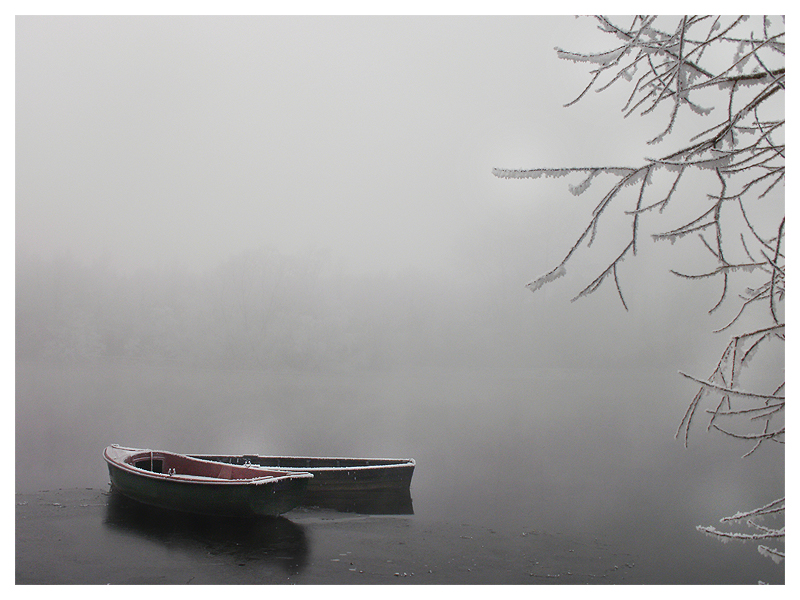
    Into the Deep
    ...honey, let's go boating! I don't care if the river is frozen... I just want to be where no one else is; with you.
    Spoiler:

    Some day, we'll reach the moon
    ...but after that, what shall be our next adventure?
    Spoiler:

    Beyond the Branches
    Spoiler:


    Found here
     
    10,674
    Posts
    15
    Years
    • Seen yesterday
    Woah guys, the number of comments is getting scary! Anyway, I have some photos for the next update, but here's a tag I did today. Mostly from scratch.

    must update this soon
     
    Back
    Top