• Our software update is now concluded. You will need to reset your password to log in. In order to do this, you will have to click "Log in" in the top right corner and then "Forgot your password?".
  • Welcome to PokéCommunity! Register now and join one of the best fan communities on the 'net to talk Pokémon and more! We are not affiliated with The Pokémon Company or Nintendo.

[Sprite Project] Pokemon Icons

2,799
Posts
18
Years
  • Well, since this forum is fairly dead, here's something new that will hopefully bring some activity: An actual project.

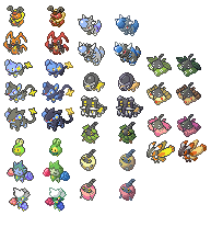
    The idea is to take these sprites from the pokemon games
    o71qo4.png
    and edit and reshade them into something that would be more useful for makers of comics and cards, or whatever else they could possibly be used for. The end result should look something like this:
    vhw0ah.gif


    o71qo4.png
    21kyzw2.png
    1jp3sg.png

    vhw0ah.gif
    11trk95.gif
    2rqfv9c.gif


    See how big of an improvement a tiny bit of shading makes?

    Anyone can join in and help out.

    Information:


    The sprites you submit to this thread are meant to be used as a resource. They aren't to be stolen, but are intended to be used with a reasonable amount of credit. On this thread, credit will be divided and labeled accordingly, but for most other purposes you're likely to only be credited with the group, usually with a link to this thread.

    You may help each other. If you submit a sprite and someone else finds a flaw with it, they can either tell you or attempt to fix it themselves. Please don't overreact if someone edits your sprite, and don't go overboard on the edits. If it's just a few pixels or a slight recolor, you can do it yourself if you want to, or you can tell the person and let them do it. If it's something kinda big, then let them try first, to let them practise their spriting. Please don't try to claim full credit on a small edit you did to someone else's sprite. Hopefully there won't be any problems with this, so please try to be mature.

    Spriting Style:


    These are the icons to be used:
    http://www.pokemonelite2000.com/dpicons.html

    Palette:
    Should be based on advanced-style.
    http://www.pokemonelite2000.com/rsgbapics1.html
    http://www.pokemonelite2000.com/rsgbapics2.html
    These are to be used as a base, but you may stray from it as you see fit.

    Light Source:
    The direction the pokemon is facing.

    Claiming Sprites


    So, you want to do a certain sprite, but don't want anyone else to get to it first? You may claim it for up to 5 days at a time before anyone else is allowed to do it. You shouldn't claim something unless you actually plan on doing it

    If you have submitted...
    • ... No sprites to the thread, you may claim 1 sprite.
    • ... 1 to 5 sprites to the thread, you may claim 2 sprites.
    • ... 6 to 10 sprites, you may claim 3 sprites.
    • ... 11 or more sprites, you may claim 5 sprites.

    Lists:


    List of pokemon sprites that are completed will be added soon.

     
    Last edited:
    376
    Posts
    16
    Years
  • Uh, well, I decided to help out. I've tried making a few comics over the years and it helps to have good icons. Oh and if anyone thinks they can make my edits better, go ahead. Though I still can't find out how to post the images directly onto your reply...
     

    Myzou

    Lost and Confused xD
    1,321
    Posts
    17
    Years
  • Even though Milotic was already done, I'm gonna be redoing the pokemon in my team (Can see in siggy)... started with Froslass, it's incredibly hard to attempt to reshade a white pokemon... so I kept the original shading, and added to it, as it was actually in the places I would put it in :P

    I'll edit this post with the finished ones when I'm done :) And dragonqueen, you gotta upload them to a place like tinypic, then use img tags.

    EDIT: If these are good enough, I'll continue with more :) I used the D/P colors for Milotic, because the advanced colors are soooo dull on her, and the point of the revamps is to make them look more lively, which I feel the D/P colors do for her.

    Icons.png


    I personally LOVE how they turned out, (especially froslass XD) but you never know, lots of critics in the pokemon community :P

    And yes, on Froslass and gengar I left most of the original shading in tact, because there is a specific way to shade their sprites so that their eyes/limbs don't disappear :P Tangrowth has some of the shading, but it's been tweaked a lot :D

    Original on Left, Revamped on Right. I posted them on one sheet, as if they are good enough, I'll start posting them seperately without the white background :P
     
    Last edited:
    376
    Posts
    16
    Years
  • Thanks for the help Myzou, and I think you did them perfectly. I like your Milotic better than mine anyway, mine's a bit too dark, though my next batch seems better.

    20gmip2.jpg
    24pjx4j.jpg
    2wdareg.jpg

    2rghmo0.jpg
    2a0hs0g.jpg
    ibz4tf.jpg

    35jmd6p.jpg
    flin11.jpg
    11qn6sk.jpg


    I think these are more improved. the shading is a bit irregular though, and Feraligatr's arm is invisible >.< and his legs look terrible, the colour of Dratini is impossible too.

    i was thinking of doing all the starters and their evolutions, after all, the colours on their in game sprites look so much better with the icons.
     

    Myzou

    Lost and Confused xD
    1,321
    Posts
    17
    Years
  • I'm working on the Sinnoh starters now. I'll be doing all of the sinnoh pokemon, in order :P

    I love using the D/P colors XD I'm oddly proud of my Grotle, considering I hate Grotle. lol. I may skip the Chimchar line, and other fire types, due to the inability to shade fire, but I'll try them first :P
     
    Last edited:
    2,799
    Posts
    18
    Years
  • Most of these are pretty good, I have a few problems wit specific ones that I'll get to later when I have a little more time to post. XD

    One thing I must make note of: The original icon's outline shading is reversed, and should not be reused. You notice how on the icons, there's a black/dark color near the top, but a lighter gray on the bottom? That should be changed. The light source is the top left, the bottom right should be in a shadow, and not lighter than the top

    @dragonqueen0210: Maybe you could use a little practise on the outlines? Many are one color and not very shaded, and many of them are just too light.

    @Myzou: I LOVE THE TANGROWTH. Most of these are very well done, but something about Milotic bugs me. Can't put my finger on it, though. Also, Gengar has that backwards outline thing, but not too badly. Yanmega's wings are just a tiny tiny bit too light, maybe making the outlines just a little darker would help them stand out a little more? Froslass is light too, but it works well, I like it. That green thing whose name escapes me right now.. the legs are a little too light on it too, imo.

    Also, dragonqueen0210, maybe slow down on the submissions a little. We're going for quality over quantity, so try to work on one a little longer before moving onto the next one.
     

    Myzou

    Lost and Confused xD
    1,321
    Posts
    17
    Years
  • Sinnoh.png


    Here are the sinnoh starter lines, took me a few hours to do em XD

    My issues is Empoleon, it just doesn't look right, but I can't put my finger on it. And I know they're gonna get the most critiqued, but I love how Grotle and Torterra turned out. >_<

    And here are the changes suggested to my other ones:

    Froslass/Tangrowth: Nothing, I love em :P And yes, the reason I kept the light outline on Froslass is it works very well for her, especially considering she's a ghost pokemon :P And thanks for the LOVE on tangrowth :P Funnily, she was the hardest one XD Getting the outlines was amazingly hard considering how many vines there were.
    Milotic: I changed the darker outline on the bottom to a shade up from the darker shade.
    Gallade: Darkened up his white outline. Didn't do it much, as he's part of the ralts line, it's meant to be simplicity with them :P
    Gengar: Reversed the outline color. I kept the original outline due to Gengar being VERY close to turning into a purple blob if you mess with it... somehow didn't notice I was putting a darker outline on top though, haha.
    Yanmega: Darkened outlines on wings as suggested.

    IconsRetouched.png


    And sorry for posting them together... just easier >_< lol

    I'll just do in order, if someone claims, I'll simply skip that one. Hopefully no one touches Butterfree Pachi or Buneary though XD
     
    Last edited:
    2,799
    Posts
    18
    Years
  • Posting them together makes them easier for me to copy to paint so I can zoom in better, so it's fine. XD

    Wow. Just... wow @ the grass starters. I love them too. The fire monkey's bodies are well sone to... the fire could use some work, though. XD I personally hate doing fire, it always seems to look odd. Finding that perfect balance of orange, yellow and red, and then trying to get the outline the right shade to make it look contained but not solid... it's so hard to do. XD

    About Empoleon.. maybe try a lighter shade of blue and make the highlights more extreme? I dunno. I can't find a specific thing wrong with it, either. I think they just made that sprite kinda... awkward?

    Anyway, I'm claiming Weedle & Kakuna. *runs off to work on them* XD
    [edit] and ok, I'll leave you Butterfree. XD
     

    Myzou

    Lost and Confused xD
    1,321
    Posts
    17
    Years
  • Yea, Chimchar you can't do much, or you destroy his entire arm, which happened to me with my original posting of them, noticed it and changed it real quick XD

    If someone wants to touch up the flames, feel free. And if someone wants to mess with Empoleon, be my guest XD

    And yea, I think Empoleon is just plain awkward... Always looked odd in game too XD The color contrasts are kind've extreme... Which is why I think the original icon uses black instead of blue and orange instead of yellow :P

    I'll claim Butterfree, Pachirisu, and Buneary then :P
     

    Mitchman

    Banned
    7,485
    Posts
    16
    Years
  • OH nice work you guys. Well i know it hasnt been made yet but once it is can i reserve a claim for flygon? If not then empoleon. If i can have flygon then that but if not then empoleon. Anyway this idea is wonderful. I know this might sound stupid but a lot of hackers/game makers will take this as a wonderful thing to uise in hacks/games. Or is that not allowed?
     
    376
    Posts
    16
    Years
  • I was wondering what was wrong with my edits, must have definitly been the outline and shading. If you think they're too light, I'll change it. I guess I always liked my sprites a bit lighter though.

    I bags Ninetales too ^ ^
     

    Myzou

    Lost and Confused xD
    1,321
    Posts
    17
    Years
  • Butterfree's wings gave me MASSIVE trouble >_< Spent like 2 hours JUST on them trying to get it to something I could stand. (I redid the lines on the wings, and even altered where the wings ended.)

    Btw, I will use D/P colors for everyone I do. R/S/E colors are very bland :S Just tried on Butterfree, and I almost cried when I saw the R/S/E XD

    EDIT: Done with my claimed ones :) Will post them once I'm done with Bidoof/Bibarel, and the Starly Line.

    EDIT2:

    Starly turned out decent... Staravia and Staraptor... Ugh. The Color scheme, like empoleon, is not meant for small scale. It makes the wings WAY too noticeable, and I tried everything I could, but it would make a giant blob most of the time -.- So I settled with this, which isn't too bad.

    Tell me how Butterfree looks to you. Took longer than any other icon I've done to do her. Look at the D/P sprite, that's where I got inspiration from, and why the bottom wing is now noticeable.

    Claimed.png


    Bibarel, Buneary, Butterfree and Pachirisu came out great, IMO. I'm not so sure about Staravia, Bidoof, and Staraptor though, I'm kinda soso on those.
     
    Last edited:
    2,799
    Posts
    18
    Years
  • Ooh, I love the new ones. Especially Butterfree & Buneary. The shading on Lopunny's ear bugs me a little, though, but meh. XD

    And yeah, Staraptor looks like one of those poekmon that are just awkward and difficult. XD

    Finished my requests, so I guess I'll work on some sprites now XD
     

    Myzou

    Lost and Confused xD
    1,321
    Posts
    17
    Years
  • Yea, Lopunny's ear bugged me, but alas, it just looks horrible without any shading at all >_< (which it wouldn't technically have [at least much] in the pose she's in :S)

    This project is a good distraction from working on the Ultimate Monotype challenge XD

    Next Up for me: Kricketot, Kricketune, Shinx Line, and I'm claiming the Budew Line. :D the Shieldon Line, the Cranidos Line, Burmy, and claiming Mothim/Wormadam. (Obviously, 17 are gonna take a while :P)

    So Claims are:

    Budew
    Roselia
    Roserade
    Mothim
    Wormadam

    Others are just on my list of to do XD If you want to claim them, feel free however.
     
    Last edited:
    2,799
    Posts
    18
    Years
  • They're saved in jpeg format. There's really nothing anyone can do with them now. Next time save them as .png.

    And these are supposed to be reshades, not recolors. You have to edit..(--well, add, since they don't have any--).. the shading.

    I'll try to finish up my sprites after work. XD
     

    Myzou

    Lost and Confused xD
    1,321
    Posts
    17
    Years
  • Weee!

    NextBatch.png


    Extremely happy w/ how the Burmy Line, Roserade, and the Kricketot Line turned out :D Kricetune was AMAZINGLY hard trying to figure out where his body/arms started and his mustache ended XD
     

    Destrozone

    Finally Flyin' Solo
    290
    Posts
    16
    Years
  • Ok, here are my icons, and since two days are up, Ninetales is mine. However, I will relinquish it if Dragonqueen still wants it at the end of this week (7days)
    The outline is supposed to be that way, as it is my style, and I kind of think that it looks nicer than a hardened black outline.

    Complete-1.png
    Complete-2.png

    I edited growlithe so that his back actually connected to his tail, and I also edited Slugma/Magcargo's faces a little. If thats not allowed please let me know.
     
    Last edited:

    Decypher

    Craig Marshall
    138
    Posts
    16
    Years
  • I might as well help out, I'll start on pokemon 333-338 which are swablu, altaria, zangoose, seviper, lunatone and solrock.
     
    Back
    Top