• Our software update is now concluded. You will need to reset your password to log in. In order to do this, you will have to click "Log in" in the top right corner and then "Forgot your password?".
  • Welcome to PokéCommunity! Register now and join one of the best fan communities on the 'net to talk Pokémon and more! We are not affiliated with The Pokémon Company or Nintendo.

[VOTING] Round 2: Rest vs. moments.

moments.

quixotic
3,407
Posts
15
Years
  • The second round of the tournament with Rest against moments.!
    This battle had the following restrictions:

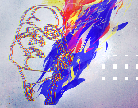
    Stock: No restrictions.
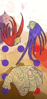
    Size: No restrictions.
    Colour: Primary Colours (Red, Blue and Yellow)
    Text: No text allowed.

    TAG 1
    redbluyel.png


    TAG 2
    raycopy.png


    If you wish to vote, please leave a comment stating who you are voting for, and at least one reason why you are voting for them over the other. As there is no poll, votes will only count if you leave a comment. The comments don't need to be really long, having to post should not deter you from voting, it can be a simple sentence if you want. Good luck!

    Voting will last for one week after the opening of this thread.

    (N.B: The usernames are detached from the images to remove bias or anything.)
     
    10,673
    Posts
    15
    Years
    • Seen Dec 30, 2023
    I feel that the first kind of met the theme a bit more than the second. Though I'm a fan of both the tags. Though I think the first lacks some finesse and compositional completion. I feel the background chosen doesn't suit the type of pentooling and the vector like shapes used. It's missing some consistency overall and I fear that though it has some really nice potential, it needs some variations to be a completed piece.

    The second felt a lot more finished. It feels quite artistic and nicely drawn. I'm a bit fan of the style. Red, Blue & Yellow aren't the only primary colours, so I'm assuming the theme stretched out to others. Either way this tag stood out a little more to me and had shown itself to be a lot more finished looking in the end.

    Good job to both.
     
    10,769
    Posts
    14
    Years
  • I saw a blog post saying I should vote here so I'm voting here even though I don't feel I have the expertise to make much of an informed comment but oh well.

    The first one has the primary colors and they show better on it, but it seems kinda like there's some unused space around the sides of the image and, I dunno, to me that makes it feel kinda "unfinished" if that makes sense.

    The bottom one feels "finished" but the colors (on my monitor anyway) look more purple, plus there's not so much yellow as there are browns. The outlined areas being so close to the edges of the image make it look kinda cramped in there, too.

    I like the overlapping colors in the first one, the way they have some kinda flow to them makes it fun, energetic, I guess. But the bottom one is different from things I'm used to seeing and since I can't really find a good reason to pick one over the other I guess I'll just vote for the one that I find more striking, which is the bottom one.
     

    BZW Golem

    Conspirator~
    142
    Posts
    12
    Years
  • My vote goes to the second one ( I can vote, right? >.>)

    I don't know much about art, so the reason why I choose it isn't deep xD

    The first one makes me say "wow!" when I look at it.. but it feels empty for me.
    The second one does not only make me say "wow!", but also makes me think "oh noes, this lines, this colors, so prefect!"
     

    Margot

    some things are that simple
    3,661
    Posts
    18
    Years
    • they/he
    • Seen Apr 16, 2022
    I honestly don't feel that the first one necessarily met the criteria more than the second one; in fact, the use of the other colors in the background makes the primary colors more bold and stand out more. Since primary colors are the theme, I feel it definitely meets the criteria just as much. I also like the the design more in the second and agree with the others who said it gives it a more "finished" look.

    So my vote goes to number 2 :)
     
    2,096
    Posts
    15
    Years
  • I'm going to go with tag number one. The way that the face has been setup plays with my eyes slightly but the way that the themes colours have been used makes up for it by a long shot. The shades that were used really work well together and the way that its been laid out makes it spring forward from behind the face.
     

    Nimblethumbs

    my name would look hot in bold
    285
    Posts
    13
    Years
    • Seen Feb 21, 2015
    Gah this is hard

    First one for me. While it does seem empty, it has a nice feel to it, especially with the way the face and the C4dthing go together. The background complements the images nicely. It seems more concise, neat, clean and professional then the second one.

    The second ones background is great, but the hand and stuff seem to damage the theme of the background. Something seems to throw me off, but I can't exactly place it D:
     

    Mr Cat Dog

    Frasier says it best
    11,344
    Posts
    20
    Years
  • I don't know how much I 'like' each of these, but the first tag is more immediately striking, so it gets my vote in this round. I like the lines on the second tag, but the colours seem slightly muted in comparison to the first one. The first one has the advantage - in my unartistic brain, mind you - of stating its theme in a more obvious way, but not bashing you over the head with it.

    So, tag #1 for me, thanks!
     

    Ho-Oh

    used Sacred Fire!
    35,992
    Posts
    18
    Years
    • Seen Jul 1, 2023
    First one. Something seems to capture the primary colours theme better tbh, plus it just looks nicer. Second doesn't really seem like a "graphic" and rather like a cartoon idk I can't really explain that. :(
     

    Shining Raichu

    Expect me like you expect Jesus.
    8,959
    Posts
    13
    Years
  • I'm gonna vote for Tag #1, to me it feels more energetic and lively and more 'primary colour' themed. I love colours that pop and I feel the first does that far more and I think the concept is incredibly inventive.

    I do love the second one as well though, the drawing has a kind of Dr Seuss feel to me and I think that's really clever - so well done :D
     

    moments.

    quixotic
    3,407
    Posts
    15
    Years
  • That's the end of voting, and moments. was the winner by just one vote! :O
    Thanks for being awesome Rest! Great battle.
     
    Back
    Top