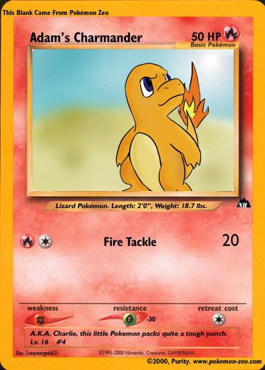
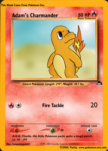
- Weakness/Resistance/RC symbols should be closer, vertical-wise, to their respective text. Also, try to make it so the symbols are centred (so the W symbol would be around Weakness, etc)
^ That still stands in Charmander.
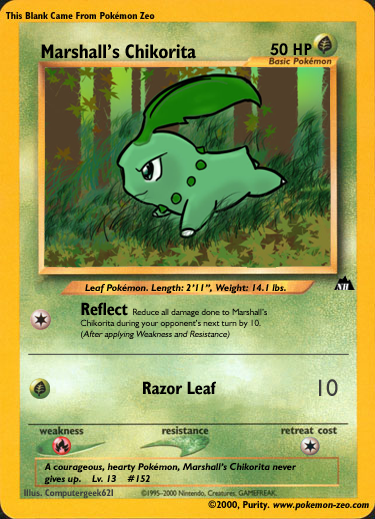
- Once again, sizes are too small. If you are going by Zeo's Tutorial, they aren't using Photoshop. Photoshop uses a pt system for sizes, everything else uses a standard size system I'd assume. Size 20 Bold in PSP is not Size 20 Bold in Photoshop. This goes for your attack titles, attack text and everything else as well. They're a tad small. If you look at real card, you'd notice straight away that the size of the number of damage isn't that small.
- The placement of the text you used for Chikorita's Pokedex lore is a bit strange. 'gives' looks like it should be on the 1st line.
- Any reason why the Illus. font with Chikorita is semi-green (or has lowered opacity, whatever)? Then again, not a huge issue so you can ignore this.
Overall, good improvement. Solid cards you have there. Keep it up ;)