• Our software update is now concluded. You will need to reset your password to log in. In order to do this, you will have to click "Log in" in the top right corner and then "Forgot your password?".
  • Welcome to PokéCommunity! Register now and join one of the best fan communities on the 'net to talk Pokémon and more! We are not affiliated with The Pokémon Company or Nintendo.

Judas (from Tales of Destiny II)

451
Posts
19
Years
  • Age 38
  • Seen Apr 10, 2008
JudasShadow.jpg


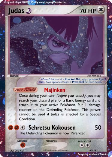
Pheer my humble return to faking.

Since I need to brush up my faking skills from a year and half ago, I didn't really try anything special, as you can see.

I love how it turned out in the end. The art is amazing. No I did not draw it. As I said I'am not trying anything special for now, so apparently I'am not drawing my own art atm.

I'm not sure about the Shadow symbol placement, but I'm pretty sure I got the placement on everything else right.

The part where it goes 'Blah blah Judas affeted by a special condition'
I know its an error (no shadow symbol, mind you). I never liked those kind of stuff ever since I started faking. So yeah, I'll fix it up as soon as I can. But not now, because I'm already working on something else. =O

Constructive criticism welcome. If Cascade doesnt reply I gotta PM him..

P.S Cascade if your reading this, I want your l33t bl4nks (Leet Blanks) ASAP! Thanks!
 
Last edited:

Roffle

Banned
97
Posts
18
Years
Oh yeah, I really pheer your humble return. :knockedou

Art - 8/10;I generally do get pleased when I see original work by the author (-2), unfortunately I have the well arse hole trait in taking away 2 points away from this artwork. It is very nice, the holographic effect is positioned in a very beautiful manner, so that bumps up the score and makes up for the loss of the 1 point. Final verdict - 9/10
Wording - 10/10; No conflicts at all, generally well placed and positioned. Well done.
Creativity - 10/10; Lovely ideas for attacks, pure genius. It's all beautiful how it all blends in together.

Finally, I hesitate taking points off fine work, I hate doing it. I should probably not be so tight with marking, but other than that, you are a great faker. Congratulations!
Final Score: 29/30.

Thank you and fake again! *Saves and prints at printing studio*
 

Cascade Of The Sky

Shining Porygon master
384
Posts
19
Years
um.. that card rocks.. ;) what is it? O_o? very special... ;) the shadows have made a come-back havent they
but you wont be seeing any from me.

and about the blanks? Im not releasing them in public yet! when i do.. you'll know about it... so, please, can people stop nagging me...

i will tell you know... they will be released.. just be patient

(that card PWNS! hehehehe (i hate pc language.. it's really lame)...

8/10... i'd love to see more
 
451
Posts
19
Years
  • Age 38
  • Seen Apr 10, 2008
Hahas, alright I'll be patient ;)

Thanks for the comments. I appreciate it.

Thank you Roffle!

And Cascade, what is that? Its a person! He wears a cool mask! I have a picture of him attacking but I like this one better, so yeah.

Cascade said:
(that card PWNS! hehehehe (i hate pc language.. it's really lame)...
Hahaha! I agree!
 
451
Posts
19
Years
  • Age 38
  • Seen Apr 10, 2008
Now I'm working on the next one.
His name is still Judas, but without his mask! He looks cool without it!

I'll edit this post with the card when I finish it.
 
465
Posts
18
Years
nice card syousuke, very nice
i see no fawls, but if you have done it in Deoxys style placement, u forgot to change the year.
i would love to see the picture so i could make it out
but nontheless 10/10 well done
 
451
Posts
19
Years
  • Age 38
  • Seen Apr 10, 2008
Thanks for the comments, Blennix!

And since your wondering, heres the original picture!

And sorry for the wait-up guys! I cant seem to find a cool picture of Judas without his mask! Maybe I would just have to draw it o_o

Edit! I finished Judas ex! No! I didnt draw it! Too lazy.. =o
But here it is!

Judasex.jpg
 
Last edited:

Roffle

Banned
97
Posts
18
Years
Art - 7/10 (Sorry). The holographic background seems a bit bland. Hmm, althought it is good, the background fixed could lift up the score way plenty.
Wording - 10/10 No conflicts, as before, perfect.
Creatvitiy - 10/10. Excellent orgininality for attacks, ought to be pleased my friend.

Thank you and fake again!
 

Cascade Of The Sky

Shining Porygon master
384
Posts
19
Years
woah.. we have the work of a master! ;) keep it up... and this idea is amazing.. i would have never thought i would say Pok?mon fakes of things that clearly aren't pokemon are SOOO cool!

hey, is theitr any possablities of seeying you make pokemon in then near future?
 
451
Posts
19
Years
  • Age 38
  • Seen Apr 10, 2008
Cascade, you are getting sick of my non-Pokemon cards arent you! XD
But thanks for all your comments, Datriot, Roffle & Cascade!

Don't worry! This is the last one!
LeonShining.jpg


Roffle said:
Art - 7/10 (Sorry). The holographic background seems a bit bland. Hmm, althought it is good, the background fixed could lift up the score way plenty.
Yeah the Holo is screwed. I chucked in the wrong one. Apologies!

I'll be making real Pokemon yes in the near future!

EDIT: Sorry for the bad quality. I don't know what the heck happened!
 

Mail Jeevas

I need a smoke...
413
Posts
19
Years
Nice cards Syosuke, they look great. I'll give them a 10/10. Reasons:
1. The idea is really original, and it looks great too!
2. The pictures that you've choosen are very well done.
3. I think that the attack's names are really cool. I think that you must have based on some of the game's attack.

Nice cards, keep it up!

ELGONZO!!!
 

x24

Researcher-Sprite Thieves, DIE
236
Posts
18
Years
nice cards.. acouple issues with it tho.. the holo seems to be put on random items.. holo normally goes on anything other than the character and sometimes item emitting from the character (beams, fire, etc)

awesome name for the PokeP tho :D

the other cards are really impressive

only error I see in ur style seems to be the HP font.. is it just me or does it flucuate in size on each card?

4.5/5 on each..
 
Last edited:
465
Posts
18
Years
yay i can see him
remember: the damage number needs to be 10 pixels away from the right border and the Plus,times and minus sign fit in the middle between the damage number and the border
kool japanese attacks :P
and the attack effect is aligned with damage number
 
451
Posts
19
Years
  • Age 38
  • Seen Apr 10, 2008
Yes! all that stuff needs to be fixed! I dont like my newest card at all now!

Thanks for your comments, suggestions and fixes!

@Majin-I like where I put my holos!

I'll try harder next time!

I'll might start a set since Im confident with faking now!
 
451
Posts
19
Years
  • Age 38
  • Seen Apr 10, 2008
Well anyway!

That was the end of my faking return preface.

Someone tell King Shuckle to close this thread! I will no longer be using it!

Thanks in advance!
 

QFred

Behold...
1,222
Posts
18
Years
Cool cards I must say, I like the art, the characters used and the attacks on them.

I believe some fonts are a bit odd,. but nothing to worry about.
 
451
Posts
19
Years
  • Age 38
  • Seen Apr 10, 2008
Thanks QFred, I appreciate your comments!

But can King Shuckle please close this!
 
Back
Top