• Our software update is now concluded. You will need to reset your password to log in. In order to do this, you will have to click "Log in" in the top right corner and then "Forgot your password?".
  • Welcome to PokéCommunity! Register now and join one of the best fan communities on the 'net to talk Pokémon and more! We are not affiliated with The Pokémon Company or Nintendo.

chromophobe;

Mr Cat Dog

Frasier says it best
11,344
Posts
20
Years
  • I apologise if this is a crappy review... kinda new at this, but here goes:

    For the most part, I really like it. It's bustling with activity but I was never distracted by any one thing; I was always looking at the image as a whole, which is impressive given how expansive it is in size and activity. I like how there are a variety of different ocean-dwellers and your use of colour, especially at the top of the image. My biggest issue is the use of light at the bottom of the image. At the top, you have the sun beating down on the water, and light filtering through and as the eye wanders lower, it gets darker but the fish seem to look like they should be higher up than they are because they're too bright. The turtle, for me, is the worst offender in this regard. The jellyfish are good as they're clearing producing their own light, but the other critters at the bottom could do with being a bit darker to reflect their spatial position. You mentioned the text in your write up: it's fine in terms of font and colour, but maybe it could do with a little spacing out. The 'r's especially look cramped in comparison to the whole text. But, on the whole, I like it. It's aesthetically pleasing and manages to convey a nice sense of place, with the text providing a nice ironic touch.
     

    moments.

    quixotic
    3,407
    Posts
    15
    Years
  • Thanks for the comments!

    ICONS!

    gjwhf8.png
    gjwhf7.png
    gjwhf6.png
    gjwhf5.png

    gjwhf4.png
    gjwhf3.png
    gjwhf2.png
    gjwhf1.png

    gjwhf10.png
    gjwhf11.png
    gjwhf9.png
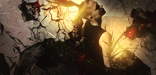
    bend.png


    blondey.png


    evolution.png
     
    Last edited:
    5,814
    Posts
    16
    Years
    • Age 30
    • Seen May 19, 2021
    Oh my god. Your graphics are absolutely amazing! <3 I got bored and decided to come to Graphics & Phototagraphy, saw your thread and though, "Oh hey, his graphics are pretty sweet, so I'll go check them out." AND I'M IN LOVE WITH YOUR GRAPHICS. :DDDDDD

    I really like this one and the icon of the fox. :3
     

    moments.

    quixotic
    3,407
    Posts
    15
    Years
  • Thanks so much for the comment Eeveon! :D
    As for you CT, you probably won't even see this ever, but GIMME THEM COMMENTS! ;)

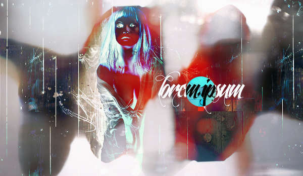
    So it's been so long, and I only have one weird piece I threw together today cause I felt like getting back into it more! It has been over a month and I wanted to go crazy again, so yeah, that's a warning.

    lorem.png
     

    Brane

    -
    372
    Posts
    12
    Years
    • Age 30
    • Seen May 10, 2016
    The thing that instantly catches my eye is that the focal blends too much with the background, I understand the whole 'contemporary' route that you took, but it seems that the focal is too weak. I reckon you could have probably broken it up more and only inverted certain parts of the focal to still maintain that focus. I also think that the image is weighted too much towards the right or too close to the center I guess, I think you need to bring the text in a little closer and then move the text and focal a little to the left. Other then that though I'm glad you've chosen to try something different :)

    I've been trying to experiment a little myself recently but they all turn out the same :P
     

    moments.

    quixotic
    3,407
    Posts
    15
    Years
  • My problem is that I always try different things and never develop styles. xP
    Thanks for the comments, I agree with most of the stuff you said, it had been 2 months, really just trying to get rid of the rust.

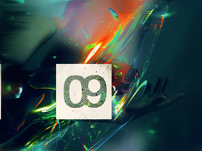
    09.png
     
    325
    Posts
    12
    Years
  • Man, I used to be so good at making sigs back in the day. Then that whole brushing thing started which I could never grasp, and now it's ridiculous. Your pictures are awesome man. Keep it up.
     

    moments.

    quixotic
    3,407
    Posts
    15
    Years
  • I never really used brushes to be honest. I use them occasionally now, but I never used them during that massive rush a few years ago, most of the time they look tacky and flat... Anyways, thanks for the comments, I'll edit this with some more if no more comments come in between now and whenever I finish my next piece.

    bend-1.png

    I just finished this, may put up another version in the morning after sleeping on it...
     
    Last edited:

    Brane

    -
    372
    Posts
    12
    Years
    • Age 30
    • Seen May 10, 2016
    http://i233.photobucket.com/albums/ee207/mattimogalli/rockhead-1.png

    Have been wanting to comment on this for a while now, but just haven't gotten around to doing so :P As for colours and composition I don't find anything wrong with it, not exactly my mix of colours but that doesn't matter. As for that light on the right of the image, I don't know if that's supposed to be coming out of the 'missing' piece in the background if thats what it is, but it seems to round and end too soon before the image which is something that catches my eye. If it isn't supposed to a sort of beam of light, then I think it's a bit awkwardly done because the focus for me seems to be too far to the right of the render. It also seems that that light doesn't match up with the shadows on the render which seem to be at more of a 45 degree angle, and not so much coming from the side.

    But otherwise, good piece! :)
     

    moments.

    quixotic
    3,407
    Posts
    15
    Years
  • You wanted to comment on the gallery, or that one piece? It only went up the other day. xP
    Anyway, thanks for the comments!

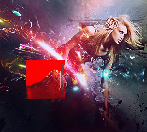
    squiggle.png
     

    Mew~

    THE HOST IS BROKEN
    4,163
    Posts
    15
    Years
    • Seen Apr 13, 2016
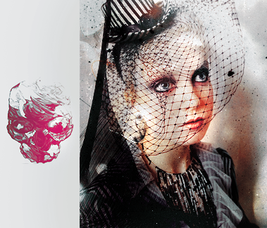
    pretty damn creative, and a really nice idea, I love it. Only crit would probably be the loss of the focus, which is the legs right? They seem to be more in the background than in focus. :3
     

    moments.

    quixotic
    3,407
    Posts
    15
    Years
  • Mew~, the focal ended up being the top of the pants, where it would like meet the stomach type area, but I can see what you mean.

    Thanks for the comment Anyu!
     
    1,542
    Posts
    16
    Years
  • MOMENTS!
    I'm here to give some love to this gallery. Why? Because I can, and you're cool.

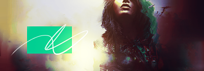
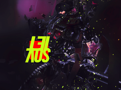
    bend-1.png

    squiggle.png

    I gotta ask, why the single colored boxes? I was just wondering, it's interesting, but I'm just wondering why you put it.

    I likes both of these, I think the second banner has much better focus on the render though than the first one.
    I like the first banner because of the effects, flow and depth in the banner. Overall, I really just like the look of both of them. ^..^
     

    moments.

    quixotic
    3,407
    Posts
    15
    Years
  • Solid boxes, not really sure, just like the look of them. Saw them in some other tags I used as inspiration and thought I'd give it a whirl. ;)

    Yeah the first tag got the quality irked at some stage of adjustments and stuff, so it went a bit claggy...
    But thanks for the comments! :D

    bubbleswip.png

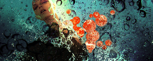
    I sent a started version of this to Kaori for a collab, but this is how I finished it up. Shall edit whenever she gets around to it. ;)

    Another.
    underorbs.png
     
    Last edited:

    Brane

    -
    372
    Posts
    12
    Years
    • Age 30
    • Seen May 10, 2016
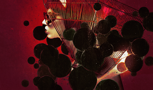
    The colours and composition in both images are nice, but I'm going to have to say that the focals are too drowned out. It took me a solid few minutes to even realise there was a figure in the first tag, and there seems to be too much floating infront of the person in the second causing it to loose some depth. Thats really all I can say at the moment.
     

    moments.

    quixotic
    3,407
    Posts
    15
    Years
  • Thanks for the comments brane! the only person who loves me

    hworang.png

    Battle.

    soviet.png

    First of 2012.

    split.png

    Yep.

    flyeye.png

    Experimental.
     
    Back
    Top