
You are using an out of date browser. It may not display this or other websites correctly.
You should upgrade or use an alternative browser.
You should upgrade or use an alternative browser.
Bulbasaur's Explosion
- Thread starter InvisibleGoldenBulbasaur
- Start date
More options
Who Replied?I try ^_^As for GPR, he's pretty well known for his excellent critique
Actually i only give out this extensive amount when i know that the spriter will put in a decent effort to try to fix their sprite. I generally don't use this method on sprites that are horrible or will not be touched again... i only really do these breakdowns for sprites that i see potential in, and i know can be enhanced. So grats IGB!
The new version looks a lot better! The negative space has been nicely dealt with, so you have a nice use of space here! Also, the clumpies are gone! YAY!
BUT!!! There are still a lot A LOT ALOT of gaps in the outlining... along the snout, the tail, the belly... and you are shading the outline on the wrong side (It should be shaded along the bright parts, not the dark parts ^_^
The shading over all is still off... it is prevoking a sense of multiple light sources, and flatness... there is no round look to the shading... it is just two toned...
As for the scoring:
Shading is not much better, if at all fixed... i realized that the pokemon is actually two colors... so you need to elaborate on the three skin tones of each of those two hues, as well as a dark outline hue to go with them. I still give you a 6/10.
Outlining is better, but not great by anymeans... there are still gaps all over the place. The clumpies are gone (woot) so with that your score will increase to a 6/10. To up this score, you'll need to redo the shading to match Pokemon's style... then readress the outlining to match with the light skin hues.
The horns look better, but are still very much similar... the extensions do fade away into the background though... i still like the general idea you have here, but if feel you need to redo (his) right horn so it is not as homogenous as the other one. 9/10 for pose.
9/10 for the anatomy... the negative space has been dealt with, and it looks great! His head got bigger though! o.o His neck can't support it... lol...
as for creativity... it's hard to up this score... since it has really been outdone already... but i'll add a point for your efforts! 9/10!
This brings your total score to 39/50... a 78%! Yay! Increase! I think the next thing you might want to do is entirely fix the shading. The shading is messing up your outlining, as well as makes your the sprite flat and undimensioned. It may help you to look at chesu's spriting tutorials... especially the fakemon ones and the starter shading ones. I find that they give great help in finding perspective in shading. I'm glad that you're improving your skill! Keep trying! And of course...
Keep Spriting!
Last edited:
InvisibleGoldenBulbasaur
Level 153
- 47
- Posts
- 14
- Years
- Age 32
- a series of tubes
- Seen Aug 6, 2010

Minor fixes to Mortoll. Tried to make him less blocky looking, and added a green stripe to the belly.

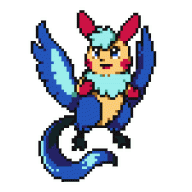
The middle stage of the Grass starter line, Belldrake. He's a Mandrake Pokemon, so he's supposed to be yelling. The palette isn't final; the blue might switch to a dark green at some point.
Im at a loss as of why didn't I notice this thread before.. Right now, it has win all over the place, both conceptual and quality-wise.
I will crit the newer ones soon, cause im busy as of now. But first, I'll get to this:
I'd only recommend darkening and adding more contrast to the darker shade of blue, to solve the depth problem entirely. Also, assuming that you're going for the smooth and shiny look, all of the dithering behind the arm/fin needs to be destroyed.
More noticeable highlights would help too.
I think the line breaks are perfectly fine, and the shading too. It would only need a few tweaks with a darker blue shade, as I mentioned above.
I agree, the right horn needs to be fixed. Right now it looks like as if, if the head were to be tilted to face straight to us, the horns would look something like this:
( (
So, yeah.
I will crit the newer ones soon, cause im busy as of now. But first, I'll get to this:
Nah. It's all fine, unless you wanted to perfectly match the pokemon advance style, which this improves.Shading is not much better, if at all fixed... i realized that the pokemon is actually two colors... so you need to elaborate on the three skin tones of each of those two hues, as well as a dark outline hue to go with them. I still give you a 6/10.
I'd only recommend darkening and adding more contrast to the darker shade of blue, to solve the depth problem entirely. Also, assuming that you're going for the smooth and shiny look, all of the dithering behind the arm/fin needs to be destroyed.
More noticeable highlights would help too.
Outlining is better, but not great by anymeans... there are still gaps all over the place. The clumpies are gone (woot) so with that your score will increase to a 6/10. To up this score, you'll need to redo the shading to match Pokemon's style... then readress the outlining to match with the light skin hues.
I think the line breaks are perfectly fine, and the shading too. It would only need a few tweaks with a darker blue shade, as I mentioned above.
The horns look better, but are still very much similar... the extensions do fade away into the background though... i still like the general idea you have here, but if feel you need to redo (his) right horn so it is not as homogenous as the other one. 9/10 for pose.
I agree, the right horn needs to be fixed. Right now it looks like as if, if the head were to be tilted to face straight to us, the horns would look something like this:
( (
So, yeah.
- 150
- Posts
- 15
- Years
- Texas
- Seen Jan 8, 2017
nice work!
i was gonna have a fire elephant starter in my hack cuz i thought no1 else would have thought of it, but i guess great minds think alike huh ;)
you're sprite is amazing btw, it actually looks like an elephant (mine looks like a pygmy with a really long nose, sigh, but oh well)
the water starters look good, so does the grass starter line, except the 2nd and 3rd stages seem to have exceptionally sharp shoulders (looks like the 3rd stage is wearing a perfect-fitting suit), and as others have stated, doesn't look too much of a grass type, still great sprites tho.
InvisibleGoldenBulbasaur
Level 153
- 47
- Posts
- 14
- Years
- Age 32
- a series of tubes
- Seen Aug 6, 2010
^ Good. The grass types are supposed to look sort of like undertakers, so a suit look is what I was going for.
@Smash: Wow, thanks! I'll go tweak that one now.
I've mostly been doing backsprites for the finished fakemon, but here's a new frontsprite:

Blastodon, the middle form of the Fire line. Once I finish Hellephant, I'll post all the backsprites.
@Smash: Wow, thanks! I'll go tweak that one now.
I've mostly been doing backsprites for the finished fakemon, but here's a new frontsprite:
Blastodon, the middle form of the Fire line. Once I finish Hellephant, I'll post all the backsprites.
InvisibleGoldenBulbasaur
Level 153
- 47
- Posts
- 14
- Years
- Age 32
- a series of tubes
- Seen Aug 6, 2010
I think it's time for a bump.

A Poison-type Plague Legendary. It's tentatively named Typhrax. It's built for Toxistalling.


Not Eevee Kitwirl, a Normal/Ground type based on sand, its backsprite (so cute!) and its evo Fennecurl. They're pretty much generic earlygame pokes; the basic form can have Pickup or Sand Veil. The adult form can have Sand Stream or Sand Veil.

Excalibird. A novelty poke... with base 140 attack, but pretty crap everything else (usable Speed, though). It's pretty obvious what moves it learns, including Sharpen and an improved Air Cutter. (It would own in 4th gen with SD/Leaf Blade/Night Slash/Psycho Cut/etc. and a Choice Scarf...)


Psyloserge (Poison/Psychic) and Obliterat (Dark/Fighting). Two Moon Stone evolutions with two prior evolutionary levels. I really like Obliterat but need some help on Psyloserge. (Yes, that entire poke is one big drug reference... teach it Acid!)
Next to come: possibly more legendaries (Only making four :|), possibly some new evos of old favorites...
A Poison-type Plague Legendary. It's tentatively named Typhrax. It's built for Toxistalling.
Excalibird. A novelty poke... with base 140 attack, but pretty crap everything else (usable Speed, though). It's pretty obvious what moves it learns, including Sharpen and an improved Air Cutter. (It would own in 4th gen with SD/Leaf Blade/Night Slash/Psycho Cut/etc. and a Choice Scarf...)
Psyloserge (Poison/Psychic) and Obliterat (Dark/Fighting). Two Moon Stone evolutions with two prior evolutionary levels. I really like Obliterat but need some help on Psyloserge. (Yes, that entire poke is one big drug reference... teach it Acid!)
Next to come: possibly more legendaries (Only making four :|), possibly some new evos of old favorites...
Involuntary Twitch
Oripoke
- 658
- Posts
- 18
- Years
- USA
- Seen Dec 10, 2020
Zephyr+: Bumping good threads before the cutoff since 2007!
You just keep getting better and better, don't you? I love the soft, muted style you've got there-- it's awfully easy on the eyes, not to mention there's some excellent designs. Your poses seem a tad bland, however, with the Pokemon mostly just standing; generally speaking, battle sprites are in action poses, and your legendaries and Fennecurl in particular are largely static. But that's ok, because they're good-quality sprites. Still, though, I think Pestallion (er, Typhrax) needs its legs spaced a biiit farther apart and maybe one leg lifted off the ground, for balance yanno.
Excalibird is awesome. I would take it and use it to decapitate people.
Obliterat is faaabulous. Psyloserge... not so much. It kind of suffers from the color scheme (I'd put a third color in there somewhere, maybe around the spots; green or orange, maybe?) and the awkwardly-posed arms and legs. the hands and feet seem to be different sizes, and the chest marking isn't clearly-defined enough.
yeah, i am a big fan of excalibird as well! That is some excellent design there, as well as originality. The only thing that i don't like is that i didn't think that up first ^_^
I agree with zephyr though, your poses are rather static... there is not much indication of movement in them.
And before i forget, kitwirl is also another stunning looking sprite. The shading is so nicely done that it gives such a soft look to the sprite. It looks very natural and very professional. I wish i could say the same about the evo though... it's a bit flat looking.
Overall though, your growth has been so tremendous in such a small time span! You're always continuing to amaze me! Keep up the great work! I'm excited to see more!
Keep Spriting!