• Our software update is now concluded. You will need to reset your password to log in. In order to do this, you will have to click "Log in" in the top right corner and then "Forgot your password?".
  • Welcome to PokéCommunity! Register now and join one of the best fan communities on the 'net to talk Pokémon and more! We are not affiliated with The Pokémon Company or Nintendo.

>9000

2,571
Posts
15
Years
  • 'sup all. kind hoping i can bump here.
    >9000


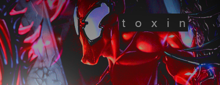
    anyone else a marvel fanatic?
    <3! I don't have any complaints or anything about this one. I too am a marvel girl at hear :3
     
    10,674
    Posts
    15
    Years
    • Seen May 16, 2024
    If you're going with inverted tags they need serious depth. Which you're lacking here imo. What would improve this would be some smudge brushing and some abstract stocks around the sides, apply image and work with dodge & burn. But yeah, B&W tags need depth and this is just lacking a little.

    Latest; big issue is the lack of a focal. I'm not entirely sure what I'm supposed to be looking at, it almost looks like a scratch abstract sig. You need a focal, otherwise it has no flow and it's just a little... messy really.

    Jack White; is almost getting there, color issues though, too bright and too much red. Try using levels/curves to change that and hop back into selective color or color mixer. I'm not fond of the overuse of red, though I know it is a red stock, there's no need to keep it that way or focus on red. Graphics are about being innovative!

    You're on the right track, just keep pushing it, take some more tuts and or look at other graphics for inspiration.
     

    Renyui!

    ascender
    1,402
    Posts
    16
    Years
  • Well, i haven't been on this thing in a while. Here's another dump of crap. Kinda makes me wish i didn't stop making graphics last year, i could've gone somewhere with it. :3 they're pretty much all requests from smogon.
    >9000

    >9000

    >9000

    >9000

    >9000

    >9000

    >9000

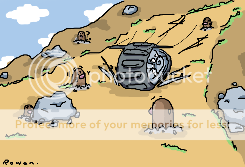
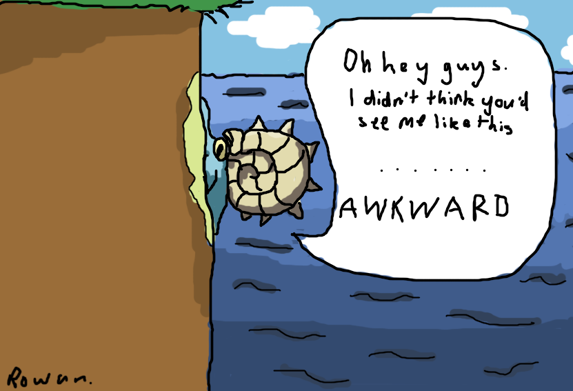
    and also some art, although it's not really the right place, i hope i dont get penalized.
    >9000

    >9000

    Oh and by the by, my good abegnation,
    If you're going with inverted tags
    It's not really an inverted tag per se, if it was, the colours would be inverted into negative. Don't think bad of me, i'm kind of a nazi at 'gfx jargon'
     
    Last edited:
    130
    Posts
    13
    Years
    • Seen Jan 8, 2023
    I like the vertical sigs...they have nice lighting and blending on most...i dont care for the poor vectoring but i will admit it is very difficult.
     
    Back
    Top