I'lll be the first to vote!
[EDIT: or at least bother to explain my vote....]
Ok, my thought process in voting for this battle ended up being quite convoluted: When originally considering both tags, my instinct told me that Gav's was superior. I like the compo better, the typography is well composed and the effects look sick. However, after I looked at the tag for more and more time, I became fixated on one aspect of the tag that drove me crazy. If only it were different!
I started to notice the weirdness of the tag's color saturations, brightness and how pronounced the blacks are. On my monitor, at least, it looks a lot like you used a really intense selective color that did a few things: 1) It looks like the color of the effects left of the focal were forced to be that orangey-red. 2) You made the blacks much darker than I think they originally were. 3) And the pink of her lips and in her hair was intensified..... While these changes were a good idea, they don't seem to pan out. The color change to orange, for example, seemed to kill the quality and depth of your effects. Also, I think the changes in how black black is and how pink pink is just plain look weird. I personally think really black blacks look better when contrasted by more white whites, or if the are more bright spots in the tag at all.
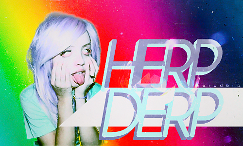
Moments' tag on the other hand is good but didn't jump out at me initially. I generally like the colors and the levels, except I think the girl is a liiiiittle too pale. The textures, however, helped and hurt you. I love the texture you used in conjunction with the gradient of color for you background. On the other hand, I completely dislike the weirdness you put over (maybe a c4d on screen or lighten?) the midsection of your text. I know what you were going for, but in the end this effect is more a distraction than it is beneficial to the piece's aesthetic.
Eventually, I had to make a decision on who to vote for, so I ended up voting for moments. Although I naturally gravitate to the aesthetic Gav was developing, I found the execution of moments's tag was generally better.
Great work both of you. Lets see more of these!