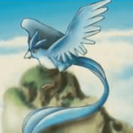
The impressive part is that the fonts actually look acceptable with the proper font and everything. That part is quite impressive.
As for the Yugioh actual text part, they really don't make too much sense in comparison to the actual rulings to the game... I suggest you to learn a bit about game mechanics and the way how most existing cards decide to word effect, then do some editing.
But it's impressive, finally get to see some card pictures that are not done with that yugioh card maker thing >_< It's not perfect, but I think it's acceptable quality.

![[PokeCommunity.com] Poke-oh!](https://i121.photobucket.com/albums/o208/lockmaster24/245-Suicune.jpg "[PokeCommunity.com] Poke-oh!")
![[PokeCommunity.com] Poke-oh!](https://i121.photobucket.com/albums/o208/lockmaster24/250-Ho-oh.jpg "[PokeCommunity.com] Poke-oh!")
![[PokeCommunity.com] Poke-oh!](https://i121.photobucket.com/albums/o208/lockmaster24/244-Entei.jpg "[PokeCommunity.com] Poke-oh!")
![[PokeCommunity.com] Poke-oh!](https://i121.photobucket.com/albums/o208/lockmaster24/243-Riakou.jpg "[PokeCommunity.com] Poke-oh!")