- 26
- Posts
- 8
- Years
- Seen Feb 28, 2025
Hi guys!
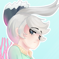
A couple of months ago I completed my design for Jakarian Carvanha (shading and all) and I really loved the way it turned out. Especially the way it's glowing organs looked like a ribcage to convey its Ghost-typing ( and I only now realize how many Ghost-types I have made for Jakar...maybe I need to dial it down a little).
It is based off of deep sea hatchetfish with the idea that they are descended from Carvanha who followed their prey down into the dark depths and never found their way back to the surface, now cursed to adapt to a world without light.
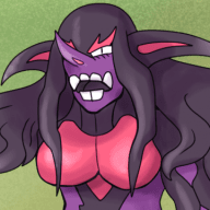
But recently I made a new sketch that is meant to more closely resemble regular Carvanha as I realized that my first design might be stretching too far away from the original pokemon, especially in its pose but conveying its new bodyshape is tricky from the pose Carvanha's artwork was painted in, the second sketch also happening to resemble a submarine by pure coincidence.
Which one should I go with? Which one better conveys the idea of a regional variant, rather than an entirely new Pokemon?
The first is the original, the second is a sketch of the redesign.
![[PokeCommunity.com] Two designs for regional Carvanha - which one looks better?](https://data.pokecommunity.com/attachments/20/20689-f914013c587f774db840f5ef0a84e076.jpg "[PokeCommunity.com] Two designs for regional Carvanha - which one looks better?")
![[PokeCommunity.com] Two designs for regional Carvanha - which one looks better?](https://data.pokecommunity.com/attachments/20/20690-83aa24026168d4c919847c923b5ec8dc.jpg "[PokeCommunity.com] Two designs for regional Carvanha - which one looks better?")
A couple of months ago I completed my design for Jakarian Carvanha (shading and all) and I really loved the way it turned out. Especially the way it's glowing organs looked like a ribcage to convey its Ghost-typing ( and I only now realize how many Ghost-types I have made for Jakar...maybe I need to dial it down a little).
It is based off of deep sea hatchetfish with the idea that they are descended from Carvanha who followed their prey down into the dark depths and never found their way back to the surface, now cursed to adapt to a world without light.
But recently I made a new sketch that is meant to more closely resemble regular Carvanha as I realized that my first design might be stretching too far away from the original pokemon, especially in its pose but conveying its new bodyshape is tricky from the pose Carvanha's artwork was painted in, the second sketch also happening to resemble a submarine by pure coincidence.
Which one should I go with? Which one better conveys the idea of a regional variant, rather than an entirely new Pokemon?
The first is the original, the second is a sketch of the redesign.