• Our software update is now concluded. You will need to reset your password to log in. In order to do this, you will have to click "Log in" in the top right corner and then "Forgot your password?".
  • Welcome to PokéCommunity! Register now and join one of the best fan communities on the 'net to talk Pokémon and more! We are not affiliated with The Pokémon Company or Nintendo.

The Graphics Rating Thread [READ THE FIRST POST. D:<]

Status
Not open for further replies.
1,594
Posts
17
Years
  • @El Captaino:The light positioning is much better than your last signature. Looks like a great signature! Text would be nice though.

    9/10.

    I don't know why I took the brushing out, but I'm making another banner to use soon.

    EDIT: I can't really put it quite right, but something feels wrong with the banner I made, I'd like to get some criticism on it to what I could do to make it better.

    HitsugayaLovecopy.png
     
    Last edited:

    evilcheese

    God I am so freakin lazy
    1,312
    Posts
    17
    Years
  • @relyt - idk, the render is a little weird. the background is interesting. the render would be better blended rather than outer glow.


    mine:
    gaara-1.gif
     

    Uryū Ishida

    Hishoku no Sora
    443
    Posts
    16
    Years
    • Seen May 30, 2009
    @everybody: thanks for the replys =) ill edit my avvy after....do you mean when behind the render it hasnt got a noise to it? i dont know why it did that.
     

    Rukia Kuchiki

    Banned
    135
    Posts
    16
    Years
  • @El Captaino:The light positioning is much better than your last signature. Looks like a great signature! Text would be nice though.

    9/10.

    I don't know why I took the brushing out, but I'm making another banner to use soon.

    EDIT: I can't really put it quite right, but something feels wrong with the banner I made, I'd like to get some criticism on it to what I could do to make it better.

    HitsugayaLovecopy.png

    There's nothing really wrong with your banner. But it might be that Toushiro doesn't match the background colours?
     

    Uryū Ishida

    Hishoku no Sora
    443
    Posts
    16
    Years
    • Seen May 30, 2009
    HEY HEY HEY....@evilcheese: i cant really criticize that much..because i love it! 9.9/10
    the 0.1 was for the text i can hardly see it(dont worry i need to work on text too).
    well heres mine i hope you like (GIMP ALL THE WAY!)
    8683p0p.png
     

    BreD

    Where's ButteR?
    125
    Posts
    16
    Years
  • 7.5/10...
    I like the light thing that's sort of leaking out of him! :)
    It's not very clear what it is on a first glance but i realised it was Cloud after looking again.
    I would be so much better if say... the background was abit more complexed, because at the moment not much is happening.


    I'd like this rating again... as i only got one rate last time.
    lflowv2sigqk7.png
     

    Loki

    x
    6,829
    Posts
    18
    Years
    • Seen Apr 4, 2024
    Alright, lezz do deez! >:D

    MAJOR COMMENT MODE, ACTIVATE!

    [/shot'd]

    I was going to post this yesterday, but I guess I didn't get the chance due to the fact that that error kept popping up. xD

    Relyt; No bother at all. xD Feel free to ask me to comment on a specific banner if I skip over it~ So since I'm here, I'll rate 'em all!

    Tsubasa; Definitely love the white brushing over it, and I'm sad that it's not in the banner in your sig. xD It's an insanely cute banner, great render, great shiny effects, and even though I don't really like the speckled background as much, it does kind of fit and tone down on the shiny-shiny-ness. The text, however, still needs work. xD It would be much better if you lowered the stroke opacity, that would work great.

    Chika-chan's Banner; Ehhh, I don't like this one quite as much. *Pink! Dx* (just kidding, I don't like pink, but I don't that's the major issue here.) Too much brushing over the render. xD; It's a good blending method, and I love how cute it is, but with this brushing, I think it'd be good to always leave at least a little of the render visible at the bottom. That way it doesn't seem too heavy, y'know? Then lets see... the vectory flower is far from desired. xD; I think smaller ones like the ones you brushed over the render with would be much better. The outer glow on the text fits well, and it's interesting that you were able to pull it off. (I can't pull off outer glow no matter what. xD) Hey look, it's a heart! *FISH'd* And what a very nice touch it is. ;D Can't really see the mouth of the render due to color effects or something, so I can't really say I like the render all too much in itself.

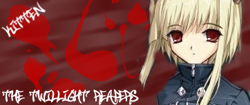
    Hitsugaya; OHMAHGAWH, I SO WANTED TO USE THIS RENDER BUT YOU KILLLLEDDDD MY MOMENTUM!!! ;; Nah just kidding. I couldn't make it work myself. xD What I don't really like about this banner is how smooth the render is, but how grungy the background is. The color scheme doesn't really appeal to me either, though there's absolutely no clash, I just don't really like it. xD; The outer glow on the text works here too, but it's just a tad too bright, and doesn't match with the brushing. Ah, maybe it's the fact that your main brushes are large and fat, but Hitsugaya's lines are all thin and detailed? I don't know, but there's something about it that I'm iffy about as well.

    El Capitano; Ohhh.... I definitely don't like this one better than the Shana one. D: It's not a matter of the render or background, it's the lighting. It just seems like some big white circle, because there's no specific point where the white expands and fades away. Well, the "specific point" takes up too much space, I guess. And due to the shadows on Gaara's face, the lighting would most likely be coming from directly below him, which makes the lighting unbelievable. The lack of a border in a c4d banner as dark as this somewhat irks me as well. xD;

    evilcheese; I'm seeing a trend. I think I'm going to go and make a Gaara banner right now to fit into the fad. xDD *definitely not.*

    Anyway- Oh! I just saw the text. xD; Yeah, unfortunately, the outerglow doesn't fit here at all, nor does it really do it's job of making the text stick out. I think this banner would look perfectly fine without text at all, especially something as minimalistically obvious as 'Gaara'. The font fits though. xD I don't really like the dark flecks on Gaara's face, and I think those should've been erased. The earthy, grungy look really fits though, and the clipping mask is really cool, even though I would like it better if it was moved a little more towards the main render, so the focus isn't drawn away.

    BreD; Hmm, I think it looks pretty cool. It looks kind of pasted on the left, and I don't really like that stand-outish blue going with L. The text would be awesome- if "BreD" wasn't underneath it. ^^;; The border is good, and the flow is definitely very nice. I don't know about that clipping mask, as I can't really tell wahti part of him it is or what it's dong there, but it's a good piece overall.


    Whew! I think that's everything except El Capitano's shoe vector, which I'm unfortunately not going to rate due to the fact that I have never once attempted a vector, and thus have no right to criticize anything. I do have to say, as an amateur who doesn't know how it works, "That is some seriously awesome stuff. ;D"


    I'll have a banner to be rated sometime tomorrow. It's saved at school, and I forgot to e-mail it to myself so I could finish it. :P Intelligence prevails.
     
    1,594
    Posts
    17
    Years
  • @Demidian: Love the Cloud banner, but I don't how you can make it seem more... filled in the background, still looks nice. A very thin stroke over the Demidian text would look nice. Black or dark blue maybe.

    @BreD: Not sure, but I think I rated your banner before. The text should stand out a bit more in my opinion, but I like it. Perhaps the render could be a bit larger too?

    Here's another:

    ByakuyaSecond.png


    And to Xenocrates I know I use Outer Glow/Stroke WAAAY too much on text, but I really have no idea what else to do unless it's large text. Have any tips? Oh and I changed my mind from the Tsubasa one because I looove Byakuya. I think I might do a Lloyd Irving theme though. And go ahead and take that Hitsugaya render, lol, I don't like the banner I made anyway, I won't be using it anytime soon.
     

    Rukia Kuchiki

    Banned
    135
    Posts
    16
    Years
  • BreD: I like it~ 9/10 But you should have made L bigger. But I love the background~

    Relyt: 9/10 And your banners good too, but I think it needs more dark in it, to match with Byakuya's hair. ^^

    I think I might give this rating thing a go... XD;

    sodenoshikayuki_rukia.jpg


    Please rate/critise~
     
    Last edited:

    Uryū Ishida

    Hishoku no Sora
    443
    Posts
    16
    Years
    • Seen May 30, 2009
    Heyy Heyy Heyy...its me again..
    @Rukia: i like the background alot...and how the moon shines off the sword nice effect =P..and you always make big banners...maybe i should start making bigger ones..9/10 for me
    well heres mine (again gimp,lol im just to cheap to afford photoshop..haha)
    6nth7gj.png
     
    1,594
    Posts
    17
    Years
  • Heyy Heyy Heyy...its me again..
    @Rukia: i like the background alot...and how the moon shines off the sword nice effect =P..and you always make big banners...maybe i should start making bigger ones..9/10 for me
    well heres mine (again gimp,lol im just to cheap to afford photoshop..haha)
    6nth7gj.png

    @Demidian: Looks really cool, but you should add a slight stroke to the "Demidian" text. Really like the "How far have we come" text too. You could always go to the Adobe website and download a trial of Photoshop. It lasts 30 days, so that should do you good. :D
     

    Uryū Ishida

    Hishoku no Sora
    443
    Posts
    16
    Years
    • Seen May 30, 2009
    @Demidian: Looks really cool, but you should add a slight stroke to the "Demidian" text. Really like the "How far have we come" text too. You could always go to the Adobe website and download a trial of Photoshop. It lasts 30 days, so that should do you good. :D
    @Relyt: Thanks for the comments..i think ill stick with gimp until i get the full version of photoshop, gimps fine anyway i didn't think i could get decent results like this so yeah....thanks ill take your advice for my next sig..by a stroke do you mean like a blur or a line?
     
    1,594
    Posts
    17
    Years
  • @Relyt: Thanks for the comments..i think ill stick with gimp until i get the full version of photoshop, gimps fine anyway i didn't think i could get decent results like this so yeah....thanks ill take your advice for my next sig..by a stroke do you mean like a blur or a line?

    By stroke I mean a border just around the text.

    @Rukia Kuchiki: Really love the effects, but the render of Rukia looks kind of odd. The last render you had was awesome. Still though, 8.5/10.
     

    Uryū Ishida

    Hishoku no Sora
    443
    Posts
    16
    Years
    • Seen May 30, 2009
    By stroke I mean a border just around the text.

    @Rukia Kuchiki: Really love the effects, but the render of Rukia looks kind of odd. The last render you had was awesome. Still though, 8.5/10.
    hmm..thanks ill figure out how to do that...
     

    Loki

    x
    6,829
    Posts
    18
    Years
    • Seen Apr 4, 2024
    A stroke would be like the black outlines on the white text in your banner, Demidian.

    ^^
     

    Uryū Ishida

    Hishoku no Sora
    443
    Posts
    16
    Years
    • Seen May 30, 2009
    xD yeah i just relised that....and i think when i use stroke selection...it shouldve gave me a hint....maybe im just to dumb...lol
     

    Sawyer

    ���
    3,196
    Posts
    19
    Years
  • Isn't this exactly the same as my thread? I don't really understand why there's a new one... but I guess I haven't been here in over a year.
     

    Loki

    x
    6,829
    Posts
    18
    Years
    • Seen Apr 4, 2024
    Sawyer; Welcome back~

    I guess if anything would word it properly, it'd be for administrative reasons that there's a new thread. And because I wanted it to be a little more organized. xD;

    And that the new method follows the same one used in the very beginning of the last one, (Like the one above,) which people stopped doing. (Thus, banners weren't getting rated, etc.)

    Also, please do not spam. ;D

    The same goes for you Demidian.
     
    Status
    Not open for further replies.
    Back
    Top