• Our software update is now concluded. You will need to reset your password to log in. In order to do this, you will have to click "Log in" in the top right corner and then "Forgot your password?".
  • Welcome to PokéCommunity! Register now and join one of the best fan communities on the 'net to talk Pokémon and more! We are not affiliated with The Pokémon Company or Nintendo.

Map Rating/Review Thread

Status
Not open for further replies.

Crimson Stardust

Anime Addiction
1,319
Posts
15
Years
  • Map Name: littleroot v.2

    Map Game: emerald

    Comments: my first map in emerald
    i gave the pokemart the pokemon center roof and the pokemon center the mart roof

    Mapshot:
    Spoiler:
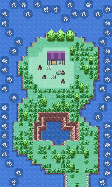
    i will give this 3/10 because there is too many/big empty spaces.Try to fill it up with other tiles or make the map smaller.Another thing is the mountains,it is too linear.The mountains in our world will not look like that.it is scattered or places unevenly.That is how you make the mountain look natural....
    Hope this helps you..xD
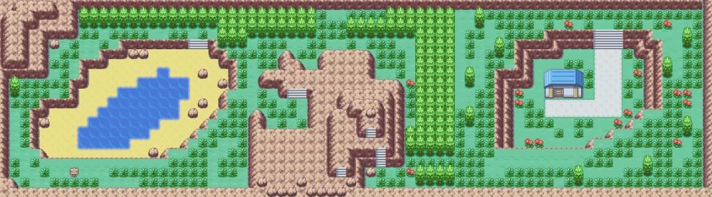
    ____________________________________
    Name:smallwood
    Base:fire Red
    rombase:MOP
    Info:a map i do to practice back on my mapping skiils as it been a while since i map
    here it is..rate it
    Spoiler:
     
    Last edited:

    Pokepal17

    More cowbell~
    1,519
    Posts
    15
    Years
  • Map Name: littleroot v.2

    Map Game: emerald

    Comments: my first map in emerald
    i gave the pokemart the pokemon center roof and the pokemon center the mart roof

    Mapshot:
    Spoiler:

    3/10, the map is too squareish and I see a tile error. Also swapping roofs isn't a good idea because people may consider it as tile errors. Make it more natural by making the mountains folloing the same pattern and don't make the top rock layer just like the bottom rock layer. I would also advise you to add more flowers and map fillers to fill up empty space.
     

    Luck

    ¯\_(ツ)_/¯
    6,779
    Posts
    16
    Years
    • Seen May 20, 2023
    Hai guyz.
    I made another made out of pure boredom...


    I know that you can do much better than that.
    The mountain shape is fine, but is bland at a lot of times. that unreachable lake there bothers me for a few reasons. For one, it's situated on a mountain. It is also ocean water, and the lake "edge" is too close to the mountain edge. And it may just be me, but the little black spots under the lake look like tile errors. The big slab of mountain tiles at the top are too empty, and is way too big, as opposed to the other ones. The trees are too linear, the flowers are badly distributed, and that building at the bottom right is basically pushed up against the trees(as well as the other buildings above that bike shop building). Don't forget that they are supposed to be known as 3D objects, and need their own space too. Lastly, the bike shop is pressed against the brick road, and the brick road just looks "off" to me. Even for an artificial road, it looks too square. I do like that you put in thin trees when it was needed and that you placed the gym,PC, and mart at good places. I don't like how big you made the map, considering that only one house, a shop, and a cave is accessible. And I didn't even see it, but you used the same grass tiles. I'd give it a 4/10.
     

    WetCurl

    Would I like a Cookie?Wy naut?
    3
    Posts
    14
    Years
  • Heeey,I made a map this morning while my internet was gettin fixed.
    Map Name:Jaggy Town
    Game:Fire Red
    Comments:Well the player has to go through a long cave to get here,but they found Fly in the cave.The tileset is Kyledove.
     

    Lover's Kite

    [b]the age of empathy[/b]
    736
    Posts
    16
    Years
  • Jaggy Town
    By: [url-inline="member.php?u=160475"]WetCurl[/url-inline] /
    firered.png
    "Well the player has to go through a long cave to get here,but they found Fly in the cave.The tileset is Kyledove."
    Original Post: [url-inline="showpost.php?p=4872695&postcount=4048"] #4048[/url-inline]
    Spoiler:
    This map is really nice, the mountain border is just right, not to square, not to intricate~ Kyledove's tiles are a bit... overused but it's not that big of a deal. The tree layout could be a bit more complex, same goes for the sandy routes. The palettes, default tiles and the custom ones clash, I suggest finding a tileset that best suits that palettes or vice-versa. The center of your map should be more filling, instead of everything along the mountain border~ That's about it...I think. Yeah~ It's obvious you know how to use Advance Map, but you need to watch how you design the map layout.
    7.5 out of 10.0
    CSS by [url-inline="member.php?u=55892"]Forgotten Memory[/url-inline]. Do not use without permission.
    Smallwood
    By: [url-inline="member.php?u=138201"]ageangel[/url-inline] /
    firered.png
    "A map I do to practice back on my mapping skiils as it been a while since I map."
    Original Post: [url-inline="showpost.php?p=4873166&postcount=4049"] #4049[/url-inline]
    Spoiler:
    Let's see... the map layout is pretty nice, really simple. What bugs me first of all is the palette, it's a bit desaturated, maybe trying adding some vibrant colours, even if it's just abit? The second thing is the Pokémon Center, I don't really see a purpose in it being there... the map is waaaay to small in my opinion, but to each his own I suppose~
    7.8 out of 10.0
    CSS by [url-inline="member.php?u=55892"]Forgotten Memory[/url-inline]. Do not use without permission.
     
    Last edited:
    4,294
    Posts
    14
    Years
    • Age 31
    • Ohio
    • Seen Jun 6, 2017
    My map is left out..xD
    Name:smallwood
    Base:fire Red
    rombase:MOP
    Info:a map i do to practice back on my mapping skiils as it been a while since i map
    here it is..rate it
    Spoiler:
    The tree line can be made to look more natural, the water line is kind of..boring. Small. Nice palettes and tiles.

    8/10
     

    Logan

    [img]http://pldh.net/media/pokecons_action/403.gif
    10,417
    Posts
    15
    Years
  • My map is left out..xD
    Name:smallwood
    Base:fire Red
    rombase:MOP
    Info:a map i do to practice back on my mapping skiils as it been a while since i map
    here it is..rate it
    Spoiler:

    Rated By: Alice./Goodies
    Rating: 2.8/10
    Comments: Well, where to start? I can generally see where you are trying to go with this map, but the thing is where you are trying to go, you don't won't to go there. You are trying to go for the old naturality look, but seriously, sometimes a nice solid style looks way more natural :/. Recently, you rated someones map, saying that their mountains weren't very natural, well, I can tell you that your water is ever so un-natural. The whole thing is just off. The path, it looks quite nice and well done, but it goes up to every door but one? Either make it go up to every door or just make it go up to none of the doors, see where I'm coming from? Anyways to the tree placement, 'ey? So, seriously what on earth are you doing with your trees? The borders are so stuffed up it's unbelievable, there is nothing that even makes it look like the border would work. Every single tree looks like you randomly placed them everywhere, seriously work on it and read a hell of a load of mapping tutorials.
     

    MASTEROFPUPPETS93

    Liebe Ist Für Alle Da
    110
    Posts
    15
    Years
  • Fire Red Hack
    Alur Town

    This is the starter town and I'm not sure what to improve on.
    Spoiler:

    Thanks
    Looks a bit empty... The roof of the houses looks weird. You should add some more trees to it... The path looks weird, too imo. I'll give your map 5/10

    ~MOP
     

    Magneto20

    CoOmnipotent1of Pokemon:WARPED
    174
    Posts
    16
    Years
  • Fire Red Hack
    Alur Town

    This is the starter town and I'm not sure what to improve on.
    Spoiler:

    Thanks

    It needs a more defined shape. About 70% of the map is just a mess of scarcely placed trees. A path leading out of the town would be a nice addition, as opposed to just linking the buildings. Also, the pond on the right is too squarish. Hope this helps.

    4/10, but there's room for improvement!
     

    Full Metal

    C(++) Developer.
    810
    Posts
    16
    Years
  • Hows this one eh?
    Map Name: Eh...PracticeMap?
    Map Game: FireRed
    ROM base: M.O.P.'s rombase
    other info: Just trying to practice some mapping. I tried to make it as natural as possible but yet still have it playable and ensure the player has multiple ways to get to the same place and direct the player through the whole map at the same time.Yes I have changed the pallettes on the base as well.
    Spoiler:
     

    andyp159

    Master of Fire!
    107
    Posts
    15
    Years
  • Hows this one eh?
    Map Name: Eh...PracticeMap?
    Map Game: FireRed
    ROM base: M.O.P.'s rombase
    other info: Just trying to practice some mapping. I tried to make it as natural as possible but yet still have it playable and ensure the player has multiple ways to get to the same place and direct the player through the whole map at the same time.Yes I have changed the pallettes on the base as well.
    Spoiler:

    Is the path meant to be sand or some kind of murky water, as it resembles the water tiles from the original game. Anyways, it's quite a decent map, however I have two points to make. Some of the trees around the edge could be less linear. Also, I would be less frugal with the grass, as its in batches at the moment and it looks as if the route has employed some sort of lawnmower in places ;)
    Overall, nice map, 7.5/10


    Here's some of my maps:

    Map Name: Ioke Springs
    Map Game: Pokemon: WARPED
    Base game: Fire Red

    Spoiler:


    Map Name: Aerbs Mountain
    Map Game: Pokemon: WARPED again
    Base game: Fire Red

    Spoiler:


    Be honest. :)
     
    4,294
    Posts
    14
    Years
    • Age 31
    • Ohio
    • Seen Jun 6, 2017
    Is the path meant to be sand or some kind of murky water, as it resembles the water tiles from the original game. Anyways, it's quite a decent map, however I have two points to make. Some of the trees around the edge could be less linear. Also, I would be less frugal with the grass, as its in batches at the moment and it looks as if the route has employed some sort of lawnmower in places ;)
    Overall, nice map, 7.5/10


    Here's some of my maps:

    Map Name: Ioke Springs
    Map Game: Pokemon: WARPED
    Base game: Fire Red

    Spoiler:


    Map Name: Aerbs Mountain
    Map Game: Pokemon: WARPED again
    Base game: Fire Red

    Spoiler:


    Be honest. :)
    Ioke Springs~

    It looks decent, it could be more neat and more big trees couldn't hurt. 7/10

    Aerbs Mountain~

    Way to blocky, some parts look empty. I don't like how the stone path goes from 3 tiles wide to 2 tiles wide either. 3/10
     

    Full Metal

    C(++) Developer.
    810
    Posts
    16
    Years
  • Is the path meant to be sand or some kind of murky water, as it resembles the water tiles from the original game. Anyways, it's quite a decent map, however I have two points to make. Some of the trees around the edge could be less linear. Also, I would be less frugal with the grass, as its in batches at the moment and it looks as if the route has employed some sort of lawnmower in places ;)
    Overall, nice map, 7.5/10


    Here's some of my maps:

    Map Name: Ioke Springs
    Map Game: Pokemon: WARPED
    Base game: Fire Red

    Spoiler:


    Map Name: Aerbs Mountain
    Map Game: Pokemon: WARPED again
    Base game: Fire Red

    Spoiler:


    Be honest. :)
    I'm not to crazy about the loke springs map...6/10
    constructive critisizm: The "pool" in the middle in my opinion shouldn't have "mountain" edges, i would reccomend using 1 "level" of those jumping things (you can walk on them and jump downwards, then can't go back up them...) other than that, unless there is something in the story of that hack i would put the jars / vases in places a little less random, seeing as they aren't anything natural (vs trees should be randomly placed)
    other than that it's pretty good :D

    The second one I really like alot as far as visually, but the gameplay would be a little difficult, seeing as there is no way in and no way out O_o.
    I like the way it is layed out as well. This map has added grass,water, and mountains in a great way. I reccomend adding a few different trees and some flowers on the left side as well. 8/10
     

    Momoko

    OMGOODNESS THATS NOT TRUE WDF!
    742
    Posts
    16
    Years
  • Here's some of my maps:

    Map Name: Ioke Springs
    Map Game: Pokemon: WARPED
    Base game: Fire Red

    Spoiler:


    Map Name: Aerbs Mountain
    Map Game: Pokemon: WARPED again
    Base game: Fire Red

    Spoiler:


    Be honest. :)


    Ioke Sping-very simple and nice. I like it, but it doesnt look very natural, and the two layers of cliff near the middle surrounding a small pond does not work. It should be maybe only 1 layer max, and even then that might be pushing it a bit. 6.5/10

    Aerbs mountain-again, i dont like it very much. looks very unatural and kind of squished :/
    It looks very weird, and I know there must be a reason for no way in or out, but that kinds of adds to this overall bad rating
    6/10
     

    sasquatchd00d

    welcoming a clean head.
    264
    Posts
    15
    Years
  • Map Name: Ioke Springs
    Map Game: Pokemon: WARPED
    Base game: Fire Red

    Spoiler:

    I'm just going to start out by saying that this looks very un-natural. Quite the opposite of what you were going for I believe. I'll say that an island would not look like this. There are no elevation changes what so ever, except for in the middle and that doesn't look right anyways. Speaking of the middle drop, there are some really, really, obvious tile errors in the mountains. There is only one regular grass tile used in this map. Fire Red gives you five to use. If they are there, use them. You tried to place the wild grass in a natural way, but it just looks awkward. Honestly, you're better off placing the grass in clumps like Nintendo does, but not as blocky if you get what I'm saying. The house is just one big tile error. There's no back sloping roof and it's four tiles wide instead of five like it should be. There's small trees placed randomly in the bottom of the map and then big trees placed in a row at the top. Pick one style or the other please. It's difficult for me to find one thing I like about this map. If I had to choose something, I'd say that the rocks in the water are not horribly placed in the top right corner. They're straight in other places. x_x

    2/10
     
    Status
    Not open for further replies.
    Back
    Top