• Our software update is now concluded. You will need to reset your password to log in. In order to do this, you will have to click "Log in" in the top right corner and then "Forgot your password?".
  • Welcome to PokéCommunity! Register now and join one of the best fan communities on the 'net to talk Pokémon and more! We are not affiliated with The Pokémon Company or Nintendo.

A Place to show off Your Custom Title Screens

Argent Crusader

Isn't Falstad dead?
300
Posts
17
Years
  • So... I was bored and checked back Pokécommunity.
    From the titlescreen you guys would recognize me :D
    A Place to show off Your Custom Title Screens
     

    Iacobus

    sǝɯɐɾ
    64
    Posts
    20
    Years
  • No idea who you are, but the hack name rings a bell though.
    Anyway, the colors are OK but..
    > I would make the upper 'border' a little darker.
    > I would make both those black bars the same size.
    > Try to lighten the background behind the Pokémon sprite so you won't see the edges as much as you do now. No idea if that will help..
    > The font of the version logo looks stretched (width). The arch of the logo is a to big in my opinion.

    It's a nice titlescreen though, these are just small things I don't like about it.
     

    558122_DG

    Learning how to make mistakes
    737
    Posts
    14
    Years
    • Seen May 27, 2021
    Trying to bring this back up to the top with a title screen for a project I'm working on. ^^
    A Place to show off Your Custom Title Screens

    Not my best work, but meh.. :/

    That overall looks great some things you should look at:
    The "press start to continue" is not centered.
    the 2010 blitz thing overall looks pretty cheap :/
    And maybe a bigger azelf sprite?


    Hey, I was wondering, would I be able to make a request for a "Xanadu Version" logo?
     

    Freya

    Squee!
    25
    Posts
    14
    Years
    • Age 31
    • Seen Oct 25, 2016
    This title screen isn't for a hack or anything, I'm just curious to see what other people would think of it.
    A Place to show off Your Custom Title Screens
     

    curiousnathan

    Starry-eyed
    7,753
    Posts
    14
    Years
  • So... I was bored and checked back Pokécommunity.
    From the titlescreen you guys would recognize me :D
    A Place to show off Your Custom Title Screens

    WOW! I mean wow!
    W - Wicked
    O - Oustanding
    W - Work
    Great use of colours and shapes to really bring out the beauty in cresselia which is mostly overlooked all the time.

    Here I'll show you the titelscreen of my hack:
    A Place to show off Your Custom Title Screens

    This is fantastic too! But just a suggesiton, ther background needs to be umm... I cant describe it.... I think about that one! ^-^ Still as always great work to you and everyone!
     
    21
    Posts
    14
    Years
    • Seen Dec 1, 2014
    This is my Title screen. Pokemonrespriter and I put it together. I could use some help with the words and background though.


    A Place to show off Your Custom Title Screens
     

    .Tactic.

    x.Paranoid's BackAlley.x
    1,309
    Posts
    15
    Years
  • It looks like you have completely messed up the writing.. And the sprite is a bit small aswell...

    0.5/10
    All you did was insert a small sprite.. so there is no reason to showcase it.
     

    .Tactic.

    x.Paranoid's BackAlley.x
    1,309
    Posts
    15
    Years
  • Woah! That is smexy! lol. :P
    But the bottom part is a bit empty.. makes it seem like you pushed everything into the top of the screen...
     

    HackMew

    Mewtwo Strikes Back
    1,314
    Posts
    17
    Years
    • Seen Oct 26, 2011
    A Place to show off Your Custom Title Screens

    Yes, the Mewtwo glows, just like the Emerald Rayquaza. I will eventually re-position the logo. Any comments on the color?

    btw Iacobus, if you can make me text saying ShadowAmethyst that will be super awesome.

    I think the Mewtwo should be smaller, and less covered by the logo/text. I would make Mewtwo resemble more his original colors anyway.


    So... I was bored and checked back Pokécommunity.
    From the titlescreen you guys would recognize me :D
    A Place to show off Your Custom Title Screens

    It looks fine, but the top/bottom bars could have been the same size and color, possibly darker. Maybe it's just me, but the "Coral Version" looks a bit weird.


    Here I'll show you the titelscreen of my hack:
    A Place to show off Your Custom Title Screens

    I think the "Drücke Start" text (that's German, for those who don't know), should be a bit lighter. If I were you, I would reduce the size of the "The Mistery of Celebi" part. And fix that white pixel near the "y". The background seems good, but Celebi doesn't blend really well, in particular the top part of its head. You should adjust the shading too, and do something for his mouth, which was red/pink in the original picture, because it looks pretty akward.


    A Place to show off Your Custom Title Screens


    This titlescreen is for my hack, Stardust Zircon X.

    The background could use some improvements, it looks quite empty. Also, you should fix those pixels in the "Stardust Zircon X" text, and move the "Press Start" etc. a few pixels down. Other than that, I'm not a fan of D/P/Pt/HG/SS sprites in title screens =/


    Trying to bring this back up to the top with a title screen for a project I'm working on. ^^
    A Place to show off Your Custom Title Screens

    Not my best work, but meh.. :/

    The background is too bright, and the "Press Start" and "2010 Blitz" would be better with different colors. You partically truncated the "TM" text near the Pokémon logo. Oh, and if you could use another Azelf sprite, it would be better. Maybe make the "Saturn Version" a tad smaller.


    This title screen isn't for a hack or anything, I'm just curious to see what other people would think of it.
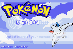
    A Place to show off Your Custom Title Screens

    Well, Togekiss should be moved more on the top-left. It's too close to the edges right now. The blue bars should be the same size, and made either darker/lighter to achieve a better contrast. Same with the "Press Start" text. As for the background, it looks good, even if it seems to be getting overused. The Blue Sky text is nice though.


    This is my Title screen. Pokemonrespriter and I put it together. I could use some help with the words and background though.
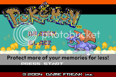

    A Place to show off Your Custom Title Screens

    The Pokémon text is totally ruined, and the "Dragon Blaze" text is barely readly. Also, using an in-game sprite is a big no-no. Can't say much else, because the rest stayed the same as the original title screen.


    The one in the top, right corner...The others are just resources for making it...

    It should be simplified, because as it is now, I hadly believe you will be able to insert it. Anyway, I don't think the yellow border fits very well.


    this is the new title screen of my hack: Pokémon Crono

    A Place to show off Your Custom Title Screens

    I think Moltres shouldn't be covered, also the Crono Version text is a bit too small I guess.
    Oh, and the 2009 Dante text should be centered I think, maybe remove the "inc." too.
    The "n" in "Dante" looks weird anyway.
     
    Last edited:
    Back
    Top