• Our software update is now concluded. You will need to reset your password to log in. In order to do this, you will have to click "Log in" in the top right corner and then "Forgot your password?".
  • Welcome to PokéCommunity! Register now and join one of the best fan communities on the 'net to talk Pokémon and more! We are not affiliated with The Pokémon Company or Nintendo.

blackmoonflower's pixel creations!

blackmoonflower

You won't like me if I'm angry
271
Posts
14
Years
  • Finally have my grass starter line complete. And in the correct size for a rom hack that I will make eventually.

    blackmoonflower's pixel creations!
    blackmoonflower's pixel creations!
    blackmoonflower's pixel creations!


    Fawleaf, Deerant, and Trokapi
     

    blackmoonflower

    You won't like me if I'm angry
    271
    Posts
    14
    Years
  • Thank you. ^_^

    This is Ponchick.

    blackmoonflower's pixel creations!


    First of the water starter line.

    ...I've been told it looks like a baby Chocobo. XD


    EDIT: I also made another virtual pet.

    blackmoonflower's pixel creations!
     
    Last edited:

    Dots

    Temporary Avvie. ^^'
    99
    Posts
    14
    Years
    • Seen Apr 23, 2012
    Finally have my grass starter line complete. And in the correct size for a rom hack that I will make eventually.

    blackmoonflower's pixel creations!
    blackmoonflower's pixel creations!
    blackmoonflower's pixel creations!


    Fawleaf, Deerant, and Trokapi

    This is neat. You're done a pretty good job at spriting those, but I'm not such a big fan of the last evolution's concept design.

    The transition from Fawleaf to Deerant was a great job and suitable for a pokemon game, as much is expected and wanted from an evolving pokemon, especially a starter. However, Trokapi doesn't meet such expectations, because he just looks like a Deerant with more props. don't misunderstand me though, the pose and facial expression are great, and it's just the similarity issue that bothers me. A change of colors (darkening them maybe?) would probably help, and maybe some little extra details on the sprite itself, such as fur coat markings or maybe elongated horns to show the growth during evolution? Wouldn't the tube structures (or are they buds?) on Deerant bloom or change during evolution? Making them petals or flowers with fresh colors would really help the design. You might even want to make the leaves on Trokapi multicolored to fill that criteria.

    That's just an opinion, and I hope it didn't hurt your feelings. I just wish the best for everyone, and try to help others if I can. You can ignore this post if you want to, or if you're convinced that you love the design.


    Got Ponchick's first evo done.

    blackmoonflower's pixel creations!


    This is Storish.

    You already know what I think of this guy if you checked my post in the Spriter's Showcase (I was going to spell the as shoecase ... =P) and Discussion thread regarding that. ^^
     

    blackmoonflower

    You won't like me if I'm angry
    271
    Posts
    14
    Years
  • I like the way Trokapi is now, though I guess I could make the horns even longer or perhaps a tad darker. Petals are a nice idea, I might try that. And those are supposed to be vines. XD I was going to make them more of a yellow color, but I ran out of palette space...

    Ponchick's colors are supposed to be kind of dull, since it's based off of a baby heron. As it evolves, the colors will be more vibrant. And I only just realized how fat Storish's legs look... I'll try to fix that at some point, though it's supposed to look like it's bending down. Its legs are quite long when fully extended. And if you look closely, you'll see that there is some color in its eye. I can try to make the head bigger so I have more room to work on that. And tbh, I kinda like the solid black on the wings... lol I'll probably end up changing that.

    Thanks for the input. ^_^
     

    Dots

    Temporary Avvie. ^^'
    99
    Posts
    14
    Years
    • Seen Apr 23, 2012
    I like the way Trokapi is now, though I guess I could make the horns even longer or perhaps a tad darker. Petals are a nice idea, I might try that. And those are supposed to be vines. XD I was going to make them more of a yellow color, but I ran out of palette space...

    Ponchick's colors are supposed to be kind of dull, since it's based off of a baby heron. As it evolves, the colors will be more vibrant. And I only just realized how fat Storish's legs look... I'll try to fix that at some point, though it's supposed to look like it's bending down. Its legs are quite long when fully extended. And if you look closely, you'll see that there is some color in its eye. I can try to make the head bigger so I have more room to work on that. And tbh, I kinda like the solid black on the wings... lol I'll probably end up changing that.

    Thanks for the input. ^_^

    Oh, so I see you're working on a ROM then? If that's the case, then the color limit can be a bit annoying. There's a solution for everything though, and that's using the same shades for similar colors instead of adding new ones, or you could reduce your palette.
    I just checked Trokapi in MS Paint, and believe me, you have way too many unneeded colors. Some of them can't even be picked out by normally looking at the sprite, so I suggest using simpler color choices to achieve the look you're aiming for.

    As for Storish, the light green in his eye is barely visible, so either darken it's surroundings, or replace it with a darker olive-green color to solve the issue. Also, even if it's bending down, the legs would retain the same thickness ... unless it's compressed instead of bent. I know how you feel about the wing, but a few shades of gray to add tiny details would help your sprite immensely, so give it a try and see what happens. ^^
     

    OMGWURMPLES!

    För Sverige i tiden
    49
    Posts
    14
    Years
    • Seen Jun 15, 2012
    These are pretty good. One thing I would suggest though, is make the animation for the animated Rapidash a bit faster, right now it doesn't really look like the fire is changing shape. I think the virtual pets are pretty nice though! Do you think you could make more, say like a Charizard? /hint
    :D
     

    blackmoonflower

    You won't like me if I'm angry
    271
    Posts
    14
    Years
  • @ OMGWURMPLES: I'll get on that, no problem.

    Now that I've redone Storish....

    blackmoonflower's pixel creations!


    I've done the final evolution stage, Herond.

    blackmoonflower's pixel creations!
     
    10,769
    Posts
    14
    Years
  • @ OMGWURMPLES: I'll get on that, no problem.

    Now that I've redone Storish....

    blackmoonflower's pixel creations!


    I've done the final evolution stage, Herond.

    blackmoonflower's pixel creations!
    I'm not an expert on bird anatomy, but on Herond where the legs meet the body the legs looks a bit wide to me. I also imagine birds' legs as being attached somewhere under the body and not, as it looks like on the sprite, someone slightly on the side. It's the way the orange of the leg appears to extend into/over the blue area rather than under/behind it that is giving me some trouble imagining it on a real bird.

    That aside, I love the shade of blue you used and how the black feathers on the head make it look like it's wearing a headband or a bandanna. If it were my sprite I would lighten the black feathers just a tiny bit because on my monitor they look like one solid block of color. Maybe that's just me.
     

    blackmoonflower

    You won't like me if I'm angry
    271
    Posts
    14
    Years
  • Hmm, you're right. Something about the legs did seem off to me, but I wasn't sure what it was. Thanks, I'll work on it.

    EDIT: Here's the remake of Herond. I like it much better now.

    blackmoonflower's pixel creations!


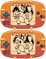
    And here's the Charizard virtual pet.

    blackmoonflower's pixel creations!
     
    Last edited:
    114
    Posts
    14
    Years
    • Seen May 7, 2012
    the bird second evo's neck is slightly too thin

    here is what I mean,.. I went and thickened it just a bit compare the two next to each other.

    (do not claim thicker neck, (of course) i just wanted to show example of how thick I think the neck should be)
     

    blackmoonflower

    You won't like me if I'm angry
    271
    Posts
    14
    Years
  • Storish is based on a stork, TCoL. If you look at a picture of a stork, you'll see that they have slender necks. Having the neck thicker makes it look more like a pidgeon.
     
    10,769
    Posts
    14
    Years
  • Well, this update was long overdue.

    blackmoonflower's pixel creations!
    blackmoonflower's pixel creations!


    blackmoonflower's pixel creations!
    blackmoonflower's pixel creations!


    blackmoonflower's pixel creations!
    blackmoonflower's pixel creations!
    The fire on the head of the backsprite for Embion looks more like the fire from Leober. It's more spiky and less wavy than the front sprite. Not that it has to be the same, but when you have two very, very similar backsprites it might be worth making a few changes just to make them distinct.

    I do have to say though, they're all impressively well done. Embion's face, however, is pretty round. I think it's the shading. It's head is shaded as though it were a sphere. That's fine for Leober because round = cute, but Embion looks like it should be less cute, more tough.
     

    blackmoonflower

    You won't like me if I'm angry
    271
    Posts
    14
    Years
  • Thanks, Scarf. I'll see what I can do about that. I wasn't sure how to make the two look different, since I'm pretty new with back sprites, and Leober and Embion look pretty similar anyway.
     

    Dorandragon

    The Pixel Master
    183
    Posts
    14
    Years
  • the backsprite of Lioblaze looks like it's head exploded...whileas the front sprite looks less explosive, also remember that fire never points down, so maybe make the mane more consistant than spikey.

    good spriting ^_^
     
    Back
    Top