• Our software update is now concluded. You will need to reset your password to log in. In order to do this, you will have to click "Log in" in the top right corner and then "Forgot your password?".
  • Welcome to PokéCommunity! Register now and join one of the best fan communities on the 'net to talk Pokémon and more! We are not affiliated with The Pokémon Company or Nintendo.

Map Rating/Review Thread

Status
Not open for further replies.

colcolstyles

Yours truly
  • 1,588
    Posts
    15
    Years
    Map name: Routes 4, 5, 7, 8, 17, 18, 19, 20, 21, 21, 24, 25, Cerulean, Cinnibar, and Fuchsia respectively.

    Map game: Fire Red.

    Comments: Can't believe I haven't posted mine yet.

    I've been changing nintendo's maps around a bit, to feel more natural. I went a bit overboard on some (good lord, is that really pallet?) And I prolly need to do some morework on some others (that route below cerulean, for instance. Square trees at the sides.) EDIT: And route 8, EW, what happened there? ... Have I even changed it?

    Also, for some reason, Route 4 is only half done. Hmm.

    Anyway, links below. Really can't be bothered to make thumbnails of all of them, so I'll make one, and just have a load of links. (^-^ ) All pics under 100k, apart from route 17. Yay cycling road. -.-


    EDIT2: I appear to have missed off my pride and joy, Route 2. Lemme just find it, and I'll show it off proudly, and cry when anyone tells me it isn't 10/10. ='[ (May as well chuck in the rest of the maps I forgot to upload for some bizarre reason, too. Pewter, I've broken, (you'll be able to see over the edge) and I've probably broken the scripts on the victory road place, but oh well.)

    Whoa! Is this all it takes to be a good mapper? Wow, I wish someone had informed me of this earlier. Then I wouldn't have wasted hours of my time making MY OWN DAMN MAPS. But this, this is a breakthrough discovery, revolutionary even! Perhaps one day, we may find the ability even to create our own maps from scratch! But I'm afraid that day is a long ways away; the technology is not yet great enough. But you, my friend, have pioneered the way towards a brand new way of mapping. I thank you.

    Okay all sarcasm aside, this is just terrible. Disgusting even. To think that you actually believed that you would get a 10/10 for your, scratch that, NINTENDO's Route 2 is just sickening. I pity you, you know that? I pity you for having the bravery to post these maps edits on this forum with your head high, expecting nothing but praise and admiration. Let me tell you something, you're not going to achieve fame and glory for the ability to somebody else's hard work and "improve" it (although your edits are hardly improvements). Do me a favor will you? Go to the Documents and Tutorials section, look up a mapping tutorial, then go make a map and when you think it can't POSSIBLY be any more perfect (this should take at least a week), post it here and I promise I'll find 101 things that you did wrong.

    Yours truly,
    Colcolstyles
     

    Rabbit

    where is my mind?
  • 484
    Posts
    15
    Years
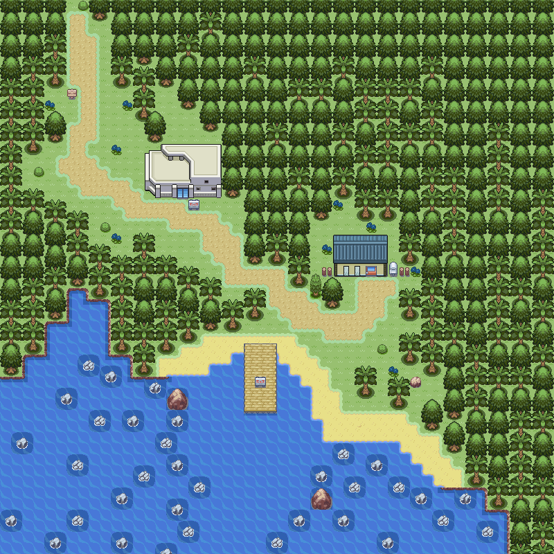
    I bring you a map:

    Map Name: Manilla Village, Lorengo island (starting town)
    Hack: Disclosed name.
    Base Rom: Fire Red

    Spoiler:


    All inserted by me.

    Thanks TB Pro and Alistair for tiles and pals

    I love that white building! @_@ Where did you get it? Can I steal it? It makes me think of California. The shape is funky and the colour used for the dark parts is bang-on.

    The trees. They don't overlap at all - well, maybe the palm trees do, somewhat, but it only looks like one tree is growing out of the other. The result reminds me of Gen 1. That's not a comparison you want anyone to make. What kind of tree are the conical trees? They look ike evergreens to me, but evergreens and palm trees don't mix. I'm not sure what biome you're going for here. Palm trees make me think of deserts, but there's a lot of green grass in the map. Were you intending to make a rainforest? In that case, I recommend a lot more variety in tree species and a lighter, fresher green.

    https://www.1-costaricalink.com/cos...l_tram_pacific_rain_forest_tour_picture_1.jpg

    The path is nice. The width is good, there's some irregularity, and the space margins are pleasing. The colour of the grass is fantastic. I notice you've left some space bethind the white building - is that for any particular purpose? Maybe you want to fill it with tall grass or a goodie. I don't like the way that the path ends abruptly at the top edge of the map. It's also strange to see a bush partly blocking the road.

    The path tiles need a bit of tweaking. It looks like the edges of the path haven't been edited with the grass, so that they appear mint blue in contrast. The path itself might look nicer if it were a few shades lighter and more yellow.

    The dock comes as a surprise to me. It just looks...unreal. Maybe it's because I never accepted those tiles as being dock tiles. I expect them to be bridge tiles instead. There are other tiles you could use, like the ones from Dewford. Also, the dock would look better positioned a few tiles to the right, where it's farther from the trees and more accessible from the path. The sign right on the dock is out of place - everyone would have to walk around it! Even putting it at the end of the dock would be more reasonable.

    The tiles you're using as the edge of the island aren't meant to be used like that. They're kind of icky in general. Don't use them. All of the 3rd gen coastal maps I can find have the edge of the landmass defined by mountain tiles. Use those. What's more, your island edges don't blend with your beach sand edges at all. Again, you might want to use a different set of tiles - I recommend the sand tiles found in Dewford and displayed best on Route 105. They can be used strictly for the beach, or border the entire coastline. If a tropical island is your goal, I think the latter would look best.

    Overall, I rather like it. The shape of the path and placement of the beach look very natural to me, and few maps can boast that. It reminds me of a marine research centre on Vancouver Island with a rather similar layout. It's also nice to see a starting town that isn't a rectangle. -eye roll- Heck, I'm kind of excited about the idea of a game that starts like this.
     
    Last edited:

    Asday

    PokéFreak. Nuff said.
  • 34
    Posts
    16
    Years
    • Seen Dec 2, 2011
    Whoa! Is this all it takes to be a good mapper? Wow, I wish someone had informed me of this earlier. Then I wouldn't have wasted hours of my time making MY OWN DAMN MAPS. But this, this is a breakthrough discovery, revolutionary even! Perhaps one day, we may find the ability even to create our own maps from scratch! But I'm afraid that day is a long ways away; the technology is not yet great enough. But you, my friend, have pioneered the way towards a brand new way of mapping. I thank you.

    Okay all sarcasm aside, this is just terrible. Disgusting even. To think that you actually believed that you would get a 10/10 for your, scratch that, NINTENDO's Route 2 is just sickening. I pity you, you know that? I pity you for having the bravery to post these maps edits on this forum with your head high, expecting nothing but praise and admiration. Let me tell you something, you're not going to achieve fame and glory for the ability to somebody else's hard work and "improve" it (although your edits are hardly improvements). Do me a favor will you? Go to the Documents and Tutorials section, look up a mapping tutorial, then go make a map and when you think it can't POSSIBLY be any more perfect (this should take at least a week), post it here and I promise I'll find 101 things that you did wrong.

    Yours truly,
    Colcolstyles

    Wel, excuse me for wanting to play Vanilla Pokémon, without the horrible squareness of everything. For your information, I've been bored recently, and have been GASP GASP GASP, being original, and making some maps in my own shape, simply because it's fun. I don't aim to achieve "fame and glory" (*snicker* Let's get famous by raping an engine (someone elses HARD WORK) :O with my own "creativity". Yeah, I can see that working.)
    nor do I aim to do... Something else I forgot.

    Yes, my "work" is a set of edits, but as I've said, I like Game Freak's (not Nintendo's, nerp derp derp) square robotic maps as much as the next person (not alot), so I see nothing wrong with being proud at making it look better, and play more immersively.

    I pose a question for you. With your, frankly despicable attitude, how many people (out of ten ^_- ) do you think will heed your "advice", or "constructive criticism"? (Something that, I should remind you, was enforced in the first post.)
     

    waterninja7

    Pokemon Rom Hacker
  • 46
    Posts
    15
    Years
    Whoa! Is this all it takes to be a good mapper? Wow, I wish someone had informed me of this earlier. Then I wouldn't have wasted hours of my time making MY OWN DAMN MAPS. But this, this is a breakthrough discovery, revolutionary even! Perhaps one day, we may find the ability even to create our own maps from scratch! But I'm afraid that day is a long ways away; the technology is not yet great enough. But you, my friend, have pioneered the way towards a brand new way of mapping. I thank you.

    Okay all sarcasm aside, this is just terrible. Disgusting even. To think that you actually believed that you would get a 10/10 for your, scratch that, NINTENDO's Route 2 is just sickening. I pity you, you know that? I pity you for having the bravery to post these maps edits on this forum with your head high, expecting nothing but praise and admiration. Let me tell you something, you're not going to achieve fame and glory for the ability to somebody else's hard work and "improve" it (although your edits are hardly improvements). Do me a favor will you? Go to the Documents and Tutorials section, look up a mapping tutorial, then go make a map and when you think it can't POSSIBLY be any more perfect (this should take at least a week), post it here and I promise I'll find 101 things that you did wrong.

    Yours truly,
    Colcolstyles
    I pose a question for you. With your, frankly despicable attitude, how many people (out of ten ^_- ) do you think will heed your "advice", or "constructive criticism"? (Something that, I should remind you, was enforced in the first post.)

    LAWL, every single one of them (With the exception of you). You may like "Gamefreaks work" more but ever think of how other people feel about the maps. This is the emulation section which means more then half the people here are with a hacking team or have their own hack. They want something new, original.

    Anyway, I have my own maps for my HACKING TEAM -stares at above paragraph- :tired:
    https://i295.photobucket.com/albums/mm156/EvanKahn77/pokemonnightmare.jpg
    (sorry about the events)

    The top is the same map of route 1 on ruby reedited a bit to make a cave. It'll be available to go into after you beat the 8th gym. (If we get that far)

    Bottom left is the same map as pallet town except it looks completely different. I've also changed the direction that you start your game on.

    Bottom right is route 701 made from scratch. Its almost done, just gotta add some minor things. maybe some flowers :)
     

    Asday

    PokéFreak. Nuff said.
  • 34
    Posts
    16
    Years
    • Seen Dec 2, 2011
    All of them? Every one out of ten?

    Awesome, I knew I'd get a 10/10 rating. =P

    But no seriously, if someone flat out insults me, it completely devalues their subsequent, and previous opinions. Anything they say after that is wrong by default, and anything that's right is a lucky guess, or not their own research/original opinion. This is the way human minds work. They can not admit they were wrong, and anyone saying they are (or any variation on such a form) is then ignored. The exception is close friends.
     

    Vrai

    can you feel my heart?
  • 2,896
    Posts
    15
    Years
    • Age 29
    • Seen Oct 24, 2022
    Wel, excuse me for wanting to play Vanilla Pokémon, without the horrible squareness of everything. For your information, I've been bored recently, and have been GASP GASP GASP, being original, and making some maps in my own shape, simply because it's fun. I don't aim to achieve "fame and glory" (*snicker* Let's get famous by raping an engine (someone elses HARD WORK) :O with my own "creativity". Yeah, I can see that working.)
    nor do I aim to do... Something else I forgot.

    Yes, my "work" is a set of edits, but as I've said, I like Game Freak's (not Nintendo's, nerp derp derp) square robotic maps as much as the next person (not alot), so I see nothing wrong with being proud at making it look better, and play more immersively.

    I pose a question for you. With your, frankly despicable attitude, how many people (out of ten ^_- ) do you think will heed your "advice", or "constructive criticism"? (Something that, I should remind you, was enforced in the first post.)

    Mmk. You know, mapping is more than simply edits. They're too simple to even be considered to be mapping. And if you don't want to "rape the engine of someone else's hard work", as you put it, then I would honestly not call you a hacker at all. There's a certain pride that comes out of making your own maps, and editing Nintendo's (which, btw, aren't very good to begin with) just doesn't cut. :/

    Also, I can't name more than four other known people on the forums who like Nintendo's maps. :/

    Seeing how Styles is widely accepted to be one of the best mappers here, as well as someone with good advice for the most part, yeah, 99% of people usually take his opinion. You could do well to do the same.

    Try not thinking of it so much as an insult to your work, but more as an attempt to help you improve by pointing out your flaws in your work. :D


    All of them? Every one out of ten?

    Awesome, I knew I'd get a 10/10 rating. =P

    But no seriously, if someone flat out insults me, it completely devalues their subsequent, and previous opinions. Anything they say after that is wrong by default, and anything that's right is a lucky guess, or not their own research/original opinion. This is the way human minds work. They can not admit they were wrong, and anyone saying they are (or any variation on such a form) is then ignored. The exception is close friends.

    Uhm, what?
    What do you mean by you'd get a 10/10 rating? I hope you don't think that he said that about your maps, because I'm pretty sure he didn't. :/
     

    Alucia

    Random tile/map artist
  • 508
    Posts
    16
    Years
    • She/Her They/Them
    • Seen Mar 19, 2024
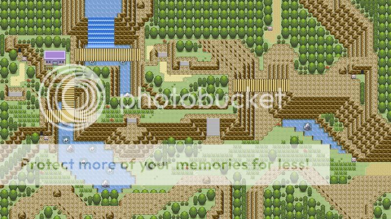
    heres one for you id like it if you reviewed this neti

    Map Rating/Review Thread


    Name: Lightpass
    Hack: white light (which will eventualy be turned into a flash game instead of a hack)
    these are the shiny gold b5 tiles but they wont be used in the finished thing the final game is being redesigned in flash i just felt like making a map on a map instead of flash for a change

    it looks like i was skipped i could really use an oppinion on this one
     

    Asday

    PokéFreak. Nuff said.
  • 34
    Posts
    16
    Years
    • Seen Dec 2, 2011
    Mmk. You know, mapping is more than simply edits. They're too simple to even be considered to be mapping. And if you don't want to "rape the engine of someone else's hard work", as you put it, then I would honestly not call you a hacker at all. There's a certain pride that comes out of making your own maps, and editing Nintendo's (which, btw, aren't very good to begin with) just doesn't cut. :/

    Also, I can't name more than four other known people on the forums who like Nintendo's maps. :/

    Seeing how Styles is widely accepted to be one of the best mappers here, as well as someone with good advice for the most part, yeah, 99% of people usually take his opinion. You could do well to do the same.

    Try not thinking of it so much as an insult to your work, but more as an attempt to help you improve by pointing out your flaws in your work. :D


    Uhm, what?
    What do you mean by you'd get a 10/10 rating? I hope you don't think that he said that about your maps, because I'm pretty sure he didn't. :/

    First off, I was kidding about the 10/10 bit. That much is obvious.

    I might have taken styles' "advice" had he put it something like this:

    Those are edits of existing maps, and not original maps. I ask you take your "work" elsewhere, as this is a thread for creativity.

    As opposed to his extremely arrogant and condescending rant. Should he wish to flaunt his undoubtedly massive epeen, he should do it in the flames section (provided there is one) at people who have more than, say eff-all posts. Way to make newbies feel welcome, styles.

    I never said I didn't want to do some engine-rapeage (why am I here?) but I'm just pointing out that OH NO SHOCK HORROR modifying someone else's work is exactly what everyone here is doing. Pots and kettles spring to mind. I simply indulge in less demanding, less in-depth editing to, as I said, increase immersion. And it works, in multiple ways. Level of immersion is increased, I have something to sink time into, I feel proud of the end result, and I get to have a (possibly) lengthy discussion about a range of things on a forum dedicated to imaginary monsters. (^-^ )
     
  • 12
    Posts
    16
    Years
    • Seen Apr 7, 2009
    it looks like i was skipped i could really use an oppinion on this one
    I really like the bridges and the way the paths wind between grass and mountain, however.. I find it looks un-natural. The mountain ledges follow each other too perfectly, too aligned. Try messing around with edges a bit - yes, it'll give you less room to move, but it'll give your map a much more natural feel with it.

    Also there are some palette errors, especially around most of the staircases.

    6.5/10.. I'd enjoy passing through the area, but if I stopped to take a proper look at it, I'd be disappointed.

    Hello, I was skipped. We need more people willing to review... Don't ask me, I suck at reviewing stuff.
    I like this map quite a lot, the concept is really nice, the mountains look natural

    However, the cave exit/entrance seems to be mismatched, try using the smaller tile. Also, it's not accessible if you don't have surf. If this is intended, maybe you could make it more apparent by moving the bridge further from it?

    The trees to the right has a dead-end.. Which seems to serve no purpose, dead-ends in rom hacks are extremely annoying, so I'd consider removing it or putting something with purpose there.

    Finally, the stairs need a bit of land at the bottom to stand on.. It just looks weird without anything there.
    7/10


    I'm quite content with Route 1, Route 2 and Echo Cave for my upcoming ROM Hack, but the settlements so far, if I'm honest, suck, and I really need pointers for improvement.
    (And I apologise about the dry links, not enough posts yet.)

    Map: Journey's Wake
    Game: Fire Red
    Comments: I know you can still definitely see parts of Pallet Town in there, it's not very well changed, I know. But, if it scores me any points, the house that's been added to the far right DOES have an inside lol. The path between the left and right sides of Journey's Wake has a cut-bush blocking it, too.
    img11.imageshack.us/img11/8619/41661220.png

    Map: Gradicent
    Game: Fire Red
    Comments: As before, I know it doesn't vary much from the original town (In this case, Viridian City) but I don't really think this one has many redeeming factors apart from the fact that Gradicent Gym is open from the very start of the game. A cut-bush exists where it is originally placed (by the dream-eater man)
    img17.imageshack.us/img17/1183/gradicent.png

    Final comments: As the old proverb goes, "Spare the rod, spoil the child." Don't go easy on me.

    Can I get mine graded now? O=) lol And by graded I mean torn to shreds, chewed up and spat out.
     

    Pokepal17

    More cowbell~
  • 1,519
    Posts
    15
    Years
    OK, I fixed the problems. I want a good score :)

    Map Rating/Review Thread
    8.99/10

    It's good but it's too bare. Add some flowers and if they're in the right position, you'll definitely be a 10/10.
    _______________________________________________________________________
    Now plz rate my map ppls.
    Name: Route 1
    Game: Pokemon Infernal Legend (my hack)

    Map Rating/Review Thread

    Credits go to me, Kyledove and the Zeikkster
     

    Luck

    ¯\_(ツ)_/¯
  • 6,779
    Posts
    16
    Years
    • Seen May 20, 2023
    It's been a while since I posted on PC, and I forgot to post this map, so here it is.

    Name: Stael Precipice
    Map shot:
    Map Rating/Review Thread
    https://g.imageshack.us/img5/staelprecipiceiv5.png/1/
    Please, no one criticize the border blocks, I will fix that.
    Oh, and I spotted an error. but I won't tell anyone what it is, disturbed should find it out.
     
    Last edited:

    colcolstyles

    Yours truly
  • 1,588
    Posts
    15
    Years
    It's been a while since I posted on PC, and I forgot to post this map, so here it is.

    Name: Stael Precipice
    Map shot:
    Map Rating/Review Thread

    Please, no one criticize the border blocks, I will fix that.
    Sorry I didn't rate this earlier. Now that I've got some time, I guess I'll just do it now.

    Alright, let's begin with grass placement. On the whole, your grass placement is pretty good. It gives the player breaks here and there and but also forces them to go through grass at certain points. There's one square-shaped area with no grass in the middle of a whole bunch of grass that looks kinda weird. I would recommend changing that so it looks a little more natural. Another thing I don't like about the grass (and this doesn't really have much to do with mapping) is that you have to travel through grass in order to reach the house. I don't know what the house is for but if it's a safe house, it would be awfully annoying to run into one more battle before getting to heal your pokemon.

    The mountains are also pretty good. They look very natural and, unlike a map I saw recently, the top layer follows a completely different path than the bottom layer. You mixed in the small and medium sized rocks pretty well so that it doesn't look empty either. The thing that really caught my eye, though, was the dirt path usage. It's REALLY good! It looks really natural, like a dirt path should. You've used just the right amount of it and you've spread it out pretty well although you might want to use some near the bottom of the map. Also, it looks a tad empty in some parts but that it easily fixable by inserting a rock somewhere. The way the cave entrance is up at the top of those stairs is a little weird but, hey, it's not entirely a bad thing.

    The trees look pretty good. It's a shame there aren't any tree shadows though :'( You used a good combination of big and small trees (as well as the beach trees from R/S/E). I also noticed some nice block edits in there, like when the small trees (or the big trees for that matter), are used directly to the south of a mountain. The area in the south is a little empty. The river takes up the entire section and the trees prohibit the player from really going anywhere. I also don't really like the shape of the river for that matter. Anyways, yeah the southern section is kind of unused. Other than that, I can't really see much else you did wrong. There aren't really any noticeable tile errors. Well done! :)
     

    sasquatchd00d

    welcoming a clean head.
  • 264
    Posts
    15
    Years
    Revamp.

    Map Name: Trillium Town
    ROM: Fire Red BPRE
    Hack: Pokémon Enigma
    Credits: Xiros - tiles, rhevarhe_duh - tiles, pey! - tiles

    Mapshot:
    Map Rating/Review Thread


    I was messing around with some different tiles and I thought I would remake one of my old maps with them. What do you guys think?
     

    Ninja Caterpie

    AAAAAAAAAAAAA
  • 5,979
    Posts
    16
    Years
    I never said I didn't want to do some engine-rapeage (why am I here?) but I'm just pointing out that OH NO SHOCK HORROR modifying someone else's work is exactly what everyone here is doing. Pots and kettles spring to mind. I simply indulge in less demanding, less in-depth editing to, as I said, increase immersion. And it works, in multiple ways. Level of immersion is increased, I have something to sink time into, I feel proud of the end result, and I get to have a (possibly) lengthy discussion about a range of things on a forum dedicated to imaginary monsters. (^-^ )
    I just want to point out that you're the one editing the most. We make our own maps, using their stuff, and replace their maps with ours. We actually (shockhorror) blank the map out first. You just edit. :\ Styles was rough, meh, but you just went overboard as everything he said was true.

    And even if I did rate the maps as they are, they still wouldn't get too high of a score. The grass is all too random.

    :\


    Now, Sasquatchd00d!

    The map...

    I think it looks better with these tiles. It's more nice and round. There's nothing really at all that I can see wrong (wasn't that terrible grammar?) so...well...yah. 9/10
     

    Pokepal17

    More cowbell~
  • 1,519
    Posts
    15
    Years
    8.99/10

    It's good but it's too bare. Add some flowers and if they're in the right position, you'll definitely be a 10/10.
    _______________________________________________________________________
    Now plz rate my map ppls.
    Name: Route 1
    Game: Pokemon Infernal Legend (my hack)

    Map Rating/Review Thread

    Credits go to me, Kyledove and the Zeikkster

    Please rate it, it's my best map yet.
     

    Neti

    Inactive
  • 1,516
    Posts
    16
    Years
    It's been a while since I posted on PC, and I forgot to post this map, so here it is.

    Name: Stael Precipice
    Map shot:
    Map Rating/Review Thread

    Please, no one criticize the border blocks, I will fix that.
    uhh
    see how i always follow this thread but not often drop a comment (that means youre special...)
    since i just came back from cinema with my gf and its 11:40pm where i live ill just do a quick rating:
    the look and felling of the map is brilliant
    im one of the few mappers who prefer the look of a map over its playability, and your map looks very natural
    i didnt check the map for possible tile or border errors (im sure disturbed will find some, he always does [there is no map in which disturbed wont find an error :p]), so ill give it a rating of 9/10
    i really see youre a talented mapper, keep on posting maps

    ps: after i wrote this but before posting it i checked your profile cause i was really wondering how a newbie could make such a good map
    then i noticed: its the good old makunouchi^^
    you improved a lot on mapping, congratulations :p
     

    Alucia

    Random tile/map artist
  • 508
    Posts
    16
    Years
    • She/Her They/Them
    • Seen Mar 19, 2024
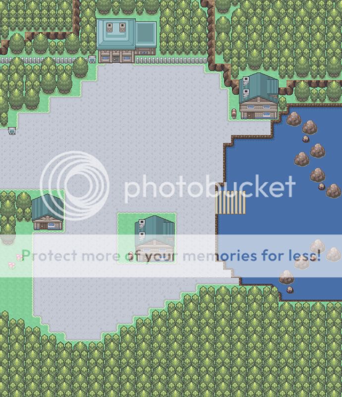
    heres a nice natural looking version of newbark town i was bored so i thought id do something simple

    Map Rating/Review Thread
     
    Status
    Not open for further replies.
    Back
    Top