Otter
Reminiscing Every Now and Then
- 46
- Posts
- 15
- Years
- Age 30
- Mapping out from Cal
- Seen Sep 20, 2011
Brushing up on the topic again..
Apart from the tile errors which have already been pointed out (and I agree, if you're having that much trouble adjusting them to their surroundings, just take out those lumps entirely), you've made a huge amount of progress with this map. Due to what kind of map you started out with, it's difficult to take away the space and squareness completely without basically redoing the map. But you've done a good job with what I told you, especially the trees, paths, and rocks. Just a few last things I'll point out in particular, but otherwise I suggest you keep trying new maps, and always start as small as possible. Only increase size when you're truly running out of room to put something you want. Smaller maps that are well made are generally more appealing than huge maps, and you'll run into the space problem a lot less. It's a difficult idea to adjust to, and even I'm working on it myself, but do pay attention to your initial map size. With that being said, time to point out details!
Top Left Entrance. Winding paths are useful to put in routes, and are a good idea when you make them interesting with stuff, such as trainers and tall grass, and so on. Giving a city exit such an unnecessary twist? I don't really like it. Think about the purpose it serves for your city. Now if there really is one, then my apologies, but otherwise just try to simplify that. Having a big patch of trees in that spot won't kill you, so there's no big need to fill it up with something.
Elevation Levels. Make sure that when you pick a certain level (in this map, the grassy city) to be above another part of your map (the beach), stick to that relationship whenever you add those mountain ledges. Throughout most of your map, the city is two levels above the beach, but notice that in the top right corner, you put the mountain as a level above both, thus giving the impression that the city and the beach are at the same height. When you work on fixing the tile errors right before that, you should clearly see how that mistake works and you'll have no trouble fixing it.
That's just about it for this map. It's not the greatest map out there, but you made a tremendous amount of improvement. Use what you've learned from this map, and try applying it to brand new maps. If you ever need inspiration, try thinking about something I said in another topic about mapping. Your maps should try to portray a realistic location through the game, not just serve as an obstacle course for a video game character. Think about what you're mapping first. Once you have a clear image in your head of the kind of place you want to map, then go for it. Best of luck to you!
Final rating: 6.5/10
Moving on...
The Pond. No, there's nothing wrong with it, but looking at the trees to the left of it, I thought of a perfect place to put a hidden item. I personally find maps to be more interesting when there are things to find, and I think an item could be placed by where that red flower is. Just move around one or two of the trees so that the player can walk through, and bam! I just think it's worth considering. ;p
Red Flowers. The ones by the house, specifically. I think you might've overdone it a little bit there. The red does have a sharp contrast with the greens, so while a few scattered flowers is fine, I think taking out one or two would be a good idea. I'm just scavenging for things to point out, so if you disagree, then that's fine too.
I don't think this map is worth a long rating since I can't find anything really wrong with it, so I'll stop here. The only reasons why I wouldn't give this a perfect score is that it doesn't have any "amazing" factors that go for it, and it's a bit small. But I'm not "marking down", I'm just simply not giving it the last boost up. It's a solid map nonetheless. Good job! And again, nice tiles.
Final rating: 9/10
Okay thanks, I see your point.
Wellhopefullythis is the last time im posting this map, as too not spam the thread.
There are probably too many rocks in the water but im too lazy to change that now.
Map Shot:
Spoiler:

Apart from the tile errors which have already been pointed out (and I agree, if you're having that much trouble adjusting them to their surroundings, just take out those lumps entirely), you've made a huge amount of progress with this map. Due to what kind of map you started out with, it's difficult to take away the space and squareness completely without basically redoing the map. But you've done a good job with what I told you, especially the trees, paths, and rocks. Just a few last things I'll point out in particular, but otherwise I suggest you keep trying new maps, and always start as small as possible. Only increase size when you're truly running out of room to put something you want. Smaller maps that are well made are generally more appealing than huge maps, and you'll run into the space problem a lot less. It's a difficult idea to adjust to, and even I'm working on it myself, but do pay attention to your initial map size. With that being said, time to point out details!
Top Left Entrance. Winding paths are useful to put in routes, and are a good idea when you make them interesting with stuff, such as trainers and tall grass, and so on. Giving a city exit such an unnecessary twist? I don't really like it. Think about the purpose it serves for your city. Now if there really is one, then my apologies, but otherwise just try to simplify that. Having a big patch of trees in that spot won't kill you, so there's no big need to fill it up with something.
Elevation Levels. Make sure that when you pick a certain level (in this map, the grassy city) to be above another part of your map (the beach), stick to that relationship whenever you add those mountain ledges. Throughout most of your map, the city is two levels above the beach, but notice that in the top right corner, you put the mountain as a level above both, thus giving the impression that the city and the beach are at the same height. When you work on fixing the tile errors right before that, you should clearly see how that mistake works and you'll have no trouble fixing it.
That's just about it for this map. It's not the greatest map out there, but you made a tremendous amount of improvement. Use what you've learned from this map, and try applying it to brand new maps. If you ever need inspiration, try thinking about something I said in another topic about mapping. Your maps should try to portray a realistic location through the game, not just serve as an obstacle course for a video game character. Think about what you're mapping first. Once you have a clear image in your head of the kind of place you want to map, then go for it. Best of luck to you!
Final rating: 6.5/10
Moving on...
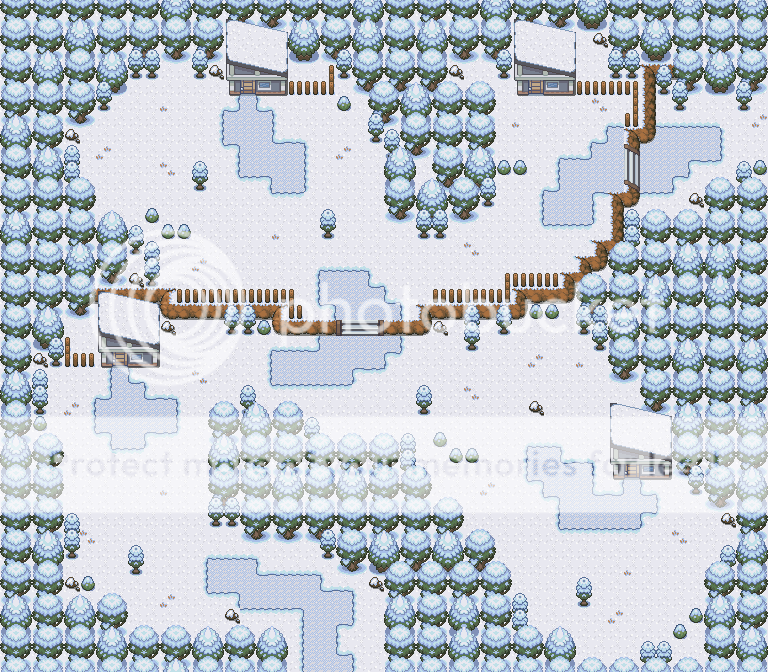
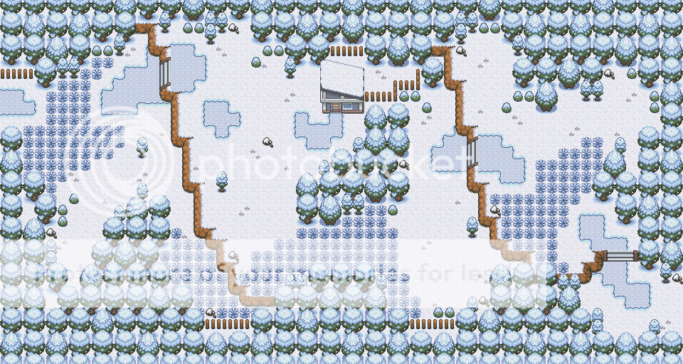
Well first off, I like the tiles. I realize this doesn't affect the rating, but the palettes go pretty well together imo. That being said, I actually can't find anything too wrong with this map. You have a large variety of trees and flowers, which adds nicely to the natural feel. Overall it's a fine map, so all I have is just suggestions and not even critiques.Iii thought i should post mah map here.
Spoiler:
Spoiler:
Comments: The palettes are not Wesley's! Anyway... i know time doesn't really matter but this took me 3 hours.
Credits: Saurav, Kyledove, Nintendo, Deviation, Linkandzelda <3, Zeikku and myself.
EDIT: OH and Alucus for the pond. ;D
bb
The Pond. No, there's nothing wrong with it, but looking at the trees to the left of it, I thought of a perfect place to put a hidden item. I personally find maps to be more interesting when there are things to find, and I think an item could be placed by where that red flower is. Just move around one or two of the trees so that the player can walk through, and bam! I just think it's worth considering. ;p
Red Flowers. The ones by the house, specifically. I think you might've overdone it a little bit there. The red does have a sharp contrast with the greens, so while a few scattered flowers is fine, I think taking out one or two would be a good idea. I'm just scavenging for things to point out, so if you disagree, then that's fine too.
I don't think this map is worth a long rating since I can't find anything really wrong with it, so I'll stop here. The only reasons why I wouldn't give this a perfect score is that it doesn't have any "amazing" factors that go for it, and it's a bit small. But I'm not "marking down", I'm just simply not giving it the last boost up. It's a solid map nonetheless. Good job! And again, nice tiles.
Final rating: 9/10


