• Our software update is now concluded. You will need to reset your password to log in. In order to do this, you will have to click "Log in" in the top right corner and then "Forgot your password?".
  • Welcome to PokéCommunity! Register now and join one of the best fan communities on the 'net to talk Pokémon and more! We are not affiliated with The Pokémon Company or Nintendo.

Map Rating/Review Thread

Status
Not open for further replies.

MASTEROFPUPPETS93

Liebe Ist Für Alle Da
110
Posts
15
Years
  • Spoiler:

    Credits:
    -Alistair
    -Kyledove
    -Red-eX
    -Saurav
    -Wesley FG

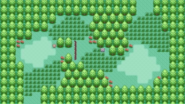
    This is a map for a competition on a german board. ;D
    I hope you like it, please give me feedback.

    ~MOP
     
    5,814
    Posts
    16
    Years
    • Age 30
    • Seen May 19, 2021
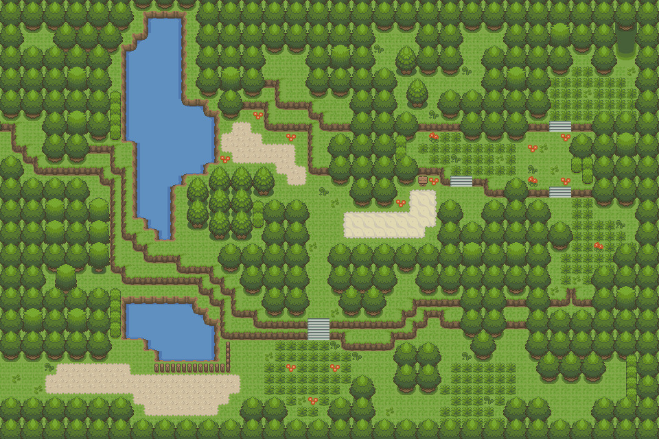
    Well, I made another map. It's not AMAZING, but I'm quite pleased with this one. I forget the maker of the ROM Base and who made the tiles though, but to whoever made them, all credit goes out to you.

    ROM used: Ruby
    Spoiler:


    EDIT: The little grass patches on the rocks are supposed to be little weeds growing out of the rocks.
     
    Last edited:

    Yusshin

    ♪ Yggdrasil ♪
    2,414
    Posts
    14
    Years
  • Well, I made another map. It's not AMAZING, but I'm quite pleased with this one. I forget the maker of the ROM Base and who made the tiles though, but to whoever made them, all credit goes out to you.

    ROM used: Ruby
    Spoiler:


    EDIT: The little grass patches on the rocks are supposed to be little weeds growing out of the rocks.

    That map is really linear; I like the style, but the grass and the trees need to be rearranged to look more natural.

    7/10

    Just reposting the map. Didn't get a review last time.

    The map is nice, but it seems a bit empty. Also, the bottom with the three random, tall trees. That looks really awkward. It needs stones, bushes, maybe some water? Ledges, even. It looks really bland right now.

    6/10
     
    10,078
    Posts
    15
    Years
    • UK
    • Seen Oct 17, 2023
    @.tactic

    Here's a rate for you ^^

    Tiles are great, and really fit, though I was a bit surprised to see a 3rd big tree type in there. It would be nice to have a small tree in to add a bit of variety but it's not essential (I'd prefer a small tree to those bush-things).

    Paths look OK, however the bottom one looks a bit 'fat' compared to the style you do the other two in. Also I'd try and stick to one path type as that sand path looks out of place.

    Mountain shape is good but they disappear! If they go behind the tree then they should either come out the other side or there be a gap between the trees where it goes up.

    The flowers should be a bit closer together, so they are more in clumps, but otherwise they look ok.

    Overall I'd rate this 8/10, aesthetically it looks great however there are a few technical flaws that let it down.


    ----


    (Pssst someone go back a page and rate my map :P)
     
    Last edited:

    Alice

    (>^.(>0.0)>
    3,077
    Posts
    15
    Years
  • Why doesn't anyone ever rate my maps??
    Why doesn't anyone ever rate my maps?
    Thought I'd repost a couple of mine, as I didn't get any decent rates for either of them. After 3 reposts...
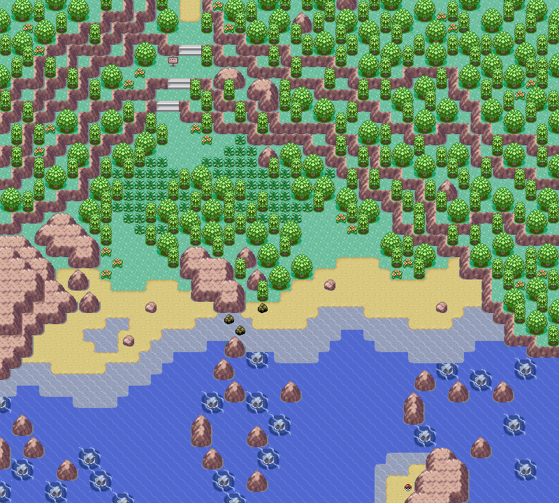
    For the first time in half a year, I found the inspiration to make another map. As usual, it isn't meant to be played in a real hack, so the areas that the player can't actually see are still meant to look good/ be rated. (Although it is still meant to be playable.)

    Map Name: Crescent Lake

    Map Game: Emerald

    Comments: I'm gonna skip the story behind the map this time, so I can see what you think before hearing me point out the billions of obvious problems. (Although, most of them are just because it's near impossible to make a natural map with Emerald tiles.)

    Mapshot:
    Spoiler:

    Map Name: None

    Map Game: Emerald

    Comments: This map is the epitome of just winging it. I originally was thinking I should do a town that you can only enter through the ocean, so I decided to just draw the mountains, and somehow, I ended up with this.
    Ignore border errors, it's not actually going to be used in a hack, so it doesn't really matter. The idea is that you come up by water on the right side, and go north to find a town. When you're done in the area, you go back out by water on the left side. (It looks like the middle set of rocks doesn't keep going, but it does.)

    Mapshot:
    Spoiler:

    And now that I think about it, if I were actually going to use the 2nd map, I would have a connection on the left side too, since there's a little... secret water path thingy over there. (In which, I would be able to block off the opening that I left in the shallow water.) And the border on the right would take like 2 seconds to fix.
    I've posted the top 5 times and the bottom 3.
     

    Omega Zero

    Is back...
    444
    Posts
    14
    Years
  • Map name: N/A
    Game:Fire red
    mapshot:
    Spoiler:

    Map name: N/A
    game: Fire red
    mapshot
    Spoiler:

    Credit:
    zeikkku tm: mountain tile!
    Saurav Tree tiles path tiles wild grass tile grass tile (and most of the palletes which i edited)
    Wesley fg Stair tiles.
    Xiros For small tree tile
    Wesley Fg Stair tiles!

    Bump* my maps didn't get rated b4 D:
     

    Luck

    ¯\_(ツ)_/¯
    6,779
    Posts
    16
    Years
    • Seen May 20, 2023
    Over time, I've realized how sad the Map Rating Thread has become.
    I see waves of average maps, and very little people constructively criticizing them because they need their map to be rated. I think I'll post this tl;dr post not only because I'm bored, but because I'm honestly sad at what happened. I loved when reviews were more than two sentences long and were more specific. I loved when the map posts-review posts weren't 90/10. I love when people aren't ignored, despite how great or awful their map might be.

    I WILL rate for palettes and tiles, because even the best made map can be ruined by ugly and/or unfitting tiles.
    Well, I made another map. It's not AMAZING, but I'm quite pleased with this one. I forget the maker of the ROM Base and who made the tiles though, but to whoever made them, all credit goes out to you.

    ROM used: Ruby
    Spoiler:


    EDIT: The little grass patches on the rocks are supposed to be little weeds growing out of the rocks.
    Eh, pretty dull, and not just because of the color. It doesn't have flowers, which, personally, is a must for grassy routes. It's also really empty, and all of that space could be used so much more efficiently. Maybe make some out of the way paths that lead to items so it can seem more lively and less linear. The trees at the bottom feel like they are just there for the hell of it, since all of the trees are only single trees lined up next to each other. The weeds don't even look like they are protruding out of the mountains, so I would suggest you fix that, since it's a pretty interesting concept. Lastly, the rocks are way overdone. It would be more understandable if you actually put some in the middle of the map, but all of them are out of the way. It's a bit bothersome to be honest. I'd give it a:
    4.5/10

    Just reposting my map...again. Route 102:
    Spoiler:
    There isn't really much to say about this map, which is the biggest flaws in simple maps. The grass placement is really good, and I like the tiles(obviously), but I don't like how the green paths are splotchy and the sandy path is somewhat more organized. It just seems out of place. The lake could use a bit more shape, but that's just me. Again, the lack of flowers leaves a lot of room for improvement, since it makes the map that much more vivid if the color sticks out from the rest. 7/10 for you.

    Tile error D:
    Spoiler:


    Foregrove City. =P I find something irritating about the middle section, but =|

    WHEN WILL I GET TO THE PART THAT I LIKE MAPPING @_@
    Just like your old map, it's a bit boring. I like it for the most part, except for the simple fact that it is inconsistent. The flowers are the main thing, but the trees are somewhat problematic too. For 90% of the map, it's all organized, but when it has to impede the traveller from easy access to the gym, it goes all wild and somehow small trees grow there too. It's nothing special, but at least you kept the map good by not making tile errors all over the place.
    7/10 for this one too.

    I would also like some opinions on a map that I made:
    Map Name: Azure Town
    Map Game: Made with tilesets from FireRed, Sapphire and myself (the double story blue house is half my creation, half Nintendos, lol).
    Comments: Azure Town is a starting town for a custom region that I am tinkering with. I plan to have a connecting beach map to the south of this map (players will need surf to continue), and a connecting forest to the west of the map. I haven't thought about the map connecting to the top yet, probably some sort of cliff area.
    I am pretty happy with the map so far, however I think the town looks a little bit plain. Any suggestions on making it look a bit more exciting?
    Spoiler:
    I like this map, it's pretty neat. That river(or lake, the tiles are misleading me) is pitiful; it gets as little as two tiles wide. The beach is shaped nicely, but it would be much better if you put a few rocks here and there and made it wider. This time, the major annoyance isn't the absence of flowers(it's second), but it's the fact that you make the small trees wrong. I don't know where you saw that, but I would suggest if you want two tile long small trees, you rip some out from Ruby or Emerald, or shorten the FR/LG ones in a better way. The mountains are pretty nice, but could do with a few rocks, but I won't take away from your rating for that. It isn't linear, which is a huge plus if you can manage to pull it off and keep it looking good, but I am bothered by that one tile wide stair tile. It irks me, and that's because it isn't even that spacy like most of your map, and I know how irritating it is to traverse one tile wide paths.
    I still really like it despite the flaws, so you get an 8/10 for me.

    Okay I re uploaded it in a different format. Hey posting a route I just made for my hack. :) I didn't insert the buildings yet, so please exempt those building blocks as where my buildings will be. I am trying out a new stly between nintendo and natural. Also I will a sure you there are no border errors, a border can be bigger than 2x2. Also the ledges are supost to give the feel that you are decreasing in elevation.

    Spoiler:
    It would be much better if you spread the ledges out more and put impeding objects in the way to give it a rougher feel. You can go through the whole route without stepping into a single grass tile, which is a big no-no, it's barely even tolerable as one of the first routes to me. The puddles are in one spot, which just look unattractive, and the sand paths are broken for no reason. It would be perfectly fine if they were separated by wild grass, but we see what's wrong with that. It's completely dull, and it would do much better if you didn't focus an entire section of the map just for ledges and another one just for easily avoidable patches of grass.
    3/10 is what I honestly believe this map deserves.
    Map name: N/A
    Game:Fire red
    mapshot:
    Spoiler:

    It's average. It isn't bad, it isn't good. It's good in the sense of it being…I honestly don't know, but I think it looks somewhat neat. However, the good is nullified by a few things; for one, there is only one house. Two, there isn't a single sign in the whole map. You'd think if a place had both a pokemon center, mart, and a gym, it would be significant enough to have at least a sign that says "welcome to [name] town: The [description]". Lastly, the curves are nice and all, but they seem like an attempt to escape making the sandy tiles wider. I find it a bit irritating, at the least, that it looks like an attempt to do that. Since it's such an average map, you will get my average 6/10.
    Spoiler:

    Credit:
    zeikkku tm: mountain tile!
    Saurav Tree tiles path tiles wild grass tile grass tile (and most of the palletes which i edited)
    Wesley fg Stair tiles.
    Xiros For small tree tile
    Wesley Fg Stair tiles!
    Now that I see it, it is somewhat irritating seeing tall grass just thrown together randomly. It'd be better if you put them in small, concentrated patches and left a bit of free space. It looks significantly better, but it may just be your tiles. The tiles aren't bad, but they definitely don't fit the kind of maps you are making. They just seem a tad blocky for your attempts at au natural maps. I'd give this about a 6/10 since I'm kinda tired writing this review up.
    Map Name: Route West
    Base: Fire red with SSKD ROM Base

    *Image attached and will have to be viewed in a separate window to see at proper size, HUGE map*

    Additional Tiles (Apart from ROM base- I take no credit for the main tiles used):
    Bridge: Ripped by 874521, palette edit and inserted by me.

    Everything else is either made by me or simply a block edit.

    Please rate in a Pros/Cons/Improvements/Rating fashion :)
    Just for you, I'll change it this once ;D

    Pros: It's pretty spacey, it isn't completely linear, and I didn't even notice until now, but you used more than 1 flower tile. It gives it a better feel to have more diversity among vegetation as long as it isn't underdone, which it isn't.
    Cons: The map is pretty thin at parts, it barely uses any of the space when it could be so much better if it took up more, the mountains just seem unneeded, you only use the sea rocks for borders, and the fences don't even make sense. Even though I don't think I complained as much, these are pretty big flaws.
    Improvements: Make use of the space that you wasted. Try to make the river wider and add some more rocks and flowers around the map, but also widen some of the narrow 1 and two tile wide paths out a bit more.
    Rating: This seems like a 5/10 to me. Based on what you could do, I know you can do really good if you try hard enough.
    Name: Route 303
    Game: Galactic Platinum
    Comments: Well I am pretty happy with this map tbh.
    Spoiler:
    It's okay I guess. It's pretty generic, and has nothing going for it if you take out the little specks of diversity among trees and flowers. Try to use more diversity, and please, don't make the mountains disappear into the trees. I don't know how this somehow became the cool or logical thing to do, but it just looks bothersome, and would be much better if you could make the mountains disappear without having to shroud it behind an object.
    Spoiler:

    Credits:
    -Alistair
    -Kyledove
    -Red-eX
    -Saurav
    -Wesley FG

    This is a map for a competition on a german board. ;D
    I hope you like it, please give me feedback.

    ~MOP
    I'd just like to say that you have become one of my favorite mappers; I really like how great your tiles are, and how they compliment your maps. This map is somewhat of an exception because it lacks color(blue, green, brown, and white), but it is in no means a bad map. It's quite spacey on the paths for the most part, but the mountains make it feel exciting. It's a bit restrictive to only the stone path though, I suggest taking out a few trees and leaving a bit of empty space just because it looks nice. There isn't much else to say, so I'll just end it and give you your 9/10 that you deserved.


    To the others, I'm sorry, but all of this reviewing is making my head hurt, but maybe it's the fact that it's 11:06 PM and I started at about 10:15. I'll try to review your maps, so just remind me if you can.
     

    Alice

    (>^.(>0.0)>
    3,077
    Posts
    15
    Years
  • To the others, I'm sorry, but all of this reviewing is making my head hurt, but maybe it's the fact that it's 11:06 PM and I started at about 10:15. I'll try to review your maps, so just remind me if you can.
    I could take that long reviewing one map (and I have... more than once.) You can see why I never do though.
    Over time, I've realized how sad the Map Rating Thread has become.
    I see waves of average maps, and very little people constructively criticizing them because they need their map to be rated. I think I'll post this tl;dr post not only because I'm bored, but because I'm honestly sad at what happened. I loved when reviews were more than two sentences long and were more specific. I loved when the map posts-review posts weren't 90/10. I love when people aren't ignored, despite how great or awful their map might be.
    I agree though, I've been feeling this way for quite awhile now.
     

    Otter

    Reminiscing Every Now and Then
    46
    Posts
    15
    Years
  • Well I haven't posted here in forever, nor have I made any maps in forever. In an attempt to dust off my mapping skills (and also to revive the ratings in this thread, which have become depressingly scarce), I decided to finally post a map of my own that I threw together. I promise to (attempt to) rate future maps after my post. s:

    Map name: Verdi Canyon
    Hack: n/a
    ROM: FireRed
    Comments: Meh, last time I mapped I was having tons of crowding issues in my style. Probably still have 'em. Would be nice to see what else can be commented on, though.
    Spoiler:


    Credits to:
    WesleyFG
    Alistair
    Kyledove
    Nintendo
    (it's been a while since I've checked my sources for my old mapping ROMs, so if I missed anybody just let me know)
     
    Last edited:

    Ninja Caterpie

    AAAAAAAAAAAAA
    5,979
    Posts
    16
    Years
  • @Otter

    The map is very nice, and the mountain shapes, etc are pretty good. You do seem to love using single-tiled rock obstacles, which there seem to be too many of. The tree diversity is a nice touch, but you might have some border errors in certain areas.

    The, uh, water. The bottom of the water...is just wrong. You just don't make block edits to do that. There are not supposed to be shadows all around the water, just from above. Please, use the tiles already given to you to make the water edge. If you don't, at least make the tile right. =|

    The grass is well-placed. I assume you start from the bottom, because if you start from the top, that's just =|. Usefulness of grass becomes zilch.
     
    5,814
    Posts
    16
    Years
    • Age 30
    • Seen May 19, 2021
    Okay, first off, thank you Luck for the review on my map. I'll read it whenever I need help on figuring out what to put in a simple route map.

    Second, I have made another map. Here it is~
    ROM used: FireRed

    Spoiler:
     

    Zeffy

    g'day
    6,402
    Posts
    15
    Years
    • Seen Feb 7, 2024
    Nobody rates my maps, I hope this time someone will. :'<

    Name: Limsville Town
    Comments: A starting town map.
    Mapshot:
    Spoiler:
     

    Ninja Caterpie

    AAAAAAAAAAAAA
    5,979
    Posts
    16
    Years
  • Okay, first off, thank you Luck for the review on my map. I'll read it whenever I need help on figuring out what to put in a simple route map.

    Second, I have made another map. Here it is~
    ROM used: FireRed

    Spoiler:
    PLSNOJPG. It's good, I guess. The shape of everything is pretty good. The patches of grass are a bit...big, though. Might want to just shrink them, maybe add an extra one in somewhere or something, but shrink them. Actually, everything looks a bit BIG. Maybe you could use a smaller sized map? Also, flower placement's a bit =|. Try putting them diagonally instead of in bundles.

    Nobody rates my maps, I hope this time someone will. :'<

    Name: Limsville Town
    Comments: A starting town map.
    Mapshot:
    Spoiler:
    There's something about this map that just irks me slightly. Maybe it's the lack of grassy area. The map is filled with sandy path. =| Because it's pretty much pushing right up to the tree line, it looks a bit crowded and tight. Maybe lessen it towards the top of the map and have some more grass and some flowers. On the topic of flowers, they're too random. As I said above, try putting them in diagonal bunches.
     
    780
    Posts
    14
    Years
  • Spoiler:

    Tiny Village

    Hack game: Fury Of Shadows

    ROM: FireRed

    Credits: MasterOfPuppets (ROM base)

    Comments:
    A village connected to the first route of my game. The Gym is a training one. two temples are around here. No PokeCenter due to a person that heals your Pokemon. The grass is there to catch some Pokemon (The first route's kinda long, with 3 trainer battles, a tiny bit of grass.) A reference to a series of books, with an upcoming movie, is around here.
     
    Last edited:
    10,078
    Posts
    15
    Years
    • UK
    • Seen Oct 17, 2023
    @Blaziquaza.

    The first problem I noticed was how much of the map is single tiles, pathways should generally be two tiles or wider - same with the mountainous region (which looks out of place in this map). Next I noticed your flowers saying HOPE, which is a bit tacky and doesn't look very appealing, but I also noticed that the bottom half of the map has barely any flowers.

    The mart in the middle of a pond looks out of place, how do the people living there do their shopping? It should be connected to the mainland. And on the topic of water, a puddle should not be bigger than a pond o.o it just looks weird.

    If you are using lampposts the make sure you place them well, they should be next to paths and/or houses. A few are nicely placed, but some stray a little too much.

    Wild grass in a town is generally a no-no, and your placements is a bit random, perhaps keep it all nearer the route if you really need wild grass here.

    Finally the border, or lack of one, is disappointing. Whatever the border is it will look very out of place here. Also, your massive enclosing fence has numerous tile errors, especially where it meets with a lamppost.

    Try widening the paths and mountains, and minimising that massive puddle. Fill in the map with some more trees and things as it looks quite open, and redistribute your flowers to cover the map evenly, in its entirity.

    Overall: 3/10


    ------


    Thanks for the rating Luck, I've changed it according to your criticism, the attachment below is an events pic to demonstrate why there were 1 and 2 tiles paths ;)


    -----

    Name: Same as before
    Base: Same as before.

    (And same credits too).

    <image attached>
     

    Superjub

    Pokémon Aureolin
    2,288
    Posts
    16
    Years
  • @Blaziquaza.

    The first problem I noticed was how much of the map is single tiles, pathways should generally be two tiles or wider - same with the mountainous region (which looks out of place in this map). Next I noticed your flowers saying HOPE, which is a bit tacky and doesn't look very appealing, but I also noticed that the bottom half of the map has barely any flowers.

    The mart in the middle of a pond looks out of place, how do the people living there do their shopping? It should be connected to the mainland. And on the topic of water, a puddle should not be bigger than a pond o.o it just looks weird.

    If you are using lampposts the make sure you place them well, they should be next to paths and/or houses. A few are nicely placed, but some stray a little too much.
    Wild grass in a town is generally a no-no, and your placements is a bit random, perhaps keep it all nearer the route if you really need wild grass here.

    Finally the border, or lack of one, is disappointing. Whatever the border is it will look very out of place here. Also, your massive enclosing fence has numerous tile errors, especially where it meets with a lamppost.

    Try widening the paths and mountains, and minimising that massive puddle. Fill in the map with some more trees and things as it looks quite open, and redistribute your flowers to cover the map evenly, in its entirity.

    Overall: 3/10


    ------


    Thanks for the rating Luck, I've changed it according to your criticism, the attachment below is an events pic to demonstrate why there were 1 and 2 tiles paths ;)


    -----

    Name: Same as before
    Base: Same as before.

    (And same credits too).

    <image attached>

    I'm not the best at rating maps, but I'll try...

    What I like about it is how much effort has been put into it. :) It's large and quite complex. However, I would make the waterfall larger. Plus, I don't understand the random healing machine. :S The Rom Base is good, too! :D I'll give it a 8/10.
    ________________________________

    Now, can someone rate my map? :)
    Map Rating/Review Thread

    Name: Evergreen Town.
    Credits:- Neon by creating the base rom and pallets
    - Saurav by Tiles and Pallets
    - WesleyFG by Tiles
    - Xiros by Tiles
     

    Binary

    え?
    3,977
    Posts
    16
    Years
    • Seen Apr 7, 2014
    @Retribution:
    Rating: 7/10
    Reason: The map is alright. It's linear towards the left. You've left a whole lot of space near the middle. There could be trees and other stuff. The trees are oriented towards the edges. I'd prefer it if you didn't put the flowers in groups. The placement of the fence is too squarish.
    Suggestions: Add some greenery towards the middle. Don't focus trees only towards the edges. Don't place flowers in groups. If you have to, then place them in a pattern to make it look like a small flower patch or maybe a garden. Also scatter them. Id also suggest you to use a different type of path, since it looks a little too green. It's your choice though.
     

    JasonX3333

    Im accepting all wi-fi battles
    102
    Posts
    14
    Years
  • My map

    Map Name:Asper Town
    Hack Of:Fire Red
    Time made in:10 minutes
    Author's Comments:The starter town don't really know what i was doing lol
    Credits:OmegaZero for his smexy rom base

    Map Rating/Review Thread
     
    Status
    Not open for further replies.
    Back
    Top