• Our software update is now concluded. You will need to reset your password to log in. In order to do this, you will have to click "Log in" in the top right corner and then "Forgot your password?".
  • Welcome to PokéCommunity! Register now and join one of the best fan communities on the 'net to talk Pokémon and more! We are not affiliated with The Pokémon Company or Nintendo.

Map Rating/Review Thread

Status
Not open for further replies.

colcolstyles

Yours truly
1,588
Posts
15
Years
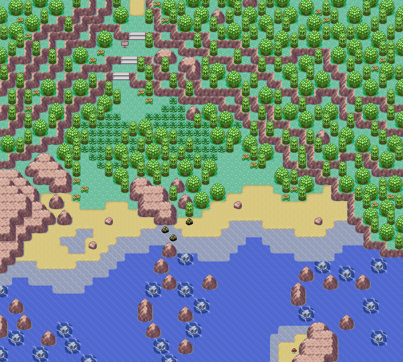
  • For the first time in half a year, I found the inspiration to make another map. As usual, it isn't meant to be played in a real hack, so the areas that the player can't actually see are still meant to look good/ be rated. (Although it is still meant to be playable.)

    Map Name: Crescent Lake

    Map Game: Emerald

    Comments: I'm gonna skip the story behind the map this time, so I can see what you think before hearing me point out the billions of obvious problems. (Although, most of them are just because it's near impossible to make a natural map with Emerald tiles.)

    https://www.pokecommunity.com/attachment.php?attachmentid=52958&d=1268377271

    I noticed that though Luck's two posts cover a lot of maps, he, sadly, left these two gems out. I agree with Luck about the quality of mapping in general and the state that this thread has fallen into so I thought I'd take the time to review these two maps.

    As usual, I'm not very fond of your style of tree placement. It's too random and "natural" for my tastes. It reminds me of my old style back in the summer of '08. Good times. I like the concept of having the player pass by a lake. It kind of reminds me of another map of yours, though I think I preferred the older one. It might be the fact that the player can't actually surf on the lake in newer map and that they won't be able to see much of the lake either. Still, I think it's a nice touch and a refreshing change from seeing what seems like the same map over and over again. Moving on, the map feels pretty cramped. There are numerous spots where the player only has one tile to move through. I know that this map wasn't made for a game but it still is nice to space things out a little. Personally, I like to space things out not only for playability but also because, in my opinion, it aesthetically enhances the map as well. But that's your decision to make.

    Other than that, there's not a whole lot else to write about. The map is moderately sized but only a fraction of it is actually used. I mean, the player can't access the entire right side of the map. :(
    Still, I think it's very nice and, again, it's a nice break from the types of maps I see these days.

    Map Name: None

    Map Game: Emerald

    Comments: This map is the epitome of just winging it. I originally was thinking I should do a town that you can only enter through the ocean, so I decided to just draw the mountains, and somehow, I ended up with this.
    Ignore border errors, it's not actually going to be used in a hack, so it doesn't really matter. The idea is that you come up by water on the right side, and go north to find a town. When you're done in the area, you go back out by water on the left side. (It looks like the middle set of rocks doesn't keep going, but it does.)

    Mapshot:
    Spoiler:

    I love what you've done with the mountains. It's a shame that no one will ever see them in-game, though.

    I think this map is a lot better than the previous map. True, they're very different and thus hard to compare but I like the concept of this one even more than the previous map. As I always say, I don't like you style of tree placement but that's a personal preference so I can't tell you to stop. One thing I noticed, however, is that your style of tree placement conflicts with your style of flower placement. The flowers can always be found in groups of two, which suggests a more "Nintendo"-styled approach while your trees are totally random and scattered. Now, by conflict I don't mean that the two don't look good together. I mean that they're different, but there's nothing wrong with different, right?

    I really like how you've arranged the rocks in the water. I know from experience that that's no easy task but you've done it flawlessly, in my opinion. I also like the little puddle of shallow water that you put on the beach. That's the kind of thing that I wouldn't have thought of. *jealous* Another thing I like on the beach is the use of Rock Smash rocks. I often completely forget about those (and Cut trees, Strength boulders, et al.) and I see that you have not only remembered them but also made good use of them. Points for that. :)

    Beware that the pokéball on the island won't show up until the player enters the map so when the player enters from the south, the pokéball will just appear out of nowhere. Even though that might not be a problem because this won't be used in a hack, I just wanted to point it out to you.
     
    10,078
    Posts
    15
    Years
    • UK
    • Seen Oct 17, 2023
    Name: Ice Valley
    Game: Pokémon Challenge
    ROM: Pokemon Fire Red
    BASE: Zero's and Qriz' Icy Kyle Base
    https://www.abload.de/img/xd9cbx.png

    https://www.abload.de/img/rofl4fwi.png


    EDIT: CREDITS:
    Kyledove
    Saurav
    Alucus

    These maps are actually pretty good, path and mountain shapes look really good and you've thought about your border well. I like how there is a big range of trees used and they have are also placed very well. The only complaint I have is that there is soooo much white that playing though could get boring since it all looks very similar. Also perhaps widen the 1 tile walking space on the mountains and such to allow a bit more freedom of movement.

    Maps even out to a nice 8.5/10.


    ---

    FYI people still rate maps, I know I have only posted 2 maps in the last month ish and rated many - often long ratings unless I feel there isn't much to improve on. All hope is not lost.
     

    Otter

    Reminiscing Every Now and Then
    46
    Posts
    15
    Years
  • Map Name: Snowcover Town
    Game: Pokemon Lavender
    ROM: Pokemon FireRed
    ROM base: Snow ROM base
    Comments: This hack has an upper region, which is covered in snow, and a lower region, which is tropical. Anyway, I thouht I did a good job on this map, after not mapping for months;

    Spoiler:

    It's not too bad, but there are many things that could be done to improve this map. First off, one of my pet peeves is the remnant of that "tree border" around the map. Obviously it helps with border errors, but when it's as obvious as that, it just bugs me. PS: tree shading. I'm not a tree shading nazi, but those don't look right. Correct me if I'm wrong. Now for other things...

    Tree Placement. It's natural, sure, but does it serve any purpose to the player? A significant chunk of the map can be wandered through due to the space left between the trees. Unless the player gets something from exploring the "naturality" of the map, I'd say it's better to just give the space a more definite shape.

    Purpose. It's a town. You have buildings. But several other things don't quite have me convinced. There are no tiles to indicate human presence besides the buildings, such as paths, signs, fences. While adding trees into a town adds a nice touch, here it just looks like a poorly cleared forest space for some buildings. Imagine the founders of this village clearing the forest to make habitable space; they wouldn't leave random trees obstructing invisible paths. Try to make walking paths more defined, and while removing the trees entirely isn't necessary, try to remove ones where people would walk and add more where people would not walk.

    Identity. I see you're planning on inserting this into a hack. While even Nintendo doesn't always to a great job of this, I consider it important. Every town should have something that gives it its identity. For some towns, it's location (beach, mountain, desert, etc). Even though this is a starter town, it would be interesting if it was more than just a forest clearing with buildings. Do loggers live here? Maybe put in a few log piles and a stump with an axe in it (just picking decorative tiles off the top of my head). Stuff like that can instantly make a town look interesting.

    Overall, it's a decent start. It just has a few basic functional drawbacks, and the rest is up to your imagination.
    Final rating: 4/10
     

    Muffin™

    Knows your age
    429
    Posts
    14
    Years
  • Identity. I see you're planning on inserting this into a hack. While even Nintendo doesn't always to a great job of this, I consider it important. Every town should have something that gives it its identity. For some towns, it's location (beach, mountain, desert, etc). Even though this is a starter town, it would be interesting if it was more than just a forest clearing with buildings. Do loggers live here? Maybe put in a few log piles and a stump with an axe in it (just picking decorative tiles off the top of my head). Stuff like that can instantly make a town look interesting.

    Overall, it's a decent start. It just has a few basic functional drawbacks, and the rest is up to your imagination.
    Final rating: 4/10


    Hmm... that's a great idea... *evil laugh* The only reason I DIDN'T think of something creative is because I have trouble with the pallets when I insert a tile...


    Anyway, thank you for the comment :)
     

    Ninja Caterpie

    AAAAAAAAAAAAA
    5,979
    Posts
    16
    Years
  • Dull, dull, dull. Everything's dull. Why? Because they don't have mountains. And thus, I decided to skip ahead a bajillion maps and land myself in a very inspired map. Inspired by colcolstyle's maps of old, Route 44 of HGSS and the ultimate Nintendo route, Route 119, here is my own - Route 113:

    Spoiler:


    Be warned, it is really, really tall.
     

    Tropical Sunlight

    The Faltine
    3,476
    Posts
    16
    Years
  • Dull, dull, dull. Everything's dull. Why? Because they don't have mountains. And thus, I decided to skip ahead a bajillion maps and land myself in a very inspired map. Inspired by colcolstyle's maps of old, Route 44 of HGSS and the ultimate Nintendo route, Route 119, here is my own - Route 113:

    Spoiler:


    Be warned, it is really, really tall.
    This is one great map.
    I like the shape, the Rock Climb tiles and I understand what you've been inspired by. Maybe you should have some more big trees on the lower part of the map, or not. It's your choice anyway.
    I can also understand why you're not able to enter the river and the shape of it is also lovely.

    I think this one deserves just a perfect 10/10
     

    Zeffy

    g'day
    6,402
    Posts
    15
    Years
    • Seen Feb 7, 2024
    Map Name: Limsville Town
    Game: Fire Red
    Comments: I changed it a bit according to Luck and Ninja Caterpie's comments. I forgot to mention this on my earlier post, but this map is located in a forested region that's why it has lots of trees.
    Spoiler:
     

    Ninja Caterpie

    AAAAAAAAAAAAA
    5,979
    Posts
    16
    Years
  • The random rock is a bit awkwardly placed, but other than that, it's much better than before. One problem that I do have with it is its playability. Sure, you gave lots of room, but it's all diagonal room. And in a game where you can't walk diagonally, that's not really space at all.
     

    Binary

    え?
    3,977
    Posts
    16
    Years
    • Seen Apr 7, 2014
    Base rom: Pokemon Ruby
    That's all you need to know.
    I might have gotten rusty, mapping after 2 years. I want to make sure xD.
    Spoiler:

    It's supposed to be a small town, so I didn't make it flashy enough o.0
     

    Matteron (96)

    Can't Read Lookin Ass
    270
    Posts
    15
    Years
    • Seen Feb 13, 2024
    Map Name: Route 1
    Rom Base: Fire Red
    Comments: I fixed up Route 1 and added accessibility to the beach.
    Spoiler:


    Also, I made a version with some of the mountain peeking out of the grass. Tell me which is better.
    Spoiler:
     
    10,078
    Posts
    15
    Years
    • UK
    • Seen Oct 17, 2023
    Base rom: Pokemon Ruby
    That's all you need to know.
    I might have gotten rusty, mapping after 2 years. I want to make sure xD.
    Spoiler:

    It's supposed to be a small town, so I didn't make it flashy enough o.0

    Turns out I do have enough time :)

    One other problem I find with this map is the amount of 1-tile walking space, and a lot of the map is very narrow because of the tree placement in the middle. The way leading up to the Pokémon centre is very narrow, especially with that bench in the way (there is also a tile error on the fence by there, there is no corner bit).

    The path is a little too haphazard, overly complicated and doesn't really make sense such as the bend in front of the house and the bit that goes nowhere except into a tree. It would look better without those two quirks and perhaps making some of the path one tile wider to stop the map seeming so narrow.

    Flower placement looks ok, perhaps a little closer together though.

    Tree placement, minus a few in the middle which seem a bit out of place, its ok too.

    The water on the mountain I don't really understand, it looks a bit like a filler option and trees would probably be better. The fence behind the Centre is also kind of unnecessary.

    The houses are well placed, I wouldn't change that, however I would get rid of the bench by the south exit and move the other to above the path, where it would look more practically placed. If that is an exit on the left hand side it should be a bit wider.

    Finally there is a border error all down the right side because of the mountains, the others are ok as I assume they have map connections.

    Total: 5/10, in all honesty I find small villages like this hardest to map.
     

    Alice

    (>^.(>0.0)>
    3,077
    Posts
    15
    Years
  • I noticed that though Luck's two posts cover a lot of maps, he, sadly, left these two gems out. I agree with Luck about the quality of mapping in general and the state that this thread has fallen into so I thought I'd take the time to review these two maps.
    I love you dude, you're the only one that ever reviews my maps. lol

    Thanks for pointing out the pokeball thing btw... I actually didn't know that would happen lol.
    Moving on, the map feels pretty cramped. There are numerous spots where the player only has one tile to move through. I know that this map wasn't made for a game but it still is nice to space things out a little. Personally, I like to space things out not only for playability but also because, in my opinion, it aesthetically enhances the map as well. But that's your decision to make.
    There is actually only one spot in the map where there's only one tile of walking space, although it's pretty much all diagonal, so it would be pretty annoying to walk through.
    One thing I noticed, however, is that your style of tree placement conflicts with your style of flower placement. The flowers can always be found in groups of two, which suggests a more "Nintendo"-styled approach while your trees are totally random and scattered. Now, by conflict I don't mean that the two don't look good together. I mean that they're different, but there's nothing wrong with different, right?
    I always though placing the flowers like that was actually a bit more realistic tbh. Granted, if it were natural, there would probably be a lot more than that, but they do grow in groups irl.

    And yeah, my style is definitely pretty different... I mean... I use emerald tiles to make natural maps. lol
    Still, I think it's very nice and, again, it's a nice break from the types of maps I see these days.
    I agree... most of the maps you see here are really... bland. And if someone tries to post something really crazy, it's usually pretty bad. At the same time, even though mine might be a bit more exciting, they're all pretty much same... I use the same formula for every single one. Other than maybe trying to do something creative with the shape of the map.
     

    Muffin™

    Knows your age
    429
    Posts
    14
    Years
  • Map: Snowcover Town
    Hack Name: Pokemon Lavender
    ROM Base: Neti's snow base (I also inserted some tile into it :D)
    Comments: It's the first town in the Balovia Region. It's for my hack, Pokemon Lavender. The map is located in the upper part (Snowy End) of the Region. Did you notice the cut-down trees and logs? They're there because the town is rebuilding (ex: cutting doown trees, making firewood, cutting wood, ect.) after a major storm. Anyway, I thought I did a good job on this map. I haven't mapped since September, so yea... Also, I feel something is missing... I just can't point it out...

    Constructive criticism, please :3

    Spoiler:


    BTW, may I say one more thing: THE MAP CONNECTIONS ARE FINE. I TESTED IT ON VBA AND THE CONNECTIONS WORK FINE.

    Thank you :3

     
    Map: Snowcover Town
    Hack Name: Pokemon Lavender
    ROM Base: Neti's snow base (I also inserted some tile into it :D)

    Spoiler:


    Overall, I'd say it's a decent map. I like the tiles you used, and I'm loving the little axe in the tree!

    There are a couple things though (aren't there always?) There's an obviously lack of paths in this town. With a smaller area it may be okay, but the playable space is too big for this town to pull off a "pathless" look. Also, the player can get quite close to the border by weaving around the trees along the perimeter of the town. Not only does that make an empty looking town look more empty, it's pretty unnecessary unless you're hiding items. Another thing that you may want to consider is to diversify your tile usage a bit. Maybe sink your town into the ground a level by putting a border of snowy mountain or ridge tiles around the perimeter of the town itself. Not only does it solve your wandering off through the trees problem, but it adds some depth to your map, which is always a good thing.

    Once you add some paths, and maybe a little depth to the map, it'll "pop" and become a bit more interesting. I really like the base you've got with this map though, it's a great shooting off point.

    6/10
    ------------------
    Time to post my map. This one's more for fun than anything else.

    Hack Name: None
    ROM Base: Firered (with some other tiles I ripped from R/S and Emerald)
    Map Name: Clearcoast City
    Comments: The top-leftmost house is supposed to be the daycare. The player can't see a majority of what's in that backyard, so don't worry about that horrible looking ledge up there. The building is two-story for a reason :P. The player first enters from the top, over the bridge. I'm considering making that bridge 3 tiles wide instead of 2, haven't decided yet. I'm not great with Saffron Tiles (they're my least-favorite outside of default Lavender Town) so I might have made some fence tile errors. I didn't see any after looking over it a couple times. I'm interested in changing the house's colors, but can't find anything I like. Any suggestions?

    Spoiler:
     

    Matteron (96)

    Can't Read Lookin Ass
    270
    Posts
    15
    Years
    • Seen Feb 13, 2024
    Time to post my map. This one's more for fun than anything else.

    Hack Name: None
    ROM Base: Firered (with some other tiles I ripped from R/S and Emerald)
    Map Name: Clearcoast City
    Comments: The top-leftmost house is supposed to be the daycare. The player can't see a majority of what's in that backyard, so don't worry about that horrible looking ledge up there. The building is two-story for a reason :P. The player first enters from the top, over the bridge. I'm considering making that bridge 3 tiles wide instead of 2, haven't decided yet. I'm not great with Saffron Tiles (they're my least-favorite outside of default Lavender Town) so I might have made some fence tile errors. I didn't see any after looking over it a couple times. I'm interested in changing the house's colors, but can't find anything I like. Any suggestions?

    Spoiler:
    Wow, this map is almost perfect. The only problem I see is the tile error on the edge at the bottom of the daycare's hill(it is next to the small tree on the left that overlooks the sea.)
    Anyway I give it a 10/10
     

    Otter

    Reminiscing Every Now and Then
    46
    Posts
    15
    Years
  • Overall, I'd say it's a decent map. I like the tiles you used, and I'm loving the little axe in the tree!
    Time to post my map. This one's more for fun than anything else.

    Hack Name: None
    ROM Base: Firered (with some other tiles I ripped from R/S and Emerald)
    Map Name: Clearcoast City
    Comments: The top-leftmost house is supposed to be the daycare. The player can't see a majority of what's in that backyard, so don't worry about that horrible looking ledge up there. The building is two-story for a reason :P. The player first enters from the top, over the bridge. I'm considering making that bridge 3 tiles wide instead of 2, haven't decided yet. I'm not great with Saffron Tiles (they're my least-favorite outside of default Lavender Town) so I might have made some fence tile errors. I didn't see any after looking over it a couple times. I'm interested in changing the house's colors, but can't find anything I like. Any suggestions?

    Spoiler:

    Like Matteron, I really don't have any complaints with your map. It looks really good!

    For the building color, have you tried something with a light blue and/or white theme? I find those to be typical coastal city colors, at least in my imagination haha. I'm not an expert on Saffron tiles myself, but considering all of the shadows are either bottom or to the right, I'm assuming they're used correctly.

    ...No other comments really. Awesome map! O:
     

    Ninja Caterpie

    AAAAAAAAAAAAA
    5,979
    Posts
    16
    Years
  • Time to post my map. This one's more for fun than anything else.

    Hack Name: None
    ROM Base: Firered (with some other tiles I ripped from R/S and Emerald)
    Map Name: Clearcoast City
    Comments: The top-leftmost house is supposed to be the daycare. The player can't see a majority of what's in that backyard, so don't worry about that horrible looking ledge up there. The building is two-story for a reason :P. The player first enters from the top, over the bridge. I'm considering making that bridge 3 tiles wide instead of 2, haven't decided yet. I'm not great with Saffron Tiles (they're my least-favorite outside of default Lavender Town) so I might have made some fence tile errors. I didn't see any after looking over it a couple times. I'm interested in changing the house's colors, but can't find anything I like. Any suggestions?

    Spoiler:

    This map is really pretty good. There is, however, a little bit of a problem nobody seems to have noticed. The islands have no sea-ledge surrounding them. That's fine if you managed to make it right, but you didn't do any block edits and thus didn't remove some of the shadows in the bottom corners of the mountains and it makes them look very odd. You could either do one of three things - give shadows to the island, place sea-ledges around it or remove the dark parts altogether. The latter would probably look weird though, so I advise one of the first two.

    The map itself, however, is absolutely awesome.

    Now can someone else rate mine? =P Route 113:

    Spoiler:


    I can safely say that this is probably my best map ever. BTW, you come from the bottom and go up. People seem to be having a problem figuring that out, xD
     
    Last edited:

    Lyzo

    Back from vacation
    261
    Posts
    17
    Years
  • Well, here are a few maps I made using RPG Maker XP and Poccil Starter Kit.
    I know that most people here only post maps for Hacks, but seeing as there isn't a map rating thread in the Game Making part of the forum, I decided to post them here. So tell me what you guys think!

    Map Name: No Name Yet
    Game Made For: No Name Yet
    Comments: There isn't much info on this map, since I'm not sure about any of it yet, I'm planning to make a game with my friend, but we're still working out some things, and I'm not even sure if we'll use this one. Anyway, it's a quite simple starter town and I need some input on how to make it better, since it kind of gives me an empty feeling.
    Map:
    Spoiler:


    Map Name: Route 1?
    Game Made For: No Name Yet
    Comments: Again there isn't much info yet, just randomly named it Route 1. I'm actually quite happy with how this map worked out. It has 4 different exits :P which makes it exiting, and I think me and my friend will probably use this in our game. Anyway, tell me what you guys think, and if things need to be fixed. Oh, and I know about the tree shadow in this map, that still has to be fixed :P
    Map:
    Spoiler:


    EDIT: Sure NinjaCaterpie, I'll rate :P

    Now can someone else rate mine? =P Route 113:

    Spoiler:


    I can safely say that this is probably my best map ever.

    Let me start out by saying, it is indeed a truly wonderful map. But, there are some things to be mentioned :P

    I like your grass placement, there's enough that the player has to walk through and it's nicely placed. Your tree placement however could be better, there aren't very many, but seeing as this is a canyon style map, I guess that's appropriate, but still I think they could be placed better. The tree placement at the top is a lot better, but around the middle of the map you get kind of sloppy. Then at the bottom it gets better, but then you only placed little trees? I do see that there isn't much room for big trees, but at least try to fit in 1 or two at the bottom :P (really nitpicky I know xD)

    Your mountain placement is wonderful, I love the climbing rocks, and the mix of sand, grass and rock is also great. There's one thing that bothers me about the river though. The form is fine, it's just that all those rocks in the water block you from surfing up and down. I guess you have a reason for that, but it would really annoy me if I were playing the game :P.

    Another thing I want to mention is that some spots are empty, you could fix that by placing flowers, but I'm not sure if you want to xD. But on the empty sandy parts, you could also place some small rocks to fill it up a bit.

    Now these were all minor things, for the rest, this is a really great map and I love it :D

    EDIT 2: Oh, and I just noticed why you put those rocks in the water xD Because otherwise you could surf all the way down to the end right away xD
    EDIT 3: Forgot to rate it: 9.2/10 Really, great map!
     
    Last edited:
    17
    Posts
    14
    Years
    • Seen Sep 1, 2010
    Firstly, thanks to Luck for your crit on my first map, Ill keep in mind what youve said in the future.

    Map Name: Limsville Town
    Game: Fire Red
    Comments: I changed it a bit according to Luck and Ninja Caterpie's comments. I forgot to mention this on my earlier post, but this map is located in a forested region that's why it has lots of trees.
    Spoiler:
    I like how this map has progressed, but theres still a couple of things Id like to say.... The rock looks a little bit odd and out of place, maybe you could add a mountainous area to the bottom left corner of the map, so it looks more like it belongs? If you dont want to do that, you could replace it with a tree. I would also make that little blue house a bit bigger, and add a window! I wouldnt want to live in a house with no window.. D:
    Overall: 8/10


    Base rom: Pokemon Ruby
    That's all you need to know.
    I might have gotten rusty, mapping after 2 years. I want to make sure xD.
    Spoiler:

    It's supposed to be a small town, so I didn't make it flashy enough o.0
    Hmm, Id say that there are too many different types of trees being used on this map. In the original games, there is usually only one type of tree, maybe two and in the natural world its much the same. Id would get rid of the palm trees, or put a fence around them or something, and an NPC explaining that they were planted as part of a garden. Other than that, I think the path is too squiggly, the whole map looks a bit sqaushed, maybe make the path at least three tiles wide? Thats what it usually is in the original games...
    Overall: 6/10


    Map Name: Route 1
    Rom Base: Fire Red
    Comments: I fixed up Route 1 and added accessibility to the beach.
    Spoiler:


    Also, I made a version with some of the mountain peeking out of the grass. Tell me which is better.
    Spoiler:
    I think the first one looks better than the second. I like that youve added access to the beach, but are you going to add a map to the right where people can surf to? Otherwise you might have to block that off with rocks as well. Other than that, it still looks a bit plain to me... Maybe try adding some mountainy rocks in the water?
    Overall: 7/10

    This map is really pretty good. There is, however, a little bit of a problem nobody seems to have noticed. The islands have no sea-ledge surrounding them. That's fine if you managed to make it right, but you didn't do any block edits and thus didn't remove some of the shadows in the bottom corners of the mountains and it makes them look very odd. You could either do one of three things - give shadows to the island, place sea-ledges around it or remove the dark parts altogether. The latter would probably look weird though, so I advise one of the first two.

    The map itself, however, is absolutely awesome.

    Now can someone else rate mine? =P Route 113:

    Spoiler:


    I can safely say that this is probably my best map ever.
    Wow, its so long, and it looks pretty awesome too! I really like how there are so many places for items and NPCs to be hidden. I have a question though, how are you going to make it so that players can walk over your bridges and walk/surf under them? It is a bit repetative though, maybe add some sort of destination or a landmark somewhere along the map?
    Overall: 8/10


    Well, here are a few maps I made using RPG Maker XP and Poccil Starter Kit.
    I know that most people here only post maps for Hacks, but seeing as there isn't a map rating thread in the Game Making part of the forum, I decided to post them here. So tell me what you guys think!

    Map Name: No Name Yet
    Game Made For: No Name Yet
    Comments: There isn't much info on this map, since I'm not sure about any of it yet, I'm planning to make a game with my friend, but we're still working out some things, and I'm not even sure if we'll use this one. Anyway, it's a quite simple starter town and I need some input on how to make it better, since it kind of gives me an empty feeling.
    Map:
    Spoiler:
    Hmm, a starter town usually has a Pokemon Lab building of some sort, that is different to the other houses in the map. Towns should also not be so spread out, try to cluster them around a central something, a fountain or a path or whatever. Also, paths in the original games are usually 3 tiles wide, yours are only 2, maybe think about changing that?
    Overall: 5/10


    Map Name: Route 1?
    Game Made For: No Name Yet
    Comments: Again there isn't much info yet, just randomly named it Route 1. I'm actually quite happy with how this map worked out. It has 4 different exits :P which makes it exiting, and I think me and my friend will probably use this in our game. Anyway, tell me what you guys think, and if things need to be fixed. Oh, and I know about the tree shadow in this map, that still has to be fixed :P
    Map:
    Spoiler:
    I like this one a lot more than your starters town (sorry), it is nice and natural looking. I would say though, unless you want people surfing up your river maybe put some rocks in as blocks. Paths once again should really be three tiles wide, but I think bordering your exits with white fence tiles is a cute edition. Also, if youre using the grass tile that you are, try to use the ones that are a little variety (heres an example of what I mean: https://i47.photobucket.com/albums/f173/WaTsErNaMe3/Grass3.png )
    Overall: 8/10


    Woo, now to my latest:
    Name: Flurry Way
    Comments:
    This is Flurry way, its meant to be a map that is accessed later in my game, high up on a mountain. As such it should be a bit difficult to navigate, which is why there are multiple cave entrances, some lead to dead ends, some do not. Any comments are appreciated, how can it be improved?
    Spoiler:
     
    Last edited:
    Status
    Not open for further replies.
    Back
    Top