• Our software update is now concluded. You will need to reset your password to log in. In order to do this, you will have to click "Log in" in the top right corner and then "Forgot your password?".
  • Welcome to PokéCommunity! Register now and join one of the best fan communities on the 'net to talk Pokémon and more! We are not affiliated with The Pokémon Company or Nintendo.

Map Rating/Review Thread

Status
Not open for further replies.
14
Posts
16
Years
    • Seen Jun 6, 2010
    I just hate it when all the grass is bunched together in nintendo styled maps...
    I'd agree I went abit overbard with all the grass though.

    Anyway, here's another map by me to rate, using the same rombase:
    Remember, to ignore border errors.

    This is a good attempt at a town. The layout is very nice, and I like the tileset. 8/10.

    Map name:Lust Tree Town
    Meant to be simple and nintendo,or gamefreak style.

    While I've always been of the opinion that three buildings does not constitute a town (contrary to Game Freak), I like what I'm seeing. Reminds me of Littleroot. 9/10.

    Wichita
    Route 1

    Wichita is good. There are a lot of buildings and everything is well-placed. 9/10. Route 1 seems like it's... too big. There's too much unused space relative to how big the map is. 6/10.

    I'll post my own stuff once I get 15 posts.
     

    sasquatchd00d

    welcoming a clean head.
    264
    Posts
    15
    Years
  • I see a tile error!
    Anyways the map has many blank spaces, I think you should map the mountain to be more natural, with more natural folds some more mountain-type texture like this map here:
    Spoiler:

    oh wow, i mapped that so long ago and people are using it to help other mappers. i'll take that as a compliment. :)

    well, here is a small map i made mainly for a tile test. maybe some rates? :)

    Spoiler:
     

    Ninja Caterpie

    AAAAAAAAAAAAA
    5,979
    Posts
    16
    Years
  • oh wow, i mapped that so long ago and people are using it to help other mappers. i'll take that as a compliment. :)

    well, here is a small map i made mainly for a tile test. maybe some rates? :)

    Spoiler:

    That two-tiled bush is demented. Just sayin'. Other than that, it's a pretty cool map. Don't have any crit, except that the top grass patch is a tad big and the bottom one a tad small.
     

    RedBaron474

    I don't even know
    113
    Posts
    14
    Years
    • Age 28
    • Seen Nov 26, 2016
    Map Name: Amber Pass
    Game: Fire Red
    Comments: Umm . . . to tell you the truth this is the first map I have ever made. Different trees I didn't connect because I lacked the desire to block edit. Enjoy!! ;)
    Spoiler:
     
    Last edited:

    Rabbit

    where is my mind?
    484
    Posts
    15
    Years
  • oh wow, i mapped that so long ago and people are using it to help other mappers. i'll take that as a compliment. :)

    well, here is a small map i made mainly for a tile test. maybe some rates? :)

    Spoiler:

    It's hard not to rate the tiles instead of the map, because they're really pretty.

    I don't know, the map seems pretty flawless to me. The first thing I noticed was that the path isn't linear - it forks. It's easy to make a boring fork, but you've avoided that. The path has a nice curvy shape to it, yet it isn't too even, and the mountain tiles help vary it up a bit. The patches of tall grass are well spaced, so the player doesn't have to wade through a lot of random encounters. I especially like the way you've used the sandy 'path' tiles - it looks very natural, and I don't see that often. Even the flowers aren't out of place, partly because they're a nice blue instead of firetruck red. The one thing I could complain about (ha, ha) is that the top path is somewhat narrow. But there's probably a reason for that - a canyon, maybe?
     

    Full Metal

    C(++) Developer.
    810
    Posts
    16
    Years
  • Map Name: Amber Pass
    Game: Fire Red
    Comments: Umm . . . to tell you the truth this is the first map I have ever made. Different trees I didn't connect because I lacked the desire to block edit. Enjoy!! ;)
    Spoiler:

    i'm no master mapper, but you really, reallly, reeeallllly should use the overlapping tiles. It looks much nicer, even though it costs some block space, trust me.
     

    RedBaron474

    I don't even know
    113
    Posts
    14
    Years
    • Age 28
    • Seen Nov 26, 2016
    i'm no master mapper, but you really, reallly, reeeallllly should use the overlapping tiles. It looks much nicer, even though it costs some block space, trust me.

    Thanks for the advice, but I was already going to do that . . . I just didn't feel like doing it right this moment . . . Ratings would be nice tho . . .
     

    AWind13

    I'm Procrastinating
    10
    Posts
    14
    Years
  • Map Name: Rugged Cave (May be subject to change)
    Game: Pokémon Sapphire

    (Tiles belong to Nintendo)

    What I'd like to say, is that since this is my actual first map that I liked and thought was good, I need some ratings please...
     

    Arma

    The Hyena
    1,688
    Posts
    14
    Years
  • Map Name: Rugged Cave (May be subject to change)
    Game: Pokémon Sapphire

    (Tiles belong to Nintendo)

    What I'd like to say, is that since this is my actual first map that I liked and thought was good, I need some ratings please...

    I like your map, it looks nice and natural, there are only 2 things bugging me:
    1: A large part of the map is unaccessible, the player isn't able to get to the south-east area of the map. Wich is a shame, really, because this really is a well designed cave.
    2: You only rock smash for the left path while you need both rock smash and strength for the right one. My suggestion on this on is to either remove the strength boulder, include a strength boulder on the left path or remove the rock smash rock on the right map.

    You did a good job on your first map, keep it up
     

    Alice

    (>^.(>0.0)>
    3,077
    Posts
    15
    Years
  • Map Name: None

    Map Game: Emerald

    Comments: I decided to put some of the maps that I've made together to form... some of a region. To the left of this one will be a big harbor town, to the north is just another route, and to the right is the beach map that I posted a couple days ago. I still made it like I normally do, (meant to be viewed as a whole, not just in game, so I still map all the parts that you wouldn't see in game) but I kinda screwed up while planning the map (lol, since when do I plan my maps?) and ended up making one cliff too many, but since you can't actually see it in game, I decided it'd be OK to not connect it properly. (Ignore the sign, it's purpose is... difficult to explain.)

    This map isn't actually made for a hack, but pretend like it is while rating it. (Connected on all sides.) Oh, and there aren't any trainers or anything on the top half of the map, but there are in the water. (And a pokeball on the part with the secret-base tree.)

    I have a feeling I made a lot of tile errors, but I can't see any atm. Please, take a look for me.
    Reposting this map. Once again, I didn't get any ratings.
     

    sasquatchd00d

    welcoming a clean head.
    264
    Posts
    15
    Years
  • Reposting this map. Once again, I didn't get any ratings.

    i ♥ your maps. people say that rse had awful tiles, yet you always show that with the right mapping, they can look good.

    the only real flaw i can find is that there is so much wasted space i guess you could say. if you had just the areas the player can see, the map would be considerably smaller. oh, also, i really am not into making routes one way. i don't like that the player can't go back north after coming down. what else can i say? everything looks wonderful. especially the sea. you hit the nail on the head with that part of the map. it looks so good.

    9/10
     
    7
    Posts
    14
    Years
    • Seen Jul 10, 2010
    Map Name: Route 1 (temp name)

    Map Game: Pokemon Emerald

    Comments: This is meant to be the first wildlife area you step into to begin your journey. Tried to spice it up and not make it too bland and boring. Tell me what you think please! (P.S. Don't mind the lack of people/trainers on the route. I will add them later. I just want you guys to focus on my mapping :D )

    Mapshot:
    Check attatchment. I can't post urls yet :p

     
    5
    Posts
    14
    Years
    • Seen Jan 1, 2018
    Map Name: Route 1 (temp name)

    Map Game: Pokemon Emerald

    Comments: This is meant to be the first wildlife area you step into to begin your journey. Tried to spice it up and not make it too bland and boring. Tell me what you think please! (P.S. Don't mind the lack of people/trainers on the route. I will add them later. I just want you guys to focus on my mapping :D )

    Mapshot:
    Check attatchment. I can't post urls yet :p


    Nice!
    8.0/10

    Pros:Nice layout, not many empty spaces.
    Cons:Could have been a better tileset.


    Here is my first map!
     

    Rabbit

    where is my mind?
    484
    Posts
    15
    Years
  • Here is my first map!

    Aaaaahh misuse of tiles overload! I'm going to list them.

    1. Using ledges as an alternative to mountain tiles. You just can't do that.

    2. Wrong bridges. The top bridge appears to be made out of sand.

    3. Flowers in the water. They aren't lily pads - it doesn't make sense for them to be there.

    4. Using flowers as a path. I know, they don't look much like flowers, but that's what they are. You'll have to find something else.

    5. Edge of ledge error on the left side, and no transition between sand and grass right beside it.

    What I like about this map is the narrow path with the lampposts. The bench makes it look like a park. However, you really need to fill up the empty green space with tall grass, more paths, houses, trees, etc. Right now you have a lot of random flowers and two patches of sand. Having a lot of empty space is unecessary. Maybe you want to make your map more realistic, but you have to remember what your goal is. It's not to make an accurate, scaled representation of reality. It's to make a map that's fun to go through. Miles and miles of green grass are not a lot of fun for the player.

    If the right side of the map looks like a park, the rest of the map is somewhat confused about its purpose. The mountain stands out the most. The transition from grass to mountain is very abrupt. Maybe if you covered it with trees and grass? The mountain is also very square, as are some other features of the map. It's as though aliens carved out a giant slab of stone and placed it in a grassy field.

    I can't comment on playability until you turn the ledges into mountain tiles, but the top area is currently unaccessible. There always have to be stair tiles between water/any other tile and mountain tiles. See <a href="https://archives.bulbagarden.net/media/upload/5/5f/Route_119.png">Hoenn's Route 199</a> for a good example. There are also edge errors at the top edge of the map. To avoid them, you'll need to map the top of the river, where the second cave is, so that the edge of the map is invisible from it.
     

    PeregrineFig

    Starting Pokémon Obsidian
    202
    Posts
    14
    Years
  • This is the first village of my new project, Pokémon Obsidian Version. Algus Village is a very small place in the middle of a dense forest. It was just settled less than a year ago, which is why there are only two houses. The ROM is Pokemon Ruby, and the tiles (with the exception of the white sign) are from the project Mustang ROMbase.

    Note: I already noticed and fixed the weirdness of the rocks lining up on the cliff thing.

    Map Rating/Review Thread
     
    Last edited:

    Pokestick good times.

    [i]cheeky[/i]
    7,521
    Posts
    15
    Years
  • This is the first village of my new project, Pokémon Obsidian Version. Algus Village is a very small place in the middle of a dense forest. It was just settled less than a year ago, which is why there are only two houses. The ROM is Pokemon Ruby, and the tiles (with the exception of the white sign) are from the project Mustang ROMbase.

    Note: I already noticed and fixed the weirdness of the rocks lining up on the cliff thing.

    Map Rating/Review Thread
    Hm.. I do like the tiles, but let's forget that for a while.
    I think it's an interesting little town. It's very small, and you have to squeeze through a one tile path more than once. That can be really annoying, and make it feel crammed and trapped, especially if there's moving NPCs having a finger in it.
    I also find the mountain a little random an unneccesary, plus the one tile path to get up on it (one-tile paths I think are more OK on the mountain itself). If you don't have any specific use for it, then I'd recommend just trashing the whole thing and give the houses some space.
    I do LOVE how you used the trees. I won't lie here. But then we encounter one more thing: as you apparently don't have fitting tiles for house touching trees, there's alot of little places the player can reach by walking behind the northern house, or just in front of the southern one. This creates a feeling that the houses doesn't really belong there, and they aren't really there, in my opinion. You can alwaysmake the little paths unwalkable, but that would just make it even weirder. So I advise you to block edit a little. It is possible with some work, I promise, unless your tileset is absolutely full xP
    The sand path and vegetation you've done good, too. And that's importnat to me, so it'll give you some important points ;D

    Well, some block edit and change of the mountain could be done, but otherwise the map is quite good.
    6.8/10, as mapping on a map like this can be done quite easily anyway.

    ----------

    EDIT: Ooh! Almost forgot! Here's a map I made this winter, being extremely bored :D
    FireRed, no name, nor intention for a hack, just the usual stuff ;P
    Oh, and the PS edit... I just had to Dx
    Spoiler:
     
    Last edited:

    Curt_09

    Also known as Chozo
    557
    Posts
    15
    Years
  • Map Name: Atio City

    Map Game: Pokemon FireRed Hack - Pokemon Faze Version

    Comments: This is the city where you begin your journey. This is my first map in over a year, so don't be afraid to hurt my feelings.

    Tile Credits: Alistair, Reck
    Spoiler:
     

    Rabbit

    where is my mind?
    484
    Posts
    15
    Years
  • PeregrineFig, I wanted to say that I agree with EVERYTHING Pokestick said. :D I also wanted to add that you might consider moving the town sign. The spot it's in right now isn't central to the town, and it's right in the middle of the town.

    EDIT: Ooh! Almost forgot! Here's a map I made this winter, being extremely bored :D
    FireRed, no name, nor intention for a hack, just the usual stuff ;P
    Oh, and the PS edit... I just had to Dx
    Spoiler:

    Not sure what to make of this one. It reminds me of the Orange Ilands...hm.

    The forest is sparse, and I don't like that, but I suppose it's just a personal choice. However, the paths the player is supposed to walk on are not much wider than the spaces between the trees. In fact, there are a lot of one-tile paths which, as you've just pointed out, make the player feel claustrophobic. I would prefer seeing large, tramped-down areas for the player to walk through, or a much denser forest, so the paths are easier to see. There's a dead-end path just to the left of the large stairs that could be easily mistaker for the real path above it.

    The cave looks rather strange. It's essentially an isolated large rock with a hole in it. If there were other large rocks beside it, or a mountain side behind it, it would be more believable. In fact, I think putting the unaccessible parts of the forest on a mountainside would make the map much more interesting. At the moment, it's rather empty.

    Map Name: Atio City

    Map Game: Pokemon FireRed Hack - Pokemon Faze Version

    Comments: This is the city where you begin your journey. This is my first map in over a year, so don't be afraid to hurt my feelings.

    Tile Credits: Alistair, Reck
    Spoiler:

    I'm sorry, but all I can say about this map is that there's way too much empty space. Making a map 'to scale' is an urge I've had, too, but this is an urge you must resist. Realism must never be your first aim. Pokemon is not meant to be realistic. That's why the protagonist runs around on foot, rather than driving by car. It would be sadistic to make the player cross a real-sized city on foot, much less a real-sized region. That's why everything must be symbolic. Let six water tiles represent a pond. Let twenty grass tiles represent a park. Let four houses represent an entire town. More is unnecessary.
     
    Last edited:
    1,906
    Posts
    15
    Years
    • Age 30
    • Seen Oct 21, 2019
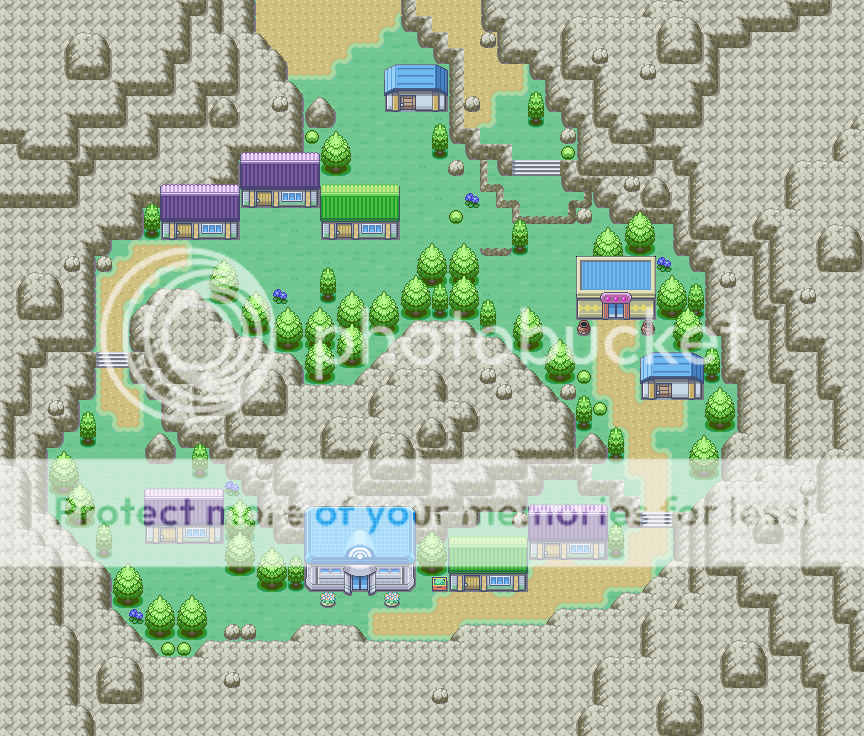
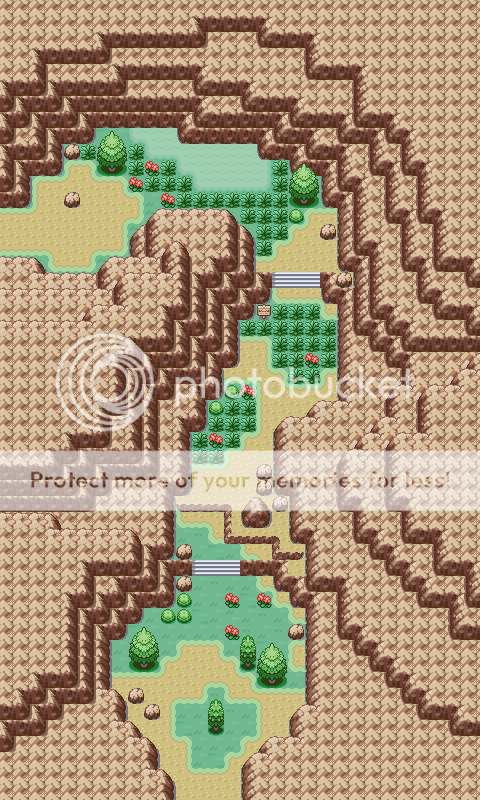
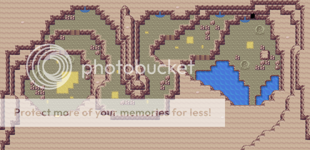
    Couple of my older maps...

    Gravala Town
    Spoiler:


    This one is a little bit more recent, and I'm sure it'll find it's way into Distant somehow...
    Spoiler:


    And last but not least, a cave that I made a while ago too!
    Spoiler:
     

    simdu68

    asleep all summer zzZZ
    218
    Posts
    14
    Years
  • Map Name: Atio City

    Map Game: Pokemon FireRed Hack - Pokemon Faze Version

    Comments: This is the city where you begin your journey. This is my first map in over a year, so don't be afraid to hurt my feelings.

    Tile Credits: Alistair, Reck
    Spoiler:

    your map is not bad, it is a big town and in a game I think there should be at least 2 big towns so it is alright, but this town is maybe too big!
    you have got very much empty space, very much garss, if you wanted to make a park you needed still to use less space and maybe also something that separates the park with the town itself like a fence or maybe bushes and juts maybe 4 entrances on four sides, but to leave so much free space open looks bad.....
    and the buildings are also not very well placed, maybe you can put them more together, if you leave more of the free space away maybe the buildings alo will be enough together and it will look more lie a town......
    well, my english is bad sorry, I'm french, I still hope you understand what i mean^^

    so if I had to rate it I would give 6/10 or maybe 7/10 but not more, I hope you'll improve it a lot, and post it again :D


    Couple of my older maps...

    Gravala Town
    Spoiler:


    This one is a little bit more recent, and I'm sure it'll find it's way into Distant somehow...
    Spoiler:


    And last but not least, a cave that I made a while ago too!
    Spoiler:


    hmm, well, I will not comment all maps in details because I'm.........too lazy^^
    well so, first map, the town is really great, the mountain shape is good, the mountain in the middle of the town is also great ;D
    the houses are well placed, the trees also......
    I just don't like the road on the right that you can't go back up, I even don't know from where it comes, maybe if I could see the route above it would be more clear, but I still don't like one-way routes that if you jump down you can't get there anymore........

    rating: 9/10

    the route, well, the mountains shape is very very good! the grass placement is.......alright, though it could still be better, if not in the sand there are some useless rock, like theres one big rock and 3 smaller rocks nearby, it just looks bad, leave the 3 small rocks near the big one away, I know why you put them, you put them to block like this you can't jump and land on a rock tile, it will bug, but the big is enough ;)
    then again, I don't like one-way paths, I realy don't like that! just because of this I will take 1 point away plus the other things I don't like, alltogether,

    rating: 8/10


    the cave, I yet never rated caves but I started with the 2 other so I'll finish.....
    hmm...the cave is good, I can't really say what to improve, exept that around the cave for example just above the entrance it doesn't look good when it is flat, put as much mountains going as high as possible all arounf the cave like this when you go in for example at the entrance you don't see flat place but rocks showing clearly that it is a wall......
    hmm, as I said ti curt_09 my english is bad, I'm sorry f you don't understand what I mean :(
    anyway...

    rating: 7/10
     
    Status
    Not open for further replies.
    Back
    Top