• Our software update is now concluded. You will need to reset your password to log in. In order to do this, you will have to click "Log in" in the top right corner and then "Forgot your password?".
  • Welcome to PokéCommunity! Register now and join one of the best fan communities on the 'net to talk Pokémon and more! We are not affiliated with The Pokémon Company or Nintendo.

Map Rating/Review Thread

Status
Not open for further replies.
1,906
Posts
16
Years
    • Age 30
    • Seen Oct 21, 2019
    Reposting since I was skipped.

    Lets see... you start at the bottom of the map, not the top-left. That's about it.

    Spoiler:
    Anyone? I'd really like some criticism on this!
     

    Lyzo

    Back from vacation
    261
    Posts
    17
    Years
  • Reposting since I was skipped.

    Lets see... you start at the bottom of the map, not the top-left. That's about it.

    Spoiler:

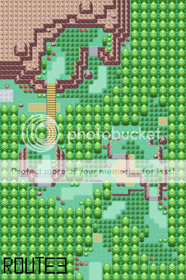
    Ok :P Well, let me start out by saying I notice that you have a Nintendo style. I personally am not such a fan of Nintendo styled maps, but I'll try to keep this rating unbiased xD

    Ok, your maps playability is really awesome. It's quite simple but it is a fun route to walk through, and seeing as this is probably going into your Hack, keep it like that :)

    What I however don't like is the mountain shapes, I find that they don't look natural. The one at the top looks better because it's connected to a mountainous area, but the other two don't look very natural because they are dumped in the middle of a foresty area. It doesn't look right :/ Also, the mountain at the top isn't totally natural as well, all the layers are precisely placed next to each other, it should be more random ;)

    Your grass placement is great, for playability and it looks nice too :) I also liked how you made use of all the different types of normal grass tiles :)

    The bridge is also a really nice extra in the map that really fits in well.

    Your tree placement is okay in most parts of the map except at the right, there's just one long line of trees which, well could be randomized a bit more...

    I like how you placed your paths, they look correctly placed and I also like how some of them go over onto the mountain area's, seeing as a lot of people just stop when hitting a mountain with their paths.

    To summarize, please work on your mountain areas, but the rest of the map is great! ;)

    8/10
     
    41
    Posts
    14
    Years
    • Seen Jul 17, 2013
    I would responed to, other ppl maps however, I have slow internet and I can't wait forever to look at a mapat least I can post my maps, these are the first 2 routes and Goldenrod city as well as Viridian City 10 years ago underattack by pokemonGoldenrod Cityhttps://members.webs.com/manageapp/photos/photo?photoid=85231686Route 34https://members.webs.com/manageapp/photos/photo?photoid=85231687Route 35https://members.webs.com/manageapp/photos/photo?photoid=85231688Virdian City (10 years ago)https://members.webs.com/manageapp/photos/photo?photoid=85231689how do you put things in a spoiler!!!
     

    Tropical Sunlight

    The Faltine
    3,476
    Posts
    16
    Years
  • Reposting since I was skipped.

    Lets see... you start at the bottom of the map, not the top-left. That's about it.

    Spoiler:
    Hmm...
    This map is very good. I don't however, like the placement of the bushes and flowers. I understand you like to put them in bunches (I do, too :P), but 4 and more at a time is a bit too much, don't you think? (especially flowers)

    The signs have been placed neatly and strategically, and you're using 2 types of paths, which is good.

    Another thing, that is tree shading. On this map, it is perfect. You also used all 4 + 1(hidden item) grass tiles of FR's selection.

    This map is a great example of how we can make a great map with no new tiles at all. Good job, Xray (or Disturbed)!

    I can't spot any tile errors either, except for the bridge which looks like it's about to fall off on its southern side. It doesn't appear to be connected to the mountain at all! Of course, that might just be me.

    9.5/10 because of the flowers XD

    Spoiler:
    Spoiler:


    This is the simplest Town I could ever made. ^^ Nothing special about this town, except for the lab.
    It's going to be difficult for me to rate the map not judging by the tiles, but I'll try.

    As you know, I don't like this mapping style of yours. The trees are... well... placed "naturally".
    On the other hand, everything else (the fence, the small trees, the path) are placed very neatly and not naturally at all, which I like very much :D

    You took care of the emptiness of this map, maybe even too much. There appears to be very few of your normal grass tiles and the map is filled with little details.
    It's a good thing there's a path, otherwise it would be probably very difficult to move around.

    I've also noticed that there isn't a Pokecenter in this town. I'm not going to deduct points because of that, but I'm wondering, is this the starting town?

    Well... nothing else but 10/10
     

    ListenT

    Black kitteh
    9
    Posts
    14
    Years
    • Seen Jul 11, 2012
    Here's my map that I would like to share with you guys. I love mapping and I know this isn't the perfect map but I really like it. Please say your opinion about it and don't forget to rate <3

    i47.tinypic.com/bjh1qq.jpg
     
    37
    Posts
    14
    Years
    • Seen Jun 16, 2010
    Fourth time's the charm, I suppose? Eh, probably not...

    These are my first maps, but don't be afraid to give some good criticism!

    Town Name: Tanzan Town
    Description: A small farming town on the edge of a forest, Tanzan Town provides the rest of the region with freshly-grown berries. This is the main character's home town.
    Comments: Those "dirt paths" on the left and top of the map are supposed to be patches of soil, y'know, because it's a farming town.

    Spoiler:


    Route Name: Route 1 (for now at least)
    Description: Connects Tanzan Town to Tanzan Woods.
    Comments: Fighting wild Pokemon is optional on this map, which is why the grass is placed the way it is. Mandatory battles come when the player enters the forest, as there will be many more grass patches where the player walks.

    Spoiler:


    __________

    EDIT:
    Here's my map that I would like to share with you guys. I love mapping and I know this isn't the perfect map but I really like it. Please say your opinion about it and don't forget to rate <3

    i47.tinypic.com/bjh1qq.jpg

    Pros:
    - The tree placement is nice. Not too square, not too wild.
    - The grass placement is also nice, for the same reason.

    Cons:
    - That river looks a bit weird to me. Those zig-zags make it look unnatural in my opinion. Make it flow more smoothly in the place where it looks jagged.
    - Instead of having the river stop abruptly like that, perhaps a bridge would look better? Having the land cut the river into two parts like that looks odd to me.

    Rating: 8/10

    I hope that helped a little!
     
    Last edited:

    Lyzo

    Back from vacation
    261
    Posts
    17
    Years
  • Here is an improved version of the forrest i posted a while ago:
    https://img22.imageshack.us/img22/186/naturalmap2.png

    Here is another one i made while practising:
    https://img85.imageshack.us/img85/1135/naturalmap.png

    Both made on fireRed please rate out of 10 thanks for looking :)

    Ok, about your first map, you added an entrance and an exit + a border That's good progress... but the map is still not finished. You need to make a path for the player to follow, add some more trees so that the player can't walk throughout the whole map.

    About your second map, the shore line is really, good, but the rest of the map is really empty... This map isn't finished either, try adding some things such as a building or things that belong on a beach.

    I'm still not rating your maps because I feel that they are not finished yet...
     

    siper x

    I'm Russia, Fear Russia
    375
    Posts
    14
    Years
    • Seen Mar 29, 2023
    well here are the cave maps for my first beta
    Hack: Pokemon Investigation
    game: Fire Red

    part 1
    Map Rating/Review Thread


    part 2
    Map Rating/Review Thread
     

    Rabbit

    where is my mind?
    484
    Posts
    15
    Years
  • View attachment 54483I would like to know your opinion about this map. Give me a rating from 1 to 10. If you have any comments, please let me know.
    See ya

    Looks like a pretty complicated, thought-out map. There's a good transition to the beach. I don't like how sparse the trees are, but that's just a personal thing. The PC looks somewhat out of place all alone on this empty, wild-looking route. Maybe you could replace it with a normal house that serves the same purpose. What I really dislike is how the two halves of the map - left and right - aren't directly connected. I assume the caves connect them, but still, it's going to drive the player berserk going all the way up, through who knows how many cave maps, then all the way down, just to get out of this area.


    Here's my map that I would like to share with you guys. I love mapping and I know this isn't the perfect map but I really like it. Please say your opinion about it and don't forget to rate <3

    i47.tinypic.com/bjh1qq.jpg

    The path is very hard to see. Are you trying to confuse the player on purpose? Because that's, like, fake difficulty. D: The ledges don't seem to fit in because they're so straight. It's like you threw them in just for variety. If you really want variety, try a sandy path or colourful flowers. You have a lot of different grass tiles, but they're all the same colour so nothing catches the eye. I like the river, but the way you can cross it means it's not a river anymore. Also, the player can surf off the edges of the map. Overall, the map is quite uniform and unexciting.

    On the plus side, I really like your tiles.

    You want a number? Okay...5.5/10.
     
    Last edited:

    TAKUORO

    Pyro from WAH ;D
    61
    Posts
    14
    Years
  • Reposted since I was skipped.
    A map from my hack, Legend Of The Rainbow
    Spoiler:
    Spoiler:

     
    3,411
    Posts
    15
    Years
    • Seen May 5, 2024
    A map from my hack, Legend Of The Rainbow
    Spoiler:

    That is simply awesome! (I love the tiles/palettes, especially the water animation and the ground. ^^)
    The map itself is win. One thing that bothers me is the way you put the grass; I like it that way, but it's not good playing it. You need to leave at least a small place without grass to let the player take a rest from wild battles. Also, the upper left corner of the map is messing with the border block.
    9/10
     

    simdu68

    asleep all summer zzZZ
    218
    Posts
    14
    Years
  • Reposted since I was skipped.


    wow! it looks awsome! I really like the tiles and pallettes, it is hard to rate the map without rating the tiles^^ but I'll try.....
    well so, the map looks great, the mounatins shade, beach, everything is really well done ;)
    but, as ray maverick said, you put too much grass, ingame it will be really boring if all the time you will meet wild pokémon, and another thing, the cave I don't really know how to go to it^^ but I bet you have to go to next map first then somehow down to the water and then back here or something so^^ so I'll leavce it out ;)

    rating:
    9.5/10


    now my own maps:

    map name: route 3
    map game: FR
    Spoiler:

    comments: well, it's a map I made on FR just like this, but I really like this map so I'll redo it in my hack^^
    credits: nintendo


    map name: donnow, starter town^^
    map game: FR
    Spoiler:

    comments: a map for someone else's hack, so I want to know the rating to have the map as good as possible since it's for someone else^^
    credits: nintendo
     

    ListenT

    Black kitteh
    9
    Posts
    14
    Years
    • Seen Jul 11, 2012
    The path is very hard to see. Are you trying to confuse the player on purpose? Because that's, like, fake difficulty. D: The ledges don't seem to fit in because they're so straight. It's like you threw them in just for variety. If you really want variety, try a sandy path or colourful flowers. You have a lot of different grass tiles, but they're all the same colour so nothing catches the eye. I like the river, but the way you can cross it means it's not a river anymore. Also, the player can surf off the edges of the map. Overall, the map is quite uniform and unexciting.

    On the plus side, I really like your tiles.

    You want a number? Okay...5.5/10.

    Thank your for your opinion. I really appreciate it. For the patch from one side to other side yeah, I wanted to make a bridge but I didn't find any good looking bridge and that tileset didn't have it either. I wanted like to make some kind of mountain or something with those ledges but I've been mapping for 1-2 months only so I can't make anything like that yet as I see. I hope that my other creations will get a bigger number and will become better and better. Thank you again!
     

    simdu68

    asleep all summer zzZZ
    218
    Posts
    14
    Years
  • i was skipped, so please rate.


    they look not that bad but.....they are little too square, and I don't like also the 2 cave entrances which are on the small rock, either when you go through you have just to come out from antother side, but then it is useless, but I rather think they lead to the second map which has exactly the same thing, in this case it is just unatural.....
    but that the cave looks good you should mainly improve the mountains shape.....

    rating: 6/10


    I was also skipped, a few posts above I posted 2 maps, can you or someone else plz rate them? thx :)
     

    simdu68

    asleep all summer zzZZ
    218
    Posts
    14
    Years
  • I was skipped five times as well. I'm the third post on this page.


    well, you town is....alright....but, there are some useless things like the paths on the top or left of the map, they are useless, put rather paths to connect the houses, then the bunch of trees in the middle is....not bad, but personally I don't really like it, but well, depends on the mapping style^^
    and finally, it is a starter town so for the main hero's house it is better if you use a "special" house, maybe just a bigger house and not the basic house....

    rating:
    5/10


    the route, well, it is really well done, I did'nt find any tile errors or anything else, but....I don't know why but it seems kinda empty, maybe you can add more grass, and maybe also more trees, I personnally don't like open borders, even if there is then the border tiles I still don't like it :S
    and overall I don't really like nintendo style either, but well, I'll rate without taking it in count, if not I like the way the firest is connected though a route, it i really good!

    rating:
    8/10


    now you can maybe rate my maps?^^
     
    Status
    Not open for further replies.
    Back
    Top