• Our software update is now concluded. You will need to reset your password to log in. In order to do this, you will have to click "Log in" in the top right corner and then "Forgot your password?".
  • Welcome to PokéCommunity! Register now and join one of the best fan communities on the 'net to talk Pokémon and more! We are not affiliated with The Pokémon Company or Nintendo.

Map Rating/Review Thread

Status
Not open for further replies.

vietazn654

A sound soul dwells within me
371
Posts
14
Years
  • Both of your maps are far too boring, and open.
    Had to say it. you do not need a 60x60 map or bigger for a plain desert, add some more features like some more mountains or a cave or an oasis.. that just shows lack of imagination.

    the second one suffers the same problem although reclaiming some of its dignity by having a nice layout. theres just too much open space.

    3/10-First- Im finding it hard to see a good point
    6/10 second-you dont need that big a map for what should be a small town.


    now for mine.
    Spoiler:

    Just to prove i can map naturally and not square.

    Sheerface town.
    as you can tell i like towns and cities.
    Alright, But in the corner you have a tile error. The tiles aren't that bad, but you should add more people in your city. Or move the people around the place. Either than that, it looks good. 7/10

    Map Name: Greenwood Town
    Map Game: Fire Red
    Comments: Something I made in a couple of minutes. Credits to TB Pro for ROM Base. No stealing xD
    Map Rating/Review Thread
     
    Last edited:
    5,814
    Posts
    16
    Years
    • Age 30
    • Seen May 19, 2021
    I like your maps, just to let you know.

    Now, this is a nice map. Very simple... But the actual town area seems too small, whereas the player doesn't have enough room to even breathe. I also don't really like the fact that you finished off a little bit of a route in the same map as the town. You could use that space to make the town bigger, as well as getting rid of a lot of those trees near the gym. You used a bit too much trees. I also notice you LOVE using ledges in a lot of your maps. Get rid of the ones in that little space where you walk into the town, next to the route. Maybe keep one or two. Other than that, I like the map. :)

    7/10
    ---------------------------------------
    ---------------------------------------
    Map Name: N/A
    Map Game: Emerald
    Comments: Got bored, as usual. I also used Emerald instead of FireRed, because I like a couple of the tiles in Emerald, and my tile inserting fails epically. Also, the map doesn't exactly seem finished completely to me. :\ Which is why I'm posting it here. It seems too empty, but I don't want to over-crowd it with random crap. So, please tell me what to add/get rid of, etc.
    Map:
    Map Rating/Review Thread
     

    Resultz

    All- round Poke-Whizz
    583
    Posts
    14
    Years
  • @eeveon, Now i come to think of it, the route doesnt look that good.
    But the twn itself is based off a English seaside town, small with narrow streets.
    Thanks :P

    PS. yeah i believe for a map to be intersting, it has t challenge the player to be able to traverse it... i.e needing ledges or mountains.. especially when the map's flat.

    Anyone remember what Manipulation posted a while back? There's about 9 different maps that need to be rated on this page, and only a few people rating. Hate to be a minimod, but people need to rate when they post ..
     
    Last edited:
    5,814
    Posts
    16
    Years
    • Age 30
    • Seen May 19, 2021
    Its ok, its to generic. Its pretty good though, its just kinda boring.
    6/10

    Spoiler:
    Thanks, that um... doesn't help me. :|

    As for your map. The paths are too thick and unnatural. Try adding some more detail into your maps. You can walk on the other side of the mountain the left which isn't good, because then you're going to come face-to-face with your map border; that really isn't a good idea. Try to get more into block editing as well, for connect the trees and mountains together. Should I even mention this? Okay, I will: TREE SHADING ERRORS AAAARGH!!!1!!!11one Also, you used the wrong tile when connection the mountains together. I shouldn't have to point them out, because 1) idk how to explain it without using a picture and 2) you need to figure this out yourself. Random jumping ledge = no. Two random green square paths also = no.

    3/10


    EDIT: Also, x Necromorph x? I think he would only have to rate your's or someone else's map if he posted his own.
     

    tetrix1993

    Quality-Map Hacker
    35
    Posts
    14
    Years
    • Seen Aug 31, 2011
    MY WORKS

    I am bored... so I create the world map of my world (not complete yet, a small portion of it). There is no town in this map (because I make it into a high-level Pokémon area), but rather a scientist camp which is indicated by the blue circle:

    Map Rating/Review Thread


    Hey, nobody (but one) have not rate my posts which is at the last post of Page 235!

    I take lots of hours on making Route 47! The cliff structure is a bit weird, but take a look!

    Spoiler:


    --------------------------------------------
    MY COMMENTS ON OTHER PEOPLE'S WORK

    Its ok, its to generic. Its pretty good though, its just kinda boring.
    6/10

    Map Name: Route 3
    Map Game: Fire Red
    Comments: Trees! I know, I know. I had to use them for borders.
    Map:
    Spoiler:

    Okay. But it is funny to see small hills admist the trees, and then the ledges at the centre of the path. 5/10

    Map Name: Petayre Town

    Map Game: FireRed

    Comments: Ok, so this is the Starter Town for my hack. I've recently remade it, due to feedback I got on my thread, but I'm uploading it on here before updating my thread to find out what people think. I know the beach seems a bit big, but it will have a few NPC's on, plus I wanted it to have a 'spaced' feeling, as the town is the most remote part of the region, having little to with the other cities and towns, so I wanted Petayre to have a similar air to it. Also bear in mind that I may have a custom tileset later on.

    Mapshot:
    Spoiler:

    The beach is quite plain, and mountains are somehow uniform. Houses should be place one tile apart from the edge of the mountain. I found it weird to see one 'hole' (above the second and third house at the top). 6.5/10.
     
    Last edited:

    .LMG.

    Yeah! Custom User Title!
    65
    Posts
    14
    Years
    • Seen Aug 8, 2015

    I like your maps, just to let you know.

    Now, this is a nice map. Very simple... But the actual town area seems too small, whereas the player doesn't have enough room to even breathe. I also don't really like the fact that you finished off a little bit of a route in the same map as the town. You could use that space to make the town bigger, as well as getting rid of a lot of those trees near the gym. You used a bit too much trees. I also notice you LOVE using ledges in a lot of your maps. Get rid of the ones in that little space where you walk into the town, next to the route. Maybe keep one or two. Other than that, I like the map. :)

    7/10
    ---------------------------------------
    ---------------------------------------
    Map Name: N/A
    Map Game: Emerald
    Comments: Got bored, as usual. I also used Emerald instead of FireRed, because I like a couple of the tiles in Emerald, and my tile inserting fails epically. Also, the map doesn't exactly seem finished completely to me. :\ Which is why I'm posting it here. It seems too empty, but I don't want to over-crowd it with random crap. So, please tell me what to add/get rid of, etc.
    Map:
    Map Rating/Review Thread
    Great map IMO. I overlooked the empty spaces since I think it looks pretty good the way it is. I also liked the grassy paths and how they're formed. 8/10


    Now for my map
    I just finished inserting these awesome tiles from WAH.

    PLEASE DO NOT MIND THE BORDER ERRORS!!!! I KNOW WHAT I'M DOING!!!
    ALSO PLEASE DON'T MIND THE FLOWERS!!! THEIR JUST FINE IN GAME
    Proof:
    Spoiler:


    Map Name: Gecho Town
    Map Game: Pokemon Global Adventures
    ROM: Fire Red
    Comments: I think I did a pretty good job on this one. Its the home town of my hack. <WOAH! LMG! IF THIS IS THE HOME TOWN, WHERE IS THE PROFESSOR'S LAB???> Don't worry about that, I'm planning on giving him his own map.
    Map:
    Spoiler:

     
    5,814
    Posts
    16
    Years
    • Age 30
    • Seen May 19, 2021

    Great map IMO. I overlooked the empty spaces since I think it looks pretty good the way it is. I also liked the grassy paths and how they're formed. 8/10


    Now for my map
    I just finished inserting these awesome tiles from WAH.

    PLEASE DO NOT MIND THE BORDER ERRORS!!!! I KNOW WHAT I'M DOING!!!
    ALSO PLEASE DON'T MIND THE FLOWERS!!! THEIR JUST FINE IN GAME
    Proof:
    Spoiler:


    Map Name: Gecho Town
    Map Game: Pokemon Global Adventures
    ROM: Fire Red
    Comments: I think I did a pretty good job on this one. Its the home town of my hack. <WOAH! LMG! IF THIS IS THE HOME TOWN, WHERE IS THE PROFESSOR'S LAB???> Don't worry about that, I'm planning on giving him his own map.
    Map:
    Spoiler:

    Okay, your map. Well, it's not bad. Since you showed the screenshot for the flowers, points won't be taken off for that. Okay... the paths: they're too straight, small, and placed randomly/too close to each other. Make, like, one or two medium sized paths, that have a decent, natural shape to them. There is also TOO MUCH empty space. Empty space is fine, but not that much. I also think you should add some rocks or decoration in the water. I like the way you placed trees around, that's a plus. The little flower garden bugs me for some reason, but that's your choice; no points deducted for that. Also, that mountain part on the top right, there is going to be a border error, unless you decide to add more mountains on the next map on the right. Anyway, that should be it...

    6.7/10
    ---------------------------------------
    ---------------------------------------
    Map Name: N/A
    Map Game: Emerald
    Comments: Okay, so I added more to the map...... more trees. XD; A LOT more.... So, um, comments and rating, k? :D I WANT A GOOD REVIEW OF MY MAP THIS TIME. Not any "its gud but it needz more stuf" kind of review, okay? I only got two decent reviews of my map and one horrible one. You know who you are, even though your post got deleted, thank God...
    Map:
    Spoiler:
     

    DuoRyan

    Hack'in as usual, it seem.
    335
    Posts
    14
    Years

  • Okay, your map. Well, it's not bad. Since you showed the screenshot for the flowers, points won't be taken off for that. Okay... the paths: they're too straight, small, and placed randomly/too close to each other. Make, like, one or two medium sized paths, that have a decent, natural shape to them. There is also TOO MUCH empty space. Empty space is fine, but not that much. I also think you should add some rocks or decoration in the water. I like the way you placed trees around, that's a plus. The little flower garden bugs me for some reason, but that's your choice; no points deducted for that. Also, that mountain part on the top right, there is going to be a border error, unless you decide to add more mountains on the next map on the right. Anyway, that should be it...

    6.7/10
    ---------------------------------------
    ---------------------------------------
    Map Name: N/A
    Map Game: Emerald
    Comments: Okay, so I added more to the map...... more trees. XD; A LOT more.... So, um, comments and rating, k? :D I WANT A GOOD REVIEW OF MY MAP THIS TIME. Not any "its gud but it needz more stuf" kind of review, okay? I only got two decent reviews of my map and one horrible one. You know who you are, even though your post got deleted, thank God...
    Map:
    Spoiler:

    I like the shape of the map very curvy but it a little bit bland. Nice playablity and used of ruby,sapphire and emerald tile.
    rating 9.8\10

    Here my map ignore the building without door
    Map Rating/Review Thread
     
    780
    Posts
    14
    Years
  • I like the shape of the map very curvy but it a little bit bland. Nice playablity and used of ruby,sapphire and emerald tile.
    rating 9.8\10

    Here my map ignore the building without door
    Map Rating/Review Thread
    This is a pretty nice map for a city. Although there's shading errors on the trees, and that tree next to the building next to the Poké Mart is a tile error. Also the paths are kinda squarish! Other then that, keep up the good work! Rating: 7.9/10
     

    Ven

    Tyrian
    124
    Posts
    14
    Years
    • Seen Mar 19, 2011
    @Eeveon
    Although your map is completely contradictory to my style of mapping, I'll give it a shot. I actually really like this map, the layout itself is fantastic, the path is, for the most part, very well made, although I feel that it's a bit to swervy at times, and I think that it's a bit too wide at the exit. I have no idea how anyone could call this bland, if anything it has a bit too much going on. There a lot of flowers, an insane amount. Some people like this, others don't, I don't really like it. The mountain that the lab is on is a bit too random. It's hard to balance out randomness and order in mountains, so I suggest you spend a little more time on it, just to straighten it out a bit. I think that the tree's are a little too random, a good example of this would be in between the top two houses.
    I don't like how wide the bottom two houses are either, maybe shorten them.
    All in all, this is one of my favorite starting maps.
     

    Rabbit

    where is my mind?
    484
    Posts
    15
    Years
  • Here my map ignore the building without door
    Map Rating/Review Thread

    I like how you use two kinds of city tiles - one for streets and one for sidewalks. The fence is a nice touch, a kind of fence I rarely see used. Overall, the shape of the city is good, though it's a little small for a city. The transitions between city and route are terrible because it's as abrupt as a cliff. You should really change that. I don't like the shape of the street. It gets really blobby in the middle, kind of trapezoidal - real streets are always straight and rectangular. And it doesn't reach a few of the buildings, like the PC, so it doesn't seem to do its job well. Overall, a decent map that needs some edits.

    Map Name: N/A
    Map Game: Emerald
    Comments: Got bored, as usual. I also used Emerald instead of FireRed, because I like a couple of the tiles in Emerald, and my tile inserting fails epically. Also, the map doesn't exactly seem finished completely to me. :\ Which is why I'm posting it here. It seems too empty, but I don't want to over-crowd it with random crap. So, please tell me what to add/get rid of, etc.
    Map:
    Map Rating/Review Thread

    I like the shape of the town. The slightly skewed streets look really nice because they have a consistent width. But the map really is too empty. You could fix it by just bringing the forest forward around the houses, especially behind the top pair. If that makes it look too small, you might add fences/small bushes around the houses so that they take up more space.

    Edit: The trees give the town a bit more weight, but it still feels like the forest is too far away. Plus, with the trees tracing the paths, it's become more obvious that there's an empty 'corridor' above the two top houses.

    You've done something creative with the house tiles, but it doesn't quite work. The single storey houses look rather skewed because the window and door are both on one side of the house. If you just move the window over, they might look fine. Or, as Ven suggested, make them narrower.

    The mountain looks a little abrupt because the elevations are closely spaced. It's this sudden cliff of mountain in an otherwise flat map. It's easy to fix - either remove one layer of elevation, put more space between them, or fill the mountain with trees to mask the elevations.

    Oh, and I agree with Ven that the path at the exit is too wide. In-game, I've never seen it wider than 3 tiles. But I feel kind of nerdy mentioning it. xD
     
    Last edited:

    x Necromorph x

    Super Saiyan 4
    295
    Posts
    13
    Years
  • This is one reason why I barely post here; no one, except for a select few, know how to give ratings anymore.


    "This map is bland"
    That is a rating. Sorry to break the news to you.


    @DuoRyan
    I dont like how your city path just abruptly ends. But other then that it is pretty good.
    7/10
     

    Ninja Caterpie

    AAAAAAAAAAAAA
    5,979
    Posts
    16
    Years

  • Map Name: N/A
    Map Game: Emerald
    Comments: Okay, so I added more to the map...... more trees. XD; A LOT more.... So, um, comments and rating, k? :D I WANT A GOOD REVIEW OF MY MAP THIS TIME. Not any "its gud but it needz more stuf" kind of review, okay? I only got two decent reviews of my map and one horrible one. You know who you are, even though your post got deleted, thank God...
    Map:
    Spoiler:

    The new load of trees. No. That little path thing behind the house is nice, but, as far as I can see, it serves no purpose whatsoever. The trees look like you randomly added them in to cut down on emptiness. If you want to do that, move the border in a bit.

    Also, like Rabbit said, the cliff is too harsh. Split them up a bit, maybe move it across ('cos there's also a border error!). Moving it across also cuts down on empty space, although you might have to shift the whole set of houses across.

    And, uh, yeah, you should cut down on the exit path.

    Overall, it's okay. It's a bit bland but, as a starter town, that works. The trees just hug the path, which is kinda awkward, as is that little corridor behind the top houses, so work on that.
     

    ChaosNinjat

    Dragon Ranger
    22
    Posts
    14
    Years
  • Rated Map:

    Map Name: Gecho Town
    Map Game: Pokemon Global Adventures
    ROM: Fire Red
    Comments: I think I did a pretty good job on this one. Its the home town of my hack. <WOAH! LMG! IF THIS IS THE HOME TOWN, WHERE IS THE PROFESSOR'S LAB???> Don't worry about that, I'm planning on giving him his own map.
    Map:
    Spoiler:


    Rating: 8/10

    Reason: I think this is a really great map. I think the tiles are new and refreshing and make a great change, and add a nice element to the overall map, plus the map itself is a good size. The layout is also nicely done, not too square, but it doesn't lose itself either.

    Suggestions: I think the house and path tiles may need to have a makeover too, so they fit in a bit more with the other tiles. I don't think the paths are very clear, which may make it difficult for the player to follow, causing them to get lost. Unless you're putting the player and the rival's houses on another map also, I suggest you make them a little more distinguishable from the other houses. Overall a very well made map.


    Ok, now for my map (I've had to post this again, due to it being deleted, presumably it was mistaken for a review post, rather than an upload post.):

    Map Name: Petayre Town

    Map Game: FireRed

    My Comments: This is a remake of the starter town for my hack. I decided to remake it due to comments received on my hack's thread. I wanted to create a really detached feeling in this town, as it is the most secluded area of the entire region, and I wanted to continue this feeling into the town itself. There are no NPCs shown on the map, but there will be a few, to guide players to the cave, where you have to meet the professor, though the paths do show the direction you need to go pretty clearly. I'm very pleased with this version of the map over the other version, but rather than uploading it straight onto my thread, I decided to put it up her first, to get some comments from other people.

    My Map (sorry the pic is so big):
    Spoiler:
     

    Orinjmate

    The Orinj of the Mate
    120
    Posts
    13
    Years
  • Map Name: Petayre Town

    Map Game: FireRed

    My Comments: This is a remake of the starter town for my hack. I decided to remake it due to comments received on my hack's thread. I wanted to create a really detached feeling in this town, as it is the most secluded area of the entire region, and I wanted to continue this feeling into the town itself. There are no NPCs shown on the map, but there will be a few, to guide players to the cave, where you have to meet the professor, though the paths do show the direction you need to go pretty clearly. I'm very pleased with this version of the map over the other version, but rather than uploading it straight onto my thread, I decided to put it up her first, to get some comments from other people.

    My Map (sorry the pic is so big):
    Spoiler:


    First off, I think the beach is a little too zig-zaggy whereit meets the sea, I also think that the bright grass behind the rooves doesn't look great (can be changed on the block editor just incase you weren't sure how to change it), I also think that the mountains don't look natural enough and are too in-a-straight-line. I also think that the brown rocks in the water shouldn't have the rounded dark water underneath each one. And I think that the windows on the right blue house is too close to the door. There a couple of tile errors, one being next to the tree and signpost where the mountain is supposed to go down onto grass but actually has the go-onto-another-mountian tile, the other being where the mountain goes down onto the sand and water and the sand goes over the water a little bit. Also I noticed that you are able to surf out of where the rocks in the water are because there are lots of gaps.

    However!
    I quite like the map overall and think that the layout is very good and that you have done the paths very well. I like the cave on the beach, you should call it Beach Cave ^^

    Overall Rating: 5.5/10

    ------------------------------------------------
    Now for mine
    Hack Name: Sky SD
    Base Rom: FR
    Map Name: Path 6
    Comments: It is very cluttered because you are going into a forrest at the right, when you enter the path from the top left it stops raining, also the path is cloudy weather.
    Spoiler:
     

    altariaking

    Needs NO VMs...
    1,087
    Posts
    14
    Years
  • First off, I think the beach is a little too zig-zaggy whereit meets the sea, I also think that the bright grass behind the rooves doesn't look great (can be changed on the block editor just incase you weren't sure how to change it), I also think that the mountains don't look natural enough and are too in-a-straight-line. I also think that the brown rocks in the water shouldn't have the rounded dark water underneath each one. And I think that the windows on the right blue house is too close to the door. There a couple of tile errors, one being next to the tree and signpost where the mountain is supposed to go down onto grass but actually has the go-onto-another-mountian tile, the other being where the mountain goes down onto the sand and water and the sand goes over the water a little bit. Also I noticed that you are able to surf out of where the rocks in the water are because there are lots of gaps.

    However!
    I quite like the map overall and think that the layout is very good and that you have done the paths very well. I like the cave on the beach, you should call it Beach Cave ^^

    Overall Rating: 5.5/10

    ------------------------------------------------
    Now for mine
    Hack Name: Sky SD
    Base Rom: FR
    Map Name: Path 6
    Comments: It is very cluttered because you are going into a forrest at the right, when you enter the path from the top left it stops raining, also the path is cloudy weather.
    Spoiler:

    I like the map, but I think the puddles need to be a bit less square, and a sign or something to indicate were the forest is.
    9/10

    Map Name: Route B
    Rom: Emerald
    Comments: A small mountainous route. This is the first route visited, but has no wild Pokemon, and leads to _________ _____'s house (don't want to give anything away xD)
    Spoiler:

    House is subject to change...#

    offtopic: what are all the elevation movement permissions? the bottom I think is 10.
     
    10,078
    Posts
    15
    Years
    • UK
    • Seen Oct 17, 2023

    Map Name: Route B
    Rom: Emerald
    Comments: A small mountainous route. This is the first route visited, but has no wild Pokemon, and leads to _________ _____'s house (don't want to give anything away xD)
    Spoiler:

    House is subject to change...#

    offtopic: what are all the elevation movement permissions? the bottom I think is 10.

    So, I'm going to try to not judge the palettes but you should really get them sorted, the tiles just don't go well together.

    Your paths have errors on them, opposite to the corner.

    The base layer of the mountain is very square, although the other layers are much better.

    Although you've varied the trees on the top on the bottom its a perfectly straight line (which can be run all the way down). Make some of the trees overlap the mountain where it curves up to block off the path sooner.

    The double route on the mountain is a bit weird and rather pointless, I'd get rid of the ledge route all together.

    The mountain also has another problem, it has two exits to the left. This might not be a problem (it may be intended, although I suspect not. It would be better to have just one if they go to the same place) but the fact they are just one tile wide is annoying for the player. There are also a few other 1 tile walkways which could do with being expanded to allow the player more freedom.

    Putting aside the tiles I'd give this map 6/10
     

    sasquatchd00d

    welcoming a clean head.
    264
    Posts
    15
    Years
  • Map Name: Greenwood Town
    Map Game: Fire Red
    Comments: Something I made in a couple of minutes. Credits to TB Pro for ROM Base. No stealing xD
    Map Rating/Review Thread

    I don't really like this map at all. There's a ton of empty space and at the same time, you cramped the bottom buildings down. There is plenty of room to shift the buildings up. Another thing, the sign in the middle of the path isn't very appealing. Just shift the path to the left a little bit and that problem is fixed. The flowers are kind of randomly placed and look bad. Try grouping them to make them look more realistic.

    2/10

    Map Name: Verde Path
    ROM: Fire Red BPRE
    Hack: Pokémon Apollo
    Credits: PrinceLegendario, Dewitty, Kymotonian, TheDeadHeroAlistair

    Spoiler:
     

    Alice

    (>^.(>0.0)>
    3,077
    Posts
    15
    Years
  • Map Name: Verde Path
    ROM: Fire Red BPRE
    Hack: Pokémon Apollo
    Credits: PrinceLegendario, Dewitty, Kymotonian, TheDeadHeroAlistair

    Spoiler:
    First off, excellent use of the jumpable cliff thingies. It's not often that I see a map with this kind of shape... where you can see (or almost see) the end of the route from the very beginning, and then have to go through the whole winding route around the cliff to get there. I like it. I also find it hard to incorporate rivers the way you did, so good job. The bridge tiles don't really fit in with this palette though. Still, I see no reason to give anything lower than 10/10
     

    locoroco

    Ginga Densetsu Weed ANIME PWNS
    251
    Posts
    14
    Years
  • Map Name: Verde Path
    ROM: Fire Red BPRE
    Hack: Pokémon Apollo
    Credits: PrinceLegendario, Dewitty, Kymotonian, TheDeadHeroAlistair

    Spoiler:

    i completely loved this map though i found that the tall grass palletes look a little wierd (the dark outline) other than that i love this map i see no reason why not to give you a 10/10

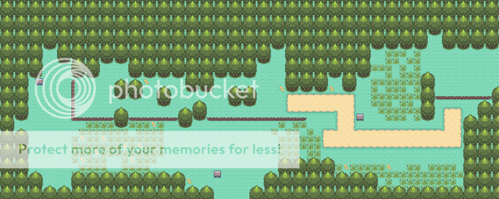
    now here is my map
    route 201
    imitation of pokemon platinum
    unsquared and all XD

    Spoiler:
     
    Status
    Not open for further replies.
    Back
    Top