• Our software update is now concluded. You will need to reset your password to log in. In order to do this, you will have to click "Log in" in the top right corner and then "Forgot your password?".
  • Welcome to PokéCommunity! Register now and join one of the best fan communities on the 'net to talk Pokémon and more! We are not affiliated with The Pokémon Company or Nintendo.

Rate the Avatar of the Person Above

Status
Not open for further replies.

Zelda

⍃⍍⍄ ⍃⍍⍄
4,842
Posts
15
Years
    • Age 8
    • +
    • Seen Sep 15, 2020
    Eh, sort of low quality but I like the position. It'd look better if it had some vibrancy too!

    6.2/10
     

    Aquacorde

    ⟡ dig down, dig down ⟡
    12,512
    Posts
    19
    Years
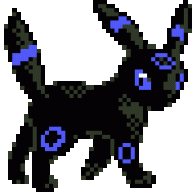
  • I think the lighter colors are just a tad too white; they are a bit blinding. On the other hand it has kind of an ethereal quality to it which is nice. 9/10
     

    Ineffable~

    DAT SNARKITUDE
    2,738
    Posts
    15
    Years
  • It's a cute looking pony!:)
    ~
    8/10
    :) So happy you like. <3

    I like yours because your old signature and new go well together and it's like having two signatures at once. Then the avatar alone is just cool on its own. It reminds me of someone else's avatar but I don't know whose.

    To the point: 8.5/10 for the darkness, very pretty colours and . . . moonset or eclipse or whatever it is. I like!
     

    Usagi-Chan~

    What are you doing my love?
    626
    Posts
    16
    Years
    • Age 26
    • US
    • Seen Apr 7, 2024
    It's a litwick, and I really like the drawing style of it soooo
    8/10

    It's a litwick, and I really like the drawing style of it soooo
    8/10
     
    Last edited:

    Aquacorde

    ⟡ dig down, dig down ⟡
    12,512
    Posts
    19
    Years
  • 6/10 It would look a bit better with some brightening I think. And the positioning seems a bit odd to me but I'm none too sure why.
     

    Magdalena~

    Feel the hnnnnggg
    127
    Posts
    12
    Years
  • 0/10 trolololol

    The dancing trollface is pretty funny, but all the white space kind of spoils it for me. It's just a bit bland and not my type . . . :( 5/10.
     

    Eucliffe

    ☆ E N T E R T A I N E R
    6,493
    Posts
    15
    Years
  • 10/10

    +3 for the nostalgia
    +2 for the simplicity and cleanliness of the GIF
    +500,000,000,000,000,000,000 x ∞ because AAAAAAAAAAHHHHHHHHH TAILS <3333333333
     

    Quicksken

    Modder/Hacker/Gamer/Dreamer
    7
    Posts
    12
    Years
  • 7.5/10. I like it. Not really sure why though... I haven't a clue about what it is. It's probably because of this that I like it.
     
    Status
    Not open for further replies.
    Back
    Top