Gary the Magic Fairy
Banned
- 2,799
- Posts
- 18
- Years
- Age 31
- Your Mother
- Seen Jun 29, 2010
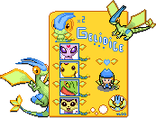
Yay, I inspired someone. XDYo, it's been quite a long time. I've been busy lately. It's well, how long has it been? Anyway, it's great to see everyone doing alright. So here goes.
http://i191.photobucket.com/albums/z67/code1992/whitneycard.png
Well, actually, I took the idea from Kenji's. Just modified a bit, though, and give it another view. Enjoy!
Anyway, it's nicely done, although it's much to large to be used for any practical purpose. I would reccomend trying one the actual size of the base image. But still, good :3
Woah, way too busy and cluttered. I'm not sure what all is your doing and what the original looked like, so I'm sorry if I say something that isn't your fault. XDI made this, but i didnt make the template, absol 20 20 at serebii did,

While I somewhat like the idea of the layered badges, why are the Orange Islands badges placed normally in the corner there? It makes no sense and kinda throws off the thing you had going there. Also, I would recommend that you use the same amount of spacing between each one.
...What's with the pokemon sticking out? Don't do that.
I would lose the fronteir symbols or put them with the badges, and put your name there, instead of that oddly shaped gold thing.
The background is too... distracting, specifically behind the trainer.
You just have too much going on, and most of it is spilling out into sections of the card where it doesn't belong.